


There’s three ways to be a regulator.
There’s an old-fashioned, contextual, benevolent world in which you look at every single circumstance individually – and respond, after consideration, appropriately.
There’s a technocratic, transparent, approach – in which you plot and publish every possible unit of data and set out clearly what you will do in circumstances where performance does not meet clearly defined minima.
And there’s the principles-driven approach – where you explain the kind of stuff you don’t like, and then come down on a ton of bricks on those that do that kind of thing.
This is the kind of stuff Michael Barber (former OfS chair) bangs on about a lot. Contextual regulation is where you’d want to be with a mature sector that generally had a high rate of user satisfaction and presented few systemic problems. The principles-driven way is for a sector in flux, where new entrants may not understand the way things are done and need to have them spelt out. The technocracy is for a failing sector – where you need to set minimum standards in clear terms to get any kind of respectable performance.
So, under the patient and diligent regulation of the Office for Students, the higher education sector would appear to have completed its journey down this hierarchy of approaches with the publication of outcomes (B3) thresholds and associated data. We’re now apparently in special measures.
Must dash
Here’s the B3 data in a handy dashboard, showing the raw values (coloured dots), benchmarked comparators (plus signs – yes, we asked and the benchmarks returned), and threshold values (the small arrows that make up that horizontal line). The latter is as close as we’re ever going to get to a numerical definition of “Mickey Mouse”, with OfS publishing a veritable Disneyland of rationale for these new minimums alongside the performance data.

You can use the filters at the top to choose the student population of interest, your preferred indicator (continuation, completion, progression) and then the two boxes below to zero in on your student attributes of choice. The “split indicator type” filter also affects the display at the bottom – when you mouse over a dot at the top you see all data for that split type (so all ethnicities, all subjects) for that provider… alongside the benchmarks and threshold.
We hardly need to add that the official OfS version has a lot more detail – though what it adds in commendable detail it loses (to us, at least) in ease of use. There’s a Wonkhe-style sector distribution curve from OfS too, with a few other options to play with. And finally if you are curious (as you should be!) about how this data is derived, OfS has published definitions.
Shape matching for beginners
There’s a world in which we all spot the areas where OfS will be taking investigatory action using these simple charts. But, despite any impression to the contrary, this is not necessarily what will happen. Certainly, a regulatory eyebrow will be raised at a below threshold performance (and remember, these thresholds are set below the median via a carefully documented process), but a sad face sticker (or indeed any number of sad face stickers) will not necessarily lead to that midnight knock on the registry door you have been dreading.
The full, updated, list of outcomes thresholds has been published – as indicated in the consultation, none of them has been raised though a few have been tweaked based on updated sector data (it turns out that apprenticeships are better than initially thought). A detailed annexe to the document describes the detail of how each figure was derived – we get a starting point very slightly below the median, and then commentary on a decision to perform a “downward adjustment” (five percentage points for every group, though there is scope to de-articulate in future). Why five per cent? Well, why not – the “exploring student outcomes” work is cited as the underpinnings, but it’s also possible to think that this was the level that looked right.
OfS will, in fact, be looking at issues contextually, and will be focusing on issues of particular concern at that moment. Despite the technocratic gloss, the heart of principles-based regulations (and indeed individual context) will still be visible here. So if you (or any of your modes, types or splits) are below the magic line, take heart. It may not be you this time. But there’s no way to know for sure.
A spoonful of sugar
What kind of context? We hear you ask. Well, the canonical example would be Norland College. As we’ve been over on Wonkhe before, Norland is fantastic at educating what we might describe as “posh nannies” – students arrive with the intention of becoming a very well-qualified (and highly paid) nanny, and that’s what the majority of them end up doing. Indeed, every successful Norland student is given a probationary placement via an in-house agency.
However, if you look up the progression stats for Norland, you’ll see they have the lowest rate of progression in the sector – an astonishing 70 per cent below the benchmark. This is because the definition of “skilled employment” used within the progression metric does not include being a nanny within the list of approved graduate outcomes. So despite the entire cohort getting the (again, we note, really well paid!) job they wanted, the progression metric sees them all (and thus the provider) as failing. Norland would be doing better as a higher education provider if its record of getting nannies placed was not practically perfect in every way.
Clearly, OfS wouldn’t want to investigate in this instance – and there are many other groups of students in which this kind of top-level analysis is unsatisfactory. There are lots of moments, for example, when looking at the national numbers when you’re sat thinking, “oh – is that the OU” and all that that means – only then to also be thinking about a long tail of franchised provision. OfS will be taking all sorts of issues into account in making regulatory intervention decisions – something it is at pains to emphasise is different and more nuanced than the data decisions made here. What we don’t know is whether (and the extent to which) those sorts of contextual factors will be taken into account when launching an investigation that is likely to be made public – see today’s Wonk Corner on that for context.
In question
As such, the thing to do is to look at the “performance” here as a way of generating a series of initial questions and hypotheses. When we’ve been looking at particular providers throughout the day, there have been plenty of “well, of course” moments, and plenty of “wow. That’s surprising” ones too. As we know from the consultation responses we got a few months back, the way the below-threshold “flashing red lights” will be prioritised for attention and then allowed based on “context” or commitment to turnaround remains in the gift of a regulator keen to show its teeth and prove itself to ministers.
That, in turn, means that locally, there will be some second-guessing mixed in with considerations of costs, volume, numbers, prestige, relationship with student experience/NSS metrics (see below), and so so when senior types are analysing which parts of the provision to work on improving, and which bits to pause recruitment to (and everything in between). In other words – a lot will happen next, both nationally and locally, that takes these numbers and causes them to interact with other numbers and narratives.
Hell yes, we’re TEF enough
The move from old TEF to new TEF illustrates the balance needed between data and context. When originally conducted, TEF was all about the metrics – there was a provider submission, but, despite fervent wishes to the contrary, it only really worked as a means to explain issues with the data.
We still get a (revised) set of data for TEF, but it is no longer possible to run most of the competition without the panel. Provider and student submissions play a huge part in determining the ratings both for student outcomes and student experience. Here’s a dashboard along similar lines to the outcomes one (again, there’s an OfS version too).

Franchise wars
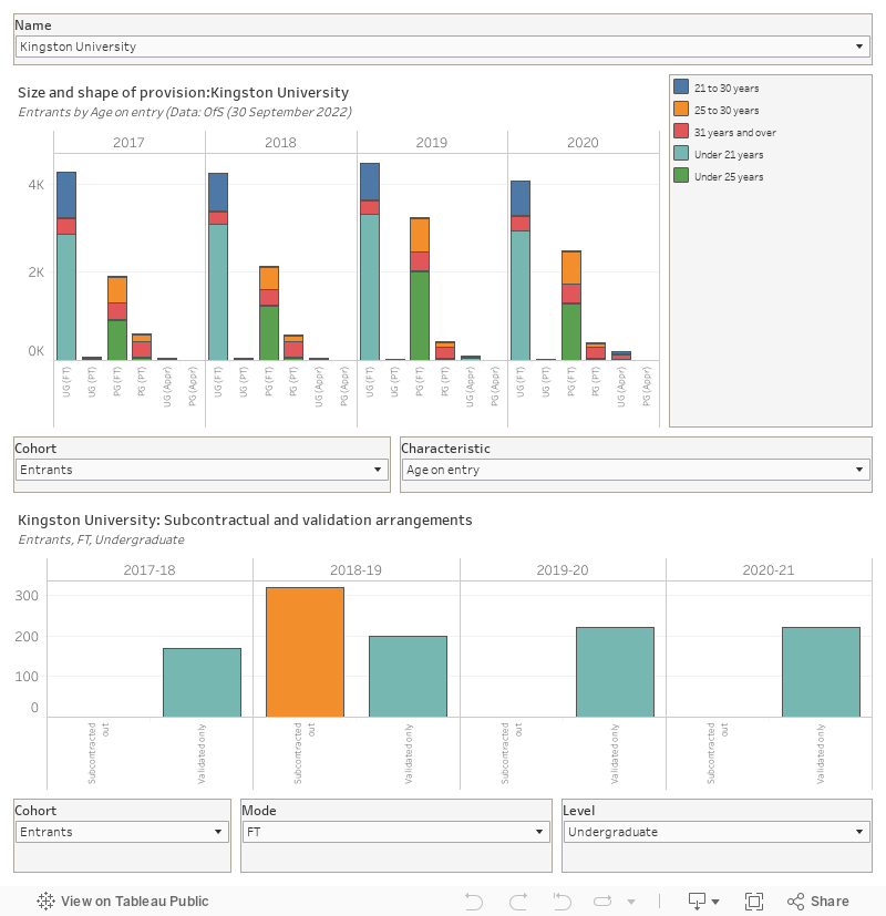
One of the most intriguing components of what is a huge OfS data drop is the information on the size and shape of the sector. It offers a detailed look at the make-up of the student body at each provider alongside – for the first time we can recall – information on the amount of subcontracting and franchising going on.
All credit to OfS for spotting that, in many cases, this is a bit of an issue. Much teaching validated or subcontracted out by regulated providers actually happens at the kind of unregulated provider that turns up on Panorama. We will eventually get details – we mean serious details about progression and continuation – about the actual providers that do the teaching for each university or college on the register. As OfS told us:
As we set out in our response to the consultation we recognise the current data limitations in relation to partnership arrangements and therefore decided not to publish the separate “partnerships” view of a provider’s student population within our dashboards in the first year of operation of the new approach to regulating student outcomes. Our current view is that we should publish data on partnership arrangements as a split indicator instead. We intend to focus on improving data quality in this, including by making the data available to providers, in order to be in a position to make decisions about publishing separate partnerships dashboards in the future.
So this is very much coming soon to a dashboard near you. If you don’t know what is happening with your subcontracted or validated provision, you’ll need to get on top of that.
Here’s that dash (and once again, there’s an OfS version with more stuff on):
Regulatory expanded universe
Back to those three modes of regulation – maybe you don’t have to choose? Maybe putting the data out adds enough transparency to give us a starting point, maybe the principles help us understand which information and what circumstances are going to matter, and maybe the unsystemisable contextual decisions mean that the lines will be drawn sensibly and in the interest of students, applicants, and the taxpayer.
That’s a positive spin – there’s also a worst of all worlds scenario where data provides a posthoc rationalisation for politically driven investigations with opaque reasoning – but this is not a system that necessarily has to be used badly. As with any attempt to regulate a sector that is already “world-class” (as ministers like to remind us), trust and transparency are key – and in releasing this data and being open about the limitations, OfS is being commendably transparent. But can we trust it?
And we can’t let the publication of all this data go without suggesting that this might be the kind of data – if presented in a friendlier fashion – that applicants and those who advise them might want to use. One of the criticisms of the former Unistats offer (and indeed, the driving animus behind the famed Sam Gyimah App Competition) was that it didn’t give you personalised information – a university may be great at landing you the job you want if you are a white male, but what if you are not? A lot of that data is in here, and it seems a shame that only regulatory nerds like us will ever play with it, for now at least.
The penultimate paragraph hits the nail on the head. The key issue is trust, but that feels as though it’s in short supply at the moment on both sides of the relationship – Paul Ashwin’s recent blog for HEPI (https://www.hepi.ac.uk/2022/09/04/the-office-for-students-expertise-and-legitimacy-in-the-regulation-of-higher-education-in-england/ ) gets at a lot of the reasons for this.