


End of cycle day is always a delight – and it does feel a lot like Christmas.
Not just because it happens in early December (usually the week before the Wonkhe Christmas party…), but because you are never sure quite what you are going to get, or quite what you are able to give.
UCAS does have a habit of releasing new data with little fanfare, ready for me to discover the interesting things at the bottom of the Christmas stocking that is sector level end of cycle. Elsewhere on the site UCAS’s Ben Jordan has been running through the key highlights, so this is more my own festive selection box.
International
For instance – who knew we’d have data on who uses Clearing Plus… by individual country of domicile. Around 5 people from Albania (rounding applies) found a provider through the semi-automated Clearing Plus service.
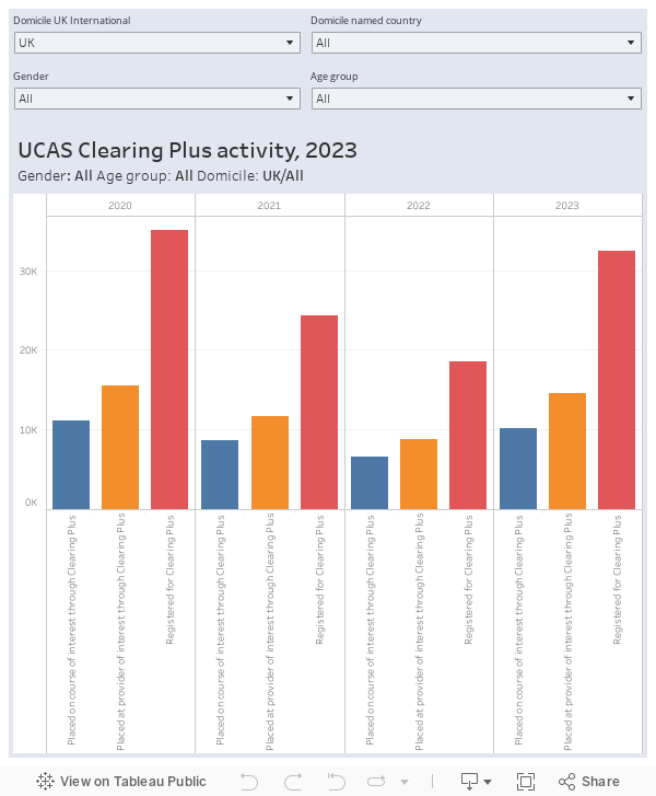
Of course, less attention will be paid to this than to the overall numbers from each country.
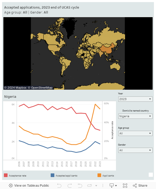
So for China applicant numbers and acceptances are down slightly (though still substantially up on previous years), while the acceptance rate continues to fall. India shows steady growth (on a near-static acceptance rate), whereas Nigeria has seen a sharp fall in applications and a smaller one in acceptances (with the acceptance rate continuing to drop).
What this means in a nutshell is that, for the initial 2023 cycle at least, demand was very strong in key overseas markets – and providers were becoming more rather than less selective.
Selectivity
Self-release is a newish UCAS process that allows applicants to disavow a previous firm offer with a view to taking on a more suitable course. Most of the rhetoric around this has been on prospective students “trading up” in some way, but the data tells another story.
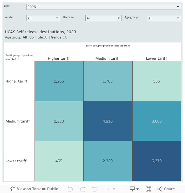
Most movement is within a tariff band, with traffic between bands surprisingly low – with the exception of from low to medium tariff moves. Nearly 2,000 people moved from a high tariff provider to a lower tariff – suggesting that this flexibility is being used in ways that suit student needs rather than ministerial aspirations.
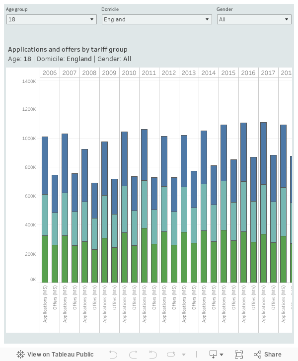
Despite many predictions, high tariff providers made more offers to English domiciled applicants than last year, though as a proportion this is down on last year. Overall offers made were also up very slightly on 2022.
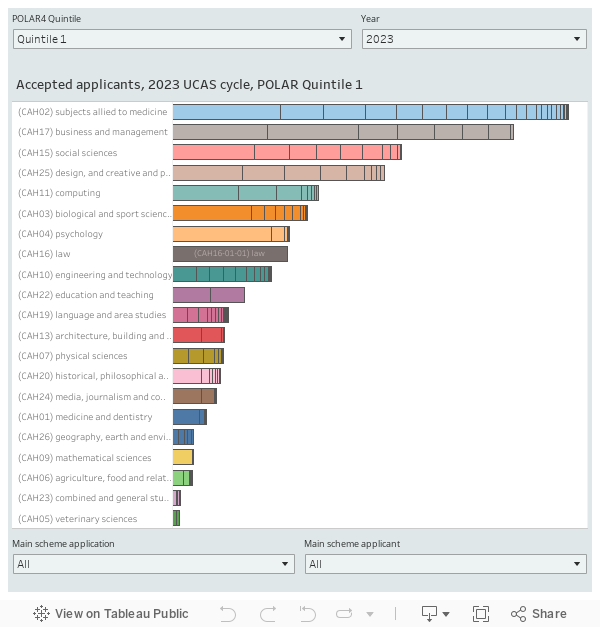
POLAR and subject area
I’ve always been intrigued by the question of how subject choice varies with economic and social advantage – and although POLAR, strictly speaking, is a measure of likelihood to attend HE, it does offer a useful perspective based on the wider local experience of university study
The most disadvantaged students tend to prefer nursing, business, or sociology courses – business is still popular among more advantaged peers, but alongside economics, design, and psychology.
Another view of this same dataset allows us to see the way this phenomenon changes over time alongside more general fluctuations in subject popularity. It is great, for instance, to see signs of growth in English literature after many declining years, and heartening to see that rises in demand at both ends of the disadvantage scale are contributing factors here.
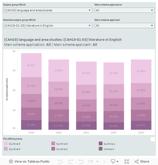
We can also use this view to see the growing preponderance of POLAR quintile 5 students in mathematics (now up to 40 per cent), and the gradual social equality arising in economics (I’m sure there’s some law that explains this).
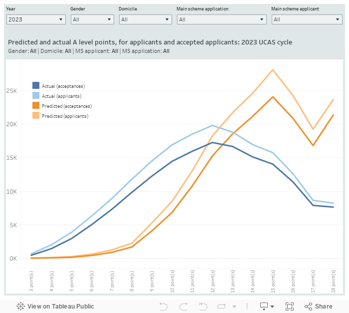
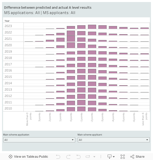
Predicting A levels
Longtime readers will recall my obsession with the accuracy of A level predictions – in short, most predictions in normal years have been over-optimistic, and this is a phenomenon that largely benefits the most disadvantaged students. Poor achieved A level grades, of the sort that tend to turn up in less well off areas, are less of a barrier to participation for this reason. People who are yet to realise this tend to be in favour of post-qualification admissions, a fine example of a logical intervention that would be hugely counterproductive.
Here’s the traditional charts:
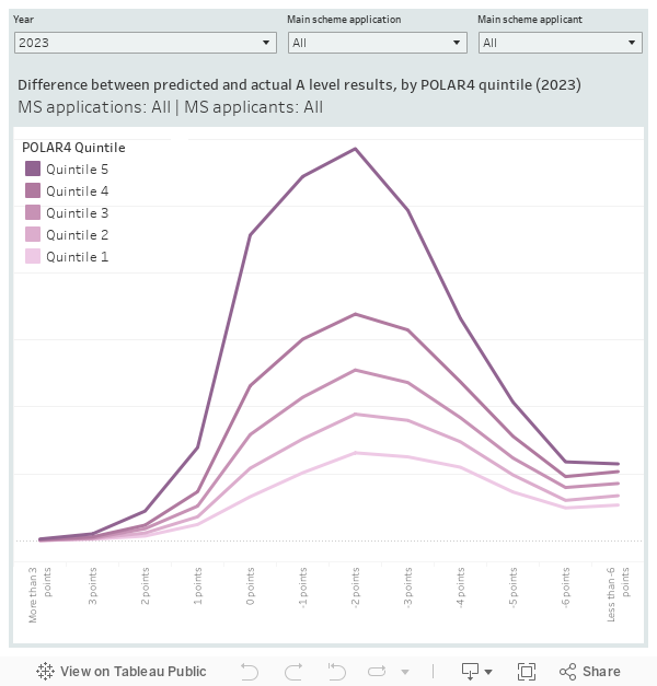
And here’s a reminder of what we (briefly) gained through the removal of the levelling algorithm during covid – more accurate predictions:
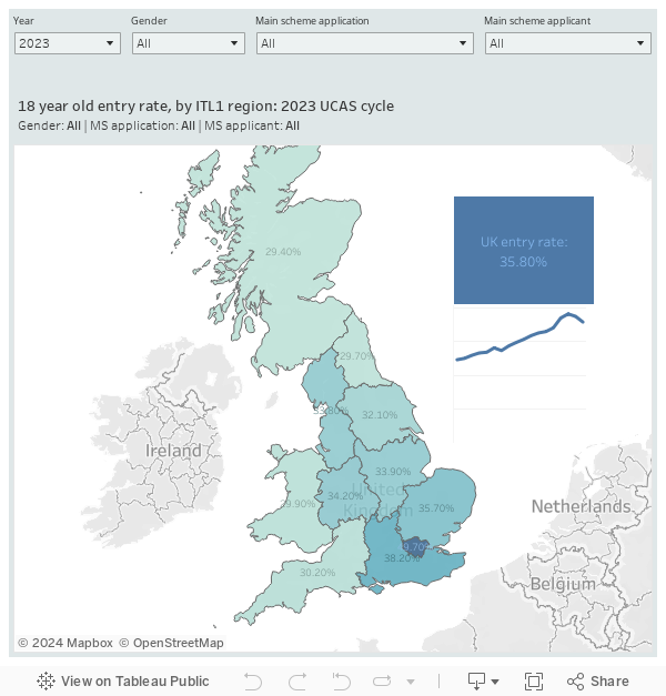
Regional recruitment rates
Did you know that 49.7 per cent of 18 year olds in London entered higher education? That’s a lot. The rate is 35.8 per cent for the UK as a whole, and only 29 per cent in the North East. The rate has fallen since the Covid peak pretty much everywhere, but the decline in the north is particularly striking.


Thanks for this insight David! Does the Predicted and actual A level points graph show the number of applications and acceptances that were above offer conditions by actual and by predicted by a range of tariff points, or the number of applications and acceptances that were below offer conditions by actual/predicted across a range of tariff points?