


The National Student Survey was originally designed to produce informative data for prospective students but in recent years has become a blunt instrument of data-driven policy.
But the survey itself has a fascinating genesis and the full scope of the available time series is seldom seen due to apocalyptic warnings about statistical integrity.
So as we stand at the cusp of another iteration – a postgraduate NSS – it is both instructive and entertaining to take a look through what we have learned so far. Our tale starts in the far flung days of the first dot com boom when institutions and government were keen to exploit this new-fangled information superhighway. The US had Google, and we had – the UK HE Mall?
We don’t need another HERO
If it wasn’t for the rise of the internet, we probably wouldn’t have a National Student Survey. The 2002 final report of the “Information on quality and standards in higher education task group” (a joint enterprise involving the QAA, HEFCE, Universities UK and the organisation that became GuildHE) was very broadly focused on the availability of information about universities, with a peculiar interest on improving the late and largely unlamented Higher Education and Research Opportunities (HERO) website.
This latter was what eventually came out of earlier discussions around the creation of a “UK HE Mall” – no, really – a consultant-led initiative to develop a “worldwide internet showcase for higher education in the United Kingdom”. This worrying world wide web was supposed to be aimed at “a wide range of users including potential students and their advisers, lifelong learners, overseas interests, researchers, industry and commerce”.
Giggle you may, but I would encourage you to read last month’s OfS Board paper on information advice and guidance for students – we really haven’t moved that much further forward. Beyond all the talk about reception areas and shop windows, what such a development needed was some information about institutions that might actually be useful to those it would be aimed at. A survey of student satisfaction was to be a key component of this offer.
Yet another task force – the Student Feedback Project Steering Group – ran until 2003, and reported that an initial plan – to add questions on student satisfaction to the Graduate First Destinations Survey (GFDS – which would later evolve into DLHE and then Graduate Outcomes) – was not going to work. HESA, in a very HESA-ish way, had argued that expanding the GFDS to cover a wider range of issues would confuse participants and make the exercise less reliable. This does make sense – generally shorter, more focused, survey instruments get better results.
The Knight that said NSS
So a new, national, independent survey was born – with Ron Cooke enveloping it into wider conversations around quality assurance. The Open University and consultants Segal Quince Wicksteed took on the development and testing of the process, running two pilots – in summer 2003 with 23 HEIs, and then (with further refinements) in early 2004 with 11 HEIs. These formed the basis of a 2004 consultation paper, the outcomes of which brought about the NSS as we know it in 2005.
This wasn’t the first attempt to understand what students were thinking – I love pointing people to the survey in the 1963 Hale Report – but what made the NSS special was the scope of it. While others had used sample-based methodologies, the NSS was, from the start, a census. Nearly every final year student would have an opportunity to have their say.
In 2018, 70% of all eligible students, some 320,864 people, completed the survey. But it wasn’t always thus. The early days of the NSS were riddled with boycotts – Oxford, Cambridge and Warwick in particular proved intractable in their disavowal of the survey as simplistic.
None less than Lee Harvey (an expert in student surveys and quality assessment) got himself into no end of trouble in 2008, when – as a director of the Higher Education Academy – he described the NSS as “bland and worthless” and sparked a row that saw him walk out of his job. And he had a point – the simplicity of the survey and the way results are presented can’t really to be said to offer any deep insight into the student experience. It’s the best we have, but it is not as good as it is often claimed to be.
Quality information?
These days “NSS day” is a calendar fixture when the early presentation of the results is deliberately designed to support prospective student information seeking rather than journalistic (or ranking) endeavours. The inability to construct a league table is a feature, not a bug, though raw data could be bent to those purposes.
A much bigger controversy this year was the absence of error bars on the data as presented. The sheer scope of the enterprise hides some quite small sample sizes – and although course (and institution) data are omitted when the response rate falls below 50% we can still be looking at a surprisingly low absolute number of responses.
Coding consistency is a bigger contemporary worry. With the use of NSS data alongside information from various HESA returns it is difficult to be sure that the same students are returned under the same subject headings. There have always been dark rumours of the way these vagaries have been manipulated to make a course or institution look better than it is and, although there is no smoking gun, the temptation in these days of TEF can be understood.
Suspicions of manipulation – generally institutions asking students (very nicely – often involving gifts) to fill out the survey in a positive way – have always existed, but in recent years the number of investigations have risen. HEFCE would silently adjust or remove suspicious data from institutions and subject areas in question. We are yet to see whether the new regulator will begin to name (and shame) where inappropriate influence is confirmed.
Full circle
Though the initial conception was for a formative dataset, the advent of TEF (and before this, the benchmarking process) brought the NSS into the summative, and judgemental, world of modern data-driven regulation. This is a task that NSS was never designed to fulfil. Although it presents a fair picture of the overall feelings of students towards their experience, the worry that the findings are being stretched to fill a role that distorts the meaning of the survey is ever present.
I’ve not covered the various tweaks to the survey (for instance those before the 2017 iteration) in this brief history. The modifications have been slight and drawn from cognitive testing across repeated iteration. HEFCE claimed such changes meant a time series was impossible to construct.
It is not valid to compare question level responses from 2017 with those from 2016 or previous years and such comparisons should not be undertaken. We do not endorse any presentations of the data which compare or aggregate question level data in this way: As the questionnaire has changed, it is no longer statistically robust to create time series data at question level that includes 2017 data alongside data from previous years.
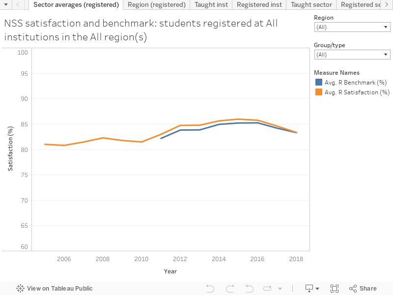
But if you look at the summary question only – and see the NSS as the crude measure of overall satisfaction it has become – a time series based around the old Q22 and the new Q27 is fair game. Below I have only included institutions where a reasonable amount of data exists across multiple years (so no Oxford, Cambridge and Warwick) and pressures of time have meant that I’ve been unable to track the changing names of further education colleges (seriously, people need to learn to use UKPRNs!).
There’s a bunch of fun stories in here across a variety of tabs – look for the strange contemporary dip in Russell Group satisfaction, the consistent “London effect”, the efficacy of the 2017 boycotts, and the way that the single biggest effect on student satisfaction has been the raising of fee levels in 2012.
I’ve included benchmarks and satisfaction rates for both the institution a student is taught at and the institution a student is registered at. Where benchmarks exist you can see flags in the tool-tips – note that a single flag here is equivalent to a double flag for TEF, though TEF uses parts of the survey rather than all of it. With a number of different views across the overall satisfaction data in the various tabs, I hope you find something to keep you happy.


Hi,
What about the (apparent?) fact that instead of using the full 1-5 range levels of answer for each item, the actual data only takes a zero vs. 1 (zero for all the three lower levels, 1 for only 4 & 5 levels) – this makes the analysis far too crude, Moreover, the (apparent) fact that we are not supposed to reveal it to the students is disturbing. To my opinion, not telling the truth is no less than a lie.
Yours
Yehuda
Hi Yehuda. The data I’ve looked at here is the overall satisfaction data – this does use a binary satisfied/unsatisfied scale as you suggest. The full NSS data includes answers 1-5 for all questions, I visualised that in an earlier article.
“Overall satisfaction” seems to exist as a concept for the less useful uses of the NSS by rankers and politicians. But it was the easiest thing to use for this historic visualisation as it gives a taste of responses whilst maintaining a usefully small dataset.