


The 2023 National Student Survey breaks with a time series stretching back to 2017 (arguably further) to paint the traditionally mixed picture of student satisfaction with aspects of their course and wider experience.
Though there’s significant variation by subject, level, mode, and provider there are some positive overall findings – given a 71.5 per cent response rate – just under 91 per cent of UK undergraduates who responded to the survey were positive about the ability of their tutors to explain. And 81 per cent agreed that marking had been fair and that assessment enabled students to demonstrate what they had learned.
The sector overall is weaker when it comes to acting on student feedback – around 4 in 10 (39 per cent) of students could not agree that student feedback had been acted on, while less than three quarters (74%) agree their course had been well organised.
Year zero
Usually here we’d be able to compare with previous years to add context and consider whether externalities (the cost of living crisis, for instance, or industrial action) had a discernible impact. The changes to the format of questions make this impossible to do so with any level of confidence.
We can say that, outside England, students were less satisfied overall in Wales and Scotland (though very slightly more satisfied in Northern Ireland). It would have been nice to make this assessment for England too. Instead – delightfully – providers and other interested groups were able to roll their own “satisfaction” ratings, resulting in a lot of winners around the sector.
Historically a lot of the value in the NSS has been the ability to build a time series to identify how student experiences were changing year on year. For this cohort of students – who have experienced issues related to the pandemic, industrial action, and the cost of living during their studies – it is a pity we are not able to see this impact directly by comparing to previous years.
A glance across the experimental thematic measures suggests that students in England may be happier in general about every aspect of their experience. This hints at a question design impact – although we can’t say whether the new questions are a more accurate measure of reality than the old ones or whether they push students into more positive (rather than equivocal) answers. It would have been hugely valuable to run the old survey with a small representative sample of learners this year in order to better understand this effect.
Certainly officers and staff at students’ unions will be delighted that substantially more students are happy with how they represent academic interests than last year – but it’s not clear whether this is a meaningful change or a survey artefact.
New topics
In 1967 Nina Simone released her famous recording of “I wish I knew how it would feel to be free.” What’s not clear is how she would differentiate between “very free”, “free”, “not very free”, and “not at all free.”
Every time we survey students about freedom of speech issues, we find that around 14 per cent of students have concerns. The much heralded National Student Survey question gives us exactly the same response. John Blake at OfS was wheeled out to answer press questions, and told us that free speech is by definition an issue that affects a small minority (who go against majority views).
It is a small minority (the three per cent in England who reported they felt “not at all free” to express “ideas, opinions, and beliefs” constitute just over 11,000 students of the 339,000 who responded) but it does feel odd that the much larger minorities who are very unhappy with assessment and feedback do not have their own dedicated complaints route, OfS director, and act of parliament to support them.
Indeed, it is much more concerning that a quarter of students do not feel like information on mental wellbeing has not been well communicated. Admittedly, I would much prefer to know whether the support itself was any good, but that’s not the question. It is fair to think that students should be aware of support available to them (again, this would have been a more useful question to ask directly), and I would hope this is something OfS are looking into.
The results
Here’s a dashboard showing results at a provider level.
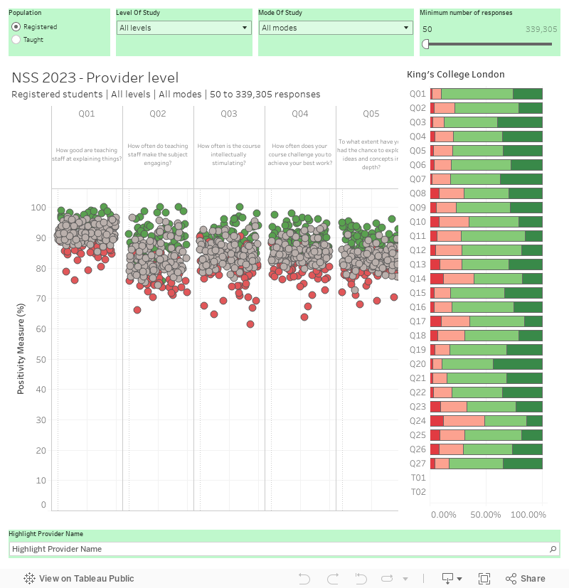
To use this and most of the other dashboards in this article start by setting the filters at the top to reflect the population of students you are interested in (in terms of level and mode of study, and whether they are taught or just registered at a named provider). By default I’ve filtered out for providers with less than 50 responses for ease of reading – you can tweak that using the filter on the top right.
Each dot on the bubble graph represents a provider, and each column represents a question or scale (note the latter are experimental statistics and may not reflect what is used in future regulatory activity). The scale on the left is “positivity” – so the proportion of students who responded using the top two of the four meaningful responses.
If you mouse over one of the bubbles you can see the detailed results for each provider on the right (note that we don’t get these for scales). Finding a particular provider can be achieved using the highlighter at the bottom, or the filter (labelled “show only one provider”) if you want to dive into that one in detail.
The colours of the bubbles refer to the distance between the observed responses and the benchmark for positivity. Where the positive difference is greater than 2.5 percentage points I’ve coloured them green, for a negative difference of a similar scale I’ve used red.
OfS highlights one mistake in data collection – students at the resolutely Scottish Glasgow Caledonian University appear not to have been asked the overall satisfaction question. The data tables (including those that underpin my visualisations) show the Scottish sector average.
Subject areas
While provider level results get the most external attention, both within providers and among the four or five prospective students that look at Discover Uni it is the subject level results that will have the most impact. Though this chart defaults to looking at England as a whole, you can use the filter to view results by (any CAH level) detailed subject area for any provider or nation involved in the exercise.
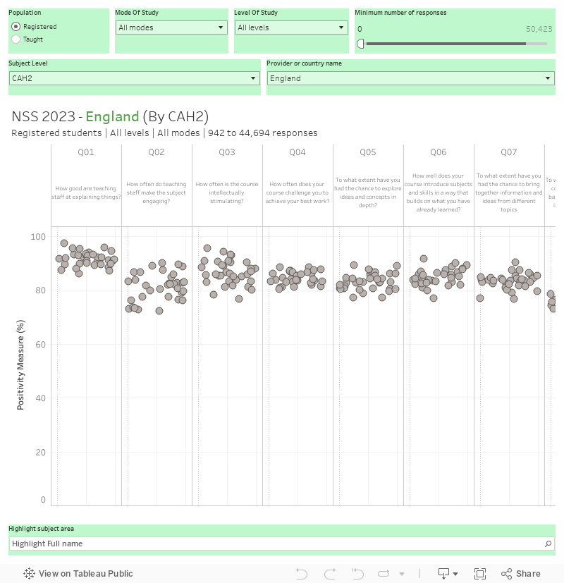
The subject area someone is studying has a huge influence on what we can understand about their experience, to the extent that OfS use it in benchmarking. Here we can see, for instance, that across England medical and dental students are more likely to have concerns about the balance between directed and independent study – whereas nursing and midwifery students are most likely to have problems with the overall organisation of their course and in contacting teaching staff.
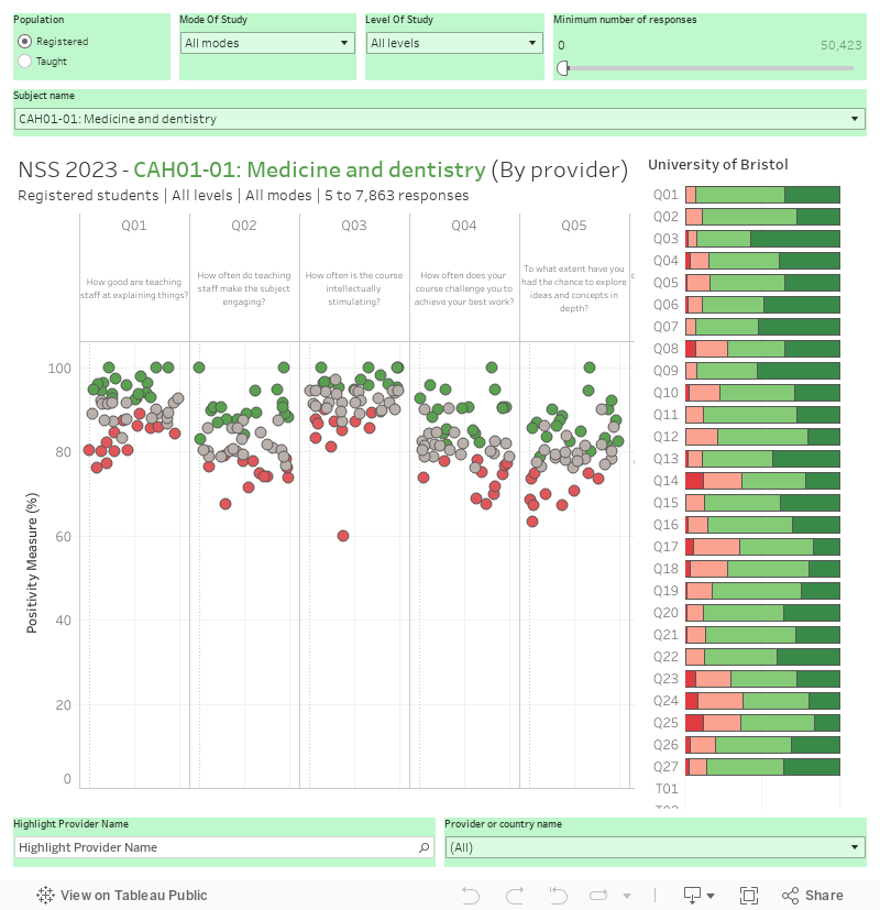
Each of these findings – and many others – are ripe for further investigation by a responsive regulator (in these cases both OfS and the NHS). And certainly you can profitably drill down to provider level to understand where problems are occurring so action can be taken closer to the level of individual students. Here’s a chart similar to the top one for CAH2 subjects (there is even more detail available at CAH3, but it made for an unwieldy dashboard).
Publication consultation
If you’re in a provider you’d probably have been quite keen to know what to expect from the publication of these results (your first chance to begin the all-important benchmarking against comparators). And in a sense, you did – the proposals out for consultation were tweaked in two very small ways.
The theme measures (results for groups of questions) have been published (at the level of positivity only) alongside the results today. This was a pleasant surprise as we were expecting them not to appear until later this year – though the “experimental” release we have now may not be the one that underpins future rounds of the TEF.
The other change is a very simple one – the original proposal was to flag instances where very small groups of students had all responded in one way as a positive or negative result, this approach (after sustained criticism) has been replaced by one that would just see negative instances flagged, with positive instances no longer supressed in any way.
Of course people flagged the missing England summative question – this was the regulatory response:
The OfS took the view that the benefits in maintaining the same summative question across the UK are outweighed in England by the need to ensure clear links between the information provided by the NSS and the aspects of quality that are subject to regulation in English providers. The different approach to the summative question in different UK nations will ensure that the questions asked of students studying in a particular nation properly reflect that nation’s approach to quality
More to follow
You may be wondering what has happened to the breakdown of these results by student characteristics at sector level – it would be instructive, for instance, to know how responses differed by student background, gender, and ethnicity. Well, there’s been no sign of that so far but I am assured the data is on the way.
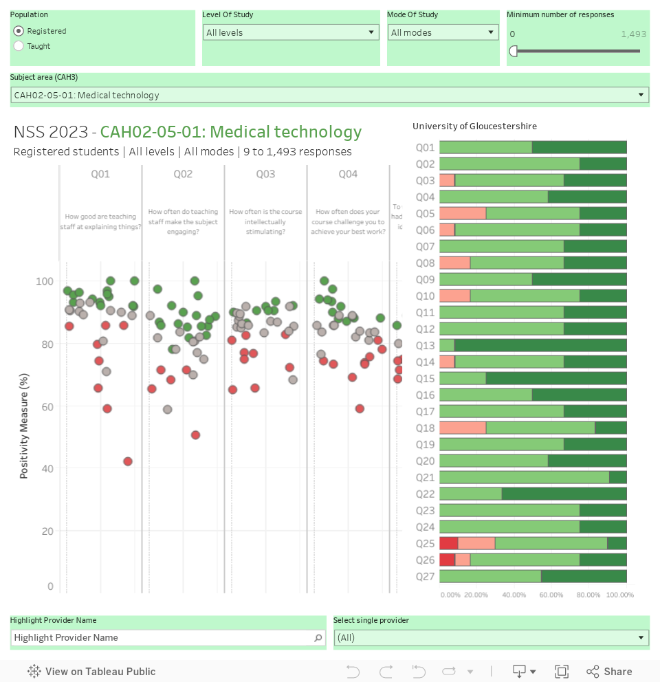
Bonus chart
Thousands (well, a handful) of people have asked me to publish something at CAH3 level. Here’s a version of the standard dashboard at that higher resolution.
“You may be wondering what has happened to the breakdown of these results by student characteristics at sector level – it would be instructive, for instance, to know how responses differed by student background, gender, and ethnicity. Well, there’s been no sign of that so far but I am assured the data is on the way.”
I would be particularly interested to see this demographic data breakdown for the free speech question, to understand more of whether there are any patterns as to which students are feeling overly restricted.
Yeah – it would be very interesting data indeed. “Later in September” is what I am told.
Is it possible to get an output of these charts without the horizontal slider? I’d like to download as an image so I can see all of the containers in one comparative view.
Hi Simon – you would need a massive image to see 28 questions plus 7 scales on a single scale given the need to see multiple dots to compare. I build the right size to embed onto blog posts, as this is also a decent approximation of the right scale and dimensions for people’s laptop screens.
One of the things that’s interesting in the sector is that there’s still a lot of ‘placed X in the country/region/mission group’ etc. type of commentary doing the rounds in public and within universities. Of course that’s understandable to some extent, but I’m seeing much less focus on scores compared to the benchmarks. I know that the benchmarks have limitations, even perhaps some flaws, but they’re a really interesting perspective (not least now that longitudinal analysis isn’t possible) on just how well or otherwise an institution has done in this year’s results.
This makes sense to me. From my experience, institutions will focus much more on benchmarks internally – i.e. in terms of whether real progress is being made / future targets and action plans, etc. but they just don’t really fit nicely into any of the marketing materials that unis will want to share publicly. I imagine that explains why any external / sector wide look at the discussion will continue to see those ‘top X in Y’-esque statements… even if internally they’re more focused on the benchmarks.
One of the things I have been looking at is rankings of performance relative to benchmark so you can still say you are position x in your peer group but without the frankly massive subject effects that we see. The one thing I would love my former colleagues to include in the data shared with providers is benchmarks so that I can see faculty, school or programme level benchmarks (using the same factors), CAH is fine but the mapping to internal structures is imperfect at best.
Sounds like a good way ahead Richard, on both counts. David makes a good point, but my disappointment is the lack of interest in benchmarked performance by the sector ‘press’ as that would reveal something that was genuinely useful rather than the kind of thing we’ve seen from THE. I’m also less convinced than David is that the benchmarks are used internally in the way they should be, e.g. as a key reference point when reporting on NSS to governing bodies. I’m sure there are some universities who do make good use of the benchmarks when doing this analysis and reporting internally; there are others who don’t.
Another quick question for David, what data are you using to define the benchmarks?
Hi Simon, benchmarks are calculated by OfS. They have a dropdown on their website ‘Understanding NSS data’. More details of that here: https://www.officeforstudents.org.uk/data-and-analysis/national-student-survey-data/about-the-nss-data.
“Indeed, it is much more concerning that a quarter of students do not feel like information on mental wellbeing has not been well communicated. Admittedly, I would much prefer to know whether the support itself was any good, but that’s not the question.” – Couldn’t have phrased it better myself… Very useful article, thank you!
Is it possible to include Colleges on the charts above?