


On the hottest day of the year the OfS have released data from the 2018 National Student Survey. And it’s not just what’s on the thermometer that is making institutions sweat – overall satisfaction is down for the second year in a row, from 86% in 2016 to 84% last year and now at 83%.
We have more institutions this year – the impact of Jo Johnson’s robust response to an NUS boycott aimed at disrupting TEF has clearly been felt – but there are two very notable exceptions. Both Oxford and Cambridge do not have enough respondents to see their 2018 data published. It’s still formal NUS policy to boycott, but even where a dwindling number of students’ unions have attempted campaigns they look to have failed.
A striking effect
A major question on the mind of multiple institutions has been whether the spring’s prolonged industrial action would impact responses. As ever with NSS, without delving into the free text comments it is hard to identify what causes overall satisfaction rates, but there appear to have been overall satisfaction falls across strike hit providers- where we have both years of data, only Southampton in the Russell Group looks to have bucked the trend. And a look at the scores for Organisation and Management (Q15-Q17) for USS providers also suggests that the action had an impact.
In many ways it is the things that don’t change over the years that are arguably the most problematic. Assessment and feedback (Q8-Q11) has always been a poor performer in the survey, and despite its inclusion in TEF metrics still over 1 in 4 full time students aren’t satisfied with their assessment fairness, timeliness and feedback quality. This seeming inability of providers to get a grip on a fundamental pedagogical problem raises interesting questions about the emerging architecture- if a quality and enhancement approach didn’t fix this, it’s hard to believe that a competition (and inevitable secrecy), data and baseline regulation approach will.
The visualisations
We’ll be diving into this data in more depth in the coming weeks – but today we’re glad to present some visualisations to help you make sense of what has happened. All these deal with all registered students at a given institution – the other option is to look at taught students, but we wanted you to see the scores as they are used in TEF. And, as always, there are links to full screen versions.
The first set lets you examine individual questions across institution and (CAH top level) subjects. Subject coding geeks will note that we have now moved on from the venerable JACS, so it is not possible to make direct year on year comparison.
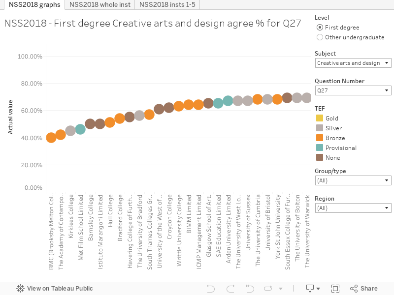
On the “NSS2018″ graphs” tab, you can look at responses to questions by subject areas across the whole sector, with a range of filters to help you make the comparisons you need (or scroll right accross to see everything. The “whole inst” and “1-5” lets you look across all subjects at an individual institution for a given question, the latter giving you more detail at responses (other graphs just look at the satisfaction percentage, providing confidence intervals in the tool tip)
Oh – you want similar visualisations for 2017 data? We have you covered.
Meanwhile we’ve also got a way of looking across the sector at performance against benchmarks. We’ve plotted the difference between the satisfaction (Q27) and benchmark for each year for every institutions. You’ll need to scroll right across to see them all, so using the filters makes things much easier. The flags are included in the tool tips (remember a + or – in a performance indicator is the same as ++ or — in TEF).
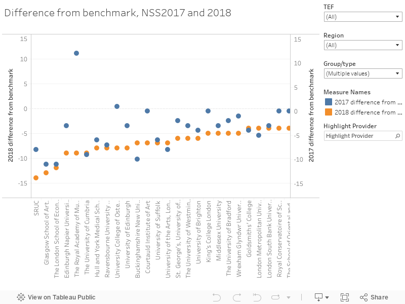
On all these visualisations we’ve filtered out FE colleges and alternative providers by default, but it is easy enough to add back in.
The raw data is available from OfS here. We’d like to offer the regulator small slap on the wrist for not consistently including UKPRNs alongside institutional names – perhaps we’re used to a more refined set of National Statistics?


Is it possible to see the data that is in the NSS 2018 graphs, but not filter it by subject area? It would be useful to be able to see the overall data filtered by type of institution or region? Is this published elsewhere? Thanks
Hi Paul – to be honest, whole institutional comparisons on NSS data are not really that useful. One large department, popular with students, can outweigh several smaller departments that students regularly complain about.
You can see overall institutional satisfaction scores on the benchmark graph. I sort by distance from benchmark because that is how TEF does it (and it is a bit more robust, as the benchmark compensates for large groups of students in subjects/with personal characteristics that correlate with lower scores), but the figures are there and you can look at particular institution types or regions from the filters on the right hand side.