


Back in September 2022 the Office for Students announced three “credibility of degrees” investigations.
These are still underway at three providers where a sharp increase in the rates of graduates with first class or upper second (2:1) degrees had been observed.
The 2023 release of grade inflation data therefore, to the surprise of many, does not include the outcomes of these investigations.
Instead we get what appears at first glance to be another iteration of the ongoing data series – showing observed qualification classifications and those controversial “unexplained” proportions, where more firsts and 2:1s were observed than the makeup of the student body suggests.
Here’s a plot – the y axis shows the proportion, the size of the marks the number of graduates, and the colour shows the proportion of “unexplained” awards. The filters allow you to focus on providers who had degree awarding powers back in 2010-11 (the Year Zero of this series), choose to consider firsts and 2:1s or firsts alone, and view charts for each mission group (based on 2023 membership).
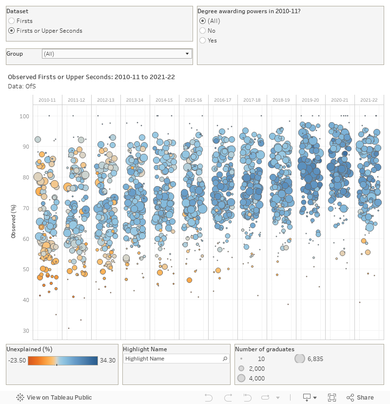
If you mouse over a provider you can see an arc of dots general showing a steady rise through to 2017-198, a slight drop for 2018-19, two years of carnage during the worst of the pandemic and then – as we already knew – a drop for 2021-22.
It’s that gives the first chunk of the OfS line:
Today’s report suggests that progress is being made in tackling the increases in top grades being awarded at universities and colleges that we have seen over the past decade.
What about “the unexplained”?
The more controversial part of the OfS statement has to do with the notion of “unexplained” results.
In a nutshell, this extrapolates what each cohort of students would have achieved had they graduated in 2010-11 based on a bunch of personal characteristics including subject of study , entry qualifications, and sex. If a given percentage of 21 year old creative arts students with three Bs at A level got a first in 2010-11, the modelling expects the same percentage in 2021-22 – any difference from this proportion (when built up to provider level) is flagged as “unexplained”.
It’s an unfortunate choice of words, in that it is entirely possible that students are achieving more because they have worked harder. We’re unable to track this back to A level/Level 3 results of course – these national qualifications are marked to a curve. Our national insistence that the same proportion of students get As every year feels like the end point of this regulatory campaign – should universities really have a set proportion of first class honours degrees to hand out each year?
What’s really strange is that a number of characteristics have been removed from the model for this iteration: disability, ethnicity, sex, and TUNDRA. The official explanation is that this is a reversion to previous practice, possible because OfS has “verified that this approach does not impact the overall results in any way” (and it would have been nice to see this verification.
This would be fine, if surprising, if we were not also told that this decision “may have resulted in changes to previously published numbers”. You can’t have it both ways.
We know from last year’s release, for example, that graduating while Black is linked to a coefficient of -1.038 compared to the (white) reference group when considering the chances of a first or upper second class award – much higher than the impact of subject groupings. For first class degrees only (an area where the sector is known to have a problem) that coefficient rises to -1.323.
We’re also told (again in last year’s release) that there is a sizable increase in the number of “explained” results when we add in these additional factors to what amounts to this year’s models. And this year’s effort charmingly demonstrates that the model over-explains quite a lot of the 2010-11 results.
OfS appears to have done all this in order to tell us:
But, we’re not out of the woods yet as half of first class degrees cannot be explained by students’ entry qualifications or the subject of study.
By this, the regulator means that just half of the 37.4 percentage point difference between the proportion of 2021-22 and 2010-11 graduation cohorts achieving firsts can be explained by the model.
At a provider level, on the chart above, the darker blue circles show a higher proportion of this difference unexplained by the model. The yellowish circles are for where the model expects more firsts (or firsts and 2:1s) than were actually observed – which feels like rock solid grounds for an appeal to me.
It always strikes me with this data that it is your more selective providers (Oxford, Cambridge, UCL, Imperial) that tend to top the charts for firsts and 2:1s being handed out, but all the concern seems to be around less selective providers some way down the chart. The link between prior attainment and degree award seems to drive this.
Anyway, we’ve moved away from the language of “unwarranted” firsts that we’ve seen in previous years – which is a good thing – but this dataset still poses more questions than it answers.
Maybe those investigation reports will shed a bit more light.
Does the number of ‘unexplained’ firsts say more about the nature of grade inflation or about the nature of the model chosen to try and examine it? My vote goes to the latter.
It might suggest the model isn’t good at explaining things?
I’ve heard it said that all models are wrong, but some are useful.
This model is useful in that it tells me how much OfS misses Richard Puttock.