


Higher education, and higher education policy in particular, can seem like it’s all about data.
This can be pretty off-putting if, like me, your skills lie in other areas (I’m Wonkhe’s “data person” but I’m a graduate in literature and music). Many decisions are made using numbers, proportions, and correlations – meaning that if you don’t have the digits and definitions at your fingertips you can feel like you’ve lost the argument before it even starts.
But there are a lot of good things about HE data that can help you – and the main thing is how widely available it is. An organisation called HESA (the Higher Education Statistics Agency) collects and publishes a vast range of data about every aspect of the sector (yes, even how many car parking spaces your university has!).
Every Thursday this year HESA has released a different slice of data, describing a different part of the sector. What I like to do is to build visualisations to help us understand what is going on in a more visual way.
Data on participation
Universities are measured on many things – one of which is the percentage of students from non-traditional backgrounds that they recruit. This measure is carried out using a measure called POLAR (which basically measures how likely a young person from a particular tiny area of the UK would be to go to university) and is bench-marked – compared against what regulators think the university should be recruiting.
Here’s my visualisation the data from February.
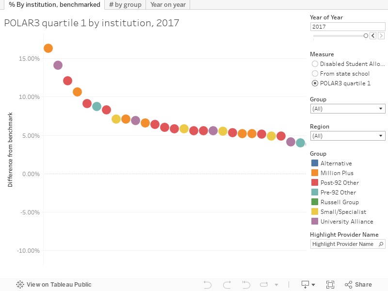
This is as good a time as any to take you through how I do visualisations (I use a tool called tableau to turn data from a boring spreadsheet into something a bit more intuitive).
The main graph is always on the left, and I generally try to sort by a useful value (in this case, the difference between the actual percentage of students recruited from areas with the lowest participation in HE and what it is reckoned it should be). If you run your mouse pointer over the dots (hard on your phone, I know) you get the detail, including the institution name. So here we can see Sunderland is doing loads better than it would be expected to – yay Sunderland!
On the right you’ve got the filters – year of year lets you chose the academic year you want to look at, it defaults to the most recent (the year beginning 2017). Measure lets you decide what you want to look at – maybe you think that the percentage of students that went to state school is a good measure, or maybe you are wondering about the percentages of students who can claim the Disabled Student Allowance. The graph changes when you chose a new measure – but we’re still looking at the difference from the benchmark for each measure.
Group and Region are standard filters that lets you look only at institutions from a particular mission group of similar universities (like the Russell Group, or Million+ – I uses colours to show these on the main graph), or in a particular region of the UK. Right at the bottom is a highlighter, which you can use to light up the institution you are interested in – and then scroll along to find it on the main graph.
Right along the top we have the tabs – you can think of these as hard mode. These usually show you a different view of the same data – here we get a closer look a those mission groups, and year on year changes for institutions.
So next time you are sat in a university meeting and someone is droning on telling you how great it is that they are at recruiting hard to reach students you can pull up this graph and say “ah, well, actually you performed worse against your benchmark for students from state school this year than last year”. They won’t know what’s hit them.
If you search “data” on main wonkhe there’s a bunch more of these to play with – on every conceivable subject.
Bonus content
Have you ever wondered how many students in the UK study exactly the same subject as you? Wonder no more.

My friend teaches physiology. That’s a subject linked to medicine – so I click on the “subjects allied to medicine” bar. This opens a new graph below, where I can see “anatomy, physiology…”. Clicking on that shows me a graph when I scroll down, showing the number of people who qualified (passed their degree) each year for the last four years in all kinds of subject. Physiology (I can see from the key on the right) is coloured green, running my mouse over that line tells me that only around 780 people (HESA rounds to the nearest 5) qualified in physiology, down from around 860 the year before. Which is a shame, as physiology is a great subject.


