

Student areas, a decade on
David Kernohan is Deputy Editor of Wonkhe
Tags
There’s a whole bunch of reasons people might want to know where, in general, students tend to live during term time.
The pandemic taught us the public health argument for understanding where students live, but information like this is also helpful in terms of service provision (where does your night bus go?), local liaison (which community groups do you need to be apologising to), and links to others working locally (planning everything from police activity to school places). Historically, students have tended to cluster – either in or around the campus, or in distinct and popular student areas.
The last decade has seen the pendulum shift away from the Young Ones style private sector houses of multiple occupancy (HMOs) that have been the popular image of student “digs” since the 80s, and towards privately owned purpose-built student accommodation (PBSA) on the one hand and the rise of local or “commuter” student living in the family home on the other. There are still student areas, but as we can see from mashing together data these have shifted from their 2010 boundaries, and occasionally disappeared entirely.
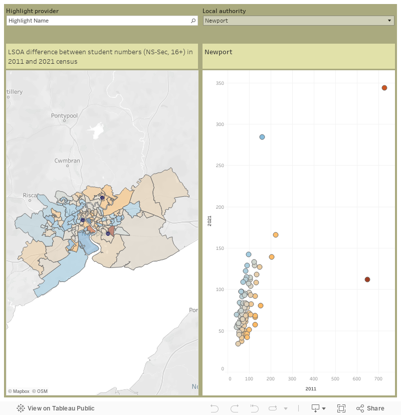
This chart allows you to look at the change in student living by 2021 lower super output area (LSOA) – areas that tend to contain between 400 and 1,200 households, or about 1,000 and 3,000 people. You can select a local authority of interest using the filter, or use the map search to find a place of interest. The colours on the map and the chart show the change in term time student residents (based on NS-Sec data, so we are looking at over-16 students studying full time) – blue shows an increase in student numbers over the decade, red shows a decrease. Mousing over an area (or the chart) show the population in each of the two years in question. I’ve added the locations of campuses via the Unistats dataset, you can search for provider names using the highlighter.
Nerdy census geography information
So why not show the difference between student resident numbers in each area? Well, on the one hand we have 2011 LSOAs, and on the other we have 2021 LSOAs – these are similar areas but not identical (tweaks in 2021, including the merging and splitting of 2011 LSOAs, ensure that the 2021 variants are all of similar populations. There is a mapping between the two, but it is very much on a “best fit” basis. LSOAs are each built of around five Output Areas (OAs) of between 40 and 250 households – these haven’t changed (though there’s way to many of them to sensibly plot) – the match just attempts to match the majority of OAs in a 2011 LSOA with a 2021 LSOA.