

All about that ONS data on the “brain drain”
David Kernohan is Deputy Editor of Wonkhe
Tags
The area-based wonk world has lost its collective mind about a recent release from the Office for National Statistics, which looks at graduate and non-graduate migration using built up areas (and built up area subdivisions) as a unit of analysis.
In the main, this is because ONS has done a stellar bit of data visualisation which has driven a lot of fascinating regional and local storytelling.
We have, of course, been able to look at graduate migration at various levels before. The Longitudinal Educational Outcomes (LEO) dataset that the ONS release is based on has long featured a similar analysis by (ILTS1) region. The Office for Students has provided information about where graduates live (at a provider level!) by travel to work area (TTWA) and, later, lower tier local authority (LTLA).
Built up areas are an innovation here, but the clue to the drawback is in the name – these do not cover the whole country, just built up areas. While this makes sense if you are particularly interested in towns and cities, for me there is equal value in looking for graduates in (and not in) more rural and isolated areas. Also, the way they treat London (just presenting north and south London as two massive units of analysis) is just plain odd. If you, as a Wonkhe reader, were wondering why I didn’t leap on this data as soon as it came out – those are the reasons.
Nevertheless, the data has clearly piqued interest – so let’s have a look at what we get.
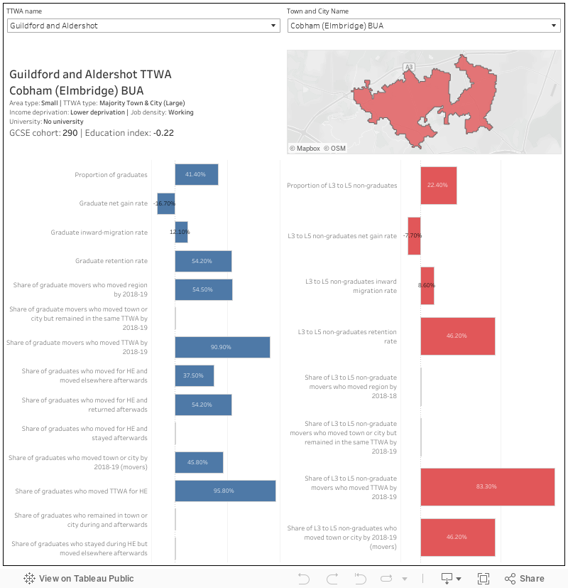
This dash gives you an overview of all the available data – ch0ose the built-up area or subdivision of interest within a travel to work area (TTWA) using the filters at the top. Contextual data is top left, map is top right – below that the data pertaining to graduates is on the left in blue – that pertaining to non-graduates with L3 to L5 qualifications is on the right.
What we are looking at here is the destinations of state-schooled young people from the area in question who sat GCSEs between 2007-8 and 2010-11, as of the 2018-19 academic year. In the contextual bit of my dashboard above you can see a figure for the number of people this pertains to – in some cases this is surprisingly low.
You can see on the main charts the proportion of each cohort who went on to get a graduate-level qualification (level 6 or above) and those who obtained a L3 to L5 (non-graduate) qualification. These are the two groups under analysis – we are not told anything about the movements of people who have their GCSEs as their highest qualification.
For each group we can then see an inward migration rate (the number of people in those GCSE cohorts with those qualifications who had moved to the area by 2018-19), which is used to calculate a net gain (those people minus the number of people from the area who had gained that qualification and no longer lived in the area)
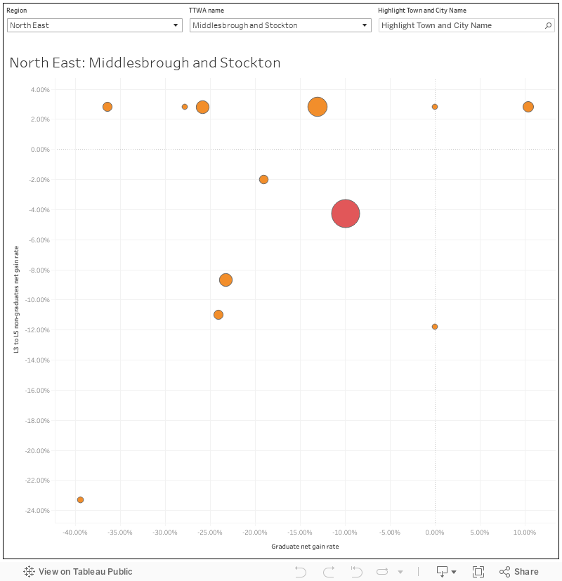
I’ve plotted net graduate gain against net L3-5 gain here: It makes for an interesting perspective on differences within larger areas.
There’s more detail for graduates on whether they moved away to study and stayed their to work, or moved away and then moved again – for both groups we can also see movement between towns in a travel to work area, or between travel to work areas.
What we don’t really see is evidence of brain drain as such – you’ll note in many well-to-do places homegrown graduates tend to have the social capital to move to work elsewhere, while other graduates move to their old home town. Conversely in more disadvantaged areas graduates may end up returning after study – either for family reasons or due to a lack of other options.
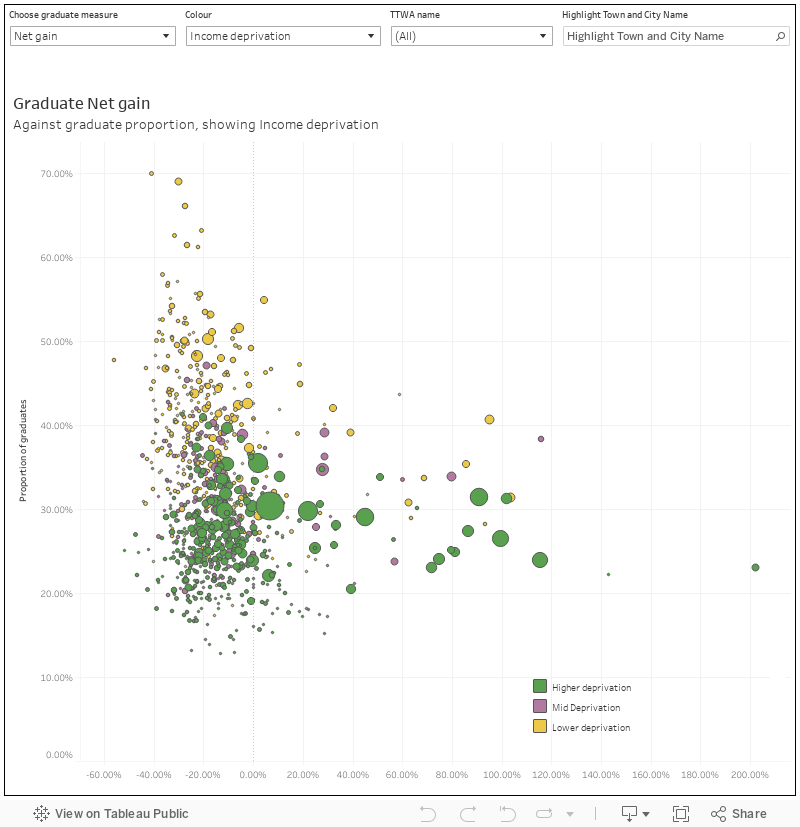
This chart lets you see graduate net gain, graduate inward migration, and graduate retention plotted against the proportion of young people from the cohort who became graduates (a great measure of how middle-class an area is!). You can also choose what the colour shows – whether or not a place has a university, broad deprivation, job density, or the type of area. You can filter by travel to work area.
There’s a bunch of other interesting things here – as you’d expect, a net gain in graduates correlates with having a university in the area, but the impact is not always on inward migration (people coming to study and then staying) as much as it is on retention (graduates from the area staying in the area). And what does appear to drive inward migration is a working area (a place where people come to work rather than just live)
Dataset does have errors in it, mind, but I’ve been onto the ONS so at least Lancaster now has a university (just in case anyone is wondering whose fault the correction note that has appeared is. It’s my fault.)
Next: Bedford, and an even longer discussion about where Harper Adams actually is.
Note that if an institution has an out-of-town campus it won’t be reflected in the dataset. Do have a look through the raw data provided and check your institution is in there.
Until the dataset is correct I will reserve judgement on how good the tool really is.
Charlie, the government never seems to remember about Discover Uni! There’s a geographic location for every campus in the UK (well, most, some people really don’t understand latitude and longitude…) that could have been used to do just this (indeed one of my missions this week is to add them to SEISA).
Some of the big urban TTWAs are interesting – Manchester, Birmingham, Sheffield – % grads declining in the satellite towns (including the well-off ones) and going up in the centre.