I’ve been thinking a lot about why and how we expect students to make applications based on longitudinal educational outcomes.
From the infamous app competitions to Unistats and new Discover Uni, there’s been an expectation that historic information on median graduate salaries would be useful in deciding which course to take at which provider. There’s been a huge amount of commentary about problems with the applicability of the data to particular groups of graduates, on the absence of data on hours worked, and on potential confounding variables such as region of employment.
I don’t intend to rehearse these here (though see the “LEO” tag on Wonkhe for more on this). Instead, I’m interested in the mechanism of change – how do we expect applicants to change their mind based on interacting with this information?
A user’s guide
Clearly, we’re not expecting people to pay much heed to the precise figures. I don’t think there’s anyone in DfE who imagines someone saying “this course sees people earning £24,000 after three years – but I want at least £24,050 so I’ll do something else instead.”
Both Unistats and Discover Uni present an overall median three years after graduation, and compares this with the range of all courses in that subject area. The inference here is that the salary is presented as a positional good – given that you have chosen to do this subject, this course’s median salary outcome after three years is either towards the top or bottom of the range of all courses in this subject.
In essence, LEO is a league table. No official sources present it as such (if you’re wondering why, I’d suspect the inability to reflect a margin or error in ranking), though you’ll frequently see such tables (for the “top 10” or “bottom 10” at least) in the media.
A sense of history
Let’s ignore the disconcertingly precise figures and treat the whole exercise as a ranking. Put the best earning graduates at the top, the worst at the bottom, and then we can cut by subject if we like. This gives the prospective student a more accurate sense of how a given course compares with other, similar, courses.
There’s a bunch of reasons not to do this – but for our purposes of giving applicants a sense of their likely relative earning potential the primary issue is the historic nature of the data. The “three years after graduation data” used on Discover Uni, for instance, refers to people who graduated at the end of the 2011-12 and 2012-13 academic years, and what they earned during the 2015-16 and 2016-17 tax years. Prospective students applying during the 2020 cycle would be likely to graduate in 2022-23 academic year – ten years after the cohort that this data is drawn from did.
So how good will ten-year old data be in predicting how much graduates will earn? We can’t look into the future to answer this question, but we can look into the past.
Compare and correlate
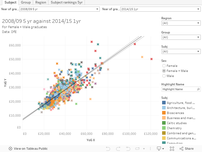
I’ve built this toy to help explore how good LEO is at predicting itself – you can choose the years of data on each axis, and the scatter plot shows institutional and subject area placements on both. I’ve included an R squared line and bounds to see, effectively, how well one year/cohort predicts another in terms of placement.
There is a statistical constraint here, because plots with large numbers of point tend to flatter R squared values, and for a population measure with one variable there’s not really an easy fix for this (if you want to suggest one, please comment).
But here’s what I found:
| Sex | Measure | Years | R squared |
|---|---|---|---|
| Male | Greatest distance between cohorts | 5yr 08/09 - 1 yr 14/15 | 0.587 |
| Male | Least distance between cohorts | 1 yr 13-14 - 1 yr 14-15 | 0.773 |
| Male | Same cohort | 1 yr 12-13 - 1 yr 13-14 | 0.763 |
| Female | Greatest distance between cohorts | 5yr 08/09 - 1 yr 14/15 | 0.64 |
| Female | Least distance between cohorts | 1 yr 13-14 - 1 yr 14-15 | 0.791 |
| Female | Same cohort | 1 yr 12-13 - 1 yr 13-14 | 0.747 |
| Male and Female | Greatest distance between cohorts | 5yr 08/09 - 1 yr 14/15 | 0.662 |
| Male and Female | Least distance between cohorts | 1 yr 13-14 - 1 yr 14-15 | 0.837 |
| Male and Female | Same cohort | 1 yr 12-13 - 1 yr 13-14 | 0.763 |
It looks like the LEO data is more predictive across smaller time periods, or where you are looking at the same cohort at different times. This is pretty much as we’d expect. Looking specifically at difference between the oldest and newest data, we find that R squared is equal to 0.662.
An R squared value of 0.662 means, basically that 66% of the variation between points in the later data is explicable by the variation between points in the earlier data. So two-thirds of the points (which represent a subject area at an institution) can be accurately placed on a plot of the future data based only on knowledge of the past data.
Sex is an interesting variable here – as data for males is in general a less reliable predictor than data for females, except within a single cohort where it is slightly more reliable. I’ve not got any explanations why this might be, but I’d like to hear from readers in the comments.
It’s all subjective
This might sound pretty decent – but remember that the data is presented within subject areas (which also has the side effect of making R squared a bit more reliable).
So here’s a few examples for predicting the latest cohort from the first one, for male and female students, by subject. Remember, a higher value for R squared means the earlier data is more use for predicting the later data in relation to other points.
| Subject | R squared |
|---|---|
| Engineering | 0.303 |
| Biosciences | 0.27 |
| Business | 0.63 |
| Computing | 0.786 |
| Economics | 0.668 |
| Medicine | 0.128 |
| Creative Arts | 0.491 |
| Education | 0.228 |
| Sociology, Social Policy | 0.316 |
That’s a huge variation in usefulness. For a biosciences or education course, the position of less than a third of institutions in the latest cohort is predicted by the earliest cohort.
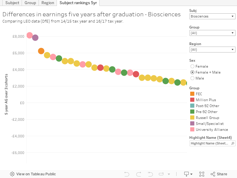
Another way of looking at this is via a straight ranking of the differences between two comparable cohorts at the same point, by institution and subject. This visualisation includes only subject/provider combinations with an average earning of over £1 in 5 years after graduation, and shows the difference between earnings after 5 years from the 14/15 and 16/17 tax year data. This is a very small period of time in comparison to the 20 years difference looked at by HESA and Warwick, but there are still some interesting differences.
Is LEO any good for this kind of thing?
For a number subjects, historic LEO is not a good predictor of salary for later LEO cohorts. There are exceptions, but for many subjects the variation is more likely to be explained by other factors than by a choice of institution. Calculations of graduate returns are fraught with confounding variables, whether we compare with non-graduates or graduates from other providers or courses. As such, it is difficult to see prospective students gleaning much value from this data.