


What’s a Record of Prior Acceptance (RPA)?
The official UCAS definition is that an RPA is:
Where an application is submitted to UCAS by an institution where an unconditional firm offer has already been [made] and accepted by the applicant.
In other words, some applications don’t come via UCAS. Offers like this happen when an applicant approaches a provider to register on a course – this usually, but not universally, happens with mature students with a decision to accept based on prior attainment or experience. We only see these as “acceptances”, not “applications” – they are presented as a done deal, which does distort the overall picture of acceptance rates. And they don’t include data about qualifications.
RPA numbers tend to be volatile year on year and between providers (not that we can often see that). Curiously, despite RPAs being noting to do with the UCAS process providers largely have to return information about them to UCAS, at a cost to the provider. In total, it’s been estimated that this costs the sector around £1.4m – not a lot, but hardly a trivial amount.
Finding RPAs
There’s a few things I’ve been looking forward to digging into in this dataset – one of which is applications by tariff group, as it has been accepted wisdom that a rise in average A level grades saw students overwhelmingly get their first choice place at a high tariff provider. This is also – as we will see – where the interesting stuff is happening with RPAs. Here’s the graph:
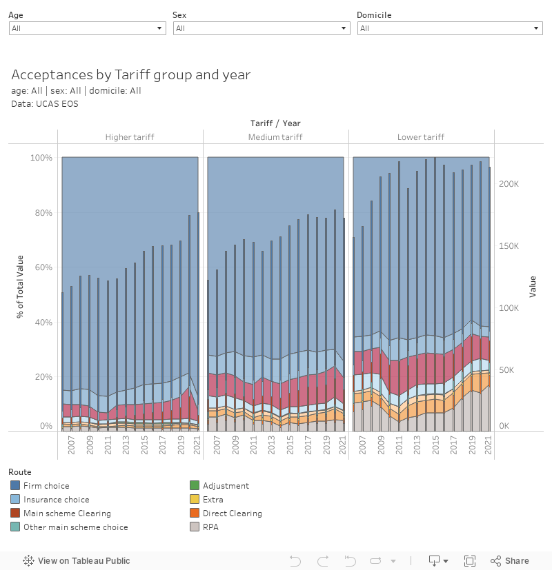
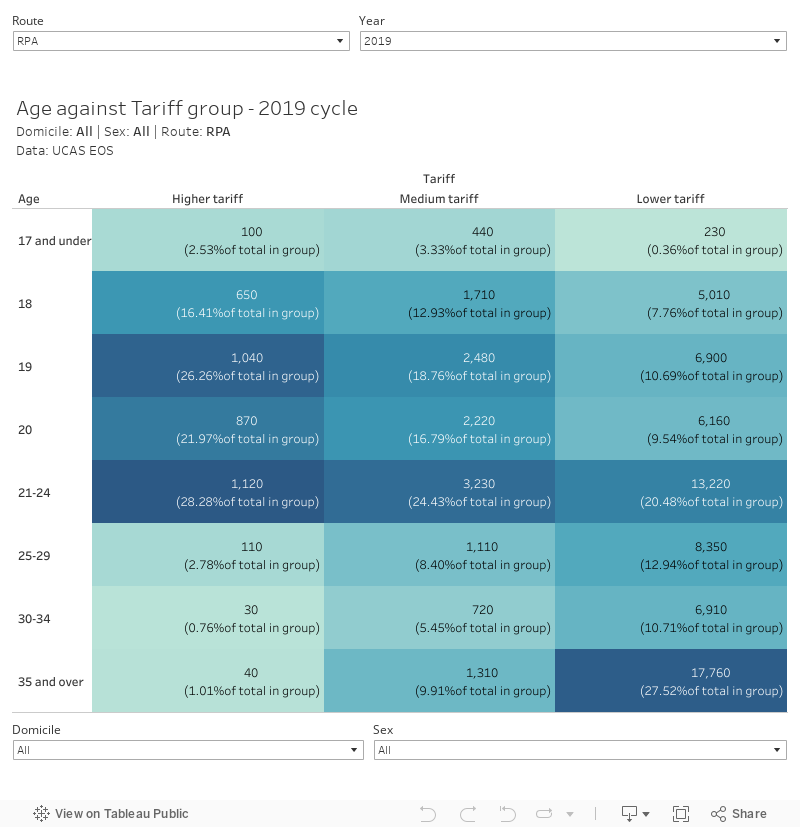
The RPAs are marked in grey on these charts, and you can see that low tariff providers (a definition we will get to) saw a substantial – three percentage point – increase in RPAs this year over last. As you’ll recall, the usual understanding is that this is mature students at lower and medium tariff providers – the data suggests though this is broadly true it is not universally so. For example, more than 20 per cent of RPAs in low tariff providers are for those 20 and under.
It’s not often we see RPAs in UCAS data. Back in the day, Mark Corver wrote about how hard it was to get a sense of what was going on with them – we now have this data in nearly every table which is fantastic.
Mark reckoned what we are seeing is:
probably a small number of providers who have changed what or how they do things that is behind the change, rather than a systematic move one way or another. But we can not be sure, and since UCAS have not published the RPAs by provider in previous years, we can not be. In short, the trends are probably more reflective of reality if you take them out. But you can not be sure
So I asked UCAS what the deal was, and Richard O’Kelly told me:
Analysis earlier in the year showed an overall increase in mature applicants searching for solace in HE this year, so an increase in RPAs at the end of the cycle would also be expected.
I’m sure the thirst for (three year undergraduate) reskilling and training among the under 20s is real. But an alternative explanation might be that claims of a drop in unconditional offers may require an asterisk. As always, more (and better) data is needed.
Tariff groups
One of the annoyances of this release is that the closest we get to provider level data is parsed through the lens of tariff groups. And we’re never entirely sure which provider is in which group.
Thankfully, DfE occasionally publishes its own tariff groups alongside other data releases. This is the latest one I can find – my plot shows the average (mean) tariff from 2019-20 (the latest available) against the number of undergraduate students in each provider from the latest HESA data.
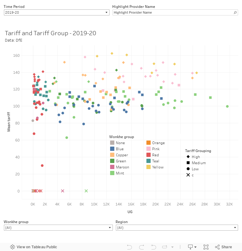
What this illustrates to me is that – for all we may imagine what “type” of provider is represented by each group – the differences between low, medium, and high are not sharply defined and (if you have a go with the date slider) these change every year anyway.
Predicted and actual
One of my favourite things from this release is the data that underlies the graph that largely undermines the calls for PQA – the one that shows that, generally, students from POLAR quintile 1 do worse in actual A levels than they were predicted, and applicants from better off backgrounds are much more likely to have been underpredicted.
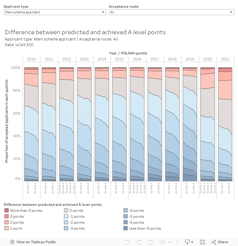
Apart from last year and this year, both of which saw the use of teacher projected grades (a kind of director’s cut of the usual UCAS predictions) and both of which saw many students perform better than expected or in line with what their teachers thought in late 2020. Here disadvantaged applicants are also more likely to do worse than expected – although a long way from the previously established trend.
Quite what this means for the currently stalled long march towards post qualification admissions is unclear. Predicted grades were more accurate than they have been in years, but the break away from the algorithm that has existed since 2010 made it harder for providers to discriminate between applicants.
What we don’t get here is tariff group by POLAR quintiles. To see whether disadvantaged students are more likely to have accepted a place at a more selective provider in 2021, we’ll need to wait for the main provider release in January. Which is a shame, as it is one of the key questions left unanswered about that last tumultuous UCAS cycle.