


There’s been more than enough fuss about grade inflation over the last few months.
2019 has seen HESA morph into mecha-HESA – releasing far more open data than ever before – so it would have been easy to miss this little heralded addition to our understanding of the issue in a news release that focused mainly on the personal characteristics of qualifiers.
We’ve already seen data developed specifically by OfS back in December, which even included a technical note on how the calculations were done for that report, TEF year 4 (even though grade inflation was dropped from the subject pilot, it’ll still be there in the summer), and regular HESA statistics. What we have in front of us includes institutions and qualifiers from outside England, and all modes of study towards a first (undergraduate) degree – the most complete data we have seen thus far.
First degree classifications
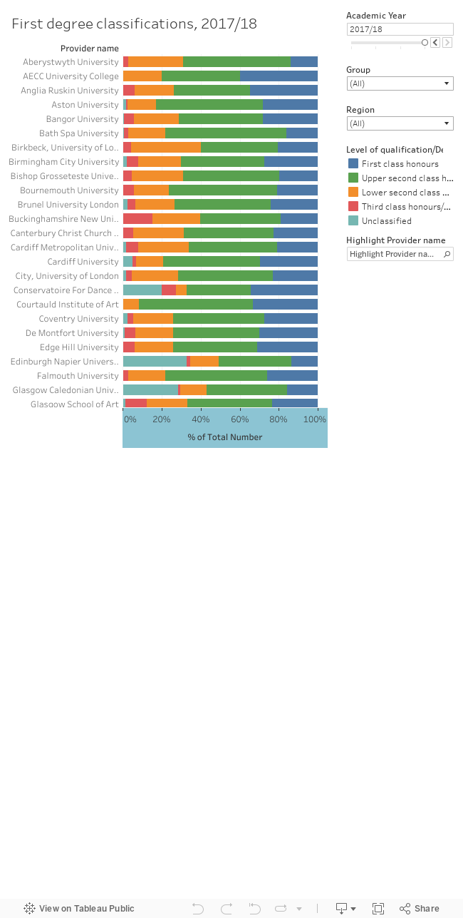
The usual set of filters (mission group, region, and an institutional highlighter) are available on the right of the graph, which shows proportions. Clicking on a bar brings up a second graph below brings up a time series, which shows the last four academic years as numbers of students, with percentages as labels.
One of the first things that stands out is the large number of “unclassified” degrees awarded by Scottish institutions. This doesn’t mean students are less able, or institutions mark more harshly – the standard degree in Scotland lasts for four years and “unclassified” in this data relates to students who elect to qualify with an “ordinary” three-year degree.
Under-explained?
Clicking through the data shows no great variations in proportions among institution of a similar size – though in most cases you can see a gradual year-on-year increase in first class degrees when you drill down. When the OfS examined this issue they used demographic characteristics to calculate a percentage of “unexplained” first class degrees – using as their headline figures the differences between the number of first class degrees they would expect given institutional intake characteristics, and those actually reported. Here we have nothing quite so fancy – the raw numbers and proportions are shown as is.
The size of an institution is hugely important in understanding what the proportions mean – we would expect more fluctuation in smaller graduating populations – and providers that grow their proportion of first class graduates while shrinking may simply be improving their admissions processes. The causes of grade inflation are as far beyond our grasp as ever – the numbers are compelling but without a full understanding of each institution, each student, and their context we are only generating hypotheses.


