

Place, adult participation, and 20 years of HE expansion
David Kernohan is Deputy Editor of Wonkhe
Tags
Though we’re gradually moving away from seeing education as a panacea for “levelling up” local areas, it is still possible to use data to help us think about the impact of more than 20 years of participation expansion on neighbourhoods in England and Wales.
In the 2001 Census, around 19.76 per cent of respondents in England and Wales had their highest qualification at level 4 and above. By the time we got to the 2021 Census, this had risen to 27.54 per cent. We do need to bear in mind the data quality issues for this field in the 2021 Census, but is uncontroversial to suggest that the trend is upwards.
Of course, this national trend is not uniform for all areas. We’re at Mid-level Super Output Area resolution here – what you might talk about as your local neighbourhood. Here, there is a a part of Manchester that has seen a 48 percentage point growth in residents holding a higher education level qualification. And there is an area in Barnet that has seen this number drop by 16.76 percentage points.
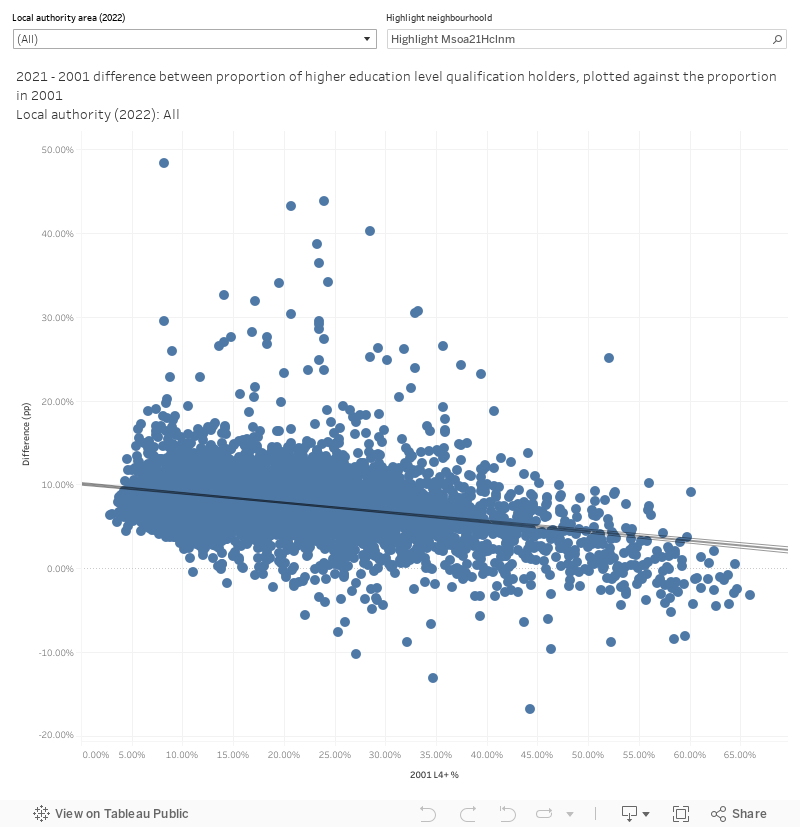
There is a surprisingly loose relationship between the growth in qualifications in each area and where it was in 2001. In general areas with lower numbers of higher education level qualification holders tended to see this number grow, but there are a surprisingly large number of areas that have seen numbers drop over this period – and very little to connect them.
There’s clearly a lot going on here – some statistical noise (see below), plus the impact of how where graduates choose to live (and why) has changed over time. I’ve knocked together a dashboard to help explore this in more detail in local authority areas – showing the number of higher education qualification holders in each neighbourhood.
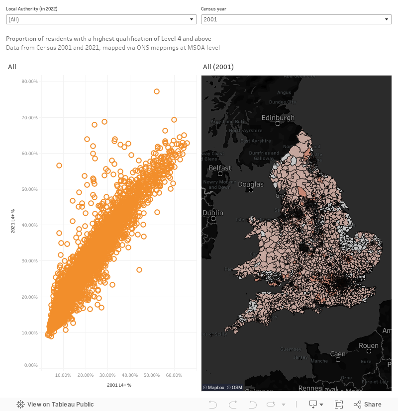
The chart on the left plots the 2001 proportion against the proportion from 2021. The map shows numbers from your selected Census year. And the local authority filter works on both sides, so mousing over a mark or area shows the same area on the map or plot as well.
Census and geography nerd notes
If you are reading under this subheading you probably are wondering how I’ve mapped 2001 MSOAs into 2021 MSOAs. I’ve used two sets of ONS mappings at MSOA level (2001 to 2011, and 2011 to 2021) which are “best fit” rather than exact in nature. For this reason we really need to take these relationships as indicative rather than precise. Many of the changes we see above could be linked to changes in the areas covered by each MSOA – though the names and numbers may remain, the actual lines on the ground have been through two separate sets of iterations.
Conversely, the highest level of qualification question hasn’t changed much since 2001 – the level 4 or above category wording changed slightly but it works for this level of comparison.