

HESA Spring 2023: UK students by (standard) domicile
David Kernohan is Deputy Editor of Wonkhe
Tags
So when HESA released the latest tranche of student data landed one unkind commentator noted the following:
But we can also do this on a UK basis – looking at recruitment from a range of local authorities across the UK – though not before the rest of this paragraph, which exists to lament HESA’s choice of a non-standard mixture of counties (including ones that no longer exist like Northamptonshire), unitary authorities, metropolitan counties, and the actual ILTS region that is Greater London. I’ll be honest, if I have to grab three loads of shapefiles from the ONS geographies portal it is not a good day for me.
Yes, dear reader, it was me. Of course, even then, HESA were plotting to release data on UK student domiciles by a standard administrative geography (local authority districts, which includes unitary authorities) – and today saw this data publicly released. We get two versions – the one for all students (table 62) by provider, and the one for new enrolments in a given year (table 61) by region of providers.
The benefit of this release, other than giving me another opportunity to make dashboards, is comparability – all kinds of data (including census 2021 data) is available using the standard local authority resolution so we can run all kinds of fun comparisons, and it requires one set of ONS shapefiles to plot rather than three.
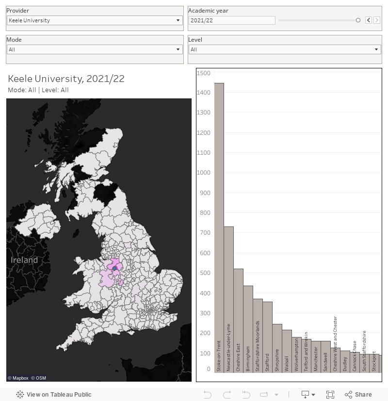
But right now – it’s a play the hits moment. Here (from table 62) is where all UK students at a provider come from with mode and level filters for a choice of four academic years:
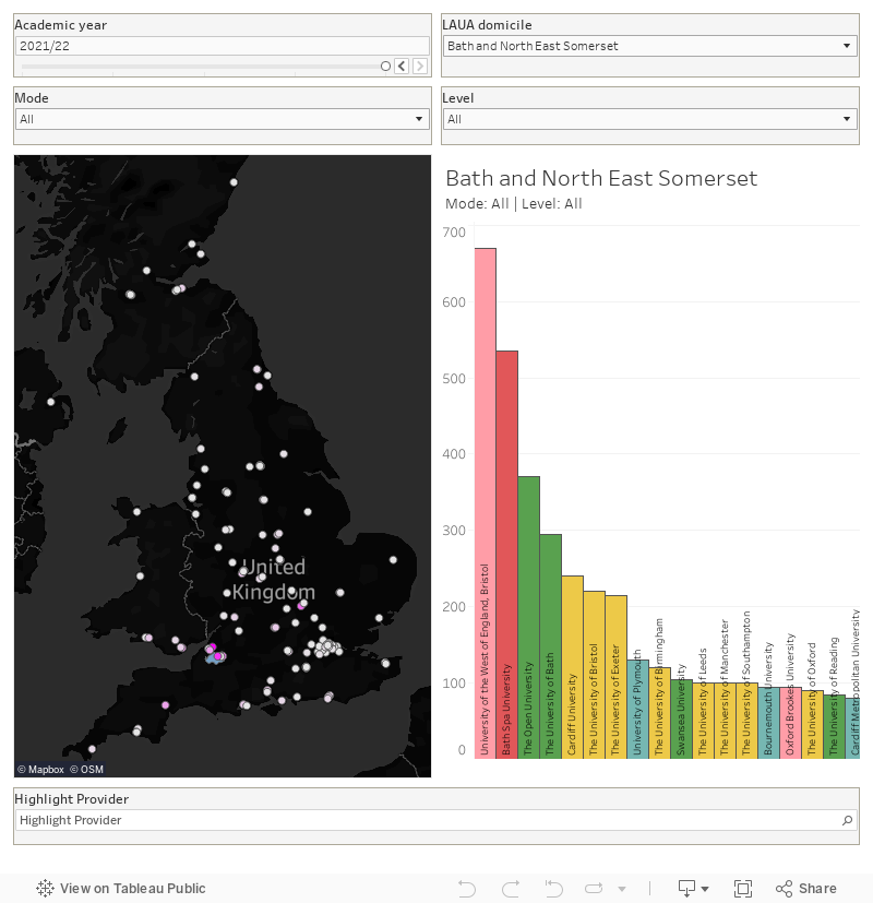
And here’s the table 62 reverse look up – where do students from a given local authority tend to study:
Thank you. Is it possible to change the colours of the first plot. I’m struggling with light brown highlights on a light grey background map. Thanks.
Hi Simon – gone for bright pink on a dark background. Hope this is easier to read!
This is great, thank you. Do you have the data for the 2018/19 academic year as well? It is missing from the time series. Thanks
That’s fixed now – sorry about that.
This is awesome! Thanks!