

Area comparisons, Covid case rates, and students
David Kernohan is Deputy Editor of Wonkhe
Tags
I am trapped in a maze of twisty passages all alike.
In other words I am again prompted to thinking about what contribution the mass migration of students made to the second wave (October and November 2020) of Covid-19 in the UK. And about what evidence would convince me either way.
From our vantage point at the top of a genuinely lethal wave three that started well after the student travel window closed, you may well wonder why this is still important. Arguably, it would be a useful thing to know if we are thinking about next autumn (and a possible wave four) – but again, arguably, not as useful having a sensible set of national restrictions, a functioning track and trace system, or a government that meets even basic standards of competence.
A thought experiment
But still the discourse continues. We appear to be iterating towards a postualted causality as follows.
- Lots of students return to a local area with lots of students in
- Covid-19 intensifies among students
- Lots of people in that small area have Covid-19
- Lots of people in surrounding small areas have Covid-19
- Government and vice chancellor resign in shame
This is a complex chain that builds in a lot of assumptions. Faced with such complexity, I like to try to imagine a simple experiment that would let me test this hypothesis.
Imagine two cities of similar size, in a similar part of the world. One has a load of students during term time, one doesn’t. By looking at changes in small area caseloads I could see whether student transmission outside of an initial peak spreads to a rise in cases in small areas with less students, or if cases were just rising everywhere anyway.
Town twinning
It’s not an easy job to find comparable areas with and without universities – most major cities and towns in England now have a reasonably sized higher education provider. Our task is made harder by the very regional nature of each wave of Covid-19 – wave two was focused in certain parts of the north. But there are a few:
- Wakefield is of broadly similar size to Nottingham. The two are about sixty miles apart, but are broadly similar post industrial cities. Nottingham has universities, Wakefield does not.
- The borough of Burnley does not have a university, but is of similar size to the City of Lancaster, which does. Both are in Lancashire.
- Mansfield is a little bit bigger than Loughborough (the borough of Charnwood). Loughborough has universities, Mansfield has none. Both are in the East Midlands.
- Middlesbrough and Stockton on Tees are next door to each other, and are of similar sizes. Middlesbrough has a university (Teesside), Stockton does not.
If you are a resident of any of these places and feel aggrieved, I apologise for any unfairness in these very quick comparisons. If you are a resident of Stockton-on-Tees, I apologise in a more general way (I spent the first 18 years of my life there!).
I’ve plotted the case rate by MSOA for each of these two pairs of areas – MSOAs with large (over 1,000) numbers of students are coloured red. For the hypothesis we are testing we would expect to see a red MSOA peak occurring just before, but overlapping, with other MSOA peaks in the same area – and we would expect student and non-student areas to have a markedly different case rate trajectory afterwards. We’d also expect non-student areas in student towns to look different to non-student areas in non-student towns.
To cut a long story short – that doesn’t appear to be what we see.
Those graphs in full
For each of these, use the “highlight” box on the bottom left and move your cursor over each option to compare the two areas.
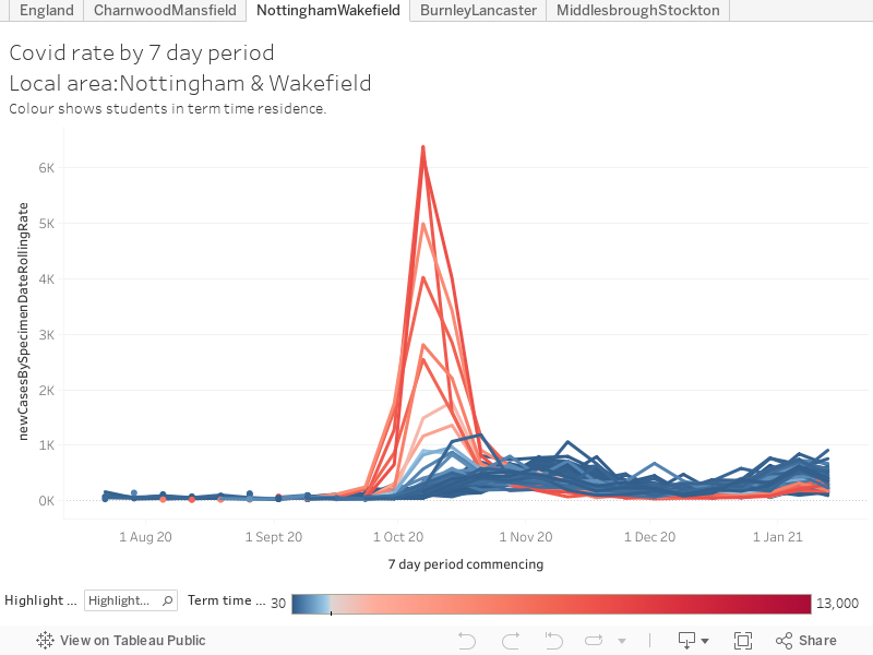
Nottingham/Wakefield
The early weeks of October saw some of the highest case rate peaks in England in Nottingham. Student areas like “University Park, Lenton Abbey, and Jubilee Campus”, and “Arboretum, Forest and Trent University” saw a case rate exceeding 6,000 cases for every 100,000 of population. But these peaks did not have a long term impact on case rates – one area in Nottingham has what could be seen as a follow on peak in mid-October, but “North Sherwood” is miles away from both campuses and the main student areas. Otherwise, the Nottingham and Wakefield curves look fairly similar going into the late October second wave. Both see rates grow in all areas from early October – in Nottingham an early peak fades away, in Wakefield the peak comes in early November.
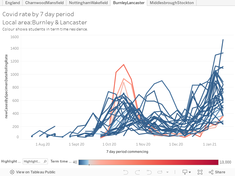
Burnley/Lancaster
Burnley and Lancaster have a messier timeline. Lancaster sees a mid-October peak in student areas, as we saw in Nottingham this is a short, sharp peak but one that is echoed in all areas of the city. Case rates in Lancaster MSOAs start growing in early October, reach a peak around the second half of the month and then fade away until the start of the third wave in December. In contrast, Burnley has two discrete peaks within the second wave, one at the start of October and one in early November – both in different parts of the town.
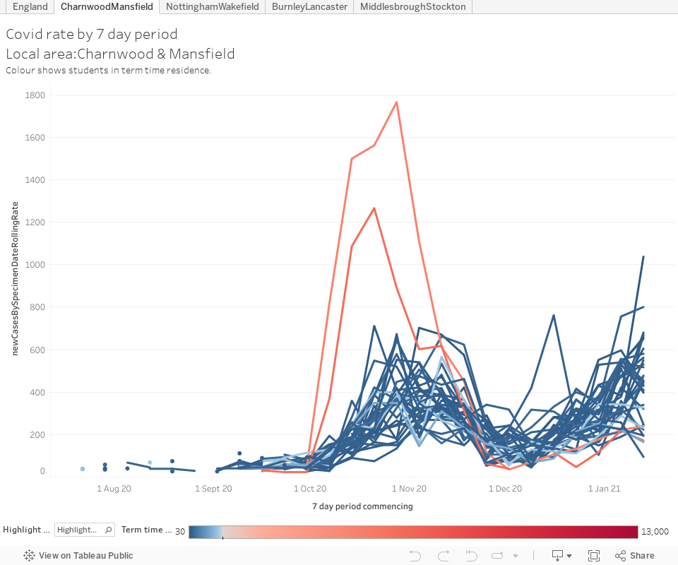
Mansfield/Loughborough
Loughborough (shown here as the wider borough of Charnwood) has a late October student peak, with rates in all other areas growing at a similar time. A peak in Thurmaston (not a place a student would be likely to go unless they lived there, and only about 100 – near enough standard background levels – do) overlaps the end of the main peak. Mansfield peaks slightly later, and with areas tending to peak at different times in a three-to-four week period. Both areas see rates drop away in early December before the third wave takes hold – Mansfield does notably worse than Loughborough over Christmas.
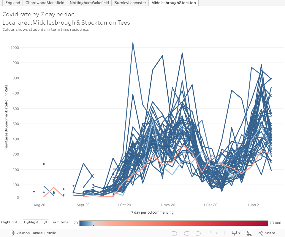
Middlesbrough/Stockton
The parallel courses of the pandemic in Middlesbrough and Stockton are largely indistinguishable over the winter (mind you, the parmos are way better in Stockton and anyone who tells you otherwise is a liar) – the single student area in Middlesbrough never displays a significant peak. The injection of around 18,000 students into Middlesbrough in September doesn’t appear to make any difference to Covid-19 transmission.
What have we learned
Causality in epidemiology is something of a mug’s game – without a proper, functioning, track and trace system there is a lot of shape matching and guesswork. We will never know for sure what the impact of sending students on to campuses in September was – although on the face of it in terms of the student experience and staff safety it was not a good idea. What I’ve seen from these attempts is:
- Student area Covid-19 peaks are sharper and shorter than peaks in other areas. This is consistent with an outbreak in a particular setting (for example a hall of residence) leading to mass testing and then isolation. I wrote more about this in November.
- Peaks in student areas seem to happen alongside, rather than before, peaks in the wider city. This is indicative of a local rise rather than a rise induced by incoming students – it does not seem likely that students make a point of visiting all parts of a city – and having unmasked contact with locals long enough to share the virus – immediately on arrival.
- Non-student areas in cities with many students appear to follow broadly comparable paths through the pandemic to similar areas in cities with few students. If there was transmission from student small areas you would expect to see a difference here.
- No matter what we manage to torture out of the data, some will still attempt to argue that the return of students led directly to a local, regional, or national second wave of Covid. There’s not likely to be a clinching argument either way – my judgement is that I’m not seeing the evidence based on publicly available data, but I wouldn’t expect that to convince anyone.
- There’s other literature on this topic that points in various directions. There’s nothing yet that is compelling and I don’t think there ever will be. US literature tends to look at single local areas rather than the spread between small areas (US statistical geography tends not to go below the level of “county”).
- There are endless, endless, confounding variables. Case rates are linked to multiple measures of equality, to ethnicity, to underlying public health, to employment type, and to cultural beliefs – all of these varying across small statistical areas. Because we are examining this just ahead of the 2021 Census, what data we do have is probably a decade old. One day when this is over someone is going to do a PhD on this very question.