This year the biggest end of cycle story isn’t in the end of cycle report.
UCAS suggests “early indications” point to a behavioral change around offer making – with seventy five per cent of providers who currently use the dreaded “conditional unconditional offers” predicted to no longer do so in 2020.
An eye-catching bet
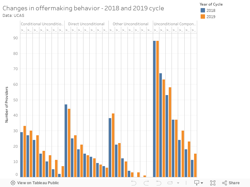
Now we don’t actually get sight of this 2020 data – the first public look will be on 6 February, a whole week away. In the report itself this is illustrated by a comparison between 2018 and 2019 data which (you would think) has been used as a basis for the prediction.
But no. I asked UCAS how they got to this finding and they told me it was a combination of:
- What providers have said about future offer-making plans (there’s some statements coming out today, apparently)
- Early offer making in the system for the 2020 cycle (that’s during 15 whole days since the main deadline)
- The trend UCAS spotted in December of students not accepting conditional unconditional offers.
But even though figure 3 in Chapter 9 (and my prettier version, above) shows us that the number of providers using conditional unconditional offers has grown between 2018 and 2019 – direct unconditional and “other unconditional” (no, me neither) offers have remained fairly stable. We’re not seeing any growth in alternatives to conditional unconditional offers so far – though that is the trend UCAS is predicting.
Now far be it from me to suggest that a well timed extrapolation based on unclear methodology can be used to turn attention away from inconvenient existing data – but getting Chris Skidmore to “welcome those institutions leading the way in committing to end these offers” and Nicola Dandridge to welcome an “an encouraging early projection” is quite a feather in the cap for the UCAS press team.
Drive time
A specific look at equality of access has long been a part of the end of cycle release. It’s how we all came to love Multiple Equality Measure (MEM) – and may soon be the source for our annual dose of applicant travel data.
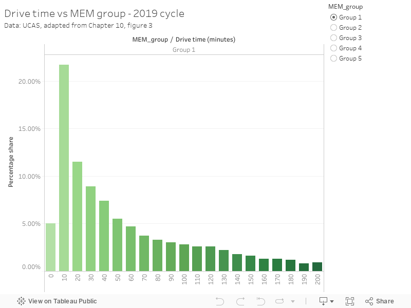
It turns out that students in MEM group one (who are likely to be from a less advantaged background) are more likely to study (I presume this means to hold an acceptance) from a provider closer to their current home, although there is a less clear pattern for all MEM groups.
It would be fascinating to see this by provider – and to get a sense whether the headline finding is due to application behavior (people applying to local providers from MEM1) or provider behavior (providers being more likely to accept local applicants from a MEM1 background). I suspect things are more complicated than this analysis suggests.
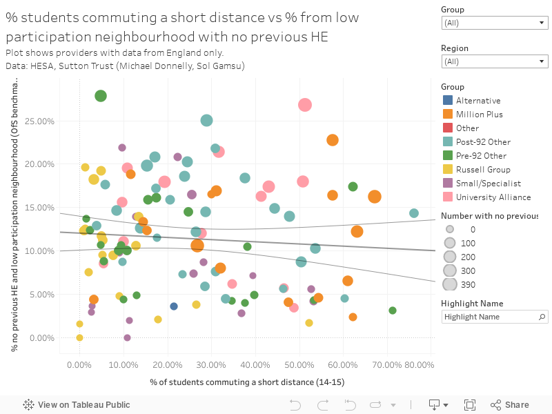
As it happens, I did look at POLAR (not MEM) data alongside commuting distance based on some great data collected by Michael Donnelly and Sol Gamsu for the Sutton Trust last year. Fans of the Wonkhe Show may have seen this plot already – but I think the fact that it shows little relationship between POLAR Q1 and distance from campus it adds something to our understanding of this new UCAS finding too. This plot shows larger providers in England only, and a “short distance” was less than 57 miles.
Equalities in depth
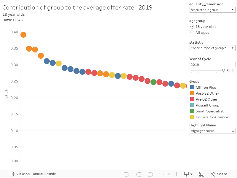
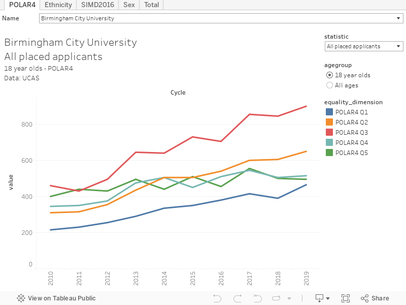
First of all here is a provider level dashboard, which will let you see performance by equality measure (POLAR4, Ethnicity, SIMD2016, Sex) over a number of metrics. The units of measure don’t automatically change (don’t blame me, it’s the design of the data!) so you’ll have to make some sensible assumptions. I’ve also included totals for each metric as a quasi-league table – use the tabs to skip between these.
Comparing providers is a complex business – but you will indulge me perhaps a few key stories from this dataset. The offer rate for 18 year old Black applicants is lowest in the sector at the University of Oxford (22 per cent), the University of Cambridge (24 per cent), St Andrews University (33 per cent), Imperial College London (36 per cent). But this needs to be put into context – some of these providers have a low overall offer rate (Oxford at 21 per cent, Cambridge at 29 per cent) whereas others do not (St Andrews at 45 per cent, Imperial at 46 per cent).
What you need to do is compare the the percentage point difference between the average offer rate and the rate for that group. Happily UCAS builds this in to the data, so we can see that the University of Chichester (-19 percentage points), Liverpool Hope University (-11 percentage points), Leeds Beckett University (-11 percentage points) and Ravensbourne University (-9 percentage points) are at the foot of the table.
But hold on to your righteous indignation – Chichester only saw 17.3 applications from Black 18 year olds per 10,000 in the wider population, Hope saw 29.1 applications. Leeds Beckett saw 125.8, and Ravensbourne 34.6. Compare these numbers to Coventry University at 931.4.
If this seems like your idea of fun, I’ve another interactive that will help you do your own comparisons – but please use the definitions document provided by UCAS.