


The sheer normality of the 2020 UCAS cycle has been one of the most unexpected events this year.
It was easy to predict a radical change in applicant behaviour, a cut-throat competition for home students among providers starved of international application, a cavalcade of trading up the tariff hierarchy fuelled by higher than expected grades. But in the main, historic trends have continued.
In reading this year’s UCAS end of cycle reports – in particular today’s “Whatever happened to the Covid cohort?” the temptation is to read Covid into every nuance. But it just isn’t there. Seventy seven per cent of applicants reported being personally impacted by Covid-19 (in all honesty that feels low), but you do not see the impact in applicant behavior. There is one interesting difference – but first let’s go through the headlines from the end of cycle dashboard and the widening access and participation report.
The UK acceptance rate in 2020 was 84.1 per cent, up two percentage points over last year. This was a large rise, but not unexpectedly so – the rise between 2016 and 2017 was a hair larger. More strikingly the 18 year old entry rate was a record 37 per cent – up just under three percentage points over last year.
Grade increases
Around 24,000 took advantage of early release to enter clearing – more than half of these from POLAR4 quintiles 4 and 5. Those least disaadvantaged quintiles were also more likely to apply and be placed after early release. Only 190 students entered adjustment.
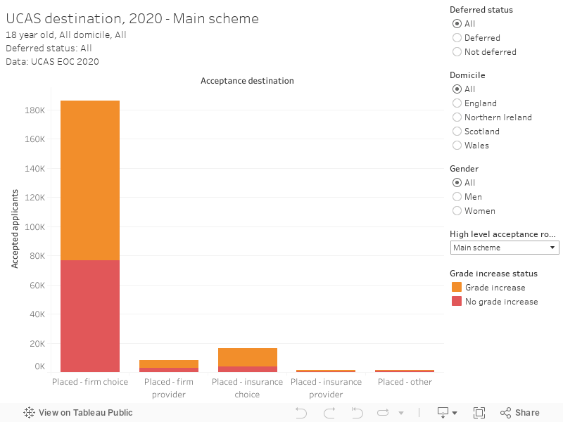
Counterintuitively, the majority of the 16,305 placed at their insurance choice of course through the main scheme had their grades increased with the move to CAGs, while around 40 per cent of those who were placed at their firm choice course did not. Eighty percent of main scheme clearing entrants had their grades increased – thinking back to clearing this would be comprised of those who did not confirm their firm or insurance choices. Nearly 9,000 ended up at their firm choice course through clearing, which is how we expected to see applicants who met their offer grades through CAGs.
Participation progress, just slower
The pattern over previous years has been a gradual narrowing in the acceptances gap between the most and least advantaged. This has slowed – using UCAS’s own Multiple Equality Measure (MEM) we see the gap narrowing by an average of 1.1 per cent year on year since 2015 versus, 4.4 per cent across the five years before that. We don’t get any attempted explanations for this trend, though demographic trends could play a part.
Higher tariff providers and medicine courses accepted more disadvantaged students this year, although they also accepted more students. An increase in awarded grades following the examishambles played a part here – we learn that there was:
“an increase in the total number of POLAR4 Q1 main scheme applicants placed at 15 of the most selective universities and colleges: from 1,725 before the policy change to 1,925 by the end of the 2020 cycle – an 11.6 per cent increase”
Overall the number of placed applicants increased by 5.5 per cent – acceptances to higher tariff providers grew by 7.5 per cent. The increase in mature students was notable – UCAS attributes the largest single year growth in over 21 entrants since 2009 to “a demand for up- and re-skilling as the economy entered recession”. There was a particular increase in healthcare and related subjects of study, including nursing (though this year’s return of bursaries may have had an impact here too).
The increase in applicants declaring disabilities – particularly mental health concerns – is striking, but it is difficult to tell if we are seeing a general cultural openness to talking about mental health or an increase in mental health problems among young people likely to apply to university.
Yes, but does it extrapolate?
Based on recent rates of progress, the time needed to entirely close the high tariff participation gap between MEM group 1 (most disadvantaged) and MEM group 5 (least disadvantaged) is 332 years – with parity expected in the year 2352. This striking finding depends on an annual 0.09 percentage point increase in MEM1 participation, with the MEM5 entry rate staying identical (at 31.6 per cent).
I’ve never found these framings helpful, and indeed the consequential that if every one of 38 high tariff providers admitted 70 more MEM1 students each year the gap would be eliminated in a decade does not entirely satisfy. It may well get some headlines but it ignores the messy reality of political and societal trends – for instance, what if there is a drop in MEM5 participation at high tariff providers based on changes to courses offers based on government policy (no more history of art)? Indeed, what if the current DfE position on widening participation – based on individuals not grouping based targets – becomes codified? What if there is a general reduction in student numbers as a policy goal?
All of these trends would also cause a change in the high tariff participation gap – and each is more likely than the steady growth in the model. Yes we need to do more to support access to higher study for everyone that could benefit from it – but such a simplistic presentation does not do anyone any favours.
The results will astound you!
So let’s get into something substantial. You’ve probably seen my annual graph of the average error between predicted and actual A level grades – which usually ends up around 3 marks in favour of the prediction. This is the crux of why I worry about PQA – the difference between predicted and actual grades doesn’t usually vary by disadvantage, but the actual marks themselves do.
Twenty-twenty was different – on UCAS forms teachers were, in effect, predicting what they would predict the following summer during a pandemic. How did they manage?
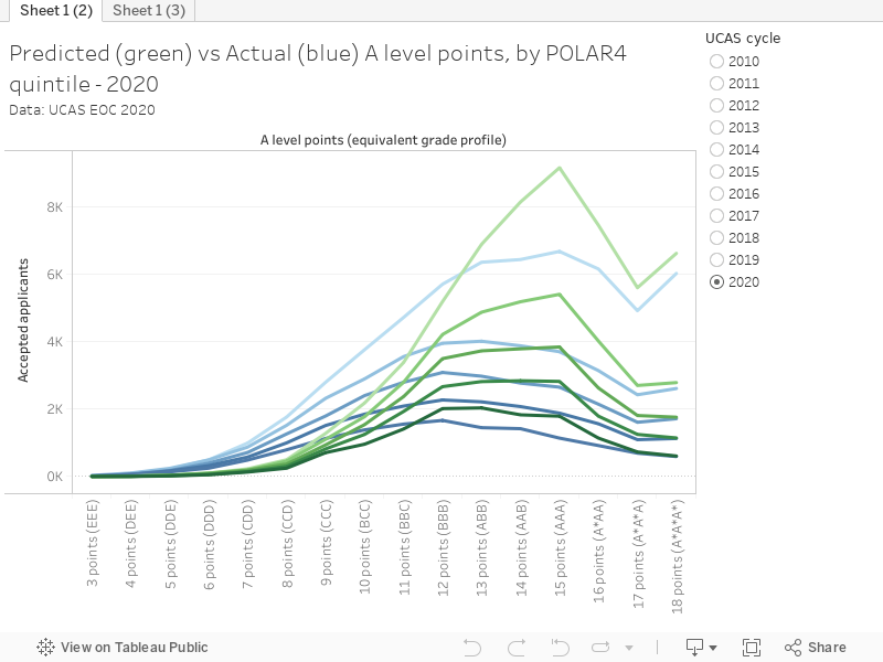
The UCAS predictions were broadly in line with those of previous years, and the actual grades (the Centre Assessed Grades – CAGs – remember) tracked predictions for POLAR4 quintile 5 (most disadvantaged, paler colour) pretty accurately. For the first time we see the triple A* tick for quintile five in actual results, and the modal number of points for this group was 15 (A,A,A).
However, as we move down through quintiles 4,3, and 2 the established three point over- prediction reasserts itself – the modal number of points tends to be 12 (B,B,B) or 13 (A,B,B). And then we get to quintile 1, with a predicted and actual peak at 12 points. To say this is unexpected is to underplay things.
What does this mean?
There were many suggestions that teachers would simply reuse UCAS predictions for CAGs despite being told not to – they did not. There were suggestions that teachers would map predictions to last year’s result profile – the overall shape of the graphs suggests evidence of this but only to an extent. And there were many, many suggestions that teachers would overpredict – in the main we saw a regression to the normal gap.
But Centre Assessed Grades appear to have disproportionately benefited applicants from POLAR4 quintile 5. There’s no way around saying so. We can speculate as to what happened – schools more attuned to the likely reaction of universities, pushy students, pushy parents – but we can’t know that from the data.
With this lens, progress on widening participation in high tariff providers looks less like grade inflation and more like the impact of efforts to improve access and participation – a smaller rise than would otherwise have been seen.


