


There has long been a suspicion in the sector that the drive to widen access to university (to enable previously unlikely groups to enter higher education) and the drive to improve outcomes (specifically in terms of average salaries, but also considering the “graduate” job) have at best a complex relationship, and at worst directly contradict each other.
We know that a student’s background is a very good predictor of graduate outcomes, and from this we can extrapolate that providers with the kind of graduate outcomes the government increasingly expects will not be those that offer places to disadvantaged students. This is the reason that outcomes measures have, historically, been benchmarked even for use in monitoring progress.
In this new world of absolutes, we struggle to make sensible decisions between these two agendas. Providers are expected to magically address structural disadvantage via the raw power of higher education. Education is a part of the answer, but there is so much more to do. And, as is increasingly clear, pockets of provision – subjects of study, in other words – are part of the picture.
For this reason, a report from the Institute for Fiscal Studies (IFS) and Sutton Trust – Which university degrees are best for intergenerational mobility? – is an important contribution to the national debate. It is far from perfect, but it is the best look yet at the interaction between access and outcomes at the provider and subject level. And it will not make for easy reading for those in thrall to simplistic policy soundbites.
Going through all these things twice
The “mobility rate” here is a simple multiplication of two components – the “access rate” (the proportion of students from low-income backgrounds, using free school meals as a proxy) and the “success rate” (the proportion of these FSM students in the top 20 per cent of the earnings distribution at age 30). It’s very much a Proceed for widening participation.
In policy terms this lets us see access (and mobility rates) in individual subject areas within providers – something it has not been easy to do in the past – and addresses some of the problems with output metrics by only counting the experiences of students who would not be expected to succeed based on their background.
To be clear, this isn’t perfect: Kernohan’s First Law of Output Metrics still holds:
You can’t meaningfully examine output metrics without controlling for sex, background characteristics, subject, provider, and region of residence, and any attempt to do this makes for unusably small sample sizes.
Here we are looking at subjects within providers, and controlling for background. The results will be skewed by the proportions of graduates of each sex in each group (remember women are more likely to work part time at age 30, and LEO is rubbish at dealing with part time work), and where they might live (people who live in London seem to get paid better). The other big caveat is that to get data for 30 year olds we need to use graduates from the early noughties (specifically between 2002 and 2004), who faced a very different graduate employment experience than that afforded to later groups.
The mention of Proceed above may have you thinking about student progression – there’s no attempt here in the main data to control for the fact students with a FSM background are more likely not to complete their course. Instead, the standard IFS definition of graduate – someone who started a course that would have completed in 2004 – is used. In most analyses this is lost in the statistical noise, but it is likely to have a noticeable impact here.
Jump right in
Let’s start by looking at the overall totals by provider. We can see a London effect – likely because graduates who studied in London remained there for work, with salaries more likely to be at the top end of the distribution. The other clear pattern is that – in general – highly selective providers do not do as well on this measure. It may be that (in spite of many years of policy insinuations) a more established university is not the best choice for everyone.
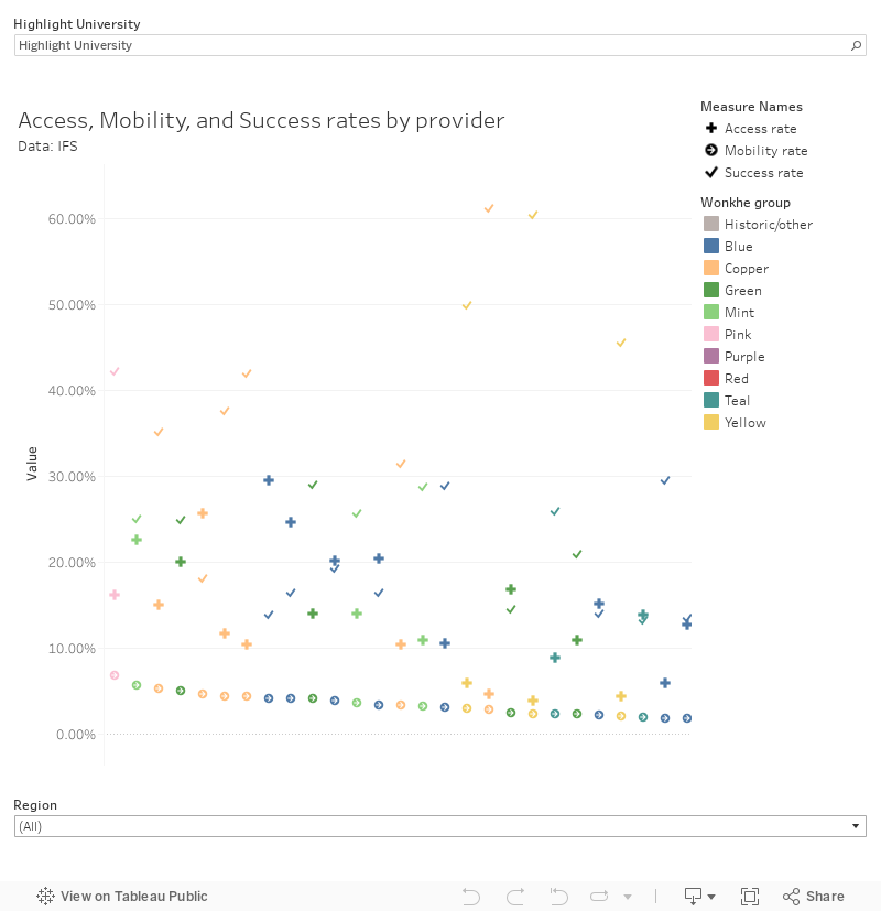
Of course, one factor in the provider totals is that each will offer a different mix of subjects. Thankfully IFS gives us data on this too – using a custom classification with broad similarities CAH2. Here we learn that pharmacology (a stand out which, here, includes the pharmacy professional qualification), law, business, and computing offering good rates of return for students with FSM experience.
Twenty pounds of headlines
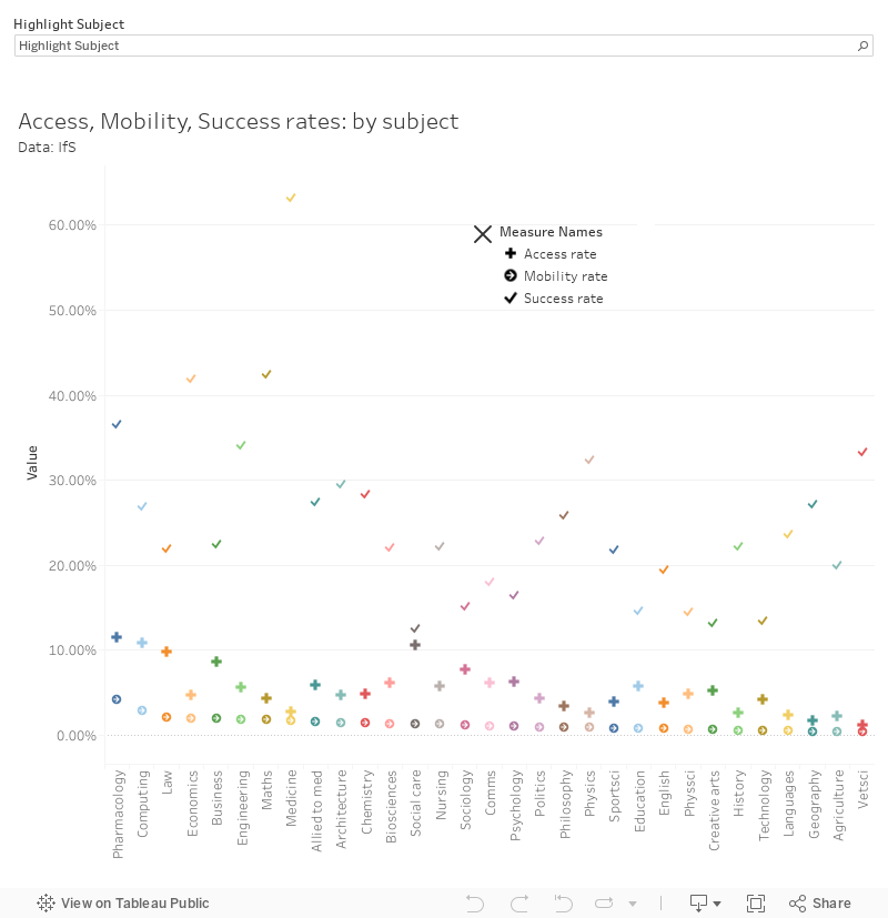
What will really make people sit up and take notice is the splits by provider and subject – what IFS calls “courses” (which of course, in reality, are broad groups of course offerings grouped at CAH2 level). We’re into the realm of small numbers here, so some combinations show no data – and in some cases (“Oxbridge”, “Imperial-LSE”) providers are grouped together to provide usable sample sizes.
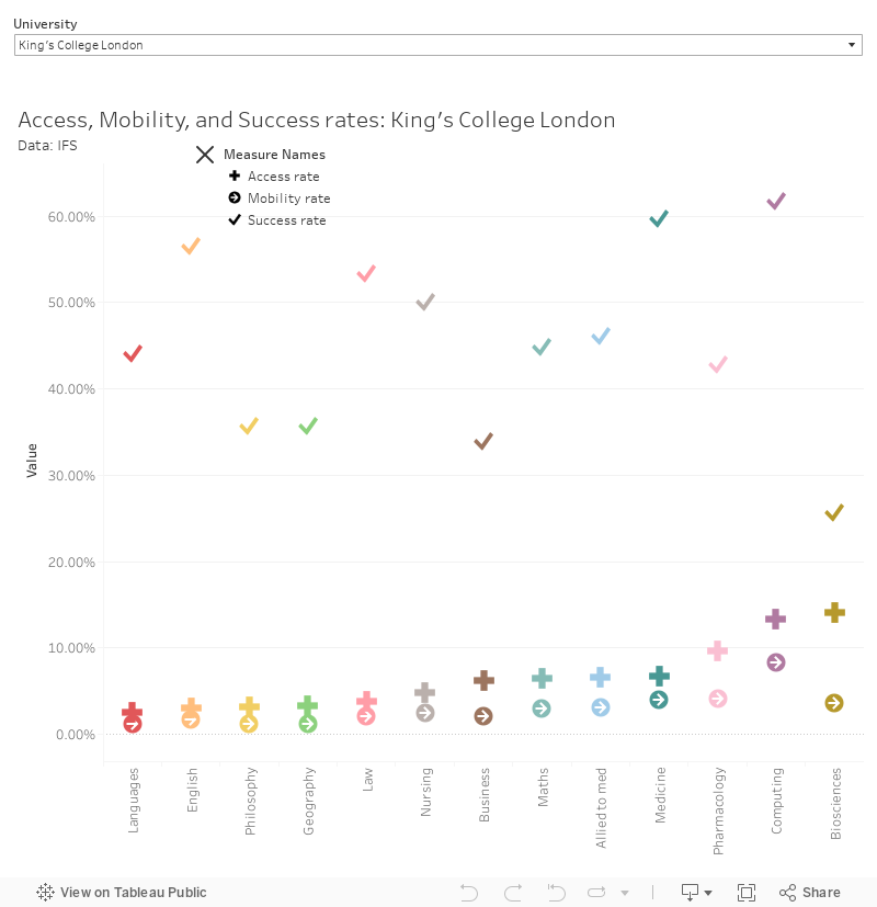
Here’s a version of the data allowing you to see providers featuring provision within a given subject area. In other words – how does your pharmacology offer compare to others for levelling up. Feels like the kind of thing that might be of interest.
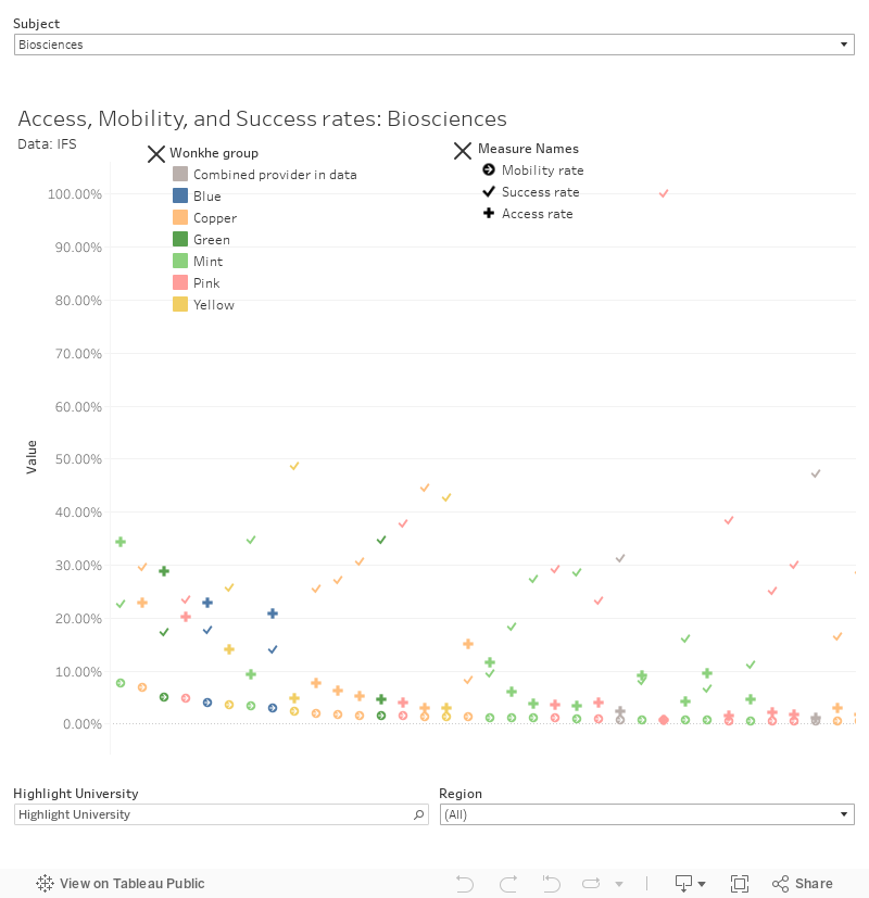
And – of particular interest for your own institution here’s the split between subject groups within each provider. This is something Wonkhe has been keen to look at for a long time, as it makes instinctual sense that some faculties are doing the heavy lifting on access whereas others are not, we’ve never seen this in data before.
Again, as we are dealing with small sample sizes the confounding effects are more pronounced. In the report IFS notes that if you look at a (NUTS3) region effect you will see few changes in the ordering of subjects and providers by mobility by ranking. However we already know that using a higher level of resolution can show more effects – perhaps OfS and HESA will release a 2002-04 graduate version of this data so we can build this effect into the IFS model.
They all fall there so perfectly
The thing with a compound variable like this (and like Proceed) is that it is based on the multiplication of two numbers – one for access and one for success. Doing this as a single variable hides the complexity of the relationship – it is not linear, although providers with a higher “success” score tend not to do well on “access” this is not a significant relationship. Here’s a plot of this (using the same data as the “by subject” graph above).
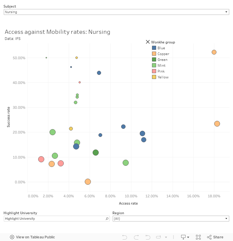
Seeing the data like this also shows us why the attempts to control for more background variables (also in the IFS paper) run into problems. Different aspects will affect each variable differently, and building in more weighting like this will not ever compensate for a low absolute value based on, say, low salaries in a common area of residence. It does, however, have a big negative success rate impact on more selective providers – but this does not follow on to the mobility rate as the access rate is so low.
Handing out free tickets
The world of support for access and participation has changed substantially since the late nineties (when this cohort was applying to universities and choosing subject areas). It’s not too far beyond the days when we applied – before the mass adoption of the internet and before the explosion in publicly available data. Another world, in other words.
There has been an expansion in access to university overall – both in terms of the total number of available places, and in terms of previously inaccessible providers trying harder to take students from non-traditional backgrounds. IFS asserts that the performance of different provider groups has not diverged over this time – though some providers have performed better than others that may be considered comparable.
Quite how this will shake out is unknown – we don’t really know about graduate success (however we choose to measure it) until a good few years after graduation. With this model we are looking forward to 2030 to see data on students that have recently graduated – any attempt to use this data to advise students or (god forbid) in a regulatory intervention is so out of time as to be almost laughable.
IFS suggests the relationship between access performance and a number of early career success markers (completion, classification, progression to PG study, and early career earnings) is not statistically significant. In other words there is no reason to suggest that a provider offers lesser student outcomes simply because it is better at access – and we would add to that the need to bear in mind provider subject coverage when looking at PG study or early career earnings.
It all seems so well timed
We want to quote an important passage at length from the conclusion:
The results are important for documenting things that universities do that are beneficial for society that are not reflected in average earnings returns: indeed, a key finding is that many of the institutions and institution-subject combinations with high mobility rates do not have very high average returns. Consequently, it is plausible that policies that restrict funding for low-returning courses could come at a cost in terms of social mobility.
Coming in the face of today’s announcements around “getting on, as well as getting in”, it seems clear that addressing the supposed “poor quality” courses with low absolute average earnings could prevent disadvantaged applicants from both getting in and getting on.
The report specifically highlights the “considerable variation” in the mobility rates across subjects within the same institution – noting that many institutions have courses both in the top and bottom 10 percent in terms of mobility:
This suggests policy might be more appropriately focused at specific combinations of universities and subjects rather than on universities as a whole.
And like a fool I mixed them
Bear in mind that OfS has been talking about “pockets” of “poor provision” for some time (where “pocket” seems to mean “subject”). As such we’ve been expecting its “B3 baseline” outcomes metrics to apply at subject level – but access and participation at subject level has not, until now, been on the cards – despite some very wise advice to do it being around since Chris Millward’s appointment.
It will all have to change in the medium term. If you have a subject of 1,000 undergrads where you do exceptionally well on access, and another where you do exceptionally well on graduate jobs, you may well point at the averages and argue “social mobility”. But it would be a lie – in that scenario, social mobility does not improve.
And what that then goes on to mean is major. Lots of universities right now still spend a lot of time thinking in and talking about institutional averages – made possible by a portfolio of provision where some of it does the lifting on access, some on satisfaction, some on costs and so on.
Not even you can hide
Across the sector, unlike when it comes to research, visibility on those realities is poor. Not only do senates and governing bodies often not see the variations, right now, plenty of subject level actors – people that run schools, and courses, and faculties – focus principally on the provision. The inputs are what that widening participation and admissions lot do, and careers are the responsibility of another professional service. We make the education happen.
But once the data starts flowing at subject level, things start to change. It means that subject-level actors need to start to think more seriously about why, for example, their subject might do so badly on access. It means that the department that’s been resisting those conversations about “employability in the curriculum” suddenly ends up with its feet much closer to the fire. And you probably start to consider, if you’re senior, how you might reconfigure your school, faculty and department structures so that feet-to-the-fire accountability is more straightforward.
The point, therefore, isn’t so much that the IFS data is directly usable for, say, funding or regulation purposes. It’s that it represents a genie out of the bottle moment – and it now becomes almost impossible for large universities to not be thinking of the “subject” (whatever that means, of course) as the primary unit it needs to organise around, assess, measure, develop student voice in and improve leadership in. Subject TEF may be dead – but its spirit both lives on and has the potential to mutate from here.


This is a beautiful, balanced, appropriately-caveated analysis. Congratulations.
Reminds me a bit of the social mobility index floated on HEPI recently and with the same big problem raised that terrible or exceptional performance in one strand of a compound measure area can be blurred by performance on another. We see the same with the standard GO measures (which also makes Proceed a kind of awful compound compound measure). Surely the important ‘take away’ here is the importance of giving individual aspects of compound measures their own due scrutiny.
I’ve only just realised why I’ve had a certain Bob Dylan song stuck in my head all day…