


All of us – whatever our role in higher education – carry an imagined model of the sector in our heads. This is linked to our access to a raft of information such as dates of foundation, league table placings, mission groups, campus location and even what it looks like. But our idea of what an institution does – aims, purpose, mission, or focus – may differ from the reality of where the money actually comes from. Even vice chancellors can fall prey to this.
The sector often lobbies – not least around funding letter, Budget, or comprehensive spending review time – as a single bloc, but this can result in benefits for some types of institutions rather than others.
An overview
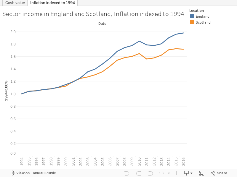
Though this data in this article focuses primarily on England, it is instructive to start with a comparison to a very differently managed sector in Scotland. Here we see the inflation indexed value of sector income since 1994 – each subsequent year shown as the proportion of the 1994 allocation after adjustment for inflation. And it has been a rosy 24 years – with income near doubling in England, and sitting at around an extra 70% in Scotland during that time.
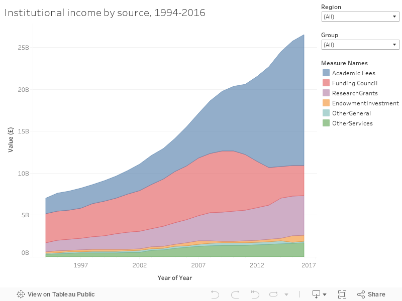
But what this doesn’t show us how much of this rise has been driven by government largess and how much by institutional income generation – for this we turn to HESA’s financial data. Our second graph looks at the sources of income by year for English institutions – we see that the majority of this increase has been driven by academic fees, which have more than compensated for a drop in funding council income. Home undergraduate fees are a massive part of this, but we should also recall the rise in postgraduate and international recruitment – earlier points in the academic fees series are made up almost entirely from these two sources.
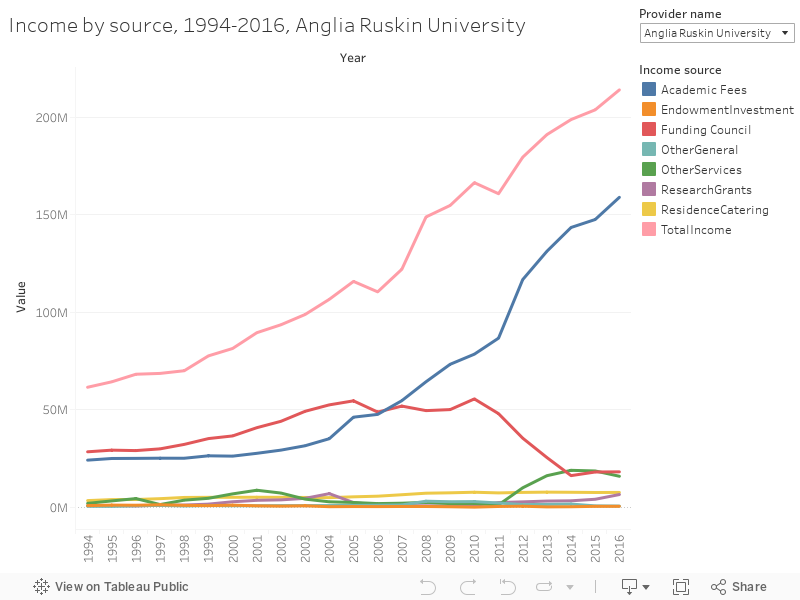
And here is nearly the same graph for each individual institution – I’ve used lines rather than areas so I can bring in a few more fields of interest, notably the total income at the top of the chart.
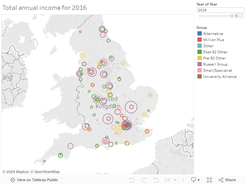
What does this look like across the whole sector? A view shows us how much more money the Russell Group makes than other parts of the sector – and you can see the London-Oxford-Cambridge “golden triangle” still sets the pace while cold spots have struggled to grow.
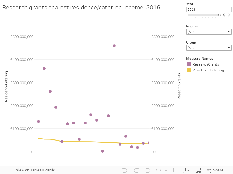
You’ll forgive me for going back to one of the less expected lines I added to the institutional graph. I’ve long been fascinated by the growth and level of institution income from catering and residences – not one of the core activities you’d imagine would be essential to an institutional bottom line. But estates and catering staff are unsung campus heroes – and in many cases may well pay your wages. Many institutions (all the ones with blobs below the orange line in the next graph) earned more last year from residences and catering than they did from bringing in external research grants and contracts. Even one from the Russell Group (yes, you can sort by mission group).
Research selectivity in action
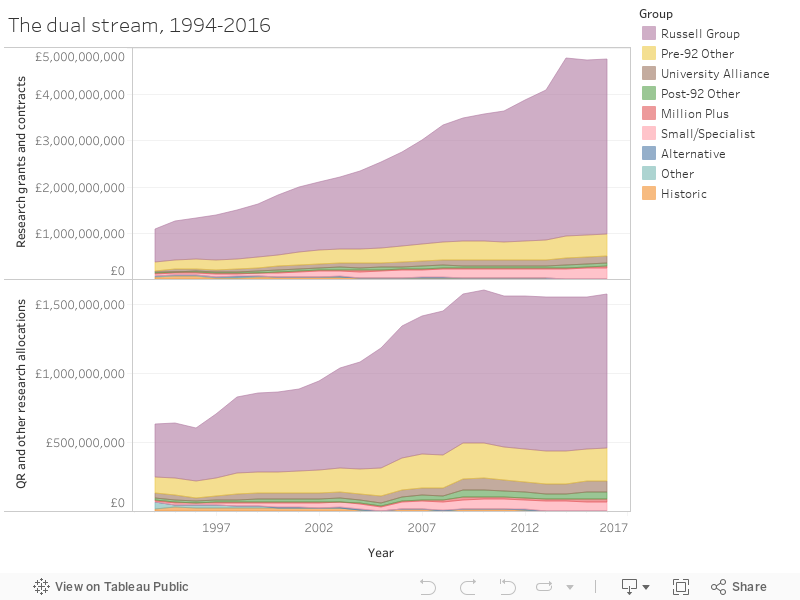
QR funding exists to support ongoing research capacity that may not attract external research funds, or be suitable for project funding. But nearly two decades of research selectivity mean that it mostly goes institutions housing departments with outstanding REF scores – which tend to be the same institutions that generate a lot of external research income. Indeed, it could be argued that one unlocks the other. Here I show both sides of the dual stream by year and mission group, demonstrating that it is the same institutions who benefit each time.
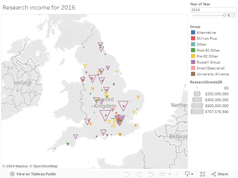
Sticking the sum of both streams on to our map shows us our “golden triangle” with even more prominence, and a number of geographical research cold spots.
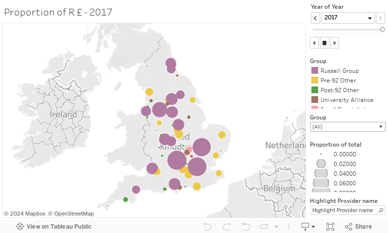
Looking just at the proportion of HEFCE research funding (now Research England) going to each institution shows a dispiritingly similar pattern.
The wave
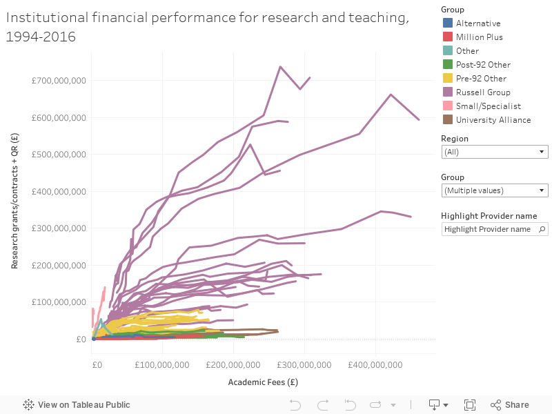
Research income is counterbalanced by teaching income, or so it is popularly imagined. But this is not correct if you look at the data. Allow me to introduce The Wave.
Each line represents an institution over time, with each point on the line showing the amount of research income (here external grants and contracts, plus HEFCE research funding) against teaching income (here using academic fees – with the obvious caveat that at the start of the series all of this came from postgraduate and international recruitment and the contribution from UK undergraduates has increased as funding policy has changed over the years.
Again we see the Russell Group take substantially more money than other groups – with the year-on-year increase also larger (note the distance between the points). This is a messy graph and rewards the use of filters – look at individual mission groups and combinations. And you can highlight a provider name using the highlight box.
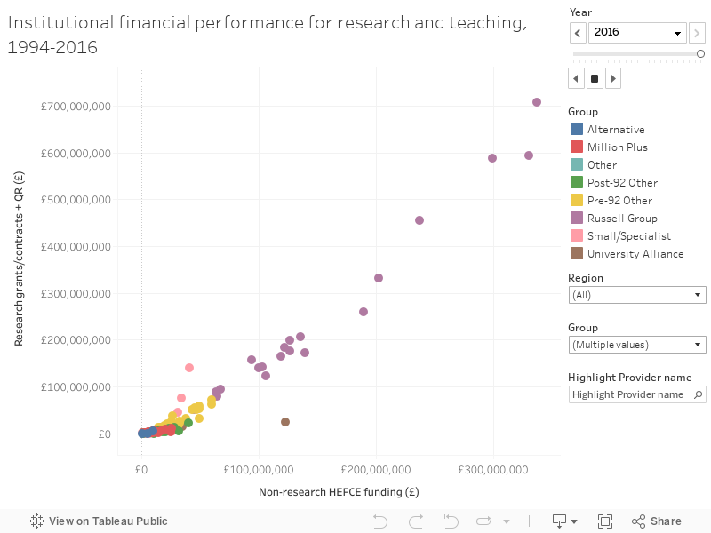
The Wave version two uses a slightly different presentational method (you can scroll through years via the filter as usual) and uses HEFCE non-research funding as a teaching proxy (this would include widening participation, strategic, and third-stream allocations). The patterns here are less regular, demonstrating the rise and fall of various initiatives and allocations.
Data notes
I have used two main sources of data – the majority comes from HESA’s “Finances of HE Providers” series, and I am very grateful for their support. I also made use of HEFCE’s funding allocation series – much of which is still available via the internet archive.
One major issue with both datasets was adding and matching identifiers to support analysis. Though these days both OfS and HESA are very good at using (UKPRN) institutional identifiers on releases, it wasn’t always thus – and the early parts of both series have no identifiers at all. For that reason, although I have tried my utmost to be as accurate as I can (even including historic institutions in their own right) there may well be errors within the data as presented – these are entirely my fault.


I wonder if the catering and residences / research grant income would be slightly clearer visualised as a scatter graph, with each income type as an axis. You might see any pattern more clearly. You’d have one dot per HEI, rather than a dot and a bit of a line. I’d do it myself and share, but the data behind the chart can’t be downloaded (I guess because you had to pay for it).
Interesting article and analysis David. An essential use of QR research funding is contributing to the growing gap between the full cost of research and what funders are prepared to cover. Research funded by external grants and contracts is not viable without QR . The fact that QR has grown more slowly than grants and contracts highlights the underlying sustainability challenge facing research. Combine that with any future cut in student fee income and we have a real problem heading our way,
Costs? Contribution rates? Debt interest?
I found this interesting about research grant income:
https://blog.esrc.ac.uk/2018/09/27/putting-research-in-its-place/amp/
Suggests that, although income in the golden triangle is higher, success rates per application are what you’d expect. Challenges the assumption that there’s some kind of bias towards these institutions during selection- but why aren’t unis outside the triangle applying?