


In 2018-19 Plymouth College of Art awarded 59.9 per cent of graduating students a first or 2:1.
According to the Office for Students, this should have been 60.5 per cent. So there’s one student from the PCA class of 2019 that got a very good 2:2 that should be feeling a little put out at the release of new data on “unexplained” grade inflation by the OfS. Maybe she’ll put a complaint in because, at this stage, why not?
According to all known laws of aviation, there is no way a bee should be able to fly
The sheer strangeness of this data release from OfS should not be underestimated. The regulator has, based on historic performance in the golden perfect year that was 2010-11 and changes in cohort demographics at provider level, predicted the proportion of students that should get a first class or upper second class degree in each subsequent year. If the actual “observed” results are better than those predicted by this “mutant algorithm”, the difference represents an unexplained difference and thus grade inflation.
Because this is 2020 we have a healthy suspicion of similar algorithms – as famously applied to A level results. We should treat these OfS projections at provider level (though they are developed on an “individual student basis”) with similar suspicion.
If you’re a white woman without a declared disability, entering higher education from a POLAR4 Q5 area with three As at A level you are expected to do better in your degree three years later than a Black male with a declared disability entering HE from a POLAR4 Q1 area with three Cs. Most of us see this as a tragic and shocking waste of potential, and a spur to see universities do better at supporting students from non-traditional backgrounds. OfS see this (for these purposes at least) as a predictive tool.
New Hive City University, graduating class of 9.15
Clearly with the affordances of such excellent modelling we could dispense with the bureaucratic rigmarole of assessment, Award Boards, quality assurance and – indeed – teaching, and just give every applicant to HE whatever degree class they have on the OfS spreadsheet based on the provider and subject they choose to apply to. These predictions could just as easily be made on enrollment day as three years later, so let’s put every student on an accelerated one day degree, allowing them just time to robe up and pose for pictures before the ceremonial handshake and entering employment.
No, sorry, that’s just the plot of Bee Movie.
But you get the idea – any model that ignores the very possibility of students doing better than predicted is not one that can usefully be applied to a scenario where we expect students to learn and grow during a three year course that offers them the support and resources they need to exceed all expectations. OfS is clear that:
It is not possible to deduce from this analysis what factors not included in the modelling (such as improvements in teaching quality, more diligent students or changes to assessment approaches) are driving the observed changes in degree attainment.”
Given that two of those are things that OfS’s predecessor body devoted 30 years and more than a billion pounds to make happen this feels like a gaping hole in the model.
Students, faculty, distinguished bees
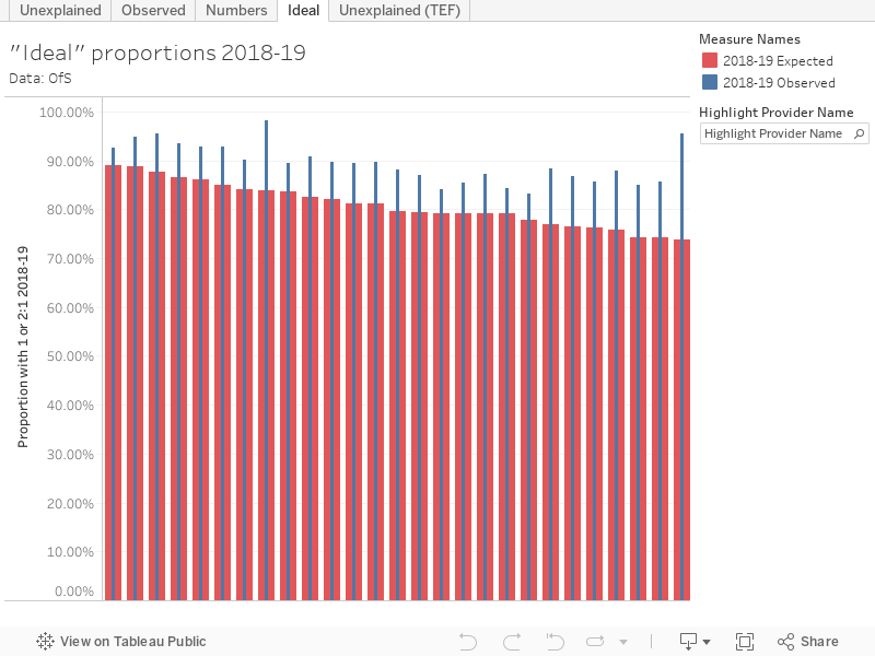
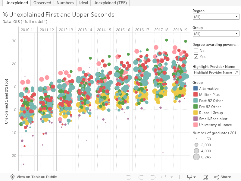
So how did your university get on? To see the effects most clearly, we need to look at two charts – the first shows the percentage point value of “unexplained firsts and 2:1s” in every higher education provider since 2011-12.
The second shows the observed proportions of students awarded first and 2:1s each year.
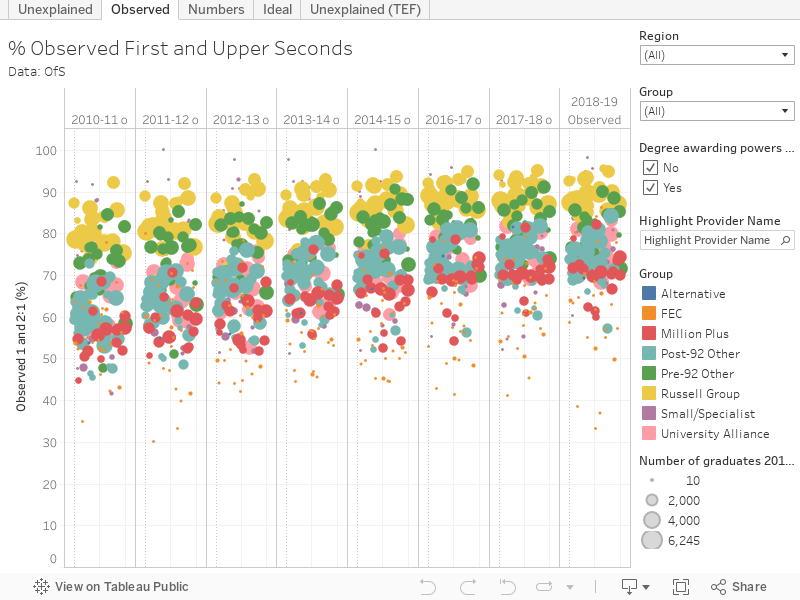
Combining these two yielded us our cheeky little chart at the top. In each graph the size of the marks shows the size of the most recent graduating cohort, and you can filter by group or region, or find a provider of interest using the highlighter. You’ll note that not all of the providers shown in had degree awarding powers in 2010 – you can exclude these if you like which makes sense.
I usually use mission groups as colours only to make the charts look prettier, but here we can use the colours to see a pronounced effect. The Russell Group (yellow) sits at the top of the “observed” chart for each year but at the bottom of the “unexplained chart” – universities in this mission group are awarding more firsts than anyone else, but less of these are unexplained. For Million Plus, this works in the other direction.
I heard it’s just orientation
There is a parallel universe where the universities that manage to get students from disadvantaged backgrounds up to first class degree standard are lauded as doing the heavy lifting that prompts education driven social mobility. But that’s a whole other directorate in OfS.
The proposals in the recent OfS consultation on quality and standards, would, if enacted, give the OfS the power to regulate in relation to the classifications awarded to undergraduate students.
“This would provide us with the ability to intervene where the evidence suggested that the standards set and recognised by the sector for its own awards are not being met by an individual university or college in practice”
“Evidence” here should not be taken to mean the outputs of this model. Instead we are unexpectedly pointed to the degree classification descriptors developed by the UK Standing Committee for Quality Assessment (UKSCQA). That body have also developed a slightly more impressive model that includes variables beyond student characteristics and prior attainment. UKSCQA uses expenditure on academic services and student facilities and a student-staff ratio alongside an average UCAS score – finding that:
- A 10 per cent increase in spending on staff and student facilities increases the proportion of upper degrees by approximately 2 per cent.
- A 10 per cent increase in spending on academic services increases that proportion by around 1 per cent
- And a 10 per cent increase in the number of students per staff member decreases the proportion of upper degrees by approximately 4 per cent.
- Increasing the prior attainment of placed students from three Bs to three As (or equivalent) increases the proportion of upper degrees by 3 per cent.
However these changes, even when combined with student characteristics similar to those used by OfS do not explain the entirety of the rise over time of proportions of graduates gaining upper degrees. The cumulative effect of 10 years of norm-referencing A level results in England is one possible explanation of the shift, the “professionalisation” of teaching as evidenced by numbers of Advance HE fellowships is another. The report concludes:
On balance, the findings from this research suggest that much of the upward trend in grades seen across the sector will have been legitimately influenced by enhancement in teaching and learning.”
Which makes it all the more odd that OfS, though undoubtedly aware of this research, do not give any credence to its main conclusions.
A little bit of magic
How do you measure an improvement in teaching quality (across all subjects and areas in a provider) over 10 years. Clearly this is a difficult question to answer – teaching quality is subjective, and the students who feed back on said quality in the NSS don’t have an alternative three years of teaching experience to compare it to. But the NSS teaching scale is, at least, a useful indicator – and satisfaction has risen (slightly) over that period.
Professional and Statutory Regulatory Bodies may be another source – they set and police consistent course standards over time to support graduate entry into particular skilled roles. I’m not as in touch with that world as I might like to be, but I’ve not heard these bodies complaining that “their” graduates aren’t as good as they used to be (though there are always ongoing tweaks to set curricula as the profession changes).
We tried (and, arguably failed) to generate a standard measure with the HEFCE Learning Gain projects – but even if it were possible to agree on such a measure it cannot easily be applied retrospectively. The external examiner system is notoriously difficult to draw system-wide data from (surely it is time for an annual survey?) but could offer, with caveats, some useful data at course level – external examiner comments were even included on the original version of Discover Uni.
Or there’s TEF – the Teaching Excellence and Student Outcomes Framework, which is hampered as an explanatory indicator by actually including “grade inflation” as a supplementary metric. If you really think that might be a goer, apply here.
These are fascinating questions – and it would be much more productive to answer them rather than rush in with regulation where cause and effect are poorly understood.
Bonus data
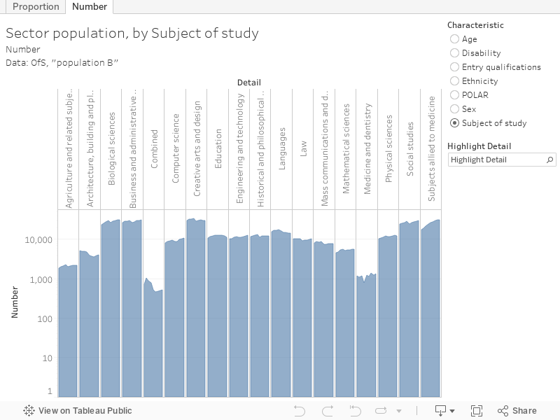
Here’s population B (from Annex B of the release, which omits very small providers from population), showing you how graduates have changed in personal characteristics since 2010.


Improvements in attainments over time is complex and the reasons are multifactorial, as can be seen by both the UKSCQA work on degree classification descriptors and the numerous Degree Outcomes Statements published by HEIs which were based on internal reviews. The analysis by the OfS does not take account of the nuances and applies a board statistical model with a varying hypotheses to explain away some of the challenges to their work, such as norm-referencing of A levels. What is most jarring is the continued use of inflammatory language such as ‘inflation’ in their press releases (the analysis at least… Read more »
How do they justify continuing to use the ‘additional contextual variables’ in this model? Can’t we all agree that attainment gaps that existed in 2010-11 for ethnicity, disability, postcode (and still exist) are a bad thing and we should try to close them without being singled out for punishment? This report does at least give a simplified model without these variables (though they are to some extent baked into entry quals anyway) and it also models the closing of attainment gaps. Both still show plenty of meaty grade inflation to grab the required headlines, but it would be interesting to… Read more »
I read the OfS document last night and by the time I got to “For an explanation of ‘unexplained’ in this context, see paragraph 12.”, I had a headache. As I read further, I wondered if my brain was totally off kilter as many aspects of the whole approach seem iffy to me. I would say that it’s slightly staggering that the report uses a model which would allow institutions to reduce their “grade inflation” measure simply by recruiting a greater proportion of white students from areas that already have a high HE participation rate. I know they go on… Read more »
The report got the headlines it wanted, and that is what this is: regulation by press release, at the behest of the DfE. These are not the actions of a serious regulator looking to ensure that students receive a high quality experience, and that the country has an HE system that benefits the country. It’s comes across as a politicised body fighting both a culture war on behalf of the government, and a more self-interested battle for dominance and control of the regulatory environment. It’s genuinely bonkers that the OfS can produce so many reports with conflicting methodologies. As alluded… Read more »
Yup, what’s really going on is “a more self-interested battle for dominance and control of the regulatory environment”. OfS has demonstrated, more than adequately, that it has neither the competence nor the credibility to fill this space. But it’s an all-powerful regulator which ignores any criticism (or assumes it’s just the mark of a self-interested sector), and nobody’s going to stop them. In a small way, the violence being done by this group of incompetents to a our brilliant, world-leading HE system is a national scandal
Always impressed by David Kernohan’s work with statistics and analysis. This is brilliant. If only OfS would take on board its lapses in logic, and the inflammatory language that another commentator has pointed out, we might be able to make progress.
I think it is difficult to deny that there has been a fair bit of grade inflation thanks to the competitive incentives put in place by the 2012 reforms. Probably less than OfS asserts but still substantial. But I think the debate over how much grade inflation is justified misses the point. The UK Government clearly wants to move to a norm referenced system where there is a fixed proportion achieving each degree classification over time as there is now for A-levels as they think that this will help employers (and – if I’m being cynical – more advantaged children… Read more »
I’ve been trying to explain that the pressure in the nineties and noughties to “use the full range of marks available” has affected final grades. It used to be that work falling into the First category was given a mark of -broadly- 70 to 85%. This matched the range available in other passing levels. While I was at a large Northern Russell group university, there was a phase of seemingly every external examiner exhorting staff to use the full range i.e. 70 – 100%. It does not take much of a mathematician to see that this change, for a student… Read more »
A gaping hole in the model indeed David. As we often point out, if you make higher education less of a mystery (based on cultural understandings and capital) and write clear learning outcomes, create transparent marking criteria, use a range of assessment approaches and ensure students understand what is expected of them then, lo, it’s unsurprising that more students appear to be achieving.