

Why does it take the British Academy to plot subject geographies?
David Kernohan is Deputy Editor of Wonkhe
Tags
When Welsh higher education minister Vikki Howells makes a written statement in the Senedd, she has a habit of including all kinds of other intriguing details beyond the headline. And, as Wonkhe Daily readers will be aware – there’s often things of interest for those more used to following Westminster than Wales.
One of the pieces of work Howells hinted at yesterday – in a statement ostensibly about a little bit of extra capital funding – was a Medr “overview of subject demand, provision, and distribution” that would allow the newish regulator to:
“consider where interventions might be required to ensure the continuation of strategically important subject areas in Wales that are vital to the success of public services
This kind of work a valuable perspective on higher education and, where we are allocating increasingly scarce additional government funding, one that you would expect regulators to be particularly concerned about (the best the Office for Students currently offers – I knew you’d ask – is the utterly mystifying Key Performance Indicator number 8).
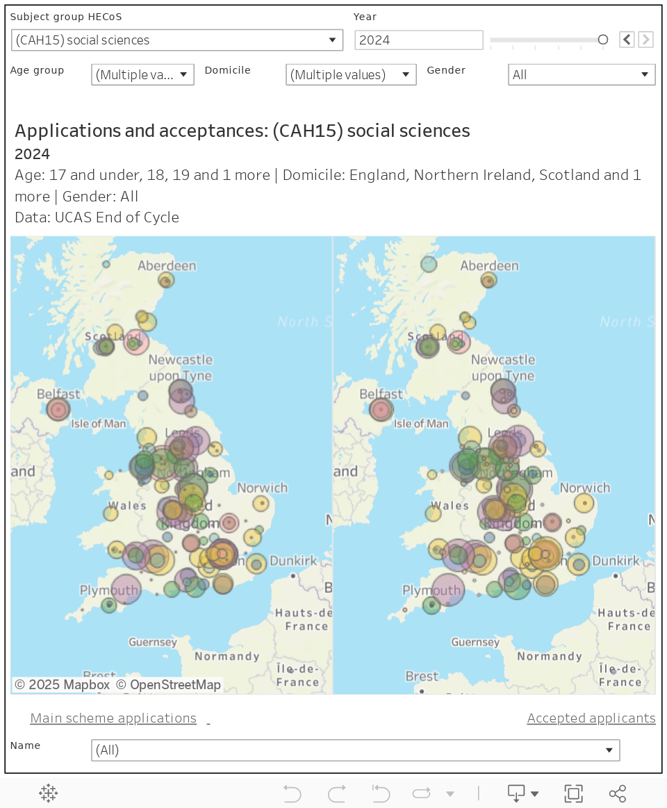
There’s a peculiar reluctance for our providers of official statistics to get involved in what is taught where, which is why an update to the British Academy “Mapping SHAPE provision” work is so welcome. The first version of these dashboards allowed you to take a view of the number of first-year first degree UK-domiciled students below the age of 20 studying in various parts of the UK, the update allows you to look at the changes in student numbers at individual providers over 11 years between 2011-12 and 2022-23 – and all for any subject within the broad SHAPE (social sciences, humanities, and arts for people and the economy).
It’s a commendable job – subject and geographic mapping is particularly tricky due to changes in definitions. Most notably the shift between two approaches to subject area coding (JACS to the far superior CAH/HECoS) in 2017, but there are other remappings (criminology moved from anthropology to sociology, for example) that have required the British Academy team to come up with a custom mapping to allow multi-year comparisons.
The tool also allows you to exclude joint honours provision (defined as where a full-time student is less than full-time in one subject area), and to filter out provision where tariffs are above average. I know subject associations and advocacy groups are already making use of this tool– with the current round of university cuts I can imagine trade unions and campaigners will be looking at today’s release with interest. The team is the first to admit that the data isn’t perfect (how could it be?) but the map, exemplary caveats, and underlying analysis represent the very best that is currently available.
And this is a problem. If we are serious about positioning higher education at the intersection of place and social mobility, about meeting student and employer demands right across the country, it should be far easier to take this kind of overview. It should be something regulators are serious about – especially as we move closer to the need for specific engagement to save provision in niche subject areas.
And the geographic extent of the subject offer is as important as where students are currently studying – we need to be able to track where institutions themselves are unilateral spotting and responding to evidence of demand, and where this has and has not worked in the past. Data like this is collected, it just isn’t published or used.
Here’s my go at using UCAS End of Cycle data to do something similar (for UK domiciled acceptances and applications from those aged 20 and under). We’re limited to a very high level group of subject areas, and can only go back to 2017 and the onset of HECoS/CAH. Ideally more detail would be available as a means of supporting subject plurality, spread, and responsive attraction – but we are where we are.
It’s worth noting that the OfS did have a go at producing a geography of English HE, but it only did it once and has now archived the page.
https://www.officeforstudents.org.uk/data-and-analysis/previously-published-data-and-analysis/a-geography-of-english-higher-education/
There’s a similar gap in 16-18 education in understanding the geography of subjects on offer and students enrolled. DfE spends £8 billion a year on the 1.2 million students in colleges and school sixth forms but there are no British Academy style maps of student and course volumes. It’s possible that the universities struggling to find applicants in important subjects are located in areas where the Level 3 provision is also restricted but who knows? Some geographical analysis could help
“subject and geographic mapping is particularly tricky due to changes in definitions. Most notably the shift between two approaches to subject area coding (JACS to the far superior CAH/HECoS) in 2017”
Module subject reporting became optional for providers in England when HECoS was introduced to the Student Return in 2019/20 (then for Scottish providers in exceptional guidance), terminating the comprehensive reporting of subject provision at module level for over 2 decades. Its unstructured coding seems to have been too abstract for most providers to implement:
https://www.hesa.ac.uk/collection/coding-manual-tools/hecoscahdata/hecos
https://www.hesa.ac.uk/collection/c19051/a/modsbj
https://www.hesa.ac.uk/innovation/records/reviews/student-record-2019-20
https://www.hesa.ac.uk/definitions/student-collection/c19051-student-record-exceptional-guidance
HECoS was the first ill-conceived outcome from HEDIIP, followed by Data Futures to impose an ideal model to shift and carry as much reporting burden as possible (especially funding returns) and serve all customers of enriched data.
Now the sector has no continuous data on subject provision at granular module level to capture provision in niche subjects, onward use is beset by difficulty in mapping between JACS and HECoS coding requiring most user to make their own bespoke groups and mappings, within a data model too abstract and complex for many providers to produce and data customers to report on and analyse.