


There’s more data current available about UK higher education than at any point in history.
We have to welcome this on one level. Data is knowledge. Data provides the basis for interventions, and helps us track the efficacy of these interventions.
But there is a growing belief, often within government, that data is a predictive tool. That it is a crystal ball – and that it can be a basis for decisions made by applicants and ministers about higher education.
And that requires our attention.
Applying yourself
Whatever you feel about the idea of a “market” in higher education, it is worth giving a moment to think about the way information contributes to the idea of marketisation.
Classically, an efficient market should offer what is called “information symmetry” – whether you are buying or selling, you know everything about the product or service in question. That’s odd in itself, as most of our experiences in day-to-day life concern asymmetric markets – we are not expected to know (as buyers) that the cost of production is basically equal for a large coffee and a small one, or the difference between the base model and the luxury version are merely a few plastic panels and some software switches being flipped. These asymmetries, crudely put, are what drive a lot of profit for a lot of people.
Application to university has, and probably always will be, an asymmetric market. Undergraduate university study is generally a service that you purchase only once, and usually at a very early age. The advice you get from any source tends to be leavened with assumptions and prejudices, and even once you get there it is not clear what you should be expecting to receive.
For many, the prospectus (and the UCAS website) were the only real information that an applicant had to go on, other than a few sketchy guidebooks and newspaper league tables. This was a fairly extreme asymmetry. Since the early 00s governments of all stripes have moved to put more data, and more independence, into the equation.
You could argue that, as more and more data has been released openly (by regulators, by specialist organisations, and the often murky world of league tables) the information symmetry within the market should be in better health than ever. Your aspirant undergraduate can now see how courses of study can lead to jobs and salaries, how many students with their characteristics continue and complete on a course – if they are lucky this can be seen at course level.
But what can they actually learn from this? What can this data tell someone about what their experience at and through university might be like. And what can it tell providers about how to make it a better experience.
I got the horse right here
The first approach is to be purely predictive – if I study *this* subject at *this* university I am this likely to finish the course, and will then earn *this* much after three years. You see this one manifest in the innumerable “we plot the university courses with the best and worst earnings” clickbait articles.
There’s another frame of reference in which university study is a bet – and engaging with things like Discover Uni or the Office for Students B3 data dashboard is equivalent to looking up form. The design and presentation of the data doesn’t really help us use it like that – the default presentation is that of a judgement rather than a record through time. And the frequent use of medians doesn’t really help us get into probability mode.
So – as an applicant I can perhaps derive (or could derive, given sensible data presentation):
- How likely a person like me is to apply to a given course/subject/university
- How likely a person like me is to get in to a given course/subject/university
- How likely a person like me is to continue studying…
- To complete the course…
- To qualify…
- And all kinds of employment outcomes: to get a job, to get a skilled job, to get a job that might pay me £x, to get a job in a particular industry or role, to feel happy and fulfilled in a job.
That’s a lot of data points. If I could knock up a simple tree diagram I could put odds on someone’s life chances. Is this really what the sector wants people to be doing?
Proceed to your destination
It sounds daft, but this has been attempted before after a fashion. The PROCEED metric (published by OfS in 2021, after a long period in development) combined the projected undergraduate completion rate by the proportion of completers in professional employment or study 15 months after employment.
It’s easy enough to construct a similar metric with the OfS’ own B3 data – even though OfS don’t seem to be bothered these days.
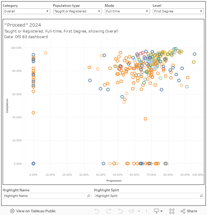
No matter when you did statistics, you can probably recall that multiplying two probabilities together yields an overall probability if you are dealing with independent events. The completion portion of this calculation is explicitly a projection (all OfS continuation and completion numbers are projections, based on historic data – in this instance we are using data collected between 2015 and 2018 alongside information on the changing characteristics of cohorts), but the progression component, though it does use multiple years of data, is not.
Moreover, it seems clear that these are not independent variables – you have to complete a course in order to progress from it! (so really it should be P(A) · P(B|A), no?) Although many (including government ministers) bought the view that the Proceed score offered you a likelihood of completing a course and getting a good job or postgraduate course, strictly speaking it did not.
Proof if we need it from Michelle Donelan:
Proceed, or projected completion and employment from entrant data, is a measure that projects rates of students progressing from entry to first degree programmes through to positive graduate destinations.
Of course, this bled into the other use of public university data – the never ending search for “low quality courses”. Donelan liked to do this, mystifyingly, at a provider level. As of my cut, there were 23 non-FEC providers with a sub-50 per cent proceed score – with Norland College at the bottom for what are very well known and entirely unjustified reasons.
I’ve always seen proceed as a minimum viable subject TEF – you can run it at subject level with interesting results. Of course, due to the gift of TEF split metric data, you can also do it (after a fashion) for subject TEF itself:
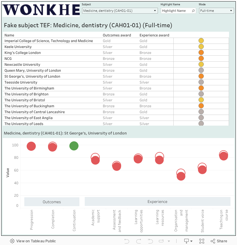
Methodology and subject version available in a previous article.
This adds data from the national student survey, and on continuation, to the proceed mix. You can (with some caveats I have previously documented) run this at subject level to get a reasonable look at whatever TEF measures at the subject level (note that here I omit a bunch of places with incomplete data).
TEF awards were (and to an extent are) calculated based on the difference between the observed value and a benchmark. I’ve not mentioned benchmarks yet, but this can be seen as a form of handicapping – given (dare we say?) wider societal issues making the success of certain groups less likely, providers supporting these groups are not directly compared to providers that tend not to attract that kind of student.
Pay as you go
Our imaginary applicant reading this form guide may be excused for thinking about continuation and completion, or about student satisfaction. These are things within the direct control of the institution (and things, as we know, that institutions might reasonably be expected to address), whereas what you might expect to be paid later in your career is very much not – unless you take the view that all universities should scrap arts and nursing courses to focus on economics and medicine. Salary data is increasingly waved in front of applicant’s faces, regulators have been asked to use it to make decisions about quality – you see newspapers run (the “ten degrees with the worst salaries”) pieces drawing on graduate outcomes or commercial datasets of dubious provenance – and the king of the jungle is, literally, LEO.
LEO is underconsidered in terms of what it can tell us about outcomes. It will never be perfect – I once came up with a law to explain why – but the population level nature of the data does offer a few insights.
First up we can look at predictive value in cohort:
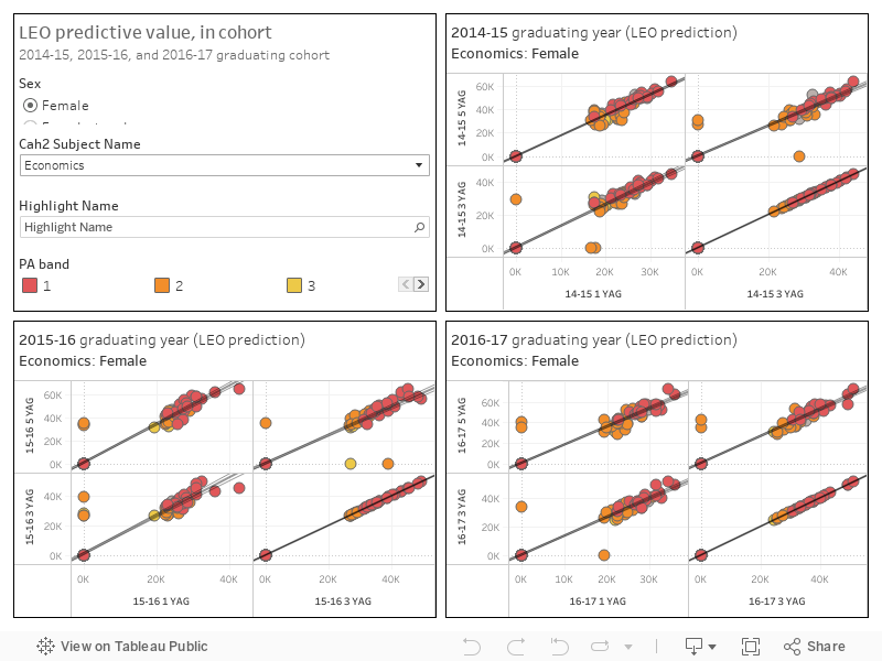
Discover Uni is happy to show LEO data based on people in the workforce last tax year who entered university six years ago – but what does that mean for applicants? If you scatterplot by provider in cohort you generally find a fairly close correlation – what someone earns one year after graduation is a reasonable guide to what someone earns three or five years after graduation.
If you start looking cross-cohort – is what the 2014-15 cohort earned one year after graduation anything to do with what the 2016-17 cohort earned one year (or five years for that matter) after graduation the relationship is less solid. Predictive utility varies by subject, but you are looking at an r squared value (a measure of how good the prediction is: or more strictly the proportion of the variance that can be explained by the variables we are messing with) of between 0.50 and 0.60.
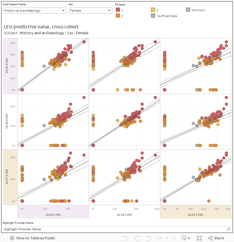
That’s not bad, but it’s not brilliant. The criticisms of LEO, and there are many, list other endogenous variables that are likely to have an impact on earnings – and that’s before we get to the exogenous stuff about the state of the economy or any notable pandemics that may be happening at the time.
Full spectrum LEO
Generally when we see LEO we see medians – the value presented by default in salary indicators is a mid-point where any individual data point is as likely to be above it (1 in 2 times) as below it (1 in 2 times). Mash in your quartiles and you have demarcated boundaries at 25 and 75 percentiles. What these tell you is that your data point is as likely to be below the lower quartile (1 in 4 times) as it is to be between the upper quartile and median (also 1 in 4 times). Yes, I know this is fairly obvious – but it is not made clear in the way any of this data is presented to applicants or journalists.
You don’t see it by provider but you can get a maximum and minimum by year, subject, and prior attainment band from LEO.
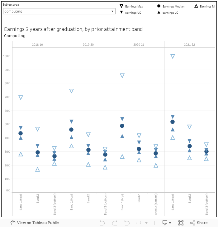
The prior attainment band splits the world of admissions qualifications into three buckets – one is better, three is worse. What is notable here is not that salaries are better if you performed better in A levels (that, sadly, is taken as read), but the variance in the top end for the best performing entrants. There are some astronomical salaries three years after graduation in that quarter above the upper quartile for prior attainment band one.
Prior attainment correlates, of course, with prior advantage. The more middle-class your background is, the better you are going to do in your A levels. And the more middle-class your background is, the more likely you are to move away from home to study, and move again to work.
Entry grades?
The other nice thing about that LEO chart is the way it splits attainment by subject area. Though it is often convenient to talk about high and low tariff providers (as UCAS do), in reality the subject area (or course aim) is far more important in predicting entry qualifications.
As we learned from UCAS this summer, entry grades (what qualifications students actually have when they start a course) are very different from the course tariffs (what qualifications students are expected to gain in order to start a course). You can now – just about – get the two in the same place via the UCAS course search (sometimes), but this is not a public data source (in the sense that you – or indeed I – can’t download it and play with it to find the difference between tariffs and actual qualifications).
As entry qualifications make such a big difference at every part of the student lifecycle, courses where there is a big difference between course tariffs and entry qualifications may be a useful indicator of where academic support might be targeted.
It is quite hard to get down to a meaningful level with stuff like this, but I’ve had a crack via the Unistats data and actual entry qualifications. Here’s an attempt to show the proportion above or at the equivalent of three Cs at A level, by provider:
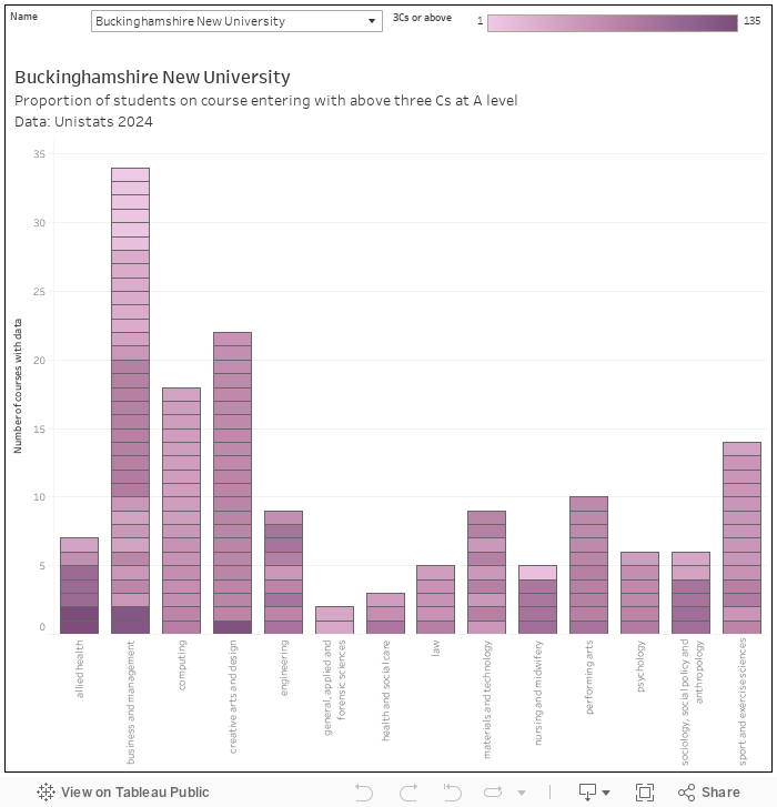
The trouble with unistats is that it uses various levels of aggregation to look at a number of hugely interesting variables – ostensibly at course level you can end up looking at anything from the broadest subject area over multiple years to a single cohort on a single course. So we are not really comparing like with like (and there may be some duplicated values – for reasons unknown Unistats can contain numerous values on entry qualifications for each course), but it is fair to say that the lighter the purple in this viz, the less students on the course you can confidently expect to have three Cs at A level.
A bit sheepish
On the day this article is published I’ll be attending the legendary Frampton-on-Severn sheep racing day. It’s exactly what you might expect – substitute sheep for horses, local charities for the coffers of Paddy Power, and it’s a grand day of probability focused fun (yes, there’s a beer tent). But I can’t look up the form of a sheep, the jockeys are hand-knitted soft toys, and although I am assured the going will be firm-to-soft and the weather fine this doesn’t really help me in placing a bet. In other words, it’s a low information wager of the kind Nate Silver cautions against.
For the moment so is applying to university in the UK. There is information – but we’re missing contextual clues and interpretation. And rather than blaming poor quality courses for uncertain progression chances, are we not faced with supporting students who are clearly on the wrong courses for them? Is it not worth fixing this?
I’d wager that in any university with a decent student information system you could knock together a dashboard that would show areas of a university where the difference between entry grades and tariff is particularly stark. This is hugely useful information – it’s the beginning, perhaps, of a sensible measure of learning gain too – but it is not available to applicants. Neither are you able to benchmark with other providers.
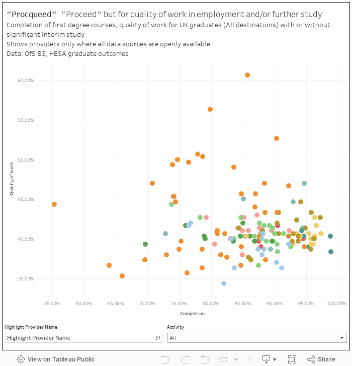
The focus on graduate outcomes expressed in terms of the “graduate job” and “good” salary has already proved unhelpful where the ambitions and career plans of graduates don’t match the more general expectations of government. We don’t have the data to properly build it, but a proceed variation that looked at the graduates own feelings about what they are doing (via HESA’s quality of work measure) and projected completion rates (at a subject level) would be fascinating. I’ve lashed one together (“procqueed”, if you will) using provider level data to show what this might look like.
There is also a case to make more use of the student voice, and the student experience, in the advice we give applicants. It has become fashionable to attack the national student survey as a spur to dumbing down (though the theory of change doesn’t work in this attack – applicants don’t look at it, providers aren’t really regulated based on it). We need more, and more immediate, data like this on student experiences for regulation too. Looking at historic data as a means to castigate historic failures doesn’t help improve current courses or the chances of current students.
Though we have more information – and, importantly, more public information – about higher education in the UK than ever before it is difficult to say that we know more, or that applicants have a better basis to make life changing decisions. The data we do have is all too often presented shorn of context for sensationalist reasons, or assumes a great deal of prior knowledge.
It’s been the goal of every government this century to use information to help applicants beat the odds – to drive social mobility, productivity, and personal fulfilment. Applicants have responded by applying to (and increasingly being placed at) high tariff providers in ever larger numbers. Maybe, on aggregate, that’s the right thing to do – but it smacks to me of a decision that is driven by unsuitable data.
Entry grade data is illuminating to a certain extent but the Covid related boost to Level 3 grades in 2020, 2021 and 2022 means that the actual entry grades in those years are almost certainly higher than those for accepted students in 2023 and 2024.
Am I reading it wrong, or does your ‘Procqueed’ graph make a very powerful case for HE in FECs?
If you filter out those graduates who are doing things other than full time work, the effect disappears.
It doesn’t if you filter by full-time employment only.