

How’s clearing going, then?
David Kernohan is Deputy Editor of Wonkhe
Tags
There’s loads of stuff to get stuck into if you are so minded, but there’s one design decision that always puzzles me. By default iit is very difficult to compare the entire course of clearing year on year – you get data for a given number of working days after results day, and you can compare the data for that day against previous years, but it is difficult to get a sense of how the shape of clearing changes without downloading the data and getting stuck in.
I first did this last year and it is absolutely fascinating. So here’s how 2021 shapes up:
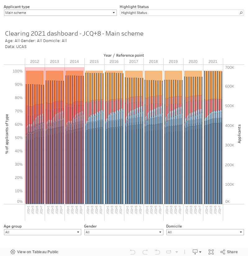
The bars on the edge show actual applicant numbers, the area shows the proportion. There’s filters by domicile, age group, and gender – and you can flip between main scheme and direct to clearing routes at the top left.
After twenty-four hours in, it was clear that the proportion of applicants who had accepted their Firm offer was the highest since 2012, but the proportion of main scheme applicants entering Clearing was the highest since 2016 (a similarly sized cohort which is handy for comparison purposes) – this is why the phones got red hot. Without the chaos of 2020 A level changes, a smaller proportion in the main scheme were still holding an offer after results day this year than last, but this proportion was comparable to previous years. Direct to Clearing numbers are historically very low (2014 is the nearest comparator there) but the recent trend of early clearing decisions made by these applicants continues.
Note that there are issues with the day 2 and day 3 data for years prior to 2015, thanks to the ever vigilant Mark Corver of DataHE for pointing that one out to me. This is an issue with the underlying data – basically due to the absence of weekend data collection prior to 2015.
Tariff
With all the current talk about huge cohorts at selective providers, I thought it would also be worth taking a look at tariff groups.
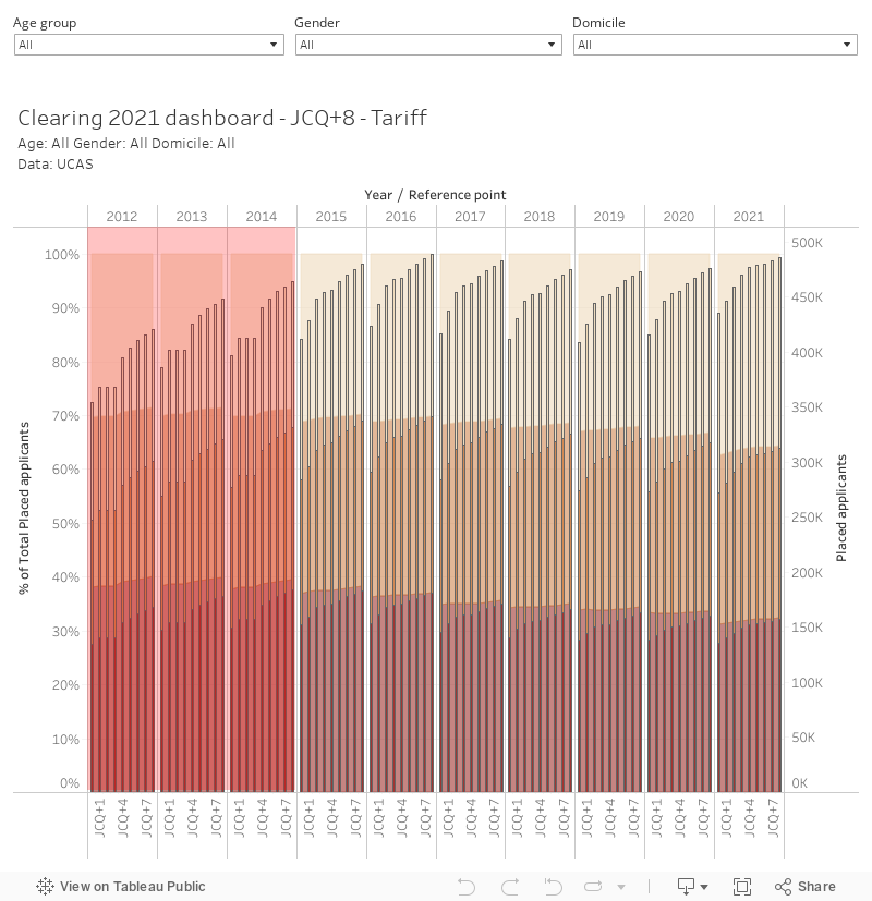
What we’d expect to see here is a growth in placed student numbers in medium tariff providers early on in the cycle and in lower tariff providers later – in fact, numbers appear to be rising more slowly in medium and (especially) high tariff providers than in previous years. This does not appear to be due to an Insurance or Adjustment effect (both of these routes are low this year), so we are clearly seeing capacity issues – which would also explain the high proportion free to enter Clearing.