

Applications and acceptances, by subject and provider
David Kernohan is Deputy Editor of Wonkhe
Tags
In my earlier piece I looked at where applicants had moved away from “firm” offers during the UCAS cycle, finding that around three-quarters of placed applicants ended up at their “firm” choice and this has remained constant for the previous decade.
There’s been some suggestion that what may be happening is that applicants are making a “firm” choice based on an offer that in previous years would not have been available to them – suggesting some combination of a relaxation of provider entry standards and better attainment among applicant was driving a change in behavior.
Offer rates (the likelihood that a given application to a course and subject will result in an offer) are what I wanted to look at here, but it seems that UCAS no longer publish data on offers made by providers in the places I would expect to find it. Instead I’ve plotted the number of (main scheme) applications against the number of (main scheme) acceptances.
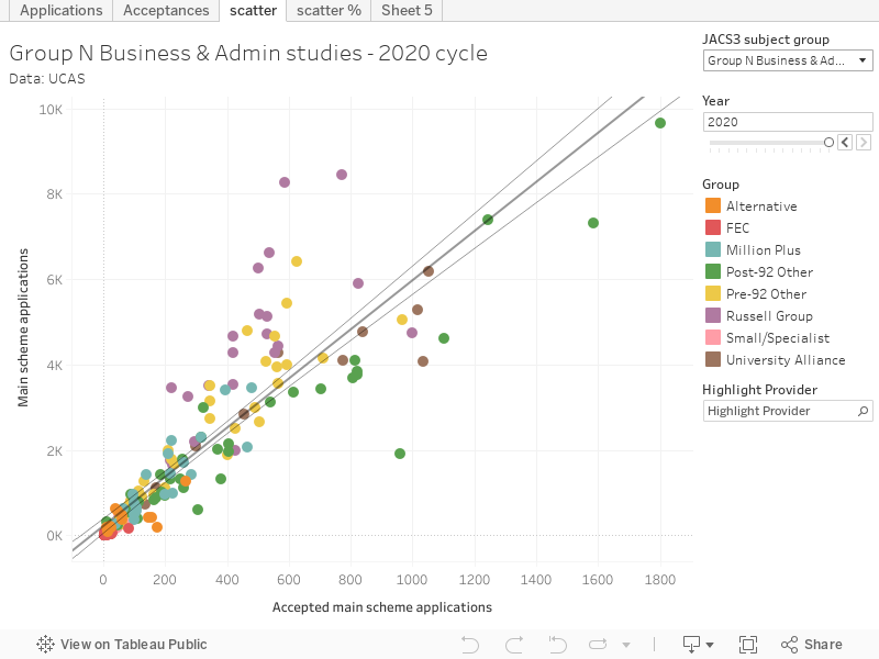
You can use the year slider and the subject filter to explore areas of interest to you – but you’ll go some way to identify a more powerful or reliable relationship than the one between the number of applications and the number of acceptances.
In reading these graphs the blobs above the trend line are those that see less applications accepted than you would imagine given the number of applications (more selective), and the blobs below the trend line shows more applications accepted than you would expect given the number of applications (less selective). We can quickly see for most subject areas that Russell Group universities tend to be more selective, and have become more so over time (using the “year” slider). You can also see a proportional view for any given subject via the “scatter %” tab.