


Monitoring a university’s impact on local Covid-19 safety is important, but an office full of screens with live data would be mostly for show.
There is very little useful “real time” data on student activity or the presence or absence of a Covid-19 outbreak – excepting social media trends that may conceal as much as they show. But we can track cases which may have an impact on students, staff, and local communities, at a high resolution but with a time lag – using public data.
Update: rolling data dashboard (MSOA) is now available
Update: It appears the LSOA data series plotted below is no longer being updated. These dashboards now show historic (wk 40) data only.
Providers and local authorities need to have some means of understanding what is happening and where. Any indication of where problems may arise can help deploy resources and enact mitigations appropriately. It’s with that in mind that I’ve been building dashboards for you all – in the absence of any meaningful central activity on the matter.
This isn’t an early warning system, nor is it a key to a successful response. Rather, it is a tool to help understand where problems may arise, and to help in allocating resources. I’m looking at where students live, and initially where students may have come from, as a way of informing mitigation.
The Data
Student term time address vs covid (LSOA)
Do we know where our students live? Honestly, as a sector, we are not great at this. Across the UK in 2018-19, there were 59,445 students returned to HESA without full term time addresses – that’s nearly 3 per cent of all students, which is more than the total number of students studying in Northern Ireland.
However for the students with address data, we know where they live within very small areas (Lower Super Output Areas, LSOAs) for England, Scotland, and Wales – thanks to a custom Jisc Tailored Data slice of the HESA record for 2018-19. Though this is old data referring to our previous cohorts it is accurate enough to identify small areas with high concentrations of student residences, and though the student housing market is growing we can assume that student areas will remain broadly in the same place over a two year period. Each LSOA contains between 1,000-3,000 people in total.
In England data on Covid-19 cases is released by LSOA, allowing us to examine Covid outbreaks in the context of student populations. Here’s the dashboard:
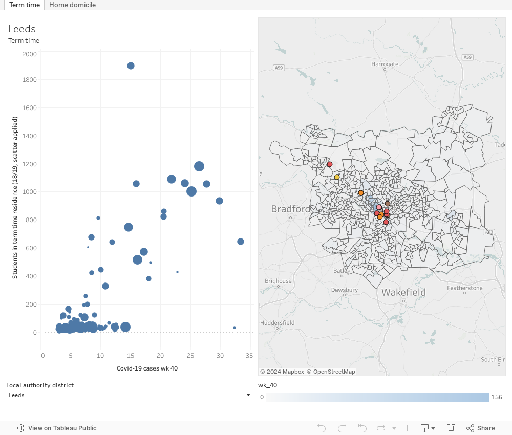
The graph on the left shows each LSOA by covid cases in wk 40 (week ending 4 October, the latest available data), and student population in 2018-19. The map on the right shows these areas spatially – click on a dot on the left to see the area it represents in close up. You can select the local authority district you are looking for via the drop down at the bottom left – if your area is not featured then there are currently between 0 and 2 Covid cases in each LSOA in that area (represented as -99 in the official data).
Data is not available publicly at this resolution for Wales and Scotland – but here is a plot of the student term time numbers data. It’s (honestly) a bit of a cludge – Scottish statistics work very differently to English and Welsh ones, and it is difficult to combine the two on a single chart.
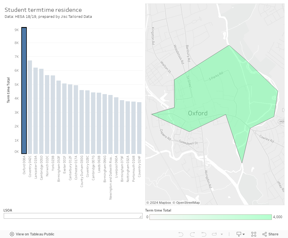
On the left is a graph of LSOAs ranked by the number of students in residence – click on a bar to see the area in question on the right. To search for an area here use the LSOA box on the bottom and type some of the local area name you are interested in. For Scotland you need to get quite specific, eg a few letters of “Newington and Dalkieth Road” rather than Edinburgh – it’s probably easier to zoom in using the map controls – or map search for Edinburgh – and work backwards.
Apologies to readers in Northern Ireland, but there aren’t even any LSOAs in your official geography.
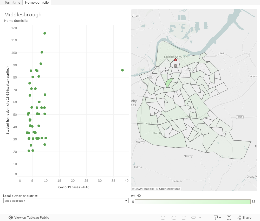
Migration patterns vs covid (LTLA)
There has been a general and growing acceptance of the value of knowing where students are living in understanding what a response to Covid should look like. But we’ve yet to see the idea of where students are coming from impact on the public debate.
As an institution you could put in a number of mitigations if you knew that some of your students were coming from a particular area with a high prevalence of Covid – thus, students you knew had a higher likelihood of carrying the virus. This may be a matter of providing additional advice and support to the students, right through to advising them not to travel to study.
Sadly the data on initial student domicile is pretty poor. In the 2018-19 HESA dataset, 48,1040 students do not have a domicile recorded at this level of fidelity – about 22 per cent of all students. Providers would hopefully have more detailed and up-to-date records, and UCAS would have data on a large portion of this year’s new undergraduate intake. This makes it much more likely that a local solution would be a better approach. But here’s a dashboard – similar to the one above, anyway. It’s best seen alongside either this detailed visualisation of estimated migration from and to local areas, or your own provider-level data on student domicile.
Transparency or the rumour mill?
We are already starting to see locally spreading rumours about university-linked infections – and this will only escalate as the virus continues to spread this autumn. Left unchecked, these rumours are dangerous – specifically to students who may feel blamed and unwanted, but also generally towards provider reputations locally and nationally. For this reason, providers need to be open and transparent with local communities – flagging where outbreaks have occurred alongside detail of what actions have been taken by the provider to protect the wider community.
This may feel counter-intuitive – surely the last thing you will feel like doing will be advertising that six students have tested positive. But the risks of this being revealed later, during a local lockdown that could have been avoided, are far greater. It would be nearly impossible to rebuild trust.
I would advise providers to commit to a single source of truth – publishing and regularly updating details of cases and actions taken on a dedicated web page. Given that many towns and cities have multiple universities and college with students often living and socialising together, it would make sense to think about this as a local initiative. There would be space for national guidelines to be agreed on what should be reported, when and how.
The state of the data: Covid
Government data on Covid
Covid testing data is submitted centrally on a daily basis, but not all the results submitted refer to tests carried out that day. Far from it. Though there are some faster antibody tests now being used by clinicians, the majority of testing makes use of a virus test – which at fastest can be turned round in 24 hours. Back in June the Commons Health Committee heard that the accuracy of the test (the proportion of positive cases correctly identified) was at worst 80 per cent, meaning up to one in five cases are not spotted. And tests are only useful during the first five days of symptoms – the official advice is that after this you should just move straight to household self-isolation.
So by the time a case is identified, it may already be too late to contain against infection. With the rise in infections among young people we’ve seen growing concern over asymptomatic carriers – people who may be carrying the virus but do not develop symptoms (either until later or at all). Unless we move to a regime of mass testing, using technology that (moonshots notwithstanding) does not exist, there is no way of spotting these people. Mass use of the current test would give too many false positives to be useful.
If you are outside of government or the NHS, data for England and Wales is published daily on the gov.uk site as a dashboard, with some underlying data available to download or as an application layer interface (API) – the resolution is at LSOA level (see the section below on administrative geography). The surveillance reports contextualise this data every Friday, and provide additional insights into areas on the “Contain” framework – local authority areas either in or near local lockdown and similar restrictions. The Office for National Statistics also has an infection survey released each Friday, and releases provisional data on deaths each Tuesday for a fortnight ago.
Data for Wales is published at local authority level (on a Tableau dashboard!) but only two days after the tests are carried out. Data for Scotland also arrives at local authority area resolution.
Other Covid data in the UK
For these reasons, there has been interest in other metrics. In the spring King’s College London developed a symptom tracking app, which used a sampling methodology to allow individuals to self-report symptoms. It’s a big sample (more than 4 million people) but it is not a match for the demographics of the UK – for instance it does not purport to track prevalence in care homes as there is not enough data.
Google does not track Covid directly, but does publish data on “community mobility” (numbers of android users travelling to work, school, shops, etcetera) with a 2-3 day delay. This data could be useful if we could draw an inference between Covid prevalence and changes in activity – but it was more useful in tracking the extent of compliance with the full lockdown.
Companies like Faculty and Palantir are also mentioned in relation to Covid tracking. Palantir is working with the NHS (specifically health technology offshoot NHSX) to track occupancy levels and covid case numbers in hospitals. Faculty AI built the dashboard at the front end of this initiative. This is all useful stuff, and a great example of how administrative data can be used to generate real insights. But again it is not directly tracking the spread of the virus.
The state of the data: students
Location
HESA (via the Jisc Custom Data Service), UCAS, and individual providers have data on where students live outside of term time – HESA and providers will have data on where students live in term time. The quality of this data is variable.
We don’t get to see this data in public – UCAS offers applicant domicile by parliamentary constituency as a part of the End of Cycle release, HESA presents initial domicile against a unique and innovative mix of lower and upper tier local authorities, and offers some basic information on the split between types of accommodation. POLAR4 offers some help as to general participation rates, by Middle Level Super Output Area (MSOA), but this data refers to participation rates more than five years ago.
The picture gets more interesting if we consider students as a whole rather than using specific provider-level data. The Ministry of Housing, Communities, and Local Government has some data on Council Tax exemptions (households that don’t pay council tax, including categories for those exempt through being an all student household or “residential education setting”) by lower tier local authorities. The most recent data was released last November for 2019.
If we are just thinking about movement there are annual internal migration estimates from ONS, again at a lower tier local authority level. These work via registrations with general practitioners, though there is a HESA related work-around for 18 year olds going to university who don’t do that (and a charming University of Warwick specific work around that attributes students to the appropriate one of two local authorities that the campus and environs straddle).
Behavior
HESA has information on historic travel to campus patterns for staff and students. It’s in the HESA Estates dataset, by provider. And that’s it. Student behavior is the biggest hole in our available data, and – short of specific tracker mobile applications and all the ethical problems and sample distortion that brings – I can’t see any meaningful way to address it other than through necessarily incomplete survey data.
A note on UK geography
For location data, how we demarcate regions of many sizes in the UK becomes very important. There’s a bewildering array of systems, but I’ll deal with four main ones here:
- Administrative geography, which deals with parishes, ward, local authorities, ceremonial counties, and the way things like the NHS or the police happen to be organised.
- Electoral geography, which deals with wards and constituencies (for all four governments in the UK)
- Census geography – the world of “output areas” and similar
- Postal geography – your postcode and what it represents.
Though you can mostly scale up and down in each system (though the “parish” is its own kind of historical oddity), moving between systems is riven with complexity. Going between electoral and administrative geography is facilitated by the common use of the ward as a building block, but in other systems and at other levels the boundaries do not always line up. Otherwise the lookups available from ONS at the magnificent “Open Geography Portal” enable a best fit approach to be used – the most famous example being the National Statistics Postcode Lookup.
And then, of course, everything changes over time. For instance Buckinghamshire became a unitary authority – abolishing four district councils – on 1 April. If your area based dataset was based on upper or lower tier local authority boundaries, you now have a problem. As you did when Bournemouth, Christchurch, and Poole became a single council in 2019, or when Royal Mail invents new postcodes every month or so.
For this reason, most small area geographic statistical work uses the Lower Super Output Area (LSOA, or Statistical Zones in Scotland). At the time of the 2011 Census England, Wales, and Scotland were split up into geographical areas containing 1,000 people – an Output Area. These are combined to produce segments of between 1,000 and 3,000 (or between 400 and 1,200 households) – Lower Super Output Areas. In England Covid-19 data is released to this resolution, which is why I requested the dataset from Jisc at that level.
The problem this gave me is that Wales and Scotland do not provide Covid-19 data at this level, and Northern Ireland doesn’t have LSOAs at all.
You may think this is a niche technical issue (although you’ve read this far…) but this presents us with huge technical problems if we are trying to combine two or more datasets based on different geographies. Even (given the state of available data as described above) if we are interested in indicative data only, we need to be able to compare attributes on a reliable basis. Good luck, as they say, with that.
Again, another masterpiece from David K
Many students have realised that uni in the time of Covid makes their location irrelevant. They may nevertheless be at their term-time address: “I’ve paid for it so I’m gonna live in it”. For the others, interesting to speculate how they split their time and how much criss-crossing the continent that might mean.