

Record numbers – and rates – of young full-time students from disadvantaged backgrounds entered higher education in 2015. This is part of a long-term, sustained trend which has seen the entry rate for young people from disadvantaged background increase by 65 per cent since 2006.
But, despite this progress, it shouldn’t come as a shock that I’m impatient for further improvements. My latest guidance to universities and colleges as they draw up their access agreements – which I published on Friday – makes clear that now is the time to accelerate change.
The Prime Minister has set a goal to double the proportion of young people from disadvantaged backgrounds entering higher education by 2020, compared to 2009. Meeting this goal will be tough – it’s clear to me that progress in recent years is not good enough. If we’re to meet the Prime Minister’s ambitions we need a further step-change in progress. That’s exactly what this access agreement guidance aims to facilitate.
So, what’s new in this year’s access agreement guidance? A change that’s made the news is a request to institutions to consider how they can best support white men from disadvantaged backgrounds. This follows from the guidance I’ve received from Ministers, which highlights the especially low participation rates of this group. Efforts are already being made in this area. Many universities and colleges already have activities in place designed to attract men into higher education, and a number specifically target white men from disadvantaged backgrounds.
I want to see more of this sort of smarter targeting in this year’s access agreements. UCAS have advanced the quality and transparency of the analysis in this area and their latest End of Cycle report starkly illustrates how easy it is for disadvantaged students to get missed when single indicators of disadvantage are used. As the chart below illustrates, when UCAS examines sub-sets of state school students from POLAR3 Quintile 3, we see huge differences in participation. The entry rate of a white male in receipt of free school meals from a Quintile 3 area is just 9 per cent – lower than the overall average entry rate for Quintile 1 (the most disadvantaged areas). Conversely, 44 per cent of Quintile 3 Asian female 18-year-olds not in receipt of free school meals enter higher education – higher than the overall average entry rate for Quintile 5.
Entry rates for English 18-year-old state school pupils in POLAR3 quintile 3 by ethnic group sex and FSM status at age 15 (2011-2015)
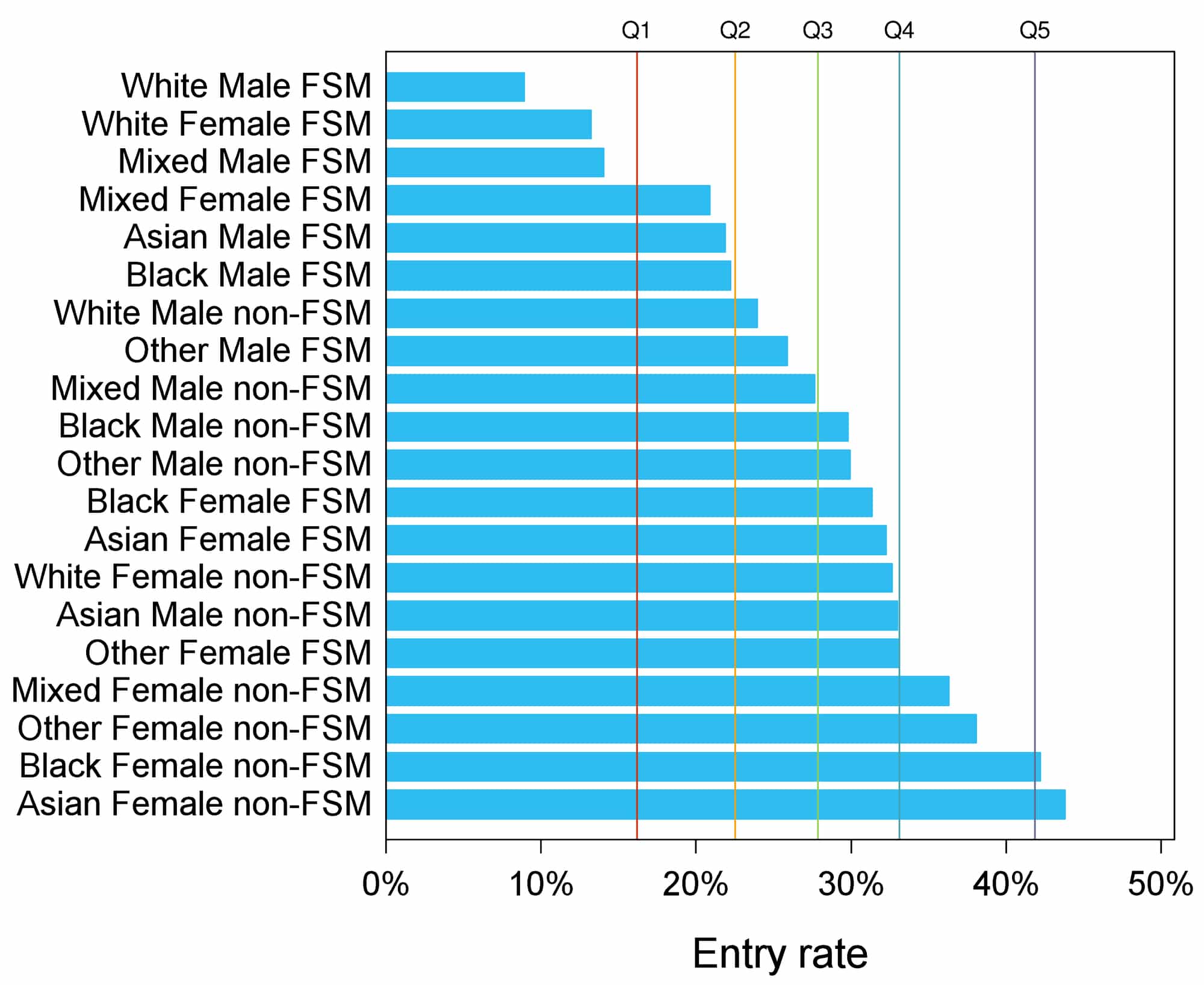
Source: UCAS End of Cycle Report 2015
What this all means, of course, is that universities and colleges need to be more conscious of multiple indicators of disadvantage when they’re drawing up their access agreements. This will help them find people with the ability to excel who might otherwise have been missed by too blunt an approach to targeting. Intelligent, evidence-led work to target particular clusters of disadvantage is key to further progress.
My main focus remains on improving outcomes and ensuring that the work delivered through access agreements delivers real and demonstrable change on the ground. So, to further understand the ambitions of universities I’ve got new expectations on targets this year. Universities and colleges will, of course, set their own targets – and I’ve strongly argued that they should continue to do so. But I do want to understand more about the impact of work across the whole student lifecycle. That means I’m expecting institutions to submit targets which cover not only access to higher education, but also to have targets in place for the work they do to support students from disadvantaged backgrounds through their studies and as they prepare for life after graduation. For those institutions carrying out collaborative work, I also expect to see a target on the impact of this work.
Institutions should expect tougher challenge from me this year. Where universities are not making progress, I want to see a clear plan explaining how they’re going to turn things around. They should scrutinise their own targeting to make sure they’re reaching talented people who would otherwise be left behind. And the targets they set themselves should be stretching.
The changes we are proposing are not revolutionary, but an important evolutionary step, recognising the increasing maturity and sophistication of widening participation practice and research. My message to vice chancellors and principals is simple. I will support you to make further progress towards your own fair access goals. I’ll continue to be reasonable – respecting institutional autonomy and recognising individual context. But in return I expect access agreements to be ambitious, evidence-led and strategic. Those that aren’t will be sent back – and I’m ready for tough negotiations to ensure that every institution is making a contribution towards the Prime Minister’s rightly ambitious fair access goals. By pulling together, we can help ensure that where you come from doesn’t determine where you’ll end up in life.


The big flaw in the Government’s and the HE sector’s chosen metric of disadvantage – living in a low participation area – is that it’s not at all closely related to individual-level disadvantage.
According to HEFCE, over two thirds of children eligible for FSM don’t live in low participation areas and so are completely ignored by the target. Over half of HE entrants from from low participation areas with a know social background are middle-class (defined as having parents in NS-SEC 1-3). 96% of children who live in London don’t live in low participation areas. Over 70 out of 324 local authority districts have no low participation areas and so would be completely ignored by a strategy to meet this target.
Targets based on POLAR – especially for highly selective universities – are just begging to be gamed (and already are according to UWE research): simply target rich kids in low participation areas and ignore a) kids in deprived areas with lots of ethnic minorities b) poor kids in rich areas.
It’s extremely concerning that the head of OFFA equates “living in a low participation area” and “being from a disadvantaged background” as it suggests a lack of understanding of the perverse incentives being set for institutions by the new target and so a lack of action to guard against it.
http://www.hefce.ac.uk/media/hefce/content/pubs/2014/201401/HEFCE2014_01.pdf
http://www.hefce.ac.uk/analysis/yp/POLAR/Map,of,young,participation,areas/
The problem is that POLAR is set at ward level.
This may be helpful towards local and national politicians, for whom the electoral ward is the building block of political representation and of the allocation of funding for much local authority-based activity targeting deprivation. It’s also relevant in terms of looking at national statistics.
However as a measure of the social science of the local relationships of geography to deprivation, particularly in relation to full time participation in HE, it is is utterly useless and it’s about time people started arguing it.
In particular in both London and in some very rural areas it completely breaks down as it is perfectly possible (indeed extremely common) for very poor and very wealthy people to be co-located in the same local authority ward, ie there is extreme heterogeneity at ward level.
HE participation statistics based on much smaller neighbourhoods, such as Output Areas used by the census, would be much better. The Datashine project (funded by ESRC) is doing a lot of good work to provide visualisation of census and other data within these much smaller and more useful geographies. See: datashine.org.uk
As an example, I selected Datashine’s OAC (Output Area Classification) Variable 38 – % of population with highest qualification at Level 3 (A Level) – and zoomed in on the London Boroughs of Camden, Islington and Hammersmith and Chelsea. Result: Loads of small areas with red or pink (showing major pockets of low educational achievement in the population). Choose instead HEFCE’s Polar map of young participation (link above) and zoom in on the same area and you get a high concentrations of purples (highest quintiles) and hardly any reds.
It’s the same thing if you look at rural Cumbria – masses of high participation purple colours from POLAR, while Datashine shows major pockets of red coloured low educational achievement, eg on the outskirts of towns like Keswick.
Now, okay these data visualisations are derived from two different sources and methodologies – OAC is based on 2011 census of the whole population (all ages), while POLAR is derived from UCAS statistics for young people’s application to HE. So I’m not strictly comparing like with like. However my point is that you would expect a strong correlation between these things. In fact I believe that the high level geography used in the POLAR calculations distorts it highly and renders it at least questionable for use as a drive or HE policy.
The limitations of the POLAR measure are certainly worth noting but what is also of concern to those working in the field of Widening Participation in HE is the the framing of the entire discussion in terms of ‘young people’. What about the mature widening participation students that no longer come to HE?
http://www.scutrea.ac.uk/p/scutrea-blog.html