


It’s always interesting to look at UCAS end of cycle provider data – but the 2020 cycle has generated a whole new level of morbid fascination.
Let’s be frank – there have been some horror stories. It has been difficult not to wonder about the impact of unexpectedly poor recruitment on provider finances – especially with the current spate of stories about course closures and redundancies.
Of course, the pain from poor recruitment is just about to hit. Usually providers would be receiving a second term payment from SLC round about now – in 2020 this came alongside term one’s payment in most cases. This helped meet start of term costs, but where under-recruitment has happened the impact of having less money to run a university of the same size will be seen shortly
In three out of four UK countries we have a system where the choices of 18 year olds shape our universities (mostly) without mediation. There are signs that this is beginning to change – regional skills needs planning has been mostly discussed with reference to FE, adult learning, and apprenticeships but we should not fool ourselves that HE will be immune. This may be one of the last cycles that has such an immediate impact on the shape and capacity of the sector.
2020 growth
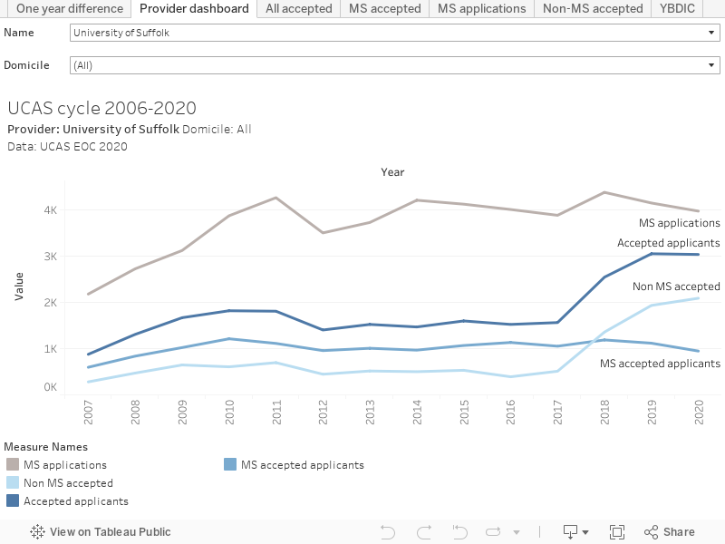
Let’s look at overall provider activity first. These graphs show mainstream applications, mainstream accepted applications, non-mainstream accepted applications, and all applications. You can select a provider and see a graph of performance since 2006. You can choose students from a particular domicile via the filter.
The other tabs are a bit more intense, and allow you to look at regional and mission group performance.
Universities do like to compare – so here’s a rank of difference in recruitment between 2019 and 2020.
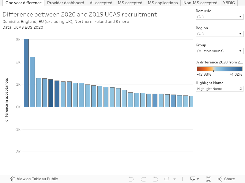
We have seen a fair few providers grow their intake – and not all of them are from the Russell Group.
- LSE’s intake grew by 32.06% over last year
- For St Andrews, the figure was 35.24%
- UCL saw a 49.5% growth over last year
- But at Buckinghamshire New University, that was 59.8% growth
- And an astonishing 74% annual growth for Leeds Trinity University
LTU grew largely outside of mainstream applications, suggesting a stellar clearing performance. Bucks New saw a more even growth. Intriguingly a big chunk of UCL growth was outside of the mainstream – this could be the impact of making offers based on revised A level grades (there was an inconsistency in how these are shown in the data) – remember mainstream should include “Firm choice, insurance choice, and other main scheme choice acceptance routes”.
2020 decline
Sadly, some providers had a less encouraging 2020 cycle.
- The University of Bedfordshire recruited 42.93% less students than last year
- At Heriot Watt the drop was 24.66 percentage points
- Coventry did not recruit as well as might have been expected, recruiting 23.29% less students
- Glyndwr recruitment was down 22.67%
- And the University of Surrey saw 20.65% less acceptances than last year
Among the larger alternative providers performance was mixed – BPP recruitment grew by 31.14%, the University of Law by 35.39%, but Regent’s University saw a 40.66% fall in recruitment.
It’s interesting to look more deeply at what may be underlying these stand-out figures. At Coventry, for instance, applications have been dropping since 2017 but the fall is particularly sharp among EU students. Coventry has performed well in EU recruitment in the past – this could well be the impact of Brexit.
Regional recruitment
There was an idea that students would be keen to study closer to their domicile during the pandemic – and we get enough data to examine this at a (NUTS1) region level. Here I’ve plotted acceptance numbers on a map, with a bar chart alongside, for each provider. The intensity of colour on the map shows the number of acceptances, whereas the colour intensity on the bar chart shows the number of applications. The other tab lets you see the leading recruiters and most popular applications in each region.
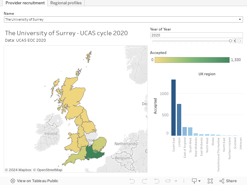
Looking at a few providers, the effect doesn’t seem to be as pronounced as I might have expected. I’d also wondered whether providers in lockdown areas during clearing (that was Leicester, Manchester, Calderdale, Kirklees, Bradford, Blackburn and Darwen, Burnley, Hyndburn, Pendle, Preston, and Rossendale) struggled to recruit outside their region. If you look at De Montfort, for instance, you can see less students came from outside the East Midlands in 2020 when compared with 2019. However, just a few streets away, Leicester saw growth from outside the region (but scroll back to 2017 to see when Leicester primarily recruited from London – it is becoming a more regional university anyway).
There seems to be big differences in those accepted ‘EOC_HEP_data_resource_2020_001_1.csv’ and those placed in the ‘Reports by sex, area background, and ethnic group’ ‘eoc2020_Published_equality_Datafile1’. For instance UCL only placed 33.7% more, even though accepts were 49.5% higher?
How can UCL have 9145 accepts but only 3450 placed? Thats a 37% place to accept conversion, most other Unis have at least an 80% conversion.
In haste I believe the equality data is UK only.
Hi David
Thans so much for putting these together to help us look at the UCAS End of Cycle 2020 data.
Some of us at our University are having difficulty in using the Regional Recruitment, Regional Profiles tab. We just get the hour glass that doesn’t go away. Other colleagues have no difficulty.
Have you any advice on what we should do?
Many thanks
Hello Jean – I’m not sure what the issue here could be. I know that a powerful computer and good bandwidth help in viewing some of the larger tableaus.