


So how did everyone get on?
The traditional end of January release isn’t the first time providers have seen their own UCAS admissions numbers, of course – but it is the first time we get to see everyone’s numbers together outside of UCAS’ offices on New Barn Lane in Cheltenham.
As most higher education institutions tend to benchmark themselves to one or more “comparator” providers, today is a day of reckoning in strategic planning offices. Meeting targets is one thing, meeting targets when others are growing far faster is quite another.
And as observers of the sector more generally, we get a unique understanding of the way things are changing. Is the Russell Group still growing in recruitment? Yes, but not as fast as in previous years. Where is the growth this time round? Universities Alliance and Million Plus. And who is shrinking? Pre-92s outside the Russell Group and alternative providers.
Let’s get the caveats out of the way – this data relates to undergraduate student acceptances that UCAS knows about, either because the application has been managed via UCAS or because it is an RPA. Main Scheme figures do not cover direct entry clearing (or UCAS Extra). Scottish Colleges don’t do applications via UCAS so we are missing a big part of the Scottish HE picture.
Provider level data
We helpfully get thirteen years of data – which is useful in understanding longer term trends. I’ve built a range of visualisations to help you see what is going on and answer various questions. Use the tabs on the visualisations to move between them.
- “Lookup” – this shows all providers in a table, with cycle year along the top. The size of the blob shows the number of acceptances in a given year for a given provider, the colour the percentage change. You can filter by region and mission group – for ease of reading I’ve prefiltered to show only larger public providers.
- “Group%” and “Group#” – these show a summary performance, in terms of a percentage of all acceptances and raw numbers respectively, by mission group.
- “Ratio” – by dividing main scheme acceptances by main scheme applications you get a ratio (which I’ve expressed as a percentage) that shows one measure of how “selective” a provider is. It’s not perfect, but it is interesting enough to show.
- “Provider” – this lets you see all 13 years of acceptances, main scheme acceptances and main scheme applications for an individual provider
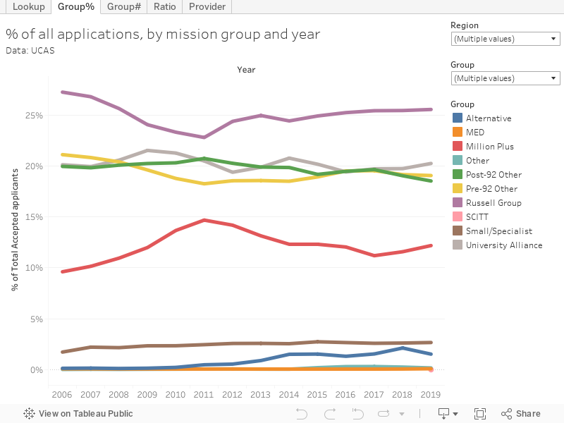
As suggested above, the big story for me is a strong post-92 performance, and comparative weakness in non-Russell Group pre-92 acceptances. In terms of individual institutional stories I would highlight:
- Strong growth from Leeds Trinity University (66 per cent over last year), Coventry University (20 per cent), London South Bank University (16 per cent), Aston University (16 per cent), King’s College London (15 per cent), and the University of Bedfordshire (a staggering 103 per cent growth). I’ll come back to that last one.
- Contraction in intake at Solent University (14 per cent over last year), De Montfort University (12 per cent, proving that not all publicity is good publicity), the University of Leeds (10 per cent), the University of Plymouth (8 per cent), and the University of Sheffield (8 per cent)
- The three institutions with the largest number of acceptances are Nottingham Trent University, Coventry University, and Manchester Metropolitan University, but there’s plenty of Russell Group providers just behind them.
By provider and subject
To help us dig deeper into individual universities and colleges I’ve taken advantage of a twelve year time series split by provider and subject area. Only two plots on the tabs this time:
- “SubjectPlot” – has year and subject group (top level JACS) as filters and allows you to see the dominant players in top level subject student markets. Applications via the main scheme are on the y axis, main scheme acceptances on the x axis.
- “Provider Dashboard” – shows you the total acceptances and main scheme applications by cycle year as an area graph – letting you see how an institution has grown and what effects application trends may have had on this. Use the filter at the top to choose your institution – you can search by typing in the top of the pop up, so you don’t have to scroll down the list.
- “Group” – choose a subject on the filter, and see how the share of acceptances by year has changed by mission group as an area graph.
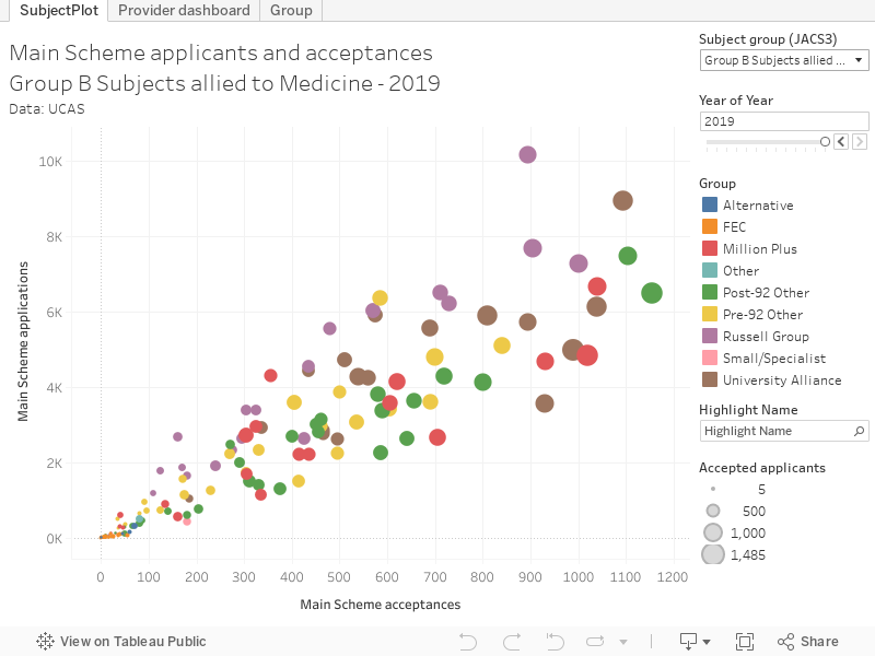
To go back to our interest in the University of Bedfordshire (above) we can see that most of this growth came from the expansion of business and social studies courses. Thinking back to other recent headlines we can see no modern languages intake at the University of Sunderland since 2015, and a slow decline in linguistics.
We can also see the way Scottish providers are beginning to dominate in education provision (the big shift coming between 2014 and 2015), and how post-92 providers have always dominated in creative arts.


Another caveat is that a significant proportion of international students are recruited outside of UCAS through TNE and UK pathways.