


In case you’ve not noticed – the venerable POLAR measure of higher education participation has taken something of a kicking in the first part of 2019 reason, for no other reason than that it continues to measure participation like it was designed to.
We’ve woken up from our collective delusion that participation was anything more than a good correlation with wider deprivation measures. It’s an oddly Victorian moment for the sector – we’ve gone from the value-judgement-free perspective that people in some areas are less likely to enjoy higher education than others to the idea that there is a “deserving disadvantaged” that universities should focus on. In case, I guess, we accidentally encourage someone to go to university who wouldn’t otherwise have considered it. Most odd.
Anyway, UCAS has helpfully given us application numbers since 2010, so we’ve got a decent amount of data on all five measures to examine. Yes, you read that right, five. As well as POLAR4, we get to see:
- NIMDM2017 quintiles, for applicants domiciled in Northern Ireland
- SIMD2012/2016 quintiles, for applicants domiciled in Scotland
- EIMD2015 quintiles, for applicants domiciled in England
- WIMD2014 quintiles, for applicants domiciled in Wales
The latter four include data for the age of applicants – choosing from under 18, 18, 19, 20 and over, and all ages. As the four measures are different for devolutionary reasons, I’ve presented them as four plots with a single filter to aid comparisons. If you take the reductionist view is that quintile 1, in each case, is the 20 per cent of the population that score highest on deprivation measures in that particular country then this is mostly OK.
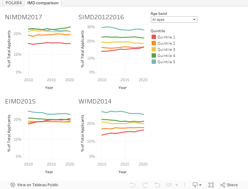
What we see for England is fairly startling given that we are used to obsessing infinitesimally small changes in POLAR quintile shares. Since 2010, the percentage of people from the lowest EIMD quintile applying to study through UCAS has risen from 17.6 per cent to 20.3 per cent. Other than quintile 5, quintile 1 is the best represented quintile if you look at all ages of applicants this year. There’s not as startling a trend in other nations – cynically I suspect this may be because we’ve already seen greater use of IMD metrics as a widening access and participation measure in Scotland.
Overseas recruitment
Studying in the UK has become a geopolitical act. Depending on who you believe, students are turning away from UK study because of uncertainties around Brexit, a “hostile environment”, or parts of Birmingham being a no-go area (that last is absolute nonsense, Birmingham is a lovely place). The data, however, presents a more complex picture.
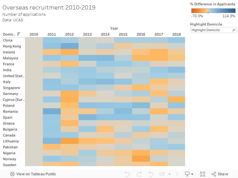
There’s more international students applying via UCAS than ever before, but this masks a range of trends in recruitment from particular countries or areas. The rising trend in applications from China, India, and the US continues, but there is a significant fall in applications from Hong Kong and Germany. If the latter is making you wonder about Brexit, it’s an outlier. The overall trend in non-UK EU applications is up this year (though not quite back up to 2016 numbers).
Subject changes
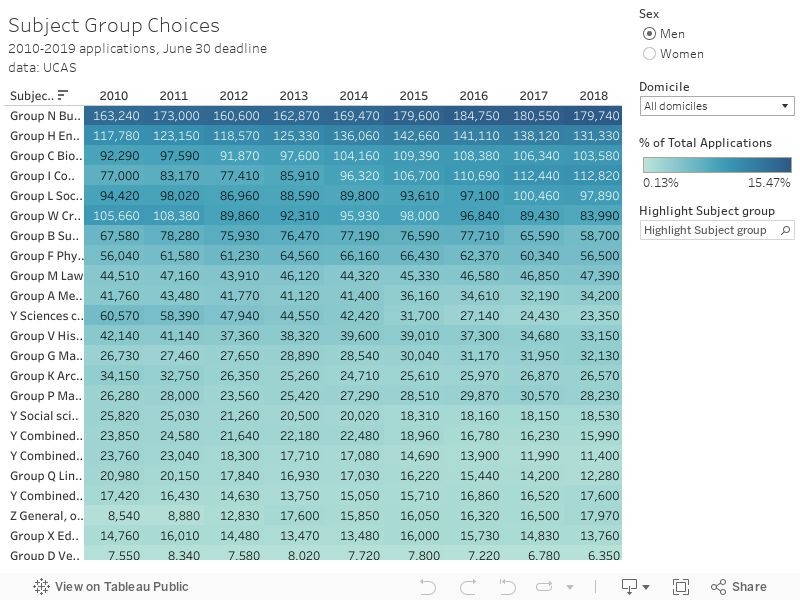
We don’t get data on institutional applications at this point, but there is a useful table of applications by broad subject area. I’ve set it so the colour shows the percentage of all applications that year, per subject, and you can filter by domicile and sex. The drop in male applications to Engineering applications continues (and has done so since 2015), though there is growth if you look only at English domiciled applicants. For women, Engineering applications remain low at around 1.95 per cent of all applications.
Creative Arts applications have also fallen this year for pretty much every demographic. It’s almost as if all those horror stories about artists not earning money have had the inevitable impact we all expected.


“There’s not as startling a trend in other nations – cynically I suspect this may be because we’ve already seen greater use of IMD metrics as a widening access and participation measure in Scotland.”
As you point out, the graphics actually compare four different metrics across the four different devolved jurisdictions. Eyeballing, however, there appears to be little difference between England, Wales & Scotland. Scotland’s Commission for widening Access may mean that that the entry data differ – or it may not. Time will tell.
What is there to be cynical about – just curious!