


The idea of a subject TEF is pretty much dead at this point.
It already feels like a fever dream from the dark days of the Williamson era.
Regular TEF, despite a nifty Shirley Pearce inspired reworking and somehow actually being called the “Quality and Standards Excellence Framework”, now takes much greater account of institutional context and is much less driven by the vagaries of data collection. Mind you, aside from a few vice chancellors with tins of gold paint, it would be hard to argue that the latest iteration has left much of a mark on the sector.
The institutional value primarily comes from the process of writing submissions. That kind of reflective practice is immensely valuable in itself, whatever the outcomes. The simple fact that TEF drives conversations about teaching and student support within universities and colleges is the best argument to keep hold of it.
Though the underlying statistics are now less important, there is a lot of value in there that can start these (and related B3 and student experience) conversations.
Subject TEF (Taylor’s version)
At the back end of 2023, I came up with the idea of running my own subject TEF, as a way of helping providers understand the differences between various parts of their undergraduate teaching.
The first version was shown exclusively to a gathering of pro– and deputy vice chancellors convened by Advance HE. What fascinated me about that experience was seeing the way senior staff understand the issues already, but could be spurred by data like this in the public domain to talk and think about implications in a remarkably candid and thoughtful way.
A tidied up version of that presentation was published on Wonkhe in December 2023. I have heard from readers that it has been used widely and helpfully to drive quality enhancement – and it also helps people understand the way split metrics work in TEF.
There won’t be another TEF until 2027 – indeed there may not ever be another TEF. But each year, the Office for Students publishes TEF data. And frankly, it would be rude not to.
This version of the subject TEF is purely data driven. Here’s how it works.
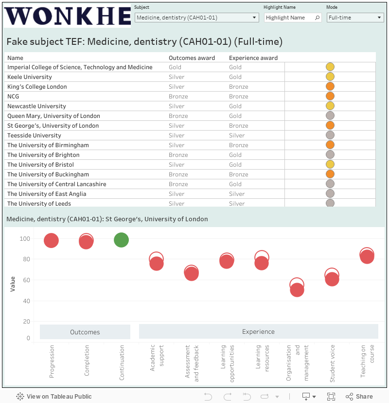
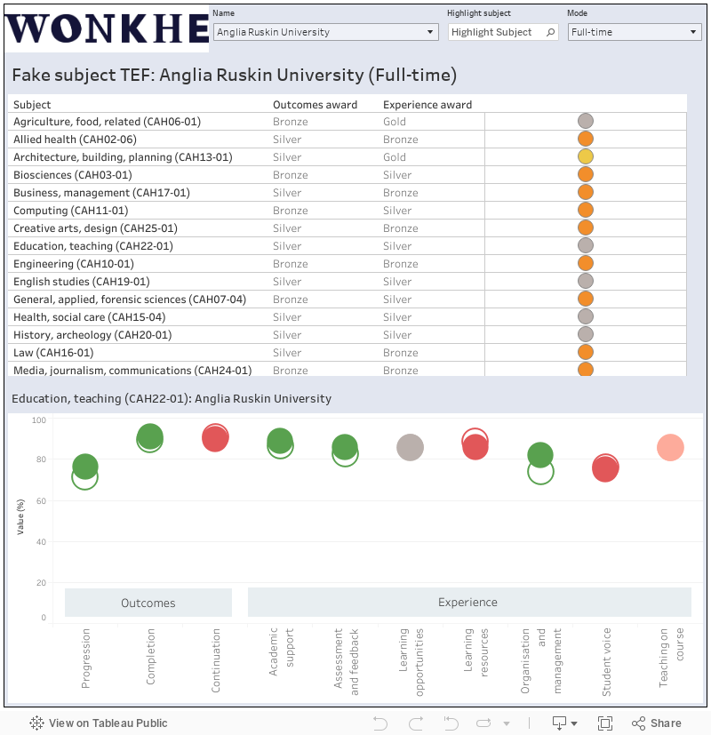
- I stole the “flags” concept from the original TEF – one standard deviation above the benchmark on each indicator is a single flag[+], two would be a double flag[++] (below the benchmark gives me a single[-] or double[–] negative flag). I turned these into flag scores for each sub award: [++] is 2, [–] is minus 2 and so on. This was made much more enjoyable by the OfS decision not to publish standard deviations this time round – I had to calculate them myself from the supplied (at 95%) confidence intervals.
- If there’s no data for a subject area at a provider, even for just one flag, I threw it out of the competition.
- For the Student Outcomes sub-award (covering continuation, completion, and progression) three or more positive flags ( or the flag score equivalent of [+++] or above) gives you a gold, three or more negative flags or equivalent gives you a bronze. Otherwise you’re on silver (there’s no “Needs Improvement” in this game)
- For the Student Experience sub-award, the flag score equivalent of seven or more positive flags lands you a gold, seven or more negative gets you a bronze.
- Overall, if you get at least one gold you are gold overall, but if you get at least one bronze you are bronze overall. Otherwise you get a silver.
- There’s different awards for full-time, part-time, and apprenticeship provision. In the old days you’d get your “dominant mode”, here you get a choice (though as above, if there’s no data on even one indicator, you don’t get an award).
The big change from last time is that there are an extra two indicators on Student Experience. “Organisation and management” and “Learning opportunities” scales join the original five sets of NSS results – this change is linked to the way the NSS has been redesigned, and I think this is the first that we knew about it.
Here’s the sector wide version – allowing you to look at all results in a particular subject area:
And here’s a provider level version, for all subject areas within a provider:
This is simply an exercise driven by the published data – if a friendlier and more impactful presentation gets more people to dive into this data in more depth, that’s me happy.
Sorry to make a boring technical comment, but I’ve tried in two separate web browsers (Firefox and Safari) and the scroll bars on the data widgets embedded above don’t work, so I can’t see the lower rows. (But if I follow the links to the Tableau Public pages they work fine there….)