


There’s a broadly-drawn equation that seems to underpin a lot of sector strategic thinking.
Common sense suggests that as a provider you improve the student experience by investing in academic staff.
A provider – indeed a subject area at a provider, as we know there is a subject effect on student satisfaction – offering a student experience involving packed lecture theatres and sporadic supervision will be perceived as less satisfying than smaller classes, seminars, tutorials, and individual support.
Everyone believes this. But it doesn’t appear to be true.
A lack of evidence
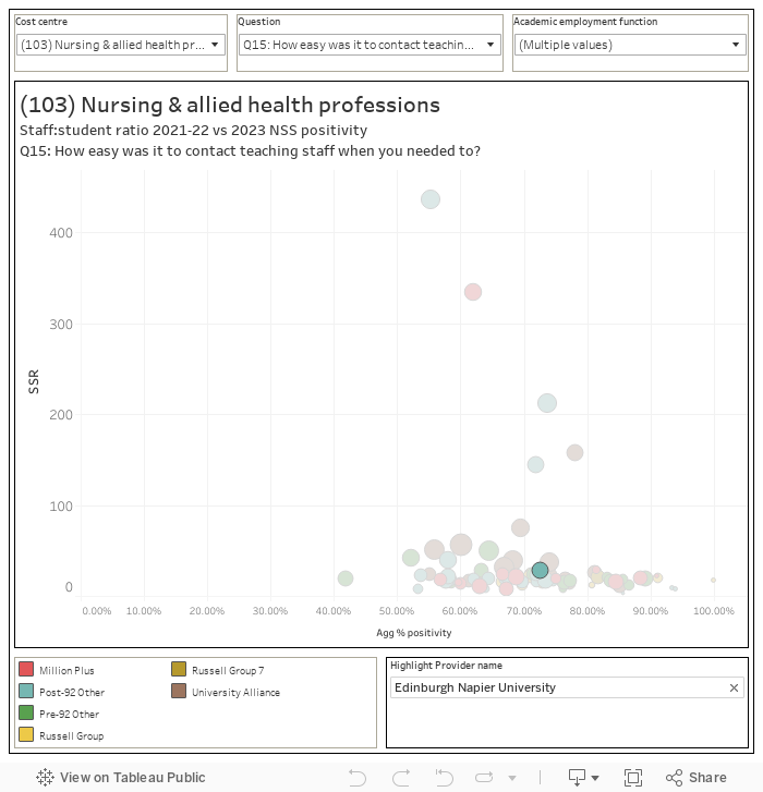
Plotting student:staff ratio against NSS fails to show even a non-significant relationship between satisfaction and staff numbers. Looking primarily at NSS question 15 (which relates to the ease of contacting teaching staff and seems most likely to see an impact from staff student ratios) there are no clear relationships between our two variables in any subject area. Clearly this is a data combination that is indicative at best (see the caveats below) but the absence of any visible relationship at all is remarkable.
Neither does there appear to be any relationship between the size of a department (in student numbers) and satisfaction – you would expect, perhaps, to see large departments with many hundreds of students making it harder for students to contact staff in a meaningful way.
You can try for yourself, across all NSS questions and subject areas, using this dashboard:
And it is also possible to see a similar lack of impact at a provider level, by subject area:
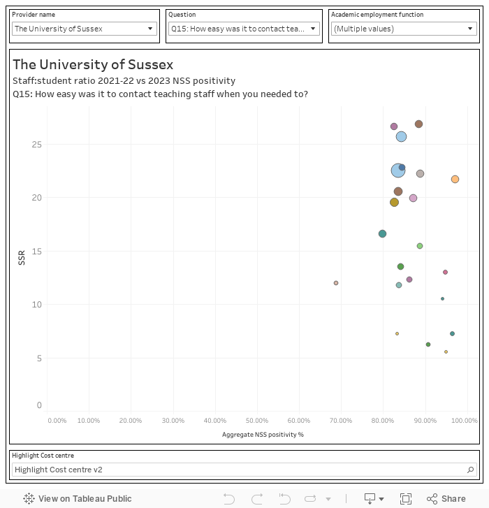
Do please have a play and comment if you spot anything that looks interesting.
Health warning – the version of this chart up first thing this morning had a very small number of errors. This new version (as of just after 9am) is correct as far as I can currently see.
Implications
The relationship between cost and quality is well understood – generally if you want to decrease costs you also need to decrease quality. Student satisfaction feels like the most appropriate way to measure the quality of the direct student experience (alternatives could include student continuation, or graduate progression – though these are also influenced by exogenous factors like the cost of living and the state of local or regional graduate employment).
Given the above findings it does feel like there must be ways to improve the student experience without increasing costs – teaching quality enhancement has long been neglected as a policy priority in England (the carrots of the 2000s have become the sticks of the current model of quality assurance), and where a subject area in a provider appears to be providing a good experience despite a high student-staff ratio it feels like it would make sense to investigate what is going on. You could imagine a kind of “reverse investigation” where the regulator or some other body could collect and share good practice in outstanding departments.
These charts – as is typical with NSS data – do a lot to dismantle institutional hierarchies. There are a fair number of prestigious courses at prestigious providers that have a surprisingly high SSR, whereas we see a low SSR at providers we would not necessarily expect – the University of Chester law school is more similar to Law at Oxford (in terms of size, SSR, and Q15 NSS positivity) than any other. SSR is no respecter of prestige or league tables either.
What do vice chancellors think?
I showed this data to Shitij Kapur at King’s College London – he told me:
Having been in five English-speaking institutions in four continents over my career I have been struck by the difference in SSRs across nations while delivering seemingly similar student experience and outcome. I always thought that reason I could not draw simple links between SSR and outcome was because these national systems were very different and had different tariffs and different regulations. Therefore it was very striking to see the wide variations in SSR across UK institutions, when they are all working within a single regulatory and tariff framework and trying to be their efficient best. It is remarkable how even within a discipline, and within a mission group, there can be nearly a 200 per cent variation in SSR with no discernible effect on NSS-measured student experience. These simple graphs raise difficult questions. Is this variation by intentional design? Or is it an accident of history and tradition of the different institutions?
SSR and NSS are both blunt measures and perhaps there are complexities in these measures themselves that obscure the relationship between staff effort and student experience. But, given that staff time is probably the most precious asset in any university – it behoves us to understand this relationship much better. In fact, as Gen-AI technologies may begin to replace some of the routine and rote aspects of university work, how and where we deploy our precious staff time will have to be a much more deliberate decision.
The data
This analysis hinges on a “best fit” mapping between Common Academic Hierarchy (CAH) subject codes and HESA Cost Centres – for details of how this has been done please see the end of the article. CAH (and the HECOS codes that underpin it) relate to courses – actually modules if we are being specific – whereas cost centres refer largely to departments, faculties, and school. It’s not completely safe to assume that courses are taught in the most obvious school, but for these purposes there are a fair number of confident assumptions that can be made – for instance law courses are likely to be taught (in the main) in your law school.
Student:staff ratio and NSS
Staff are only mapped to subject areas via cost centres, and as we get student numbers by cost centres too it’s fair to use these to construct a student:staff ratio (the common complaint is that this includes research only staff – using custom HESA data these have been removed). You may wish to argue that it would make more sense to look at undergraduate students only – for me it is arguable that the expansion in PGT makes it more important to include postgraduates too (and one day we may even get a PGT NSS!), though clearly NSS is (primarily) undergraduate only). If undergraduate students are struggling to get access to staff, it is very likely that this is happening for PGT too – and a large UG and PGT student population would have much the same impact as a similar sized population made up solely of undergraduates.
Some of the larger and more unlikely SSRs will stem from partnership and franchise arrangements (all students registered to a provider have their FTEs recorded in this dataset, though only staff employed by a provider are shown). I’d like to be able to finesse this issue further, but we’re still waiting for detailed data on franchise and partnership arrangements.
The staff and student FTE data is from 2021-22 – the NSS data from 2023 (the staff and student FTE refers to the second year of study for those who completed the 2023 NSS, which felt like a good compromise). This can be updated when we get 2022-23 student data in mid-April to see if there is any difference.
The CAH/CC best fit mapping
The analysis uses CAH level 3 subjects as an appropriate level to map to cost centres. As above, this is a best fit mapping only and does not take into account individual provider circumstances (unlike, for example, the Guardian University Guide mapping). This is probably fair in that everyone is disadvantaged by this choice. The full mapping is available as a google sheet – feel free to reuse it if it is helpful, or critique it if not. In short:
- Several smaller CAH subject areas in subjects allied to health have not been mapped to CCs
- Non-specific science, and forensic science, have been not mapped to CCs
- CC108 Sports science and leisure studies has been mapped only to (CAH03-02-01) sport and exercise science
- Bioengineering, medical and biomedical engineering, and “others in engineering” CAH have not been mapped to CCs
- Social science (non-specific) has not been mapped to CCs
- Cultural studies has not been mapped to CCs
- Childhood and youth studies has not been mapped to CCs
- All area/language CAH have been mapped to modern language (CC137) only, excepting English (CAH19-01-xx) mapped to CC138 (English)
- Area studies (CC138) has not been used (As a small subject, and because it largely duplicates parts of CC137)
- History of art, and heritage studies, have not been not mapped
- Combined studies (CAH23-01-xx) has not been mapped
- Publicity, publishing, and journalism CAHs has not been mapped.
- CC145 Media Studies covers only CAH24-01-05
I presume something has gone wrong with the calculation. Look at Edinburgh Napier nursing in the second Tableu chart. Popup says 2950:1 SSR. The chart says around 58:1 SSR. But students are 2950 and staff 110, leading to 27:1 SSR. Chart calculation problem, data problem, something else?
Version of chart published first thing has a couple of rogue errors. These now fixed.
Very interesting, but I think some of the calculations in the second plot still look off (e.g., looking at Architecture for UAL as an example – SSR is shown as 485:1 in the second plot, but 9.7:1 in the first)
It also doesn’t differentiate between UG, PG, online, franchise, etc. I think a very big claim has been made in this article without real data to back it up. Very disappointing.
Or Single Honour, Joint Honour, Major-Minors…. 1 student fte could be 3 individuals.
Not in one cost centre, no.
This is the best available public data, the chart is as accurate as possible given the data but as I note above it will always be indicative rather than exact given the restrictions of what we are working with.
For me, I focus on the more monolithic cost centres (we can be pretty certain all the law students are taught in the law school). It does appear that SSR is not a major driver of satisfaction (as measured by NSS, which is a whole other world of caveats!) and the point of the piece is that there may be other, interesting, things going on with teaching practice and the student experience that we could all learn from for the good of students.
And in the sister article https://wonkhe.com/blogs/hesa-spring-2024-staff-movement/, as an example, University of Leicester has 45 academic (excluding atypical) staff in computing, but in the data presented here has only 25.
This chart allows you to filter out “research only” academic staff. That capability was not in the earlier chart (it’s also the thing that caused a few problems with this chart earlier this morning!)
So, the upshot is that it’s not how many students are in the room but what’s happening in terms of quality (or not) of teaching, learning, interactions, inspiration… and so on. Who’da thunk it? Having been an observer of hundreds of university classes (lectures, seminars, workshops, labs, etc) over 20+ years, your suggestion that it’s not as simple as lower SSR = better student experience is one I completely agree with.
Yes. Absolutely that.
Trouble is, whilst we all know the NSS is fundamentally flawed, buoyed by this analysis, what actions do you think Pro-VC’s around the country will now feel justified to take? How many uni’s are already facing mass redundancies, how many more will follow in the next few months and years? All this article does is give legitimacy and justification to the culling of thousands of jobs, especially in the Arts and Humanities. I hope that wasn’t the intention, but c’mon, really?
I am pretty sure Pro-VC aren’t making decisions based on me plotting two pieces of public data from nearly 10 months ago against each other.
Indeed. The decisions have already been made. But at least they now have a WonkHE article to justify them.
What I’d hope is it would provide increased motivation to provide (much) better quality staff development and support (and the time to engage in it)…
Again, not sure anyone is going to be justifying decisions they have already made based on my heavily caveated charts.
Numbers alone mean little, full time on campus not part-time gig working for multiple Universities Academic staff who have the ability to engage students effectively are the key.
Yet –
‘Controlling for a range of other factors, our key finding is that a five percentage point increase in the proportion of teaching delivered by staff employed on a casual contract leads to a 0.58 percentage point reduction in the probability that a student will be satisfied with the university experience.’
Williams, Rhys (2020, July 17) An unintended consequence of staff casualisation: the effect on student satisfaction. Higher Education Policy Institute.
https://www.hepi.ac.uk/2020/07/17/an-unintended-consequence-of-staff-casualisation-the-effect-on-student-satisfaction/
Looks like Williams revised this upwards in the final paper, reckoning on a 0.25 ppt fall in ‘very satisfied’ in NSS per ppt increase in casualisation above a threshold of 8.5% in teaching by casual staff:
“a five percentage point increase in the proportion of teaching delivered by staff employed on a casual contract leads to a 1.25 percentage point reduction in the probability that a student will be ‘very satisfied’ with the university experience … Additionally, the existing literature highlights that staff casualisation is undesirable for other reasons, including student results, graduation rates, quality of education, staff health and staff retention”
Rhys J. Williams (2022) The effect of casual teaching on student satisfaction: evidence from the UK, Education Economics. https://www.tandfonline.com/doi/full/10.1080/09645292.2021.1958168
As the measure used in League Tables and accessible for study, NSS scores become the operative target, although we already know “staff casualisation is undesirable for other reasons, including student results, graduation rates, quality of education, staff health and staff retention.”
Williams calls for more data on Staff satisfaction, rather than relying on a UCU survey. But a piece last week (https://wonkhe.com/blogs/we-need-better-data-on-technical-staff/) notes the Staff Return may not include those who would supply it. Over 30% of providers opted-out of returning non-academic staff, which suggests the data burden is already beyond capacity to deliver. Meanwhile, the source for the NSS population, the old HESA Student Return, has been severely impacted by JISC’s Data Futures project.
Sorry, rather than staff satisfaction, Williams suggested: “…improved data relating to the proportion of casual teaching ought to be collected without resorting to subjective survey methods. Such data-gathering could collect information relating to the characteristics of individuals on casual contracts…”
He does acknowledge that, “Whilst this paper has focussed on the effect of casualisation on student satisfaction, there are a number of other dimensions affected by casualisation. This includes staff well-being and retention, graduation rates and educational attainment.”
Rhys J. Williams (2022) The effect of casual teaching on student satisfaction: evidence from the UK, Education Economics. https://www.tandfonline.com/doi/full/10.1080/09645292.2021.1958168
Incredibly interesting. Thank you!
This is fascinating David, and you capture something I feel about so many experience and engagement type surveys. Why do we always focus on investigating bad stuff, when we might learn more from deep dives into the good.
Interesting read. It would be more clear to plot your independent variable (SSR) on the x axis and your dependent variable (satisfaction) on the y axis. You would also need to do a mixed effect analysis using school as the random effect and controlling for at least subject and cohort size to make the conclusions you are insinuating in the article.
…deleted due to duplicated comment…
I still find some errors in the current version of the plots.
For example, in the first plot, Gloucestershire has 935 students vs 60 staff, and yet the calculated SSR is only 7.8, which is 50% lower than its actual value. Swansea also has a 50% lower SSR than the actual value in this plot. I checked other subjects and questions and saw similar errors. It seems that a random set of SSR data has been reduced by half. If you randomly change the values in your plot, then, unsurprisingly, the plot cannot accurately represent the actual trend of the data.
I am also not sure if Question 15 is the most indicative of the impact of SSR. Why not just look at the Q28 (overall satisfaction)? I checked the plots for a few cost centres, and after correcting the errors in SSR values, those plots show a clear trend of higher SSR values being correlated with lower satisfaction.
The other plot, which compares different subject areas at the provider level, does not make much sense. Different subject areas may require varying staff-to-student ratios to achieve the desired level of quality. i.e., different subject areas may have different “trend curves” that show the correlation between SSR and quality *in that subject area*. If you sample from different curves, then the clear trend in each curve might be less visible. Not to mention that there are obvious errors in the data in the second plot as well (e.g., the SSR ratios in the popups seem all wrong).
TL;DR: If we correct the SSR data errors and examine Question 28 for overall satisfaction, the plots actually reveal a correlation between higher SSR and lower satisfaction. It would be interesting if universities were using the claim in this article to support their decision to increase SSR. It would be easy for staff to point to the obvious errors in these plots to refute their justifications.