


There are four hundred and fifty one regulated providers of higher education in the UK.
The diversity of these providers is astounding – 272 of them do not have degree awarding powers, 164 do not have a current TEF award. Twenty four of them have both a medical school and a nursing school, nine are members of both Universities UK and GuildHE. On it goes.
Every time we look at sector data on Wonkhe (and we do this a lot, as you know) we’ve used the lens of mission groups to get a handle on some of this diversity. We do this to help you compare like with like, similar to similar, and put your performance in a meaningful perspective. Although mission groups are self-selecting, and the similarly ubiquitous pre-and post- 1992 divide is nearly 30 years old, these divisions have become the default when considering providers that are like other providers.
Any categorisation is an act of violence against diversity – easier to use data erases uniqueness and individuality in favour of comparability, and there needs to be space for providers to define themselves rather than deal with an unwanted definition based on the circumstances of their birth. There’s a delicate balance to be managed – and a starting point for this needs to be the use of defensible and meaningful categories.
So I thought I’d have a go at coming up with some new provider groupings.
The shape of the problem
There are two huge issues with using “mission groups”, as we (and most people) do currently.
The first is that as lobby groups mission groups are necessarily small and selective. Many providers choose not to associate with a mission group, and although membership suggests at least some common ground (because that’s how lobbying works!) there are many providers that also share this same ground that are not members. Because of this, we’ve tended in the past to mix in purely descriptive groupings – based on when a provider was founded (pre-1992, post-1992), on size and focus (small/specialist), or on other activity (there are a lot of Further Education Colleges in higher education). We then have the troublesome idea of “alternative”, which – I freely admit – has become a catch all for providers that were not regulated by HEFCE, are not FECs, and are regulated by OfS.
It’s all fairly broad brush, but the second problem is that there are often value judgements attached to these groupings. Although “better” is a slippery idea when it comes to higher education, there are many that will argue that a provider founded before 1992 is “better” than a provider founded afterwards, or that a more traditionally proportioned university is “better” than an FEC or another alternative.
For a lot of people, the Russell Group has cornered the market in “better”. This goes as high as Michael Gove, who famously offered members of this mission group (only) the chance to get involved in the design of A levels in 2013. And although it’s always the quiet bit that you never say out loud, the idea of the Russell Group underpins a lot of recent ministerial invective about “poor quality courses” that are a “waste of time”. But the Russell Group way is just one way of doing higher education. And – whisper it – there’s are big differences even within the Russell Group (or any other mission group).
The idea of one provider being “better” than another belongs in the bin along with ninety percent of the league table industry. Better at what? For who? Russell Group universities are often very, very, good at some things – but not others. The same could be said for any other arbitrarily chosen provider. By using these groupings I’m concerned Wonkhe is perpetuating this confusion, and this is why I’d like to propose an alternative.
Starting points – who do you answer to?
Autonomy is a key facet of UK higher education, but there are practical limits to what providers can do. For me, one of the most important ways of characterising a provider is by understanding the constraints it works under. These could be:
- Regulatory constraints
- Financial constraints
- Constraints of scale
- Location constraints
- … and so on.
Overall, I’ve found it most helpful to consider what regulations a provider is subject to in delivering higher education. Degree awarding powers is a clear constraint to what a provider can do, and for those without degree awarding powers, the dominant relationship is with the awarding institution rather than with one of four UK regulators – SFC (Scotland), Department of the Economy (Northern Ireland), HEFCW (Wales), or Office for Students (England).
As time passes and systems diverge it makes less and less sense to compare a provider from one nation to one in another. Three of these systems, for instance, have a proper peer-based quality assurance system. Three allow providers to charge tuition fees to home students. Each regulator varies in their attitude to the sector it manages (from co-operation to antagonism!) and the requirements it places on providers. However, there are constraints even more fundamental than this.
In England, 173 providers – the Further Education Colleges – are regulated both by the Office for Students and the Education and Skills Funding Agency, but it is the latter that defines the scope of data collection. This presents us with a problem in that comparable public data is not available for these providers. Though the majority of English FECs do not have degree awarding powers, six have Foundation degree awarding powers, two have Bachelor’s DAPs and one (NCG) has full Taught DAPs.
Scotland’s FECs also deserve a mention – though key providers of both higher education provision and articulation to higher education, and though regulated by the same regulator (SFC), they are regulated as colleges under a different regime. Wales will be moving to a similar system in future.
And there are levels of regulation in England too – the little-discussed “Approved” registration offers an underexplored range of opportunities and restrictions.
Starting points – what do we know about you?
I’m keen to do this exercise with public data, for reasons of transparency and reproducibility. This does present a problem in that not all providers are represented in all possible datasets – for reasons of timing (newer providers haven’t yet had chance to submit to HESA), volume (small values are often suppressed for sound data protection reasons), and location (a depressingly high number of useful datasets do not cover the whole UK, and one regulator has started making some data returns optional…).
Although we’d all be happy if this exercise resulted in better quality data, my fear is that we have to work with what we have – another reason to make a simple split before getting into using data to differentiate.
I’ve also made some potentially surprising decisions relating to currency and utility – you’d not find any REF data (2014 was a while ago, after all) or NSS data (I’ve tried not to use survey data). KEF, in contrast, is simply too good to use – the entire presentation of KEF data is geared towards making only sensible comparisons between similar providers – though I’ve included these “clusters” within my existing categorisations. With apologies to Vikki Boliver (and Ant Bagshaw) the KEF clusters are the best attempt to classify providers in recent times, but the specificity of reference that makes them work so well also makes them less useful outside the world of knowledge exchange.
So what have I looked at? Financial data, student numbers data, and staff data is presented as both absolutes and proportions. Subject focus is split across STEM and non-stem by staff FTE, widening participation is represented by state school entry levels, by local recruitment – and the OfS Proceed data works (England only, alas) as a good proxy too. Plot it against state school entrants to see what I mean.
I’ve constructed data on non-main scheme UCAS recruitment which has proved fascinating – this isn’t quite the proportion of entrants accepted via clearing but in some cases it is near enough to present some big surprises. I’ve also included data on the deprivation (unemployment benefit claimants as a proxy) of the local (constituency) area. There’s a lot here – more than I’ve ever plotted before – and probably a lot more that could be added.
There’s some things that I would have loved to have used that are simply not available. Surely the time has come for us to have public access to both stated and actual entry tariffs by provider. So I’ve used Matt Hiely-Rayner’s presentation based on purchased UCAS data from the last-but-one Guardian University Guide – seemingly it is OK to disseminate this information commercially but not as a public service.
The current ways – the dashboards
There are 31 continuous measures represented in the visualisations in this article, each with varying levels of coverage. There are also 17 existing or derivable categorisations and provider attributes in use. I’ve documented each of these in a data dictionary – in each case I’ve used the most recent and complete data available.
Single dimension
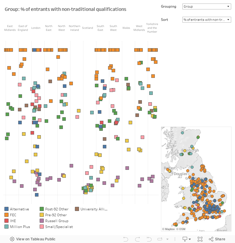
This single dimension view attempts to put all of this in another perspective, that of place. The main chart shows providers by NUTS3 region (that’s the English regions plus Wales, Scotland, and Northern Ireland). Mouse over a provider to see the location on the map at the bottom right, or some key facts above it. You can search for a provider using the highlighter box.
You can change the grouping (what the colour of the marks show) and sort (the y – vertical – axis values) using the drop downs.
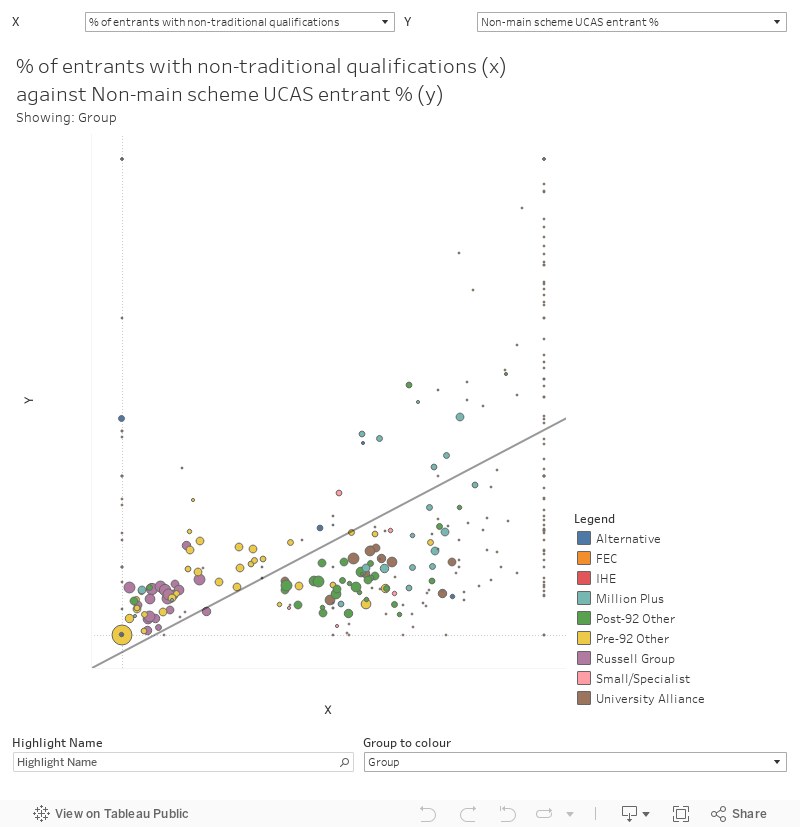
Double dimension
Seeing two values plotted as a scatter chart is a hugely powerful way to investigate the diversity of the sector – I’ve even included a basic linear trend line for those interested in correlations. There are two drop downs offering the same measures for each of the X and Y axis. Below the plot you’ll find the highlight box and a drop down to change what the colours represent. The size of the marks represents the total student headcount – mouse over a mark to see provider details (I’ve left null values in, these are plotted along each axis or at the origin where no data at all is available.
What next? – proposed groups
What I’ve come up with here is very much a starting point – I’m hoping that over the coming weeks and months responses to this, as articles and comments on Wonkhe, will help us get to something more consensual.
The groups (named after colours to avoid any suspicions of a qualitative hierarchy) are populated in the order shown below. If a provider is a group further up the list this takes precedence over lower groups – and as will become clear the splits are primarily based on the likely external pressures each provider will face.
I’m fully aware that this grouping will annoy nearly everyone, but please be assured that there is no implicit value judgement – providers in every group could and should be chosen to represent aspects of what is excellent about higher education in the UK and the world.
Orange and red
To start with I want to separate out providers without degree awarding powers, and split these further into FECs (Orange) and other small providers (Red). There is diversity within each of these groups, but these regulatory aspects – to me – define the group to a greater extent. A provider without DAPs is not similar to a provider with DAPs in terms of the choices it can make. Because I’m still proposing to keep the NUTS3 filter in most visualisations we can see the five providers without DAPs based outside of England separately as needed.
Though these are large groups (164 in Orange, 108 in Red), they tend not to feature in sector data much, so as used we will very rarely see all 272. And should any of these providers gain DAPs, they would be of a scale that would see them enter the Teal category.
Purple and maroon
Similarly, the remaining nine FECs (all in England) need to be seen as a separate group (Purple) facing separate regulatory pressures – with the Education and Skills Funding Agency as primary regulator. This is a smaller group than I would like to be using, but it is a unique one. The argument also applies for OfS Approved registered providers who are subject to a different set of OfS expectations – there are eight of these (Maroon) with DAPs, none of them are FECs.
Teal
And there are 29 (Teal) of the remaining providers that have less than 3000 students (headcount, all levels). Though these are not all specialist providers in the strictest sense, most have one or more clear subject focus. This gives us a new small/specialist category, and removes the troublingly vague alternative category entirely. Smaller providers can be more nimble in responding to external pressures, but their size also can act as a cap on ambition unless investment is available for growth.
I swore I wouldn’t do this, but I’ve also manually added three providers here – the London Interdisciplinary School (new, but likely to start small), London Business School (larger but entirely postgrad), and the University of London Institutes and Activities (larger but entirely online). LBS is a unique provider on many axes, so it is difficult to add to a group – it made more sense here with the majority of single subject specialist providers.
Yellow
On the other hand there are six providers with an annual income above £1bn according to HESA Finance Data – Oxford, Cambridge, Imperial, UCL, Manchester, Edinburgh – and to this list we can add KCL as a hair under the magic figure (or change the cut off figure to £950m) on the grounds it will probably get there next year. For all seven of these (Yellow) about a quarter or more of their income comes from research. It does feel like a very blunt cut to make, but the sheer scale of available finance bends reality around it.
Pink
There are 24 providers (Pink) where the proportion of all income derived from research is greater than 15 per cent, and the proportion of research-only contracted academic staff is greater than 20 per cent. The proportion of academic staff on “research only” contracts is also a decent indicator of the amount of research income a provider is receiving, as staff on research-only contracts tend to be linked to specific funded projects or research centres. Two postgraduate-focused providers (LSHTM and the Liverpool School of Tropical Medicine) are outliers here, similarly Cranfield also sits in this group but sits closer to the median.
Many providers have a research focus – the ones in this group reflect this in the volume of income generated and the number of dedicated staff this allows them to employ. Research here is a critical business pressure. You may suspect that certain kinds of research brings the money in – all of these providers have more than 30 per cent of all staff (academic and non-academic) employed in STEM subject cost centres, and less than 30 per cent employed in other academic cost centres. In terms of the policy weather, it would be changes to research funding policy and science that would most affect these providers
Green
Institutional finances, and investment in estates or capacity, provide for delicate and complex distinctions. Here we see sixteen providers (Green) are clearly in a transitional phase, with the proportion of their income spent on the cost of finance (interest, fees, etc) above 3.5 per cent and a proportion of expenditure to income greater than 90 per cent. I don’t see this as a permanent grouping – many providers can and do make large capital (supported by borrowing) or recurrent (seen as a negative balance) investments based on expected future income, and as these pay off the figures will drop. At this stage in their institutional journey, these are providers that would be hit hardest by funding cuts.
Blue
There is a cluster of 30 providers (Blue) who see 60 per cent or more of their undergraduate intake arrive with one or more “non-traditional” qualifications – usually a BTEC. This indicates that students are arriving through more diverse routes (often from and to vocational qualifications) and thus suggests that admissions is more complex than for providers who overwhelmingly accept applicants with just the “traditional” A levels, Highers, and International Baccalaureate. All but two of these providers take more than 95 per cent of their intake from state schools (the remaining three are well above 90 per cent), all but one get less than 5 per cent of their income from research. Tariff rates tend to be lower than average, but it is striking that these providers are not homogenous in their split between local, national, and international recruitment – and there is also significant variation in selectivity.
The unique pressure faced here is that admissions is very much a year round process, with an emphasis on outreach and serving non-traditional groups of students. All providers talk about civic responsibilities and “levelling up”, but if you are not among the traditional 18 year old cohorts that enter higher education it is providers like this that make it happen.
Copper and Mint
Selectivity – the proportion of applications that could be expected to result in an applicant being placed, splits our last two groups – with one contain those with a selectivity of less than 20 per cent (22 in Copper – where less than 1 in 5 applications would be expected to result in a placed student) and those with a selectivity of more than 20 per cent (34 in Mint). There is a decent correlation with recruitment activity outside of the UCAS main scheme, and a mild correlation with non-traditional qualifications – these tend to be higher for Mint, but the relationship is not so tight as to preclude a number of interesting outliers. There is no association with tariffs. And though there’s no statistical relationship -providers with more than 20 per cent of academic staff on research-only contracts are Copper rather than Mint.
Not every application involves a potential student that is right for a provider, but if you’re getting a lot of applications compared to the number of places you can sensibly offer it makes it easy to choose the right students. Otherwise there are other mitigations that need to be put in place – proactively looking for the right students via marketing or clearing activity, or offering foundation courses to get people to the place they need to be to benefit.
I’m less happy with this split than with others because selectivity is not a brilliant measure – there are market effects (and effects linked to other rankings and groupings) built into applicant behaviour. But until we let go of the idea that detailed provider-level data on offer-making behaviour is largely a commercially confidential resource, it is the best I can do.
What’s next – playing with the groupings
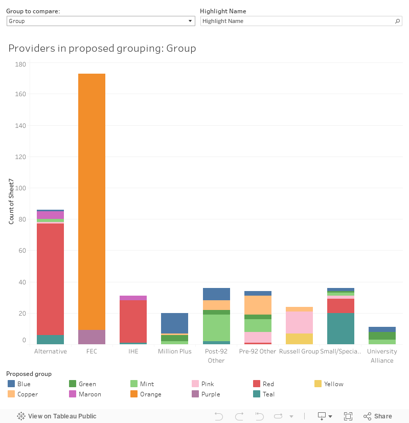
My first chart shows how these map to all the existing groupings. Select a group to compare on the top left and find your provider of interest in the bar charts using the highlighter.
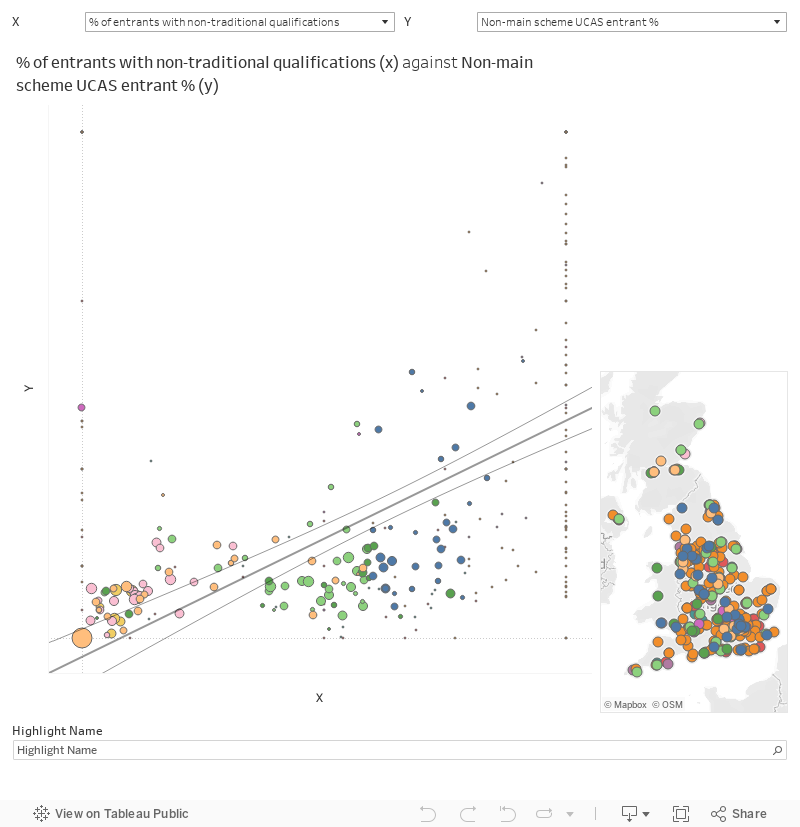
And here’s a version of the 2D chart from above, so you can see how these groupings work against continuous data. Choose your two axes using the boxes at the top, and there’s a highlighter at the bottom. Again, I’ve left the null values as zero so you can see all providers, and all the details are visible when you mouse over a data point.
What’s next – over to you!
There’s a lot here to take in – but if you take one thing only away from this piece I would like it to be that these colourful groups are not set in stone.
To that end – Wonkhe is opening a consultation on the next steps. Here’s how you can take part:
- Drop me an email – dk@wonkhe.com – to let me know what you think. This doesn’t have to be a detailed data-driven critique (although please do bring it on if that’s what you have!) – I’m interested in your thoughts on everything from the way I’ve handled individual providers to the names of the groups being rubbish.
- Pitch us an article – team@wonkhe.com – about university grouping. Maybe you think the whole thing is a waste of time and providers can never be grouped, maybe you have your own model you’d like to put to the public, maybe you’ve got experience of using existing groupings that you’d like to share. Or maybe you are one of many kind people who have commented on my work in preparing what I’ve presented above.
- Do something else. If you want to start a conversation on Twitter, please do (and copy me in). If you want to write something on your own blog please do, but drop me a line so I know about it.
I might give the occasional indication as to how opinion is moving on Twitter (@dkernohan) or as a Wonk Corner. But the consultation period will close at noon on 1 December 2021, I’ll do a full response in time for Christmas. Update: in the spirit of OfS and DfE I have delayed the response till the new year.
I’ll use these and the existing groupings in data visualisations before then, so don’t be surprised to see the colours turn up in other Wonkhe work.
Congratulations. This is an amazing contribution to a better understanding of the sector.
As you say, it has the potential for further analysis. One of the major differences between UK Universities and Universities in other countries is the geographic “hinterland” from which they draw students. Few other countries have such a high proportion of institutions which not only have a high percentage of students from overseas but also have the majority of their country students paying to live in local accommodation.
When many people are looking at the economic contribution of specific Universities to their immediate community and differences in performance of students who are home based versus those living away from home and those that stay local versus move away once they have graduated, (levelling up?) such information would be useful.
I can immediately see how useful this kind of categorisation would be. Particularly for helping some of my new-to-HE colleagues to start to understand the different universities that we talk about.
Though I do think that it should be possible to come up with group names that summarise what the group comprises (without TOO much bias). Talking in colours, or anything similarly abstracted, is just another barrier to those new-to-HE colleagues. Let’s make it a bit simpler for them in the final cut of this.
Really useful article and piece of work. Look forward to seeing the results. As a technology partner selling into the education sector, a better understanding of the sector like this is invaluable. Look forward to reading more and getting involved.
Very refreshing to see the diverse arts institutions disaggregated for once. Coming from a predominantly PG institution I note some the results are being mangled by the algorithms applied, and that could be revisited. I’d also be interested to know how ‘mobile’ individual HEIs turn out to be in terms of their groupings over time using these measures.
There is a lot to take in here and you have set out much of your thinking but there are some areas that could do with more explanation/justification. It may not make any differences to the composition of the groups/clusters but looking at the data dictionary why did you use a category (has medical school or nursing school) rather than use a continuous variable by splitting the proportions of students studying x subject by more than just STEM and BAHSS (i.e. have medical/health students as separate set from within STEM)? Also why lump all UG and PG students together and not split by full time/part time?
This great. The comparisons are fascinating. One point that you must have noted also. The Open University is an outlier on some plots to such an extent it compresses the view of the others
Thanks, this is fun to play with. It looks like the medical school indicator could use some manual manipulation – the top non-medical schools by %research income are the London School of Hygine and Tropical Medicine, the Institute of Cancer Research and the Liverpool School of Tropical Medicine, which are probably not listed by the GMC as they are (IIRC) postgraduate medical schools that don’t provide initial medical training. Queens University Belfast and Queen Mary University of London are also marked as not having medical schools, which would probably come as a shock to the folks at Barts!