

HESA’s “data spring” continues with never-before-public details of institutional finances. In the past this level of institutional data has been available to key contacts within institutions – and paying customers – but as a part of HESA’s open data programme we can see (and visualise) more than ever before.
As with other releases, I can only really scratch the surface in a short article. Continued changes to the shape and size of the UK HE sector make it difficult to make overall year on year comparisons – the most sensible way to consider the data is at an institutional level.
A peek under the bonnet
Here I’ve recycled some graphs I used last year to highlight changes in types of income and expenditure for large English providers – others will have less of a history and less complete data. I’d love to have gone back and added the full time series for all providers, but that will have to happen another time.
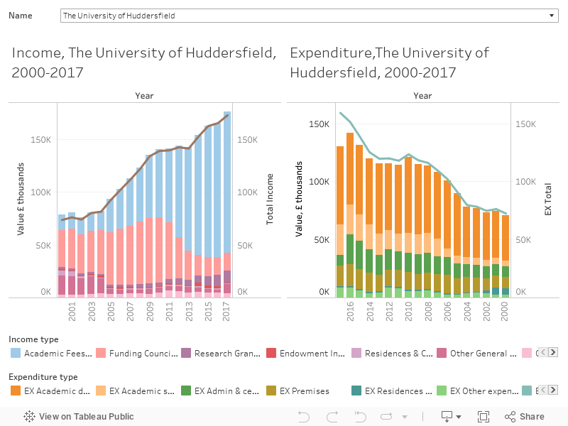
The graph is split into an income time series on the left and an expenditure series on the right, both moving towards the present day (or as near as we get, 2017-18 is the latest data available) at the centre. The total income or expenditure is a line – the stacked bars represent other kinds of income and expenditure, as labelled. The total height of the bar nearly meets the line most of the time – a function of my decision to show the top level reported figures from the largest or most interesting areas rather than aim for completeness.
This choice reflects the fact that, although we may believe that finance is simply a matter of counting the money as it goes in and comes out, the reality is a little more nuanced than that. Some income or spending may count in more than one category – other spending may count in none of the displayed categories.
The key and the secret
But this overview of the other data will likely be lost entirely behind the first publication of the Key Financial Indicators (presented as a three year time series). Finance directors have a number of calculations they like to use to determine the financial health of an institution within distinct parameters – HESA also perform these calculations, and offer a handy set of definitions. Here is a presentation of these raw indicators.
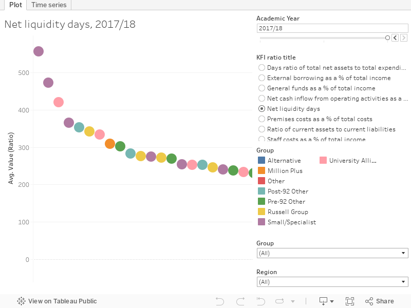
There’s two tabs here, one showing a chosen indicator on a plot comparing institutions along the x-axis, the other offering a list of providers and the value for the chosen indicator for each year, using colour to compare across the UK.
None of these calculations are a defacto indicator of financial problems, as each focuses on a different aspect. For example, an institution with large reserves (or savings) due to borrowing but low income when compared to expenditure would do well by some measures, and badly by others.
The number of days of net liquidity, for example is calculated thus:
(Investments) + (Cash and cash equivalents) – (Creditors: amounts falling due within one year: Bank overdrafts)
Divided by
(Total expenditure) -(Depreciation)
Multiplied by 365
It is a measure of the ability of a provider to manage its borrowing – it emphatically does not tell you how many days until a university has run out of money. Do read the HESA guidance linked above before getting concerned or worried about these measures.
Fun with composites
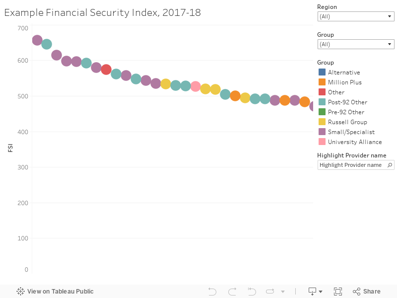
Several parts of the sector use a financial security index to help understand the financial standing of different institutions – this is a compound measure using rankings based on the indicators of a number of this on (or like) the KFI data released today. Based on recipes for this I’ve heard from a few sources I’ve pulled together my own as follows:
- the index score of the average of the last two years’ percentage ratios of unrestricted reserves to total income (ranked from low to high);
- the index score of the days ratio of general funds to total expenditure (ranked from low to high);
- the index score of the days ratio of total net assets to total expenditure (ranked from low to high);
- the index score of the percentage ratio of external borrowing (ranked from high to low).
There’s no magic to these choices, they just struck me as sensible ways to take a look across the whole gamut of short and long term measures. Though this is one assessment of comparative financial security among providers, it is not the only one or the most meaningful one for your purposes. It is a composite measure and should be used with caution – not least because the underlying measures and indicators above might not reflect the aspects of institutional finance that you are interested in. Fans of HEIDI plus may well be aware of a similar one that they may prefer.