There is a reason why there is a taxonomy for almost everything.
Groups and typologies help us build understanding and see patterns.
A few weeks back David Kernohan penned a piece explaining why we shouldn’t care about tariff groups. I disagreed with most of it, not because I think that the tariff groups are perfect or even the best solution to the problem they are trying to solve, but because groups like this represent a solution to an important problem – and they’re the one that currently has some traction.
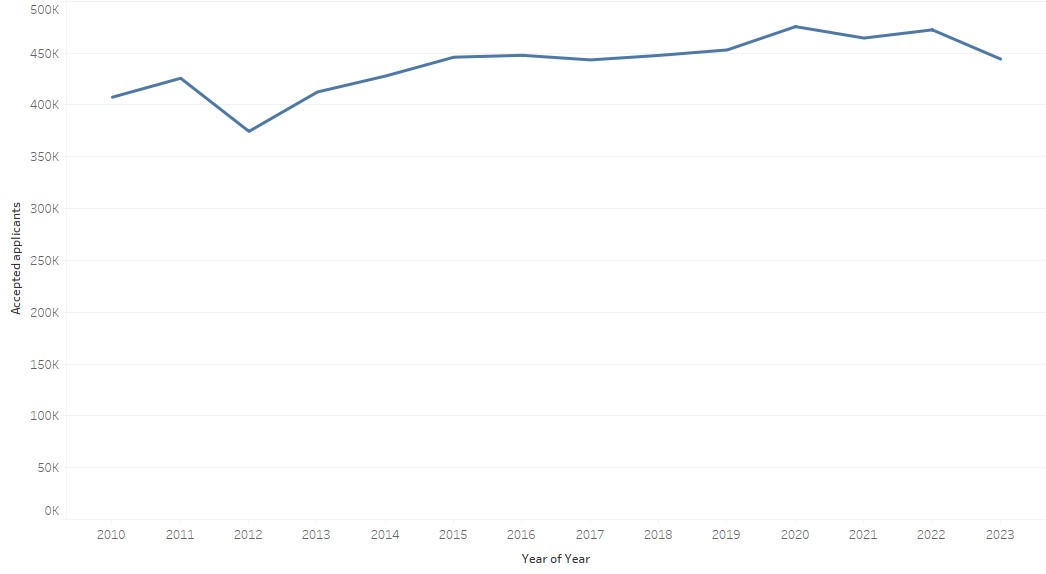
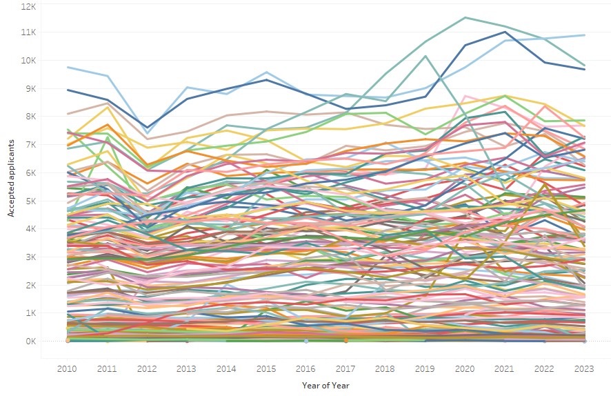
Let me give you an example: to my mind neither of the following charts (roughly based on UCAS data) really helps me understand what has really gone on with applicant acceptance to English providers last cycle:


We need groups
The first chart above is simply too high level to understand what is going on other than the sector has grown, the second is just noise.
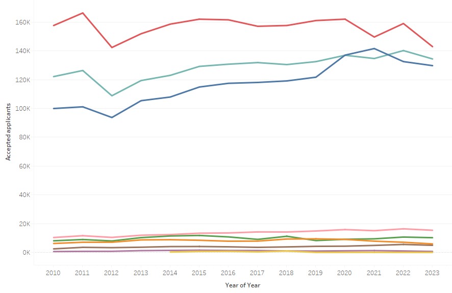
However, the following chart based on a rough mapping of OfS tariff groups to UCAS data does tell me something about how the English sector has responded to recent challenges and the differential impact. From the chart below we see that since 2012 the market share of the blue group (high-tariff) has markedly increased while the red group (low tariff) have dropped their market share and overall numbers. It’s also quite clear that in 2021 the modest dip in numbers was felt quite differently between the three large groups. We also see that the pink group (specialist arts) have also grown markedly.

Other attempts
So, if we accept my basic premise that having only two ways to view the sector either as one big blob or as individual providers is unsatisfactory, we inexorably reach the conclusion that there is value in the sector thinking about how we can create and maintain a set of groupings.
Of course in a sector with well over 400 diverse providers any grouping will have its fair share of rough edges with providers at one “edge” of a grouping having more in common with those at the “edge” of another group than at the other “edge” of its own group. This is unavoidable unless we define unique peer groups for each provider – an approach which has its place in institutional benchmarking, but doesn’t help understanding trends as we will have almost as many groups as providers.
We could argue that we don’t need to define more groups as we already have a plethora of mission groups but, as with any self-selecting grouping, it is far from perfect. Not everyone is in a group and the groups themselves lack objectivity, there are some research-intensive universities who are not in the Russell group and GuildHE and IHE compete in the small provider space.
David Kernohan also had a stab at this in the past, though this attempt never caught on. Partly because it never had buy-in from the start, but partly because people like me couldn’t remember who was in Teal and who was Blue or Green or whatever. More on that later.
When we were drafting the first OfS business plan I included developing a provider typology as I knew that to understand the system you need to break it down into a manageable number of broadly homogenous groups that will behave in similar ways to various external factors including regulatory changes. After a lot of thought and a fair amount of analysis we developed two typologies one student focused and the other finance focused. These typologies were actually pretty good but suffered from being developed by and for the OfS: so we couldn’t consider financial models, and of course they only applied to England.
Going back to first principles
I think the best place to start is to agree on a set of principles against which to judge any proposed grouping. These would definitely be principles not rules so will require some judgement in how they are applied and how tensions between them are dealt with. The principles we started with at OfS are not a bad place to start:
- Providers within the same group should be broadly homogeneous, that is to say that they will typically respond in a similar way to regulatory interventions or changes in the external environment.
- Groups are neither so small that the behaviour of one provider can dominate, or so large that the group loses homogeneity.
- It should be easy to describe groups with expert users intuitively knowing which group a particular provider would fall into.
The word “broadly” in the first principle is doing a lot of heavy lifting and is probably the area that will be debated most, although it is tempered by the second principle which requires groups to be of a decent size.
There are other more practical considerations that I would add. The classification needs to be relatively stable – it’s no good having a classification where large numbers of providers switch groups every year. Adding this consideration also removes the need to recalculate the classification every year as most providers will stay in broadly the same group: I see a classification that stays the same over 3-5 years as a real benefit.
I would also add an absolute limit on the number of groups: probably ten or fewer. If the average person can’t remember the groups or you can’t plot them all on a chart you’ve probably got too many for them to be useful. I recognise that with such a diverse sector ten is not that many but without a hard limit the tendency will be to keep creating more as you spot an awkward fit somewhere in the typology.
When we developed the final typology in OfS we didn’t use any fancy clustering techniques or modelling – not because we didn’t know how (I had some very clever people working for me) – but because for us this felt like a problem where expert judgement about where to draw the boundaries was better than any formal tests of clustering. This was especially important when considering our third principle as we had to be able to describe the groups, something that’s often hard when they are created by clustering algorithms.
My starter for 10
For me there are a number of attributes of providers that it’s important to consider when devising a typology for providers. These are:
- Business model or type (for profit, charity, FE college, and so on)
- Specialism, both subject and type of provision
- Research strength
- Selectivity or tariff
I think it is important to consider the business model of providers FE colleges will behave differently than providers whose main business is HE, and for profit providers will behave very differently to not for profit organisations. Specialists are another group that will behave differently to multi-faculty providers – only the latter can choose to either stop offering a subject or reduce its size in response to changes in the external environment.
Even having only considered the business model and specialism I am in danger of breaching my hard limit of ten groups and we still have to deal with research strength and selectivity.. Given the links between the two (research strength arguably drives reputation, reputation arguably drives selectivity) one of these has to go.
For me, and given that so much analysis focuses on students and recruitment, it’s unfortunately research strength that has to go by the wayside. While it would be tempting to leave out both selectivity and research strength as these are the only obviously hierarchical elements, the impact of reputation and the concomitant ability to select students rather than recruit them is so strong that leaving it out will lead to a grouping with much less value.
The groups I would use
Having considered these factors, I am left with the following nine groups leaving one spare:
- FE colleges (this could be split by size but I am running out of groups)
- Large for-profit providers
- Small and medium for-profit providers
- Specialist arts
- Specialist non-arts
- Predominantly postgraduate
- Multi-faculty highly selective/high tariff
- Multi-faculty moderate selectivity/ medium tariff
- Multi-faculty low selectivity/ low tariff
You will note that I have not defined any of my terms. I’ve not said what large means, I haven’t said how specialised you need to be to be a specialist, and I’ve offered no detail on how I will define selectivity or tariff. This is largely because there’s judgements to be made on these points and while I have views on, and could make, those judgments that process is better made by consensus or at least not by one person.
I have stuck to three groupings of multi-faculty providers – I could have gone for four, though I might be tempted to leave the tenth spot for franchise-only providers given how different they are.
You will also note that these groups are very similar to the OfS groupings – the main difference being to call out specific business models – as I said I think the OfS groups were actually pretty good.
I accept that providers themselves are not homogenous. For very large providers the levels of selectivity or research strength will vary massively between subject areas, so it might be reasonable to class one department or faculty as highly selective with others with either moderate or even low levels of selectivity. However, I don’t think this is a reason not to classify providers based on the average nature of the provider as that same averaging will happen with their behaviour.
So my view has not changed since we wrote the first OfS business plan. The sector is too broad to be considered as whole and too large to be considered one provider at a time so we need a sector accepted typology for providers. Whether that typology should include tariff or selectivity is a point we can debate, but I suspect one of these measures would make the cut.
Now, we just need someone to own it – and this is maybe a job for the sector’s designated data body.


There would also be sense in OfS and the DDB talking to DfE which, for more than ten years, has judged schools and colleges on the number of 18 year olds (“year after Key stage 5”) go to Russell Group universities and which still plans to measure entry rates into the top third by entry grades
https://amp.theguardian.com/education/2024/oct/26/dfe-to-stop-grading-english-schools-based-on-proportion-of-russell-group-students
I agree it was always anomalous government using the Russell Group in that way as while it’s a convenient shorthand for selective research intensive universities it’s not objective.
I am sure that Richard Puttock is right to say that partitioning the sector into reasonably similar groups helps to chart the impact of changes in regulation and competition. It also seems to me to remain important in influencing public debate and government policy. In 2006 we set up the Alliance of Non-Aligned Universities – which soon morphed into the University Alliance. We were mainly institutions with strong local links and with clear national and international missions across teaching, research and public engagement. Our motivation was that it was relatively easy for a minister to meet with group representatives (then… Read more »
I thought it was curious that the provider typology developed by the OfS included one group (High Tariff and QI over £200m and less than 70% of income) which exactly mirrored the Russell Group. This made me wonder if the methodology was developed to fit the answer…
Unless my memory fails it was pretty much coincidence
I agree with Richard’s points, but surely, how one defines the grouping depends entirely on the purpose for which you want to group them. I’m no KEF fan (particuarly as its shortcomings remain after four iterations), but the clusters go a long way to making it a useable and useful thing. And the KEF clusters (which did take a statistical clustering approach) seem to fulfil most of the desirable criteria – goldilocks number (not too many, not too few), rational and transparent basis, intuitive to experts, stable, meaningful to the problem at hand. And one doesn’t have to be beholden… Read more »
I agree that form must follow function which is why I would choose a student selectivity measure over research quality because the student arena is where I would expect it to be applied most often. The KEF clusters are fine although you need to decide how to name them in a memorable way and I don’t object to using some clustering analysis to test your approach but in the end I’d favour drawing the lines in nice easy to understand ways.
I agree that the cluster analysis should inform. Of course, rubbish variable in = nonsense clusters our. And ah yes, naming. It’s hard, as names = labels. For KEF clusters, we tried trees (inspired by HEFCE office meeting rooms), but they come with connotations – Mighty oaks etc. Clouds were no good either (some were higher than others), and animals have food chain issues. I think the best names are factual descriptions based on what drives their grouping (e.g. KEF cluster V: ‘large, research intensive, broad discipine base, generally including medical school’).
Outside of HE regulation, data analysts will typically partition across different variables (time based and otherwise) in a star schema to interrogate business critical issues. And yet, I can certainly see the aesthetic appeal of “one grouping/partitioning to rule them all.” The elephant in the room here is a recent guardian article flagging that 75% of HEIs are projected to be in the red next year. (72% according to the actual OfS report). David Kernohan has flagged elsewhere that HE finance data tends to arrive very late in the day (or rather the year). This suggests to me that seeking… Read more »