


Wonkhe recently threw down the gauntlet for attempts to make some sense of the incredible diversity present among higher education providers, and kicked things off themselves.
A passing glance at any of the dashboards on this site gives a clear motivation for why it’s helpful to categorise universities in this way: not even the most detail-orientated wonk would want to construct an individual narrative for over a hundred different institutions, and it seems almost too obvious to say that for a given university, some universities will appear more similar, and others more dissimilar. So, aside from quibbling about which exact metric set to use, what could possibly prove so challenging?
Alas, were it so simple!
I hope to give a flavour of the difficulties ahead, at least for universities, and why whenever possible it’s better to view universities as on a continuum rather than as groups or clusters. Whilst I hope to show that attempts to find meaningful, intuitive groups are likely quixotic, I recognise it is also sometimes necessary, and so offer a three-way grouping below.
Without further ado then, let’s dive into the methodology. To try and keep this accessible, I’ve omitted much of the technical detail. If you’d like to talk about the details do get in touch – I’ve only used publicly available data, and am happy to share my code.
I used a reasonably wide range of features to characterise universities drawing from HESA and the CUG’s league table. These were: Entry tariff; NSS scores; REF results; Grad Outcomes; Staff-student ratio; academic services expenditure; facilities expenditure; good honours; degree completion; number of undergrads; percentage of UG provision in STEM. (Data-wonks: all features were standardised with Z-scores before analysis).
My litmus test for each feature was, if two universities were similar in all respects except for the feature in question, would it make sense to say that there’s a significant difference between the two institutions? (This is obviously extremely subjective, so fingers crossed I’m a reasonable subject).
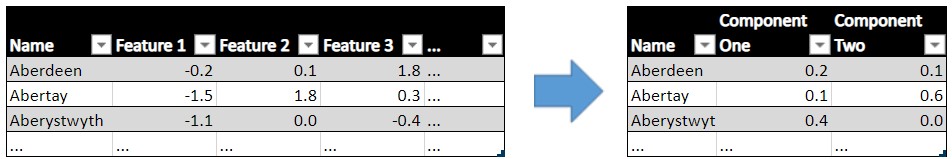
Super features
The first test I undertook is visualising the universities based on the first two principal components. Think of a principal component as a “super feature”, made up of the other features but which contains more information than any one feature. So, you’d have a better idea of how different two universities are by looking just the first principal component than you would for any individual feature. If you’re struggling to conceptualise this, the table below given an example.
I’ve plotted the first two principal components below. This is a great way of getting your head around how grouped a data set is, by using the highly sophisticated technique of plotting it, squinting a little, and relying on your gut instinct.
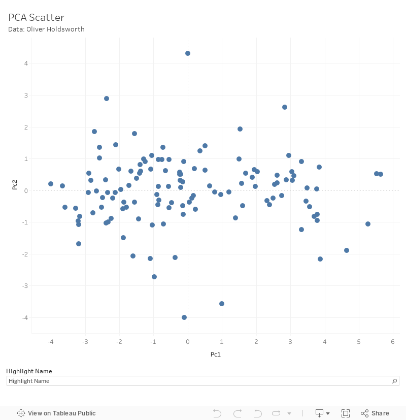
Whilst it might be reasonable to look at the above and say that some universities tend to be more specialised than others, I do not think it is particularly clear that there are any meaningful groups.
(As an Easter egg, the “same” chart (it was based on similar but not identical features) from 1986 actually has relatively clear clusters (Dolton and Makepeace, 1986), so I should revise my earlier claim – grouping universities is only hard if you don’t have a time machine).
Mutant algorithms
Of course, you may worry that simply looking at the two features in a scatter plot isn’t sufficiently rigorous. Fortunately, we can tighten things up by borrowing a clustering algorithm from the world of machine learning. (It may come as a surprise that human judgement is often still essential for machine learning projects, but I invite the reader to gamely ignore this and assume that this is simply beyond scrutiny).
I’ve used Gaussian Mixture Models (GMMs) to do this. I will spare you the (extremely interesting) details, but the idea is to work iteratively as follows:
- assume the data is made up of a one normal distribution
- estimate the parameters of this distribution (I.e. build a model)
- evaluate how “good” this model is
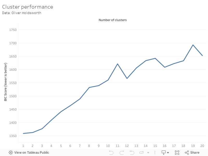
Steps 1-3 are then repeated with two normal distributions combined, then three and so on. Once you have done this for the largest possible number of normal distributions that could have created the data set (i.e. each university is the only instance of a normal distribution, so 126 normal distributions), you can then evaluate how good each model is. Models are evaluated using a Bayesian Information Criterion [BIC], in which a lower value is better.
The benefits of this approach are that they work well with a range of weirdly shaped clusters (which don’t necessarily have to be normally distributed, although it helps), and they work on data sets best described as a single cluster. This last point turns out to be key; the graph below shows how good each model is for each number of clusters. The result is that the data is best described using a single cluster.
Is it impossible?
The above uses what is, in my view, the best approach to finding clusters – boiling the features down to the first two or three principal components and using the GMM with the lowest BIC to identify this. However, I will note that my conclusion – that there are no clear groups – is remarkably resistant to methodological changes. If you use all of the features, other clustering algorithms, or other criteria to evaluate the best fit of clusters, you will never find a helpful grouping; the best model is invariably a single group, or such a large number of groups that grouping offers no benefit.
In short then, splitting up groups of universities is like splitting up a single-sex group of adults by their height. Certainly possible and sometimes necessary, but don’t expect the divides to be particularly meaningful. This doesn’t of course mean that providers are especially similar: Middlesex University and Oxford University are very different universities, just as a 5’ and 6’ are different heights.
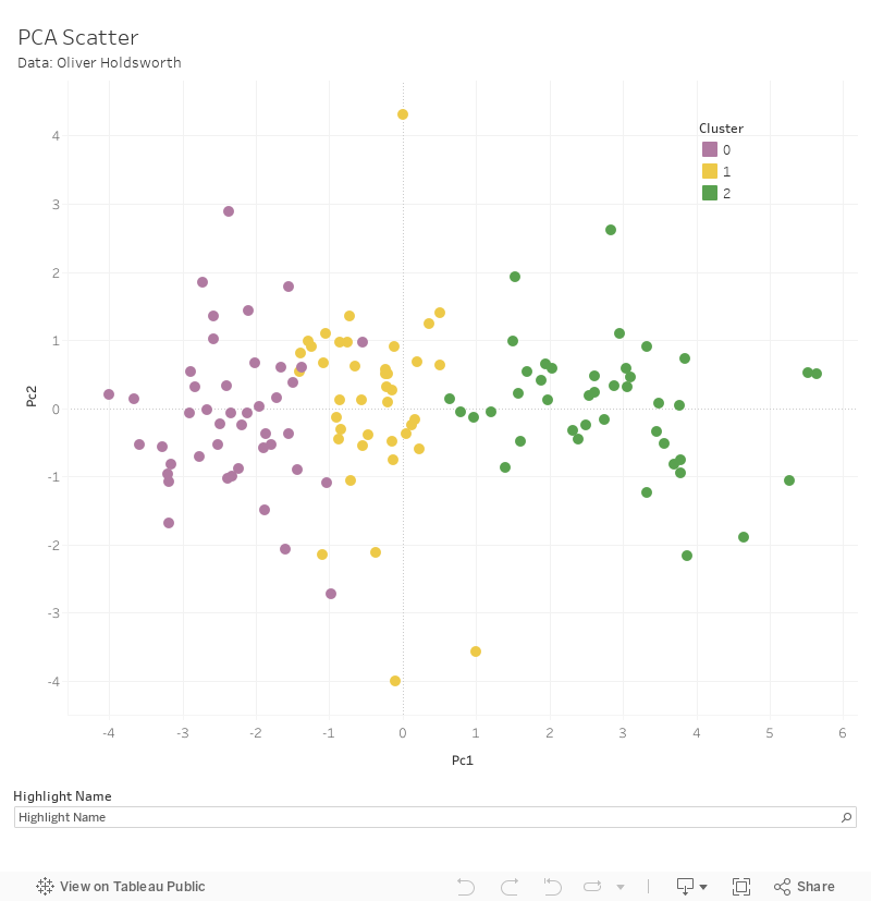
In spite of the above, if you have to split up the groups, I offer the promised division based on three clusters below, although you can use the same process for any number of clusters. The Russell Group institutions all share a category, but they share it with 18 other institutions, and universities are relatively evenly split among the groups. You can explore these results, and get a feel for the types of institutions within them, below. (I’ve used three principal components, but have only plotted two, which is why there’s a blob of purple in the middle of the yellow).
Let me finish by noting that universities’ resistance to being clustered is, in my view, a good thing: having clusters of universities implies gaps (or at least minimal provision) between the clusters, and however frustrating it is from a taxonomical standpoint, this variety can only contribute to the richness of UK Higher Education.
The groups
| Group 0 Smaller, low tariff, institutions 44 providers | Group 1 Somewhere in the middle 40 providers | Group 2 Larger, high tariff providers 42 providers |
|
|---|---|---|---|
| Paradigm example (PC1 median) | Northampton | Plymouth | Loughborough |
| Size | 11,172 | 19,502 | 23,059 |
| % STEM | 34% | 46% | 48% |
| Entry standards | 115.4 | 127.8 | 162.3 |
| Student satisfaction | 4.1 | 4.0 | 4.0 |
| Research quality | 2.3 | 2.7 | 3.1 |
| Research intensity | 0.2 | 0.4 | 0.8 |
| Graduate prospects | 69.6 | 75.6 | 82.6 |
| Student-staff ratio | 17.1 | 16.2 | 14.0 |
| Academic services spend | 1578.5 | 1680.3 | 1933.5 |
| Facilities spend | 622.9 | 687.8 | 760.9 |
| Good honours | 70.0 | 74.8 | 84.5 |
| Degree completion | 79.4 | 83.1 | 92.5 |


Great article, but think you final graph legend has groups 1&2 mixed up
That’s fixed now. Thanks for spotting.
So the conclusion is that universities have far more similarities than differences to make anything other than a single cluster be the best fit to the data. That could well be the case if all universities/He providers in the UK were considered not just the 126 included in this analysis but then again the features used ignore some elements of difference. For example using the entry tariff excludes The Open University while using number of undergrads has seemingly eliminated Cranfield University, to take but two example that are not so typical. So it would be good to see this rerun with features that can accommodate the full diversity of the sector to check if it is unhelpful to cluster universities/HE providers in the round as opposed to by selected features.
Thanks Andy – you’re right in that this has quite a narrow scope in that respect and I strongly suspect that if you looked at all OfS registered providers including non-universities, those not listed here may form a separate group/s. Nevertheless, we currently split the above providers into groups (RG, post-92 etc.) and I’m gently pushing back against how meaningful these are.
The trade-off for using fewer universities is getting to use granular data for each, and and so capturing more of the differences. It’s also unlikely that adding a handfull of universities (OU, Cranfield etc.) however anomalous would really introduce a new cluster, unless they were all very similar and could form a new cluster themselves.
I would also just note that it’s not about the absolute differences between universities per se, so much as how these differences are spread out – for example, if I took all of the features and either increased/decreased them by an order of magnitude, as long as I did it to all universities the results would be the same (despite the differences between them increasing/decreasing significantly). The point is that there’s a rough continuum, not groups.