


I don’t think I’ve ever seen a provider-level look at entry qualification types before – but as a way of thinking about the differing impact of the 2022 cycle on applicants it is quite fascinating.
It’s not a part of the formal equalities release – I’ll get there later in this piece – but it is notable how different providers cater to students from non-traditional backgrounds. Listening to the annual debates on university access (and the dark hints of “social engineering” that seem increasingly to run alongside them) you would think most people got to university with three good A levels – in fact, in many providers, those with A levels are in the minority.
How they get there
Of course, the bulk of recruitment for many traditional English and Welsh providers is from students with A levels. For those on the bleeding edge of subject specialism or reaching underserved groups the mix is much more varied – both BTECs and “other” qualifications tend to dominate, and we also see more A levels taken alongside other qualifications.
There are many, many, providers out there where students entering with A levels are in a minority – it is not safe to assume that A levels somehow constitute an “academic route” and that other qualifications are walled off away from higher education entry. In particular, mature students, and those entering outside of the UCAS main scheme, very rarely enter higher education with A levels.
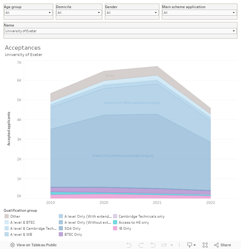
This chart shows acceptances by entry qualification type for a provider (you can also select “all” on the filter) over four years. You can filter by age, domicile (in the UK), gender, and application route. I’ve shown percentages alongside values in the tool tip.
Make me an offer
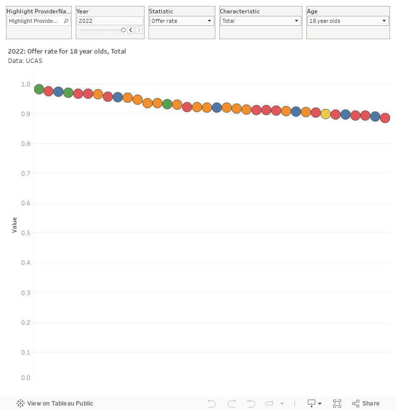
To start thinking about equalities in student recruitment, it is worthwhile starting with an idea of the proportion of offers made by each provider per application. Offer-making behaviour does not have a direct link to placed students – rather it represents a calculus of the likelihood of applicants to meet the terms of their offer and decide to attend that provider. It’s not, as you may assume, linked to “prestige” – many quite selective providers make a large number of offers.
Quite why UCAS doesn’t present offer-making alongside regular applications and acceptance data I am not sure. Here is the raw offer rate data – you’ll see some providers make an offer based on just about every application, whereas just 19 per cent of applicants to Oxford are made an offer. Most providers have a rate of above 70 per cent – note for instance York and Sheffield make an offer 83 per cent of the time.
How the other half live
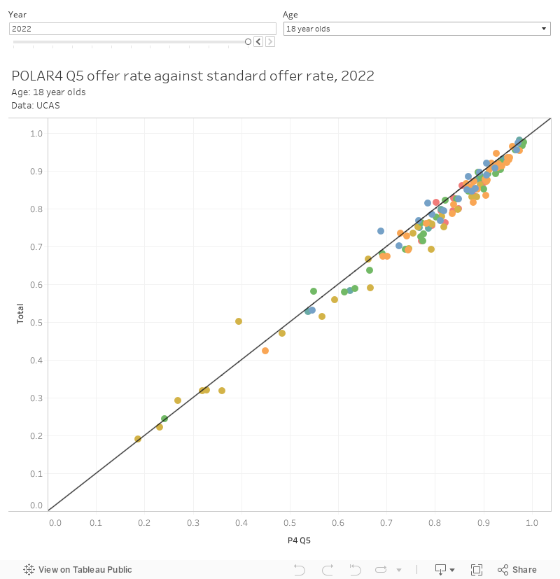
There’s been some media suggestions that advantaged students (here shown as 18 year olds from POLAR4 Quintile 5 backgrounds, which is technically students from areas that are most likely to send 18 year olds to higher education) have seen a difficult year in getting offers from their chosen university. Today’s release offers us the chance to check this out.
I’ve made a scatter plot with the offer rate for all applicants for each provider on one axis, and the offer rate for POLAR4 Quintile 5 applicants on the other. As you can see only a handful of providers are less likely than usual to make offers to more advantaged students: LSE, Durham, Strathclyde, Sunderland, and East London being the obvious standouts.
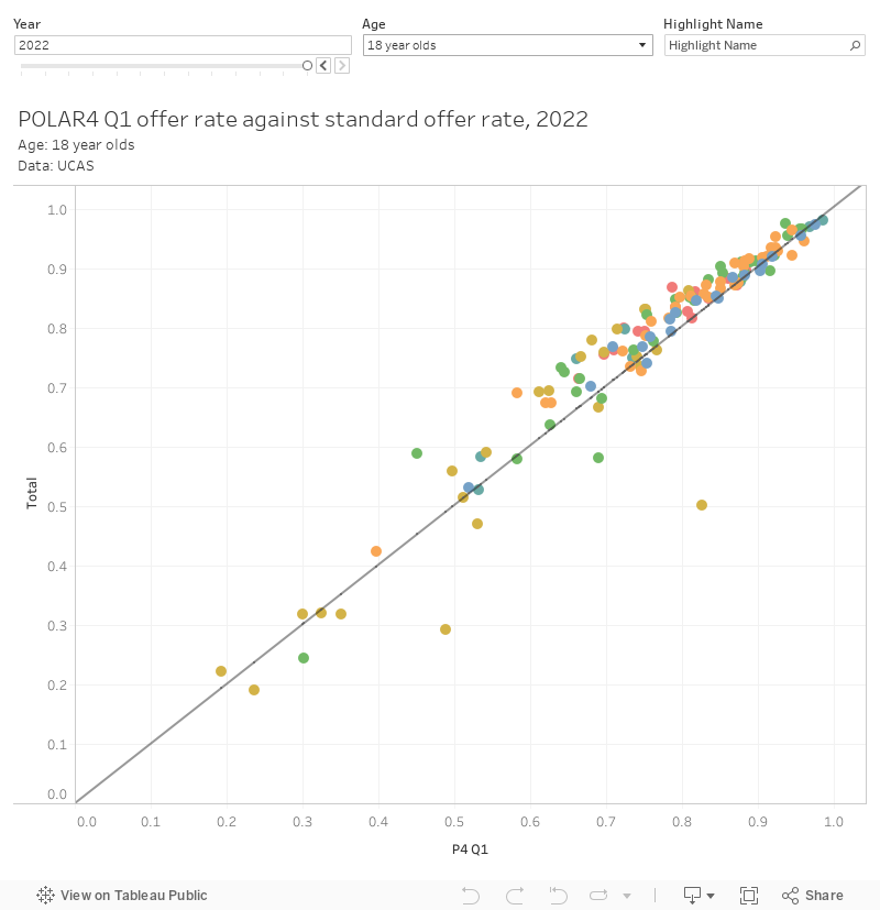
But what about the most disadvantaged students – in this case POLAR4 Quintile 1? Using a similar plot we can see far greater variation in institutional behaviour, and we can note that Oxford, St Andrews, LSE, King’s, Strathclyde, and Durham are clearly making particular efforts to recruit students from such backgrounds.
Ethnicity in recruitment
To look at offer-making behaviour as it relates to Black applicants I’ve used a percentage point difference between offer rates, in a similar way that the Office for Students has historically done. This presents a ranking rather than a scatter, and I also wanted to be clear that we really need to think about the ethnic mix of applicants when considering offer rates – a provider that recruits locally and is based in an area with fewer Black young people will see offer rates affected by a small number of decisions.
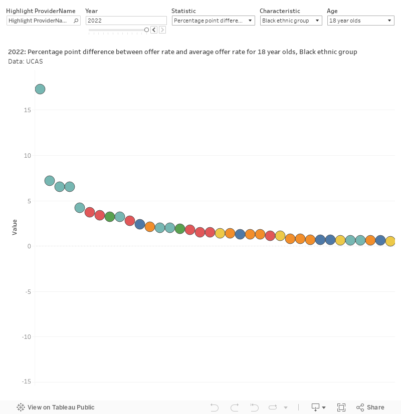
Even so, it is notable that both very selective and more inclusive providers struggle to reach offer rate parity between Black applicants and all applicants. I’m not seeing any pattern that would explain every data point here.
You can use this chart to explore other student characteristics via the filters at the top.
I can see that Polar and SIMD data is there, it would be great to see WIMD data too.
It would be! Alas, UCAS don’t release that data.