

Understanding the 2026 league tables
David Kernohan is Deputy Editor of Wonkhe
Tags
There’s no university league tables that actually matter in the grand scheme of things, but if you have to pay attention to them – perhaps because your vice chancellor insists on it – there’s only three worth bothering with: the Guardian University Guide (GUG), the Complete University Guide (CUG) and The Times’ venerable “good university guide” (Times).
There are many others that crop up from time to time, but the three big ones all turn up, for reasons beyond my understanding, in late September – just as most people have made and confirmed their applications for that year. And you could hear the dropping of marmalade spoons across the sector as The Times published a table this year which dared to show Oxbridge outside of the top three (joint fourth, behind LSE, St Andrews, and Durham).
This finding is, of course, contradicted by the usually more avant garde Guardian, which puts Oxford, St Andrews, and Cambridge in the top three. CUG, meanwhile, goes with Cambridge, Oxford and LSE. So what is the keen reader supposed to make of such confusion? Do we take the best of three?
There are defined rules for every kind of sport – and for sub genres within each sport. In NBA basketball (played in the US) you need to shoot for the basket within 14 seconds of your team having the ball, and you can commit six fouls before being sent off – in FIBA basketball (played in the rest of the world) you can commit five fouls, but have 24 seconds to shoot.
Different rules make for a different game – NBA rules make for a fast and physical game, FIBA is more tactical and has a greater emphasis on team play rather than individual skills. And in the same way, the differing requirements in university league tables make universities aiming for a rise in a particular table emphasise different things in the vast range of stuff that universities do.
Here’s a link to the methodology for each of the GUG, the CUG, and The Times. The information is clearest expressed as a diagram, illustrating the proportional weightings that underpin each league table:
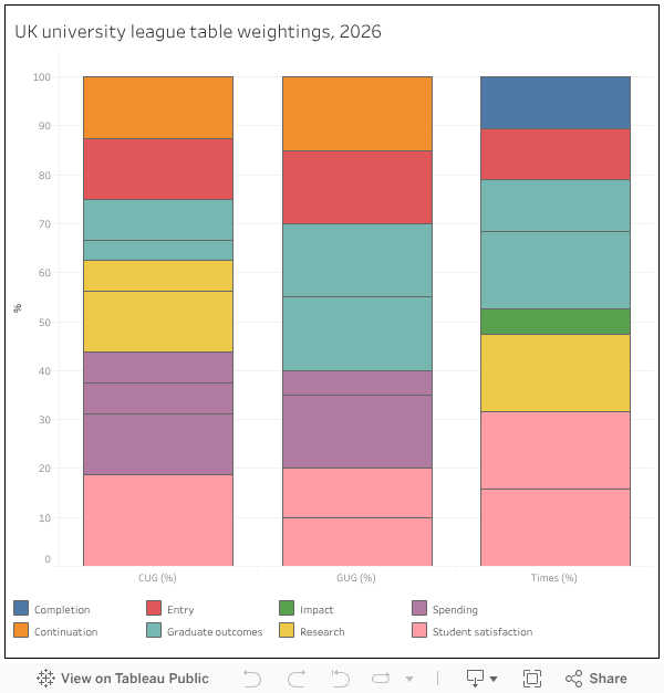
So you can see that institutional spending choices (including on the number of teaching-focused academics you employ to improve your student-staff ratio) have a big impact on CUG and GUG placings – indeed, a quarter of your overall score in CUG is decided in your finance office. In comparison The Times doesn’t pay any attention to spending at all – offering, perhaps, opportunities for less well-off universities to shine.
Conversely The Times and CUG devote considerable value to research performance (and in the case of CUG research intensity) – although research performance has no place in GUG, making it a ranking based on teaching performance.
The Times (in the “people and planet” category) is the only ranking to consider the wider external impact of university activity (covering a basket of metrics ranging from renewable energy use to policies on workers’ rights). The Guardian is the only table to take into account the background of students in considering their post-graduation activity (in the “value added” category), while The Times gives considerable (around a third of the total) weight to the opinions of students expressed via the NSS.
A senior level decision to chase a ranking improvement in a given table may drive strategic prioritisation. If you want to rise up The Times’ ranking you clearly need to focus on improving your NSS score, while it is also the only table to take account of the proportion of first class or upper second degrees you award. So there’s that.
For the reader or seeker after information, knowing what each table values and what it does not are the only way to assess whether a particular ranking is of any use to you – only a ranking that values what you value is worth worrying about. All of the tables allow you to sort by individual components rather than the overall score, which helps to an extent – and all offer subject area tables (at various levels of resolution) which are probably of more immediate use to the applicant.
The provider level tables are mainly a narrative device. They allow us to tell endlessly clickable stories about who is up and who is down, and also lend credibility to the tables by allowing for a ranking that broadly reflects a more general sense of the prestige (however you might define it) accorded to each provider. If you plunge into the subject tables you will find more that may surprise you. The only people that really care about individual placings are university senior managers and marketing teams.
Full disclosure: I’m on the Guardian University Guide steering group, which meets every few months to chat about what a nightmare sector data is. I don’t have any input into which university places where.
As you’re on the Guardian steering group, for the love of God please can you either get ‘value added’ removed, or get a methodology for this that is actually meaningful? It is *inconceivable* that – to pick a random subject – Accounting at Edge Hill has value added 4, but the same subject at Edinburgh has 8. The methodology is: “Each full-time student is given a probability of achieving a first or 2:1, based on the qualifications that they enter with or, if they have vague entry qualifications, the total percentage of good degrees expected for the student in their… Read more »
Surely league tables that give you points for the number of Firsts or 2.1 etc awarded, encourage grade inflation, with some senior managers giving messages to encourage some leniency in the marking.