

Plotting VC pay against OfS progression
David Kernohan is Deputy Editor of Wonkhe
Tags
If The Times is going to use a suspiciously Classic Dom sounding Department for Education source to float the idea of a new university league table for use in regulation, you know I’m going to build it as an interactive using public data.
On the vertical we have the basic salary of the head of provider, before sacrifice. This represents what you would assume would be the salary if you were applying the job (the headline figure if you will) – where there’s been multiple heads of the provider in a year you are looking at the total amount of salary paid to everyone that held the role.
On the horizontal is the OfS proportion for progression, from the most recent B3 indicator release. I’m looking at full time first degree progression only (for simplicity’s sake) – the measure reflects a “positive destination”, which is defined as:
the proportion of qualifiers from higher education qualifications who have been included on the Graduate Outcomes target list, responded to the survey, and reported that they have progressed to professional or managerial employment, further study, or other positive outcomes, 15 months after gaining their qualification
The size of the marks is the denominator for this progression measure (so the number of full time first degree graduates that responded to the graduate outcomes survey) – it’s a multi– year measure so don’t worry about the numbers, I’m more using it as a proxy for the size of the provider.
And for fun (as a throwback to a much-missed podcast segment) I’ve plotted r squared to show an (absence of) correlation.
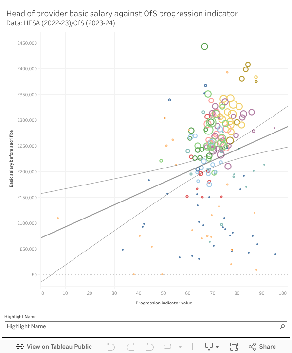
What are we seeing? Honestly nothing surprising. Larger and more established providers tend to pay vice chancellors more – and because of the backgrounds and social capital of the students they tend to recruit there are better progression numbers. Some very small providers may not have a full time head of provider (showing as much lower salaries) and there’s a couple of outliers – generally if a provider seems to be paying more than you might expect there have been multiple heads of institution during the period (the University of Wolverhampton had three, for instance).
All the old caveats apply – your head of institution’s pay package is a very small proportion of your university’s salary bill, there is not a massive pool of people that are both willing and able to run a UK university to a moderate degree of competence, and salaries are broadly comparable both internationally and cross-sector to other business of a comparable size and exposure to unpredictable market conditions.
Is this the golden bullet that will solve Bridget Phillipson’s university funding and quality concerns? Frankly, no – but it is an effective way to drive press coverage, as previous governments have been well aware.
Perhaps in the current climate a mapping of salary against ‘financial health’ of the institution would be an interesting view. Obviously the question of what constitutes financial health merits a longer discussion, but if we wanted public data (therefore assuming liquidity days isn’t possible) then a metric based on net surplus/deficit and liquid reserves would be a starting point?
I may have a delightful surprise for you towards the end of the week (though I don’t think we will learn much from it…)
Perhaps in return the government can publish a 100% transparent league table of exactly how much every MP makes in income from all sources so we can see if their wages and supplements offer value for money for the taxpayer.
Here you go, Joe.
https://www.parliament.uk/about/mps-and-lords/members/pay-mps/
Top work sir.