

Longer hours, higher bills – but don’t base your budget on this twaddle
Jim is an Associate Editor (SUs) at Wonkhe
Tags
The average student now works 46.39 hours per month, up from 18.3 hours per month in 2023.
That extra cash isn’t covering the shopping – household bills have increased by 358 per cent, costing students on average £157.78 per month, up from £34.48 per month in the previous academic year.
And the most common cuts made over the last academic year include online shopping (59 per cent), nights out (55 per cent), and more worryingly, number of meals eaten each day (38 per cent).
The cost of living crisis is not over, something must be done, etc etc. But when it comes to advice for students, I have a penchant for accuracy.
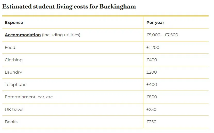
Today i News reports that a page titled “Estimated Living Costs” on the University of Buckingham’s website told students they could expect to spend £1,200 a year on food, £400 on clothing, £200 on laundry, and £800 on entertainment. But it found the website was giving the exact same figures in late 2014 – almost 10 years ago.
So if you’re not minded to believe university webpages, maybe national research would help. And I have to admit that from time to time, I’m all for a bit of drama in student cost of living stats.
But sometimes the numbers are so dramatic as to render them meaningless. Especially when the research they’re based on would make you look foolish the moment anyone pokes around in the powerpoint.
If you prefer stats and data
The NatWest Student Living Index is a widely reported bit of work that emerges at this time of year every year as a hook to promote its student bank account.
Going to university, says NatWest, is an exciting new chapter in your life. There are so many people to meet. And you might be living away from home for the first time. But it’s important not to lose sight of your finances as this adventure starts.
From budgeting, income and spending trends to mental health and battling fraud, the 2024 NatWest Student Living Index “has it covered”. It says its findings can offer “valuable insider knowledge” and help prepare students for life at university. “That way, you’ll know exactly what to expect.”
Some universities quote its figures as a source of accurate information on costs, or proudly trumpet its findings on a particular city:
If you prefer stats and data, you can use the Natwest Student Living Index. This is an annual report on how affordable cities are for students. In 2023, Natwest asked 3,052 students in 63 of the UK’s university cities about their income, and what they spend it on.
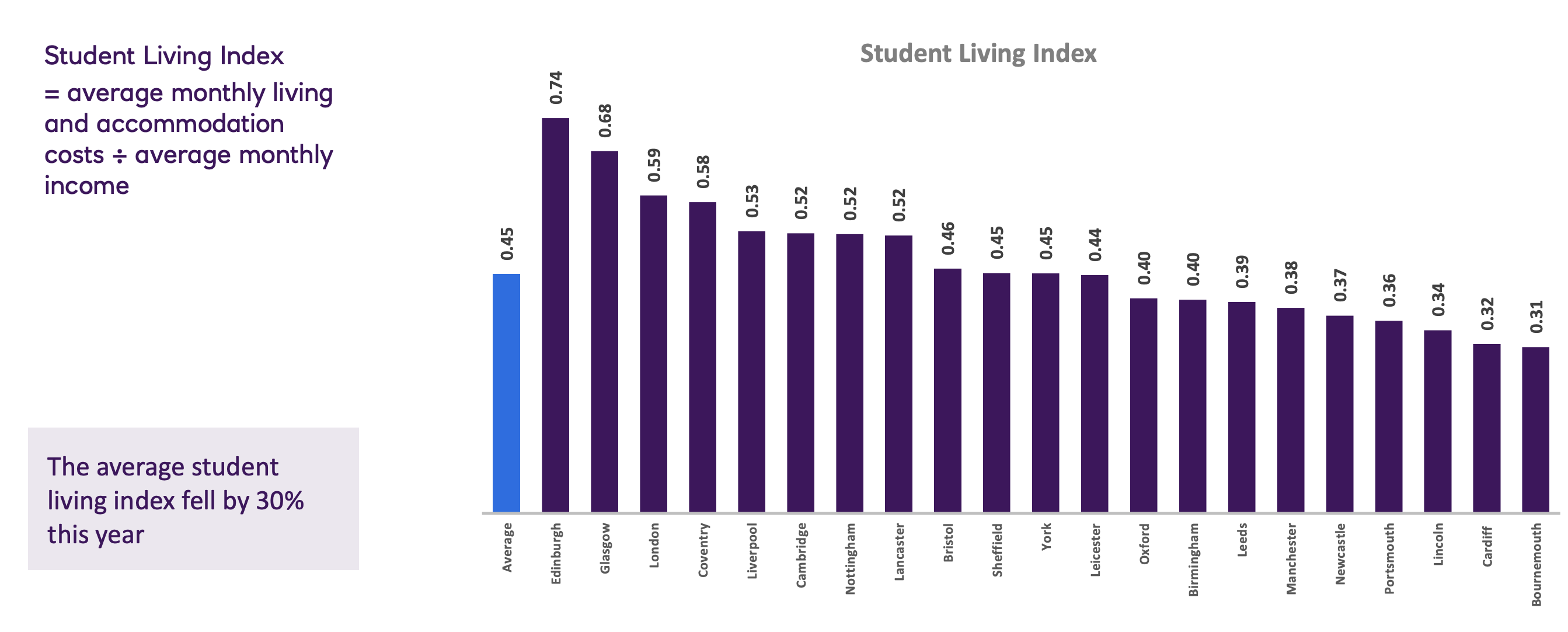
It’s [a] useful guide to what students around the UK are spending their money on, where they’re finding their income, and how they feel about their finances. Dividing a city’s average student spending by average student income gives you that city’s Student Living Index – a number that indicates how affordable it is to live there. In the 2023 report, we were ranked 4th in the UK.
The problem is that relying on its findings may not be entirely sensible.
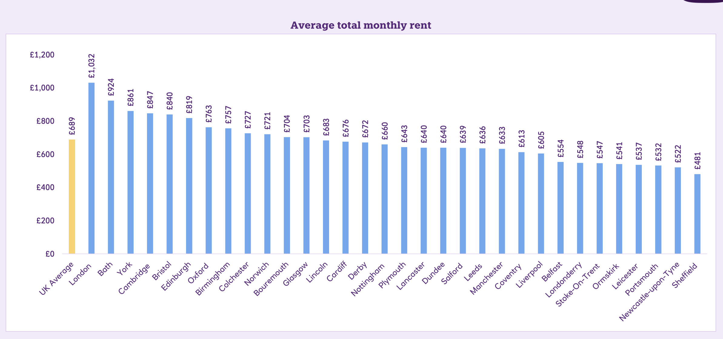
In 2021 this “valuable insider knowledge” told us that students in London were paying £9.10 a pint, in 2022 it suggested that student rents in Edinburgh had fallen to £200 a month, and last year we were expected to believe that the “price of a pint” had magically reduced by 50p in Oxford – but had increased by £1.47 in Cambridge!
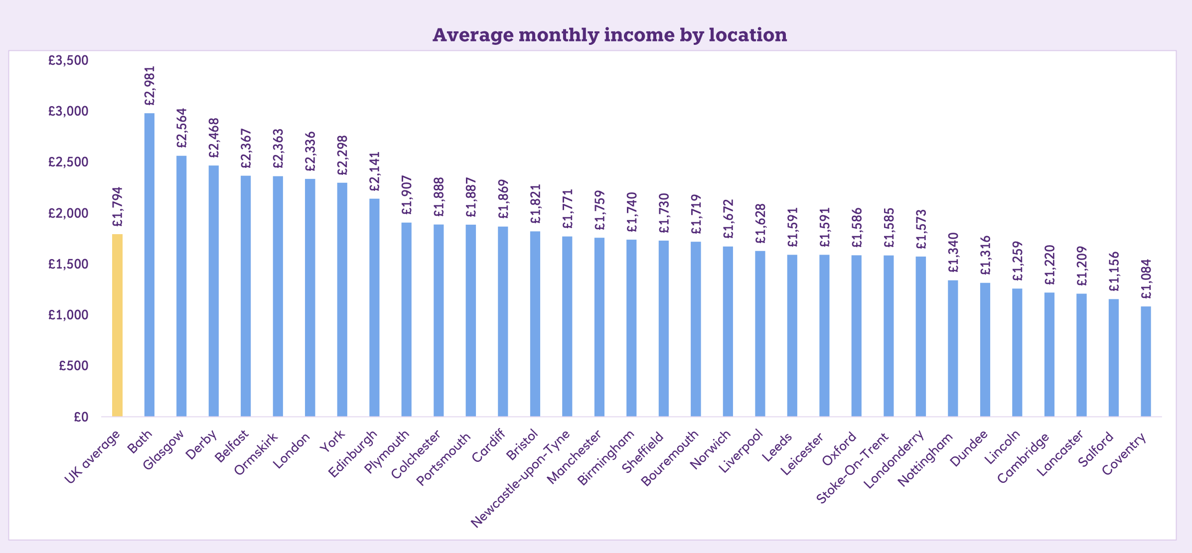
It also told us that contrary to popular belief (and pretty much every other data point available), students’ average income had somehow rocketed – from £1,805 a month to £2,893 a month.
The central conceit of the exercise is, for some reason, to take average monthly living and accommodation costs and then divide them by average monthly income – excluding the student loan. That then supposedly gives us a “Student Living Index” score for each university town and city.
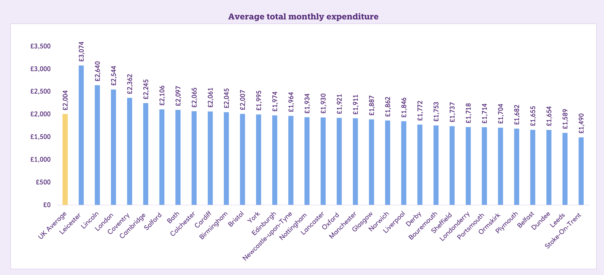
This year, Belfast, Bath and Derby take the podium places – all three of which will be thrilled, not least because the sample sizes are so low that last year none of those places appeared in the bar charts at all.
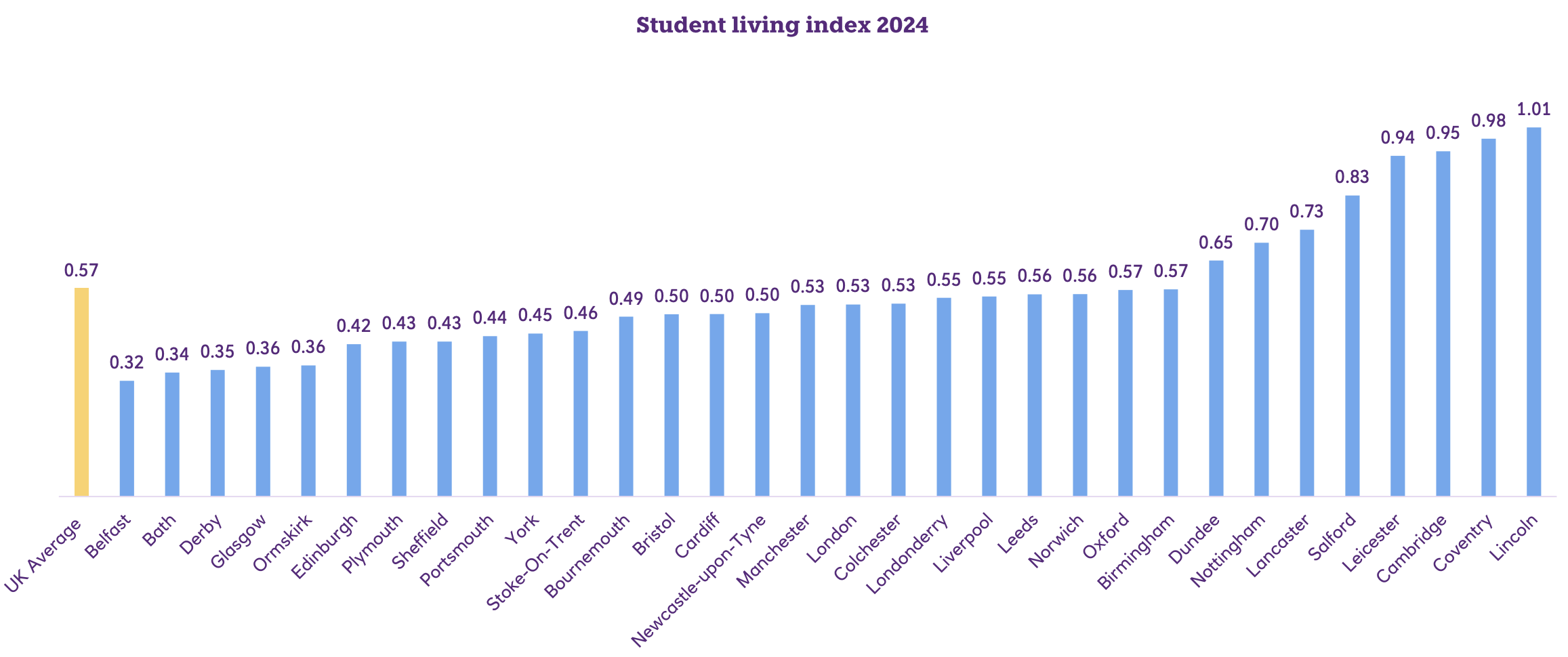
Lincoln, on the other hand, languishes at the bottom – which will come as a surprise given that last year, it was third from top.
This year we’re not told the sample sizes used to draw these conclusions, but to give you a sense, last year Bournemouth’s top spot was derived from a sample size of 52, unweighted for characteristics.
Cardiff – whose figures were used by the University of to brag about coming second – was based on a sample size of 49. They even put in a bar on the chart for Cambridge – its sample size was 35.
For the whole thing to make sense, you’d want to control for income when looking at expenditure and vice versa. But it doesn’t – so unless you drill down into the graphs, you might assume that as if by magic, the £2,363 in income a month that students are apparently pocketing in Ormskirk will trickle down into your wallet just by picking Edge Hill.
Chinny reckon
That central conceit – comparing incomes with expenditure, by city, on woefully small sample sizes that are unweighted even by domicile – also provides ridiculous year-on-year comparisons.
We’re expected to believe, for example, that average monthly student incomes in Coventry have fallen from £1,727 to £1,084 in a single year. Incomes in Lincoln have apparently fallen from £2,837 to £1,259 a month. Meanwhile in Glasgow, students last year had £1,600 a month spend, but this year have £2,564 a month. Trebles all round!
The figures are just as daft on the expenditure side. Last year outside of London, Bournemouth students (N=52) were supposedly spending £1,225 a month on rent and other outgoings – now up to £1,753. And DMU and the University of Leicester better get some cost of living initiatives cranked up – students in Leicester spent £3,074 a month this year, up from £912 a month last year. As if.
The big dilemma in exercises like this is whether you publish national stats – which should be more accurate given the sample size but less useful – or local stats that could help with budgeting but could paint a false picture.
We know from plenty of surveys that rents are up – but this exercise suggests they are up 16.5 per cent – which is just about the highest figure I’ve seen in any exercise this year. But the claim is rather undermined once you look at the location based results – last year’s cheapest city, Newcastle (N=97), saw an increase of 18.2 per cent year on year. We’re never told whether the comparison has been weighted such that we’re comparing Uni of and Northumbria, home and international or even those who actually pay rent v commuters. We can guess why.
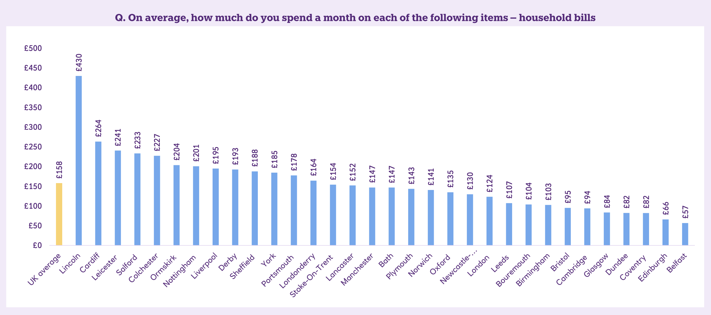
The problem is the way that students might rely on the information to make decisions. One bar chart tells us that Lincoln students spend £430 a month on bills – up from £60 last year. The weather’s often bad in Lincoln, but surely not that bad.
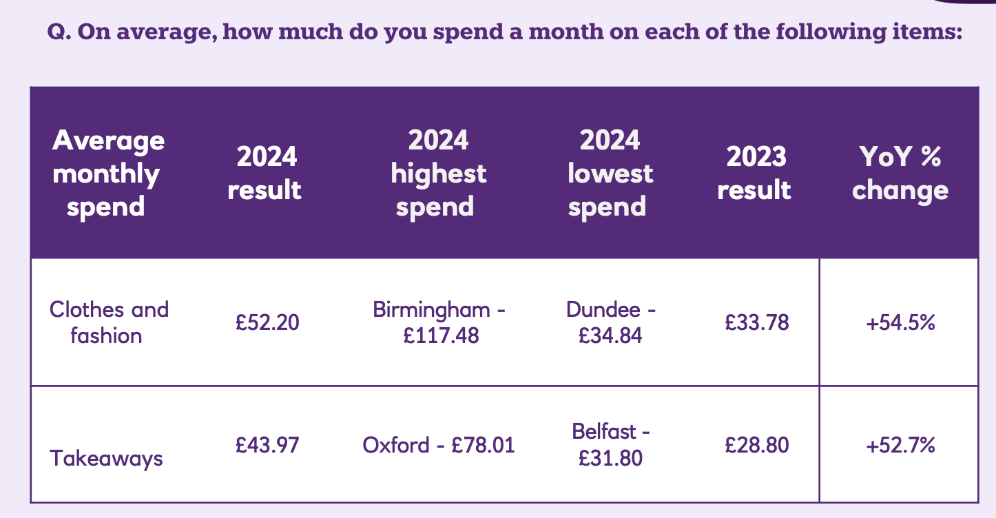
Another says that the famously fashionable students of Birmingham spend 125 per cent more on clothes and fashion than the average student. One chart tells us that an average supermarket shop in Edinburgh has gone from £110 to £153 – a conclusion reached last year on a sample of 79 students out of the circa 70k studying in the Scottish capital.
Not all of the numbers are useless. The YOY comparison might be unhelpful given the lack of weighting, but it is interesting that on a sample of 6,184 students, 30 per cent have never been to a nightclub and 21 per cent have never been to a pub. Nevertheless, 14 per cent rely on alcohol to manage their stress, and 24 per cent rely on friends – with implications for health education and belonging work as a result.
But some of the findings really are useless. What does “students are paying for rent using their student loan (67 per cent), parents (44 per cent) and own income (20 per cent)” even mean?
I’m not suggesting, of course, that Redbrick (the firm used to carry out the polling) have made anything up, or that the figures are anything other than an accurate reflection of the sample that it collected the information from. It’s the design of the exercise, the sample sizes used, the failure to weight and the drilling down by town and city that render the exercise meaningless.
Maybe the odd dodgy survey from a company trying to flog cardboard boxes or IT supplies to new students is OK. But this is a high street bank – whose figures may be relied up on prospective students to do their budgeting, and whose numbers will almost certainly put anyone off from studying in.
Students need much much better, nationally coordinated, accurate and up-to-date information on this sort of stuff – and surveys like this from bodies like banks really ought to be banned.
Indeed and I would argue that there are certain national organisations who similarly don’t properly check these statistics (I would argue that NUS’s statistics that 20% of all students have used a food bank in the last six months is similarly not validated). This either needs to be nationally coordinated (potentially through a certain regulator for students?) or can be locally driven through targeted work driven by a collaboration between SUs and the university; either way, it needs to be accurate, particularly if used within institutions for planning on financial support etc.
With my “I remember being a student” hat on, these numbers baffle me. How is a monthly income of £2,564 for students in Glasgow (for example) calculated? That’s more than I take home a month as a UTA! My mum gave me £300/month, which paid my accommodation and phone bill. I graduated in 2010 and then did a fully-funded PhD so paid my own rent until 2014 (approx. £280/month excl. bills). I lived off (bills, clothes, food, going out) about £300/month. Those were Yorkshire universities, but a very quick search shows properties for £370/month, or £455 with all bills. Obviously… Read more »
Small observation.
Misspelling of Bournemouth in the charts.