


The demographic crunch over the past few years has given a different flavour to data on widening participation.
In the past, the assumption has been that reaching underserved communities was a mechanism for recruitment growth, with a multi-year decrease in overall student numbers meaning that these “new” students may be helping institutions maintain their cohort size. Arguably, the social justice rationale for opening up higher education to disadvantaged groups is now bolstered by a much colder calculus of institutional survival.
The HESA Performance Indicator data for 2017-18 is more about proportions than raw numbers. The headline figures see England and the UK enjoy a 0.2 percentage point rise (from 11.4% to 11.6%) in young entrants to HE from low participation neighbourhoods. Wales remains static at 13.2%, and Northern Ireland grows to 7.1%, from 6.8% last year. There is no POLAR related data for Scotland – and recall that low-participation is defined as POLAR3 quintile 1 for this data, so a truly representative intake would be 20%.
There is also data on state school entry rates. In the UK and in England 89.8% of young full time first degree entrants attended state school, down 0.2 percentage points from last year. Scotland remains static at 86.5%, and Wales sees a rise of 0.6 percentage points to 91.7%. The data from Northern Ireland is not relevant here, as all schools are classified as state schools.
To put this latter paragraph in context, the Independent Schools Commission estimates that around 14% of 16 year old pupils attended an independent school.
One widening participation marker that is rarely discussed concerns the participation rate of students with disabilities. 6.6% of UK-domiciled full-time first degree students are in receipt of the Disabled Students’ Allowance in 2017-18 – the same as last year. The figure has fallen in Wales (7.9%, from 8.4%) and Northern Ireland (5.4%, from 5.6%). Both England and Scotland remain static at 6.8% and 4.6% respectively.
This being a UKPI release, there is benchmarked data for institutional figures – though again there are, of course, no benchmarks or data provided against the POLAR measure for Scotland. There are some fancy location benchmarks available for English providers; for consistency I’ve used the main benchmarks, which give me a comparable series across the UK.
I have three plots for your exploratory pleasure, each of which looks across the three measures discussed by institution and mission group: POLAR3 quartile 1 (low participation neighbourhoods), the state school marker, and students in receipt of disabled student allowances. All of these are for full-time, first degree entrants domiciled in the UK.
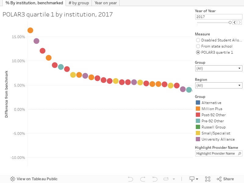
Tab one shows the percentage point difference between the benchmark by institution, with the colours showing mission groups. You can chose the year and measure you are interested in, and filter by group and region. You’ll see that in general post-92 institutions perform better than pre-92s in each of these measures – a historic connection with the local area and commitment to improving access to higher education would still seem to be playing a part. You’ll notice the state school measure is slightly different – recall the differences in data and demographics for Scotland and Northern Ireland.
Tab two looks at volume and mission group, but as usual you can use the highlight field to find a particular institution. The post-92 groupings on the left offer by far the greatest volume of access against each of the three measures.
Tab three shows year on year trends in the percentage point difference from the benchmark by institution. It’s a messy chart, so use the highlighter and the region and group filters to get a better sense of what is happening. There is something fascinating going on in the POLAR measure for London institutions: for 2017-18 only one institution is above the benchmark (and it might not be the one you would expect) while many other institutions have seen performance worsen against their benchmark. The comparison with the north of England is quite something.


Patterns of participation are different in London, but surely the main issue there is just that you aren’t using the location-adjusted benchmark? That will obviously mean that institutions which recruit mainly in London look worse than institutions like the LSE and Courtauld which happen to be based in London but recruit nationally?