I’ll admit that the Neil O’Brien-powered analysis of graduate repayments in The Times recently annoyed me a little.
There’s nothing worse than somebody attempting to answer a fascinating question with inappropriate data (and if you want to read how bad it is I did a quick piece at the time). But it occurred to me that there is a way to address the issue of whether graduate repayments of student loans do see meaningful differences by provider, and think about what may be causing this phenomenon.
What I present here is the kind of thing that you could probably refine a little if you were, say, shadow education minister and had access to some numerate researchers to support you. I want to be clear up top is that, with public data and a cavalier use of averages and medians, this can only be described as indicative and should be used appropriately and with care (yes, this means you Neil).
My findings
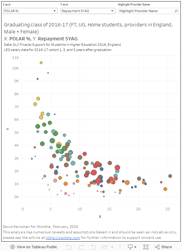
There is a difference in full time undergraduate loan repayment rates over the first five years after graduation by provider in England when you look at the cohort that graduated in 2016-17 (the most recent cohort for which public data over five years is available).
This has a notable and visible relationship with the proportion of former students in that cohort from POLAR4 quintile 1 (from areas in the lowest 20 per cent of areas).
Though it is not possible to draw a direct conclusion, it appears that subject of study and gender will also have an impact on repayments.
There is also a relationship between the average amount borrowed per student and the proportion of the cohort at a provider from POLAR4 Q1.
The combination of higher average borrowing and lower average earnings makes remaining loan balances (before interest) after five years look worse in providers with a higher proportion of students from disadvantaged backgrounds..
On the face of it, these are not new findings. We know that pre-application background has an impact on post-graduation success – it is a phenomenon that has been documented numerous times, and the main basis for complaints about the use of progression data as a proxy for the quality of education available at a provider. Likewise, we know that salary differences by gender and by industry (which has a close but not direct link to subject of study).
Methodology
The Longitudinal Educational Outcomes dataset currently offers a choice of three cohorts where median salaries are available one, three, and five years after graduation. I’ve chosen to look at the most recent available cohort, which graduated in 2016-17.
Thinking about the five years between graduation and the last available data point, I’ve assumed that median salaries for year 2 are the same as year 1, and that salaries for year 4 are the same as year 3. I can then take 9 per cent of earnings above the relevant threshold as the average repayment – taking two year ones, two year threes, and a year five gives me an average total repayment over five years.
The relevant threshold is whatever the Department for Education says was the repayment threshold for Plan 1 (all these loans would have been linked to to Plan 1 repayments) for the year in question.
How much do students borrow? There is a variation by provider – here we turn to the Student Loans Company 2016 cycle release of Support for Students in Higher Education (England). This provides details of all the full time undergraduate fee and maintenance loans provided to students that year by provider – we can divide the total value of loans by the total number of students to get the average loan amount per student. There’s two problems with this – I want to look at a single cohort, and this gives me an average for all students at the provider that year. In the interests of speed I’ve just multiplied this average by three (for a three year full time undergraduate course) and assumed the year of study differentials net out somehow. It’s not ideal, but there’s not really another straightforward way of doing it.
We’ve not plotted all of the available data – the focus is on English providers, specifically English higher education institutions (filtering out smaller providers where averages are less reliably). And we don’t show the University of Plymouth (yet), there is a problem with the SLC data somewhere.
Data
This first visualisation gives you a choice of X and Y axis as follows:
- POLAR % – the proportion of students in the cohort from POLAR4 Q1
- Three year borrowing – the average total borrowing per student, assuming a three year course
- Repayment 5YAG – the average total amount repaid, five years after graduation
- Balance 5YAG – the average amount borrowed minus the average total repayments over five years
You can highlight providers of interest using the highlighter box – the size of the blobs represents the size of the cohort.
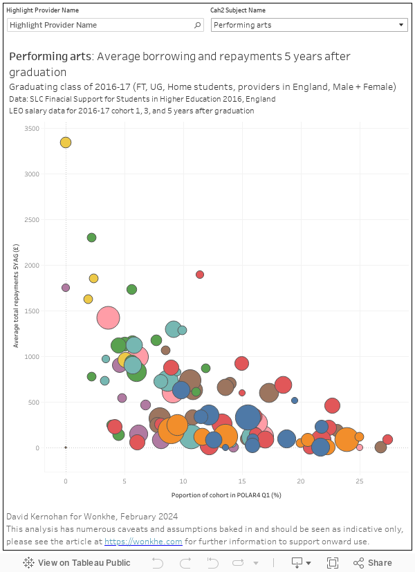
Of course, we don’t get data on student borrowing by provider and subject – but we can still calculate repayments on that basis. Here’s a look at average repayments over five years by CAH2 subject (box on the top right to choose) – I’ve plotted against the proportion of the cohort from POLAR4 Q1 because that curve is impressively persistent.
For all of the reasons – and short cuts! – above I want to emphasise again that this is indicative data – there are loads of assumptions here. I’m comfortable with this analysis being used to talk about general trends, but you should not use this for any form of regulation or parliamentary question.
The question it prompts, for me, is whether it is fair to assume that providers with a bigger proportion of non-traditional students will be less effective at teaching. Graduate outcome measures may offer some clues, but there are a lot of caveats to any analysis that relies solely on that aspect.