


However little money you feel the sector has, it actually has less.
The annual release of Transparent Approach to Costing (TRAC) data is easily the most dispiriting event in the sector’s calendar.
We learn that for 2022-23 the aggregate sector deficit stands at £2,767m – up from £1,926m in the previous year. The sector is particularly bad at covering the costs of what it does from the income it gets – just 93.7 per cent of what the sector spends is matched by income.
Coming as it does during an election campaign, one could imagine a world where the perilous precarious state of our skills and innovation infrastructure would be a national scandal, and a decisive intervention by a politician could shift public opinion. That isn’t this world, but the need remains.
And the first part of that need is the need for a comparable basis of understanding what is going on – and where.
What’s a TRAC?
If you’ve heard the word TRAC at all, you probably associate it with workload allocation. If that’s your starting point – have a read of our explainer on that topic and then head back. In layperson’s terms TRAC takes the money spent on doing university-type “stuff” (say teaching, or research) and compares it in a consistent way with the amount of income related to doing that stuff. On some levels that is easy – a research grant, you would think, might best be compared with the work done within that project, plus overheads. For more complicated activity, like teaching home undergraduates, we get into the wilds of cost codes and workload allocation. Again, plus overheads and contingencies – which are all nightmarish to calculate.
TRAC is a way through this mess. It may not be the only way through, but it is a commonly agreed one, which is why OfS can use it to compare groups of providers. In fact, the regulator can use it to compare individual providers – but we never see that published, so the venerable TRAC groups exist. Click the link to see where your institution sits, but in essence:
- Group A: Institutions with a medical school that get 20 per cent or more of their total income from research (pretty much the Russell Group)
- Group B: Other institutions with research income constituting 15 per cent or more of all income (largely the big, research intensive, traditional universities, outside of the Russell Group.
- Group C: Research income between 5 and 15 per cent of all income (larger and research focused post-92 providers with some pre-92s mixed in)
- Group D: Research income less than 5 per cent of a total income greater than £150m (Other big post-92 providers)
- Group E: Research income less than 5 per cent of a total income less than £150m (the rest of the traditional universities, plus specialist providers)
- Group F: Specialist music and arts institutions (as you might expect)
A total of 160 providers are grouped – for 2022-23 aggregate data is based on 128 providers in England and Northern Ireland, with a total of 150 dealt with in the UK wide Annex B figures. One provider in England couldn’t submit signed off data in time, a further fiver submitted data that was not suitable for inclusion in the analysis. Two rest-of-UK providers were excluded in a similar way, and a further two didn’t submit data by the deadline.
And back to those allocation surveys and workload planning models – requirements were relaxed during Covid restrictions, so 26 providers struggled enough with this to submit an action plan alongside their data. Of these, workload modelling was not TRAC compliant in 10, 5 hadn’t run surveys in the past three years, two hadn’t updated (estates) space data or weighting in the last three year, three had TRAC oversight groups that didn’t do enough overseeing, and four had not bothered reporting on TRAC compliance to a committee of the governing bodies. Given this is the only data we have on how much higher education teaching and research costs to deliver, this could fairly be described as a bit of a worry.
Comparisons
Why are costs rising and incomes staying stagnant? Well – it will come as no surprise to Wonkhe readers that the cost of doing business has been going up steadily for a couple of years (everything from staff wages and pensions, to materials, to the costs of finance: those high interest rates in action). Meanwhile, there’s been no attempt to increase regulated fees or other teaching income, no attempt to improve the low cost recovery on research contracts (from the research councils in particular), and the changes to society wrought during the pandemic mean that other income-generating activities (catering, accommodation, conferencing) are not actually generating income. The only positive cashflow news is on non-regulated fees (international, postgraduate) and investment income (if you’ve got money to invest – and very few providers are – you can get some decent on paper returns: though good luck getting your cash out).
What TRAC shows us is that there is a difference in the way this hits different types of provider. Larger, more teaching intensive, providers are doing marginally better with publicly funded teaching (though nobody is making any money out of it). However, teaching costs make up a much larger proportion of total costs for these providers – economies of scale may be working up to a point, but if a larger proportion of your total costs are not recouping you may have problems.
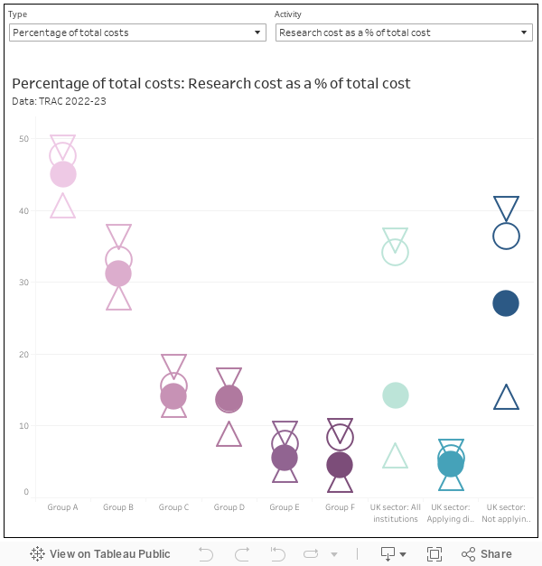
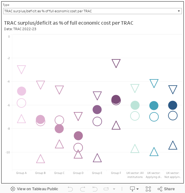
With all of these charts the upper quartile, lower quartile, and median values for the group are shown as outline shapes, while the arithmetic mean (or a weighted mean for proportions) is a filled circle. You get the six groups (purple) alongside values for the UK sector as a whole, UK sector providers where dispensation from complying with TRAC requirements applies, and UK sector providers without this dispensation (these latter three are shades of teal)
Likewise, economies of scale may be one reason why groups A and B are doing better at recouping the costs of research – though again this represents a larger proportion of costs.
We can dig into research a bit deeper with additional data:
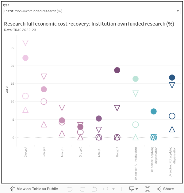
Again, though no part of the sector sees the full economic costs of research covered from any source, you can see that traditionally research intensive providers in groups A and B from government sources, providers in group C may have some advantage with industry and charity research. Nearly nobody returns any income worth speaking of from research funded from within the provider – only groups A, B, and F (specialist music and arts providers) manage to return even 10 per cent of costs, though this skews the sector average up.
We also get a handful of tables looking at more traditional financial measures. Of particular interest is the TRAC-calculated surplus (or deficit) as a proportion of TRAC-calculated full economic costs. Providers in groups C and D do particularly badly here – pensions costs will almost certainly be playing a part.
Of glancing interest to those who remember the debates around costings in the Augar report is a small change to sustainability adjustment (a close cousin of the “margin for sustainability or investment”). This now sits at 8.5 per cent of full economic costs, down from 9.2 per cent last year (this is calculated using a six year average). The change may reflect increasing spending (both current and forecast) along with an assessment of individual provider recruitment, income generation, and spending plans.
Interpretation
Unlike the main OfS financial monitoring publication the narrative that comes alongside the figures is purely descriptive – there’s a bit of a reach into interpreting the figures we do see from more complete figures (that we don’t), but there is a surprising reticence to look at more detailed trends in sector finances in the light of the issues we know the sector is facing.
It is a shame, then, that this is the only look at these figures we get. I’ve argued before that the absence of provider level TRAC data doesn’t stop people using other, cruder, approaches to compare the cost and financial performance of providers – often to the direct detriment of our understanding of the sector. It scares finance departments and TRAC specialists, but TRAC needs to (at least partially) become an open dataset in the interests of improving the national discussion (and thus proposed policy solutions) to the growing financial crisis the sector is facing.
Say “provider efficiencies” and it is often seen as two dirty words: a prelude to “right-sizing” or your other favourite euphemism for job losses and worsening conditions. But improving the (internationally outlying) cost base of the higher education sector will be a key part of what any new government will need to do – the availability of open, agreed, data, will help it become a collaborative exercise rather than another exercise in a kind of trust that is in short supply between senior leaders and workers.


If the £3.7bn sector created sustainability adjustment was removed this would be useful and insightful data. It would also tell a very different story.
The sustainability adjustment (a HM Treasury standard applied in remarkably similar ways across the whole public sector) actually fell proportionally this year. If removed we would have data on what would be required to run the sector in 2022-23, should that academic year happen again endlessly on a Groundhog Day-style loop. I would argue that such data would neither be useful nor especially insightful.
Can you evidence where this type of adjustment is applied elsewhere in the public sector? E.g Schools or NHS? Genuinely interested.