


Exciting news reaches middle England – the Daily Mail has entered the university league table business!
Naturally, it measures universities differently to other rankings. The headline twist here is that its method is “highly topical”, apparently prioritising “the key issues and concerns for students and their families”.
There’s even a set of whizzy sliders that allow prospective students and their helicopter parents and grandparents to alter the weightings afforded to each of the factors – and so allows one of your graduate interns to be told to spend hours finding a way to adjust the sliders to make your university top in something.

Awks
Rather embarrassingly for the Guardian, whose rankings are also out this weekend, the Mail’s uses this year’s National Student Survey (NSS) results.
The Guardian had originally planned to get around the removal of the summative overall question by increasing the importance of satisfaction with teaching and satisfaction with feedback by 2pp apiece – but the paper says 2023’s results were published too late to be used, so it’s kept the decision to drop the overall course satisfaction metric while defaulting back to last year’s scores.
One of the Mail’s two big twists is the inclusion of the NSS question on mental health support – a “major issue for students, universities and parents alike” – although as we know, it only measures communication of those services rather than anything to do with satisfaction or quality.
The other is “the first university ranking to include a measure of social inclusion” – the Sunday Times does a standalone list, this one includes the measure in the main list. The weighting of these “key issues and concerns for students” isn’t quite as advertised, though – see below.
The guide’s Editor is one Alastair Mccall, a Professor of Quantitative Studies at the University of Buckingham and a former Assistant Editor at the Times, where he used to be closely involved in their rival guide.
They say the only thing worse than eating sausages is finding out what’s in them – so as a piece of public service I’ve shelled out the £1 to get behind the paywall to have a dive into the methodology, so you don’t have to.
A lesson in excellence
On the main NSS measures, the Mail doesn’t say so but having wrangled around to work it out we’re looking at students being directly taught by the provider (rendering tables meaningless for those looking at franchised provision) and it’s all undergraduates rather than first degree.
“Teaching Excellence”, which is worth 10 per cent in the main table, is based on adding up positivity for the first nine questions in the “Teaching on my course” and “Learning opportunities” section – but it has had to be bodged a bit for Cambridge – so the score used is based on ratings from 359 students in medicine and dentistry and engineering and technology only. That boycott just seems to have made tables like this even less helpful.
There’s no subject tables here – which does mean, for example, that readers glancing at UWTSD’s 86.1% teaching excellence score would never know that its actual result for “Teaching on my course” in Law is just 57.5%, and those looking at Staffordshire University’s 78.8% teaching excellence score would never know that its actual result for “Learning Opportunities” in Law is just 56.9%. Damn miserable Law students!
Support in decision making
The “student support” score is much like the one above, only this time we’re wedging the seven individual questions in the assessment and feedback, and academic support sections of the survey – along with that pesky one on how well information was communicated about mental wellbeing support services.
That absence of subject tables thing does mean that, for example, readers salivating over the University of Nottingham’s 75.9% student support score would never know that its actual result for “Assessment and Feedback” in Medicine and Dentistry is just 45.2%, and those getting excited by the University of Northampton’s 75.6% student support score would never know that its actual result for “Academic Support” in Psychology is just 53.2%.
In a way it’s pretty helpful that the mental health question is basically only worth 1.25% in the overall ranking, which isn’t quite the message in the blurb at the top.
Experience issues
The third indicator in the ranking drawn from the NSS is based on student responses to nine questions in three sections of the survey – organisation and management, learning resources, and student voice. I won’t repeat the above examples thing, suffice to say that once you’re down at subject level this is pretty meaningless.
Generation 1st
That “first in family” thing is interesting – here and worth 10% in the table we have the proportion of UK domiciled undergraduate students whose parents did not attend university – although this time we’re obviously not using final year UGs from this year, we’re looking at the HESA’s parental education field for 2020/21, which as we know has about 15% of students missing from it.
Before you ask, this is a positive in the ranking – although parents worried that their kids will be spending time with the hoi polloi can always fiddle with the slider, doing which takes Edinburgh back in to the top ten.
Quite why it’s not using 2021/22 figures we’ll never know. It then says “except University of Roehampton”, which apparently has provided its own score of 50.5% first-gen students.
A right job
Making up 15% of the main table scores is the proportion of first degree UK domiciled graduates in highly-skilled employment as defined by the Standard Occupational Classification, SOC2020, 15 months after leaving university. Graduate Outcomes, in other words, although again there’s an “except University of Roehampton” institution-provided score again.
Must be funny
And making up a whopping 5% of the main table’s scores is a salary calculation, where we’re using the median salary of first degree UK domiciled graduates in full-time paid UK employment, 15 months after leaving university.
Points awarded are based on the proportion of the largest salary (£35,000 at Imperial College London and the London School of Economics) represented by an institution’s own median salary. So given Imperial and LSE each earned a maximum 50pts, a median salary of £28,000 earns 40pts (80% of the total points available) because £28,000 is 80% of the largest salary of £35,000.
This is also, of course, almost completely meaningless once you’re down at subject level and, like the jobs calc, takes no account of region.
Do your research
Research Quality is worth 10% on the main table, and is based on performance in the Research Excellence Framework 2021, published back in May 2022. This time the percentage score is based on the maximum possible score had all research been given the top 4* (world-leading) rating – a “Grade Point Average” has been produced based on the volume of work graded 4* (world-leading), 3* (internationally excellent), 2* (internationally recognised) and 1* (nationally excellent) which has then been converted to a percentage.
The University of Buckingham doesn’t enter the REF – so its score of 67.4% is based on its average attainment across the other 11 performance indicators, which is roughly how the telephone vote in San Marino is calculated in the Eurovision.
Meanwhile a research income measure is a per capita measure of research grants and contracts based on data collected by Hesa and published in Table 7 of Hesa’s annual dataset on university finances. The staffing figure used for the calculation is the total of staff whose academic employment function is listed as research only, or teaching and research in Table 7 of Hesa’s annual dataset on university staffing. Points are awarded re based on the proportion of the largest per capita sum (£104,770 at Oxford) represented by an institution’s own per capita research income figure. So as Oxford earned a maximum 50pts, a per capita sum of £52,385 earns 25pts (50% of the total points available) because £52,385 is 50% of the largest per capital sum of £104,770.
Here Chester, Coventry, Heriot-Watt, Keele and Northampton have research income data from 2020-21, and Buckingham’s score is based on its 2022 accounts, which is lucky given its problems in getting accounts signed off in recent years.
Bad honours
Much to the chagrin of the Office for Students, making up 10% of the table’s score is the proportion of 2022 first degree graduates who gained either First class or 2:1 classifications – with ordinary, general, unclassified honours, aegrotat, merit, commendation, distinction and pass excluded, except for pass degrees awarded without honours following an honours course, which are included in the calculation. Roehampton has provided its own again here.
This is a positive, where OfS keeps arguing that inflation is a sign of declining academic standards. The sliders, sadly, don’t allow you to reverse ferret the score.
Carry on ranking
Another 10% is given to the proportion of students of full-time first degree first year students who remain enrolled at their original university or who have transferred to another higher education institution a year after their original registration. This is 2020-21 HESA data, except Falmouth which provided its own.
Again, subject level variations – and the strong influence of socio-economic entry status on continuation – do render this one pretty meaningless.
What do points make
Making up 5% of the main table score is the mean number of UCAS tariff points held by first year undergraduate UK domiciled students gaining a place at university in 2019-20. The Mail says it has gone back there because that was the most recent year to be not affected by the grade (and therefore UCAS tariff points) inflation of 2020 and 2021.
Points are awarded on the proportion of the largest mean number of tariff points (210 at St Andrews) represented by an institution’s own tariff points figure. That means a tariff points mean of 105 would earn 25pts (50% of the total points available) because 105 tariff points are 50% of the largest mean tariff point total of 210.
Class sizes
The ratio of students to staff (worth 5% of table points) is calculated from Hesa data, where student numbers are calculated from the student full-time equivalent (FTE) population, including placement year FTE students, held on the HESA Student Record – and full-time equivalent academic staff numbers, including atypical appointments, held on the HESA Staff Record. League table points awarded are based on the relationship between the lowest student-staff ratio (SSR) (10.3:1 at Oxford) and an institution’s own SSR.
This one – a version of which is used in other tables – is not only again meaningless once you’re down at subject level, it’s also fairly meaningless even if you had subject-level scores because it fails to differentiate between UG and PG provision. This time Bangor, Buckingham and Exeter have supplied their own data.
We’re out
Ravensbourne University, London and University College Birmingham withheld their data from analysis for the Mail’s guide, and Aston, Queen’s University Belfast, the Royal Agricultural University and the University of Westminster declined to complete a survey to inform the guide – and they’re all excluded as a result.
Not included in the main ranking but also on each university’s page is all sorts of additional data, much of which is made up of characteristics of the provider in the 2021/22 HESA record and UCAS figures on stuff like the applications to places ratio and the offer rate.
There’s also a university’s ranking in British Universities and Colleges Sport (BUCS), the QS World University Rankings, a completely meaningless total cash value figure for bursaries, scholarships and hardship support, and a university rents (per year) figure for the minimum and maximum price of university-owned or managed accommodation in 2022-23 (or “2023-24 if available”, which will doubtless have produced all sorts of “ooh I, er.. now can’t find this year’s…” moments where rents have increased by inflation).
Even if you set aside the uselessness of a min and max without a median or a mean, they’ve then upped the ante in the uselessness stakes by calculating rent as a proportion of student loan for the minimum and maximum rents – only given the loan sum used for the calculation varies between locations and countries, it’s used the maximum loan sum available to Scottish students for Scottish universities, English students for English universities etc.
That of course completely ignores branch campuses in another country and forgets the huge number of students that get a loan based on their domicile but study in another part of the UK. And naturally, there’s no data on whether home domiciled students stand a chance of getting into halls in the first place – cheaper rooms or not.
How do the four main tables compare?
The Mail joins the Guardian, The Times (in the form of the Good University Guide), and the Complete University Guide in offering provider level rankings of universities. Though all four ostensibly do the same thing, the methodological differences add up. DK’s been over all this on the site before, but here’s how the four methodologies compare for the 2024 round.
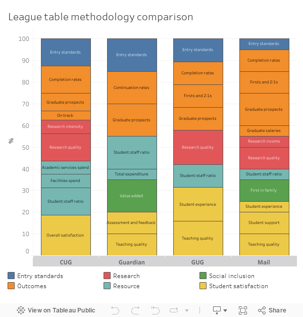
We can immediately see that the Mail offering is much heavier on graduate outcomes measures (including that utterly useless salary marker) than competitors, but it is welcome to see a lower emphasis on entry tariff.


Excellent analysis Jim. However, you have done what the Mail wanted you to do, is to make a fuss of this and give them exposure. I found their version mostly random and meaningless, but it sells newspapers.
It’s really no better or worse than many other HE league tables, and I found the sneering towards the Daily Mail and their readership unnecessary. I am sure it made the author feel superior though.
Just tells us to some extent what those of us in the ‘giving advice to sixth formers’ already knew. Don’t believe the league tables, or potentially any university marketing.
Excellent analysis – thank you
How can you take this league table seriously when they haven’t included all universities. Aston University was missed from the list. Daily Fail at it’s best.
Aston declined to give the Mail their information, so couldn’t be included.
Despite this answers a need in the information market supporting university applications, and the Mail should be applauded for producing an accessible and engaging guide. I look forward to seeing how it develops over the coming years, adding subject level and other improvements.