


Medical students are unhappy.
So are nursing students. So are those studying subjects allied to healthcare.
This is the cohort (for those on three year degrees) that primarily began their studies in 2018-19, and dealt with the pandemic over their final two years of study. Medical and nursing students will have spent a part of their time pressed into dealing with a national emergency – and have experienced perhaps more of their roles than undergraduates in other years.
Why unhappy?
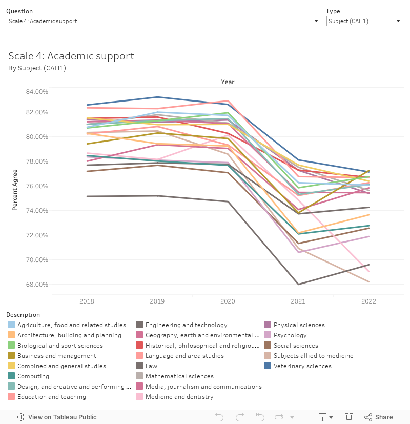
Overwhelmingly these students are particularly unhappy with the amount of attention staff are able to pay them. The “academic support” questions in the 2022 National Student Survey results show particularly troubling evidence of this.
This chart also allows you to view information on responses to questions by characteristic groups at a sector level. We don’t get these splits by provider – at least, not until the TEF data is published.
During and beyond the worst moments of the pandemic we saw a huge surge of interest among applicants in health-care related courses. Changes to the way level 3 qualifications were awarded made for more people getting the grades than ever before – leading to record-breaking cohort sizes. Though this is great news for the UK – we urgently need more doctors, nurses, and other healthcare professionals – the capacity of the departments and faculties they were joining did not grow at the same time.
The cohort responding to this year’s NSS have seen their experience worsen over three years, with two bumper years of recruitment pushing staff and physical capacity to breaking point. Scale 4 is the canary in this particular coalmine – and most subject groups are down by at least 6 percentage points from the previous standards.
Big names, big disagreement
At which providers are nursing and medical students particularly unhappy?
More than 60 per cent of medical students at Nottingham disagreed that their course was well organised and running smoothly. More than a third of medical students at St George’s did not feel the advice and guidance they had received was sufficient. Among nursing students at Birmingham, nearly half disagreed that they had received sufficient advice and guidance and more than 40 per cent disagreed that they had received helpful comments on their work.

Something of a Wonkhe signature, the top chart here shows % disagree rather than the agreement rates more usually used – we feel that students actively expressing unhappiness is a more important signal (the modal response overall is usually a 4). You can select a question, subject (CAH2), and level of interest at the top, and highlight a provider of interest. Mousing over a dot changes the display at the bottom to show all responses to all questions from the provider in question.
What is striking here is that these are large, well-known, providers. These are the kind of places that will have been popular with applicants, and over-recruited in the 2020 and 2021 cycles. As the value of (SLC) fee and (funding body) grant income declines over the next few years staff availability will fall again as the staff-student ratio rises, and this problem will get worse.
Today in history
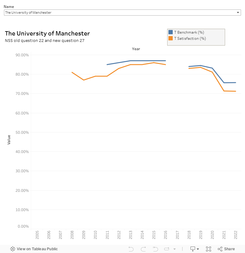
Overall satisfaction is down from the pre-pandemic trend, but (in most cases – not sure what is happening at Manchester, for instance…) up from the 2021 trough. We’re always told not to build long time series, but I figure it is safe enough to compare the old (Q22) and the new (Q27) overall satisfaction question – and I’ll keep doing this with whatever the question ends up being next time round. This is a look by provider – if there is a gap in your chart this quite often shows a successful student NSS boycott!
Response rates are still at last year’s low levels – around 68 per cent compared to the 75 per cent we used to get before 2020s disastrous ministerial intervention. Providers are no longer required to promote the survey to their students (though most do).
Pure benchmarking satisfaction
Though benchmarking has fallen out of favour at OfS (for everything but TEF and, for some reason, Proceed) we still get provider level benchmarks for each question and scale in the NSS. Here we compare provider results to an idealised situation involving hypothetical students with the same age, gender, ethnicity, and disability characteristics studying the same subjects in the same mode.
This comparison allows us to compare providers without being too concerned about the ways in which students and courses differ. Again, news for larger (dare we say “prestigious”) providers is not great.
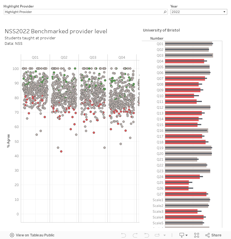
This is a complex but fascinating plot, showing provider actual performance on each question on the left (the green dots having a positive significance flag for results substantially above the benchmark, and the red dots having a negative significance flag) Use the highlighter – just start typing in it, there’s a ton of providers in this data – to find who you are interested in, and then scroll along the bar at the bottom to see each question.
If you click on a dot it shows all results and benchmarks (for each question and scale) for your chosen provider on the right. There’s two years of data here so you can look at either 2021 or 2022 using the drop down on the right.
NSS in the future
We were half-expecting something on the future of NSS alongside today’s results, but clearly this is not a decision that has been made. Perhaps the research findings from the test question banks are lying on an abandoned ministerial desk somewhere in Whitehall. But it would be a shame to see such a useful (if occasionally painful) dataset and time series whither – it remains one of the best tools we have to understand and improve the experiences of students rather than the destination of graduates. These two are not the same thing.
Too much analysis of these data is done without prior cleaning. It’s very easy to spot for medicine, in particular, as there are institutions in the tables – with quite large numbers of students surveyed – that don’t have medical schools. All very nice to know that students studying medicine at the University of the Highlands & Islands and the University of South Wales are highly satisfied, except that these students don’t exist. Trying to draw conclusions from meaningless data is foolish.
The CAH2 subject is Medicine and Dentistry (CAH01-01). Looking at their websites, I see UHI offers programmes in Oral Health Science (CAH01-01-04) and USW offers Medical Science (CAH01-01-01).
Perhaps the lower scores for Academic Support reflect the fact that as well as all students being impacted negatively by the pandemic (particularly those in medicine and health care who needed to answer the call to help deal with the direct impact of the pandemic), so were staff – who were also trying to manage the impact of the pandemic on them and their lives.
The situation highlighted by Gordon Dent (above) calls into question the “accuracy” of the answers given.
I wonder what percentage of answers are “impossible” to be correct, as course availability at particular Universities does not seem to have been checked before accepting the answer as a valid fact.
If this situation is widespread the data may be of little use.