


You know the argument – of course you’re going to have a higher non-completion rate, because your institution has a higher level of students from a low participation background. As low participation rates correlate with more general measures of disadvantage you can expect more of these students to leave their studies, often for non-academic reasons. It’s just an occupational hazard.
Not much of that still holds, if it ever really did. True – of those who didn’t continue their studies, those from low participation backgrounds (by which here we mean POLAR4 Q1 – a measure with its own issues but the best of what we are offered) are more likely to have left higher education than those from other backgrounds on average (8.60% as against 7.71%) when looking at an average institution. But the proportion of those who transferred to other higher education providers is also slightly higher among those that are from low participation backgrounds (3.26% as against 3.16%).
But at provider level the data is less clear. And most of the really high percentage non-continuation rates relate to students who are not from low participation backgrounds.
Provider level
We tested a common variation on the above theory – that non-continuation rates are lower at the Russell Group and higher at post-92 institutions due to the latter taking higher proportions of first degree young undergraduate students from low participation backgrounds. We’re using the “experimental” HESA data, as it allows us to look at alternative providers alongside POLAR4-derived participation rates
Among the providers with the lowest non-continuation rates are the Universities of Oxford and Cambridge with 2.3% and 2.6% in the last year, respectively. At both providers, the proportion of students who either left higher education or transferred to another provider is roughly the same for students from low participation backgrounds and those from other backgrounds, hovering at around 1% for both. At the London School of Economics and Political Science, the number of students who did not continue in their studies was made up entirely of those from other backgrounds – zero percent of students from low participation backgrounds left their studies at LSE in 2016/17.
Among Russell Group institutions, students who didn’t continue were more likely than average to transfer to another provider than to leave higher education altogether. Russell Group institutions tended to have a lower proportion of students from low participation backgrounds than the average provider, but non-continuation rates for those students from low participation backgrounds at Russell Group universities tended to be lower than 8%.
The equivalent figure for post-92 institutions is in the range of 5-20%. When we look at students from other backgrounds, this range narrows to between 4 and 12% at post-92 institutions, while at the Russell Group it is between 1-7%, but generally – with the exception of Queen Mary University of London – below 4%. The proportions of those from low-participation backgrounds who do not continue in their studies is higher at both groups of institutions than the equivalent figures for students from other backgrounds.
This dashboard repays sustained attention. You can choose filters for the main graph on the right – clicking on a dot representing an institutional non-continuation (left HE) rate (or a line representing the benchmark) powers up the other graphs on the right, which show an institutional percentage breakdown above a sector-wide average, alongside a numerical institutional breakdown.
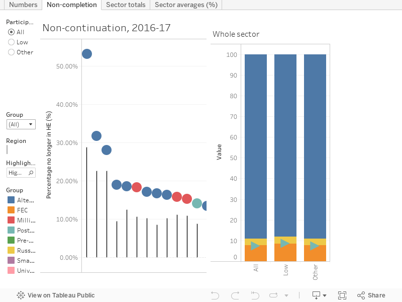
[Full screen] (we recommend it for this one!)
Distractions
It’s easy to get caught up in the drama of a well-known provider with a sky-high non-continuation rate. But drilling down offers a far more surprising story – said provider does not really recruit from students with a low participation background. The same goes for many other alternative providers – partially a function of low overall student numbers. But any idea that alternative providers are currently reaching students that would otherwise not access HE, much less offering them a successful student experience, should be abandoned.
Only three alternative providers have 50 or more students from low participation backgrounds, the largest BIMM has 185 (subject to usual HESA rounding rules), compared to a total student body of 1,400.
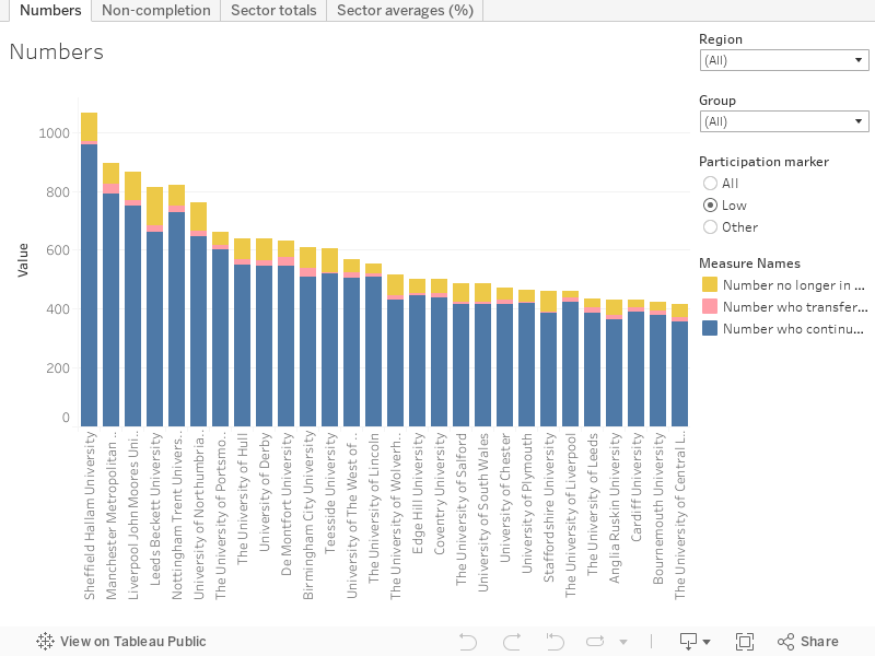
It’s the post-92 end of the traditional sector that widens participation most noticeably in numerical terms – Sheffield Hallam, Manchester Metropolitan, and Liverpool John Moores take the prize here, with the University of Hull top among pre-92 providers.
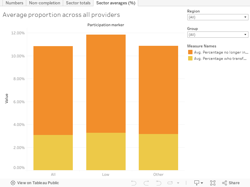
Here, we’ve plotted average proportions for non-continuation for the sector by participation group, you can filter by region or mission group.
This graph examines institutional totals with colours showing participation status, and filterable participation background groups alongside the usual mission and region.
Stay on subject
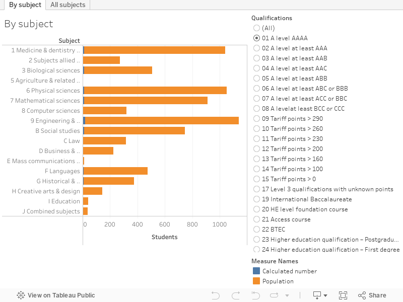
It’s always good to see government getting into the detail of HESA benchmarking tables, and this time round we see DfE talking about dropout rates by subject for young first degree entrants. But the table under discussion has another dimension – the entry qualifications of entrants.
Here we’re plotting table NC1 (via WP2) of the experimental statistics to look at the overall numbers and percentages of young full time first degree courses by subject and entry qualifications.
And there’s some surprising differences – the overall rate for all students leaving computer science (for instance) is 9.8%. But among students who enter following a HE foundation course, the rate is 4.2%. What students come in with is a huge predicting factor of their course outcome.
Among students entering with at least some tariff points, mass communications and documentation sees the largest percentage of non-continuation (20.40%), but the largest number of students not completing their course (6,341) are on social studies.
For those with BTECs – to give another example – the subject area with the largest number of non-completions is biological sciences (5,738), but the subject area with the highest percentage of non-completions is engineering and technology. The overall preferred subject of study for BTEC students is business and administration.
From the desk of Damian
It seems like we need to get used to the Secretary of State weighing in on HE issues, as once again it is Damian Hinds rather than Chris Skidmore that supplies our comment. Inflammatory “bums on seats” language will do little to endear him to the sector, and once again the threats of Office for Student action are wheeled out.
His substantive point is unlikely to surprise anyone:
No student starts university thinking they are going to drop-out and whilst in individual circumstances that may be the right thing, it is important that all students feel supported to do their best – both academically and in a pastoral sense. Today we have announced a new taskforce to help universities support students with the challenges that starting university can involve, but universities need to look at these statistics and take action to reduce drop-out rates.
The taskforce “will look at ways of helping students manage challenges in four key areas, which includes aspects of student life including managing finances, getting used to independent study, and finding your feet among a large new group of peers”. There’s been no indication as to who will sit on it, but we hope to see some current and former students represented.
I find the Secretary of State’s line a little illogical. If universities are only interested in “bums on seats” then we would surely do all we can to retain every student so they can carry on paying fees. For the student, withdrawing from a course can clearly be a serious and prospect damaging event and I am sure universities try and do more every year to support and advise students, but for some is will be the best course of action. We should all welcome any taskforce or help available to support students and positive cooperation with any initiative will be good for both students and providers but we need a shared understanding of the reasons before reacting to the physician’s rubber hammer tap just below the patella! So thank you for this article’s insight into what is difficult and incomplete data.
Is part of this problem the use of language such as “drop-out”? I have always felt this is a poor choice of words to describe the many and interrelated reasons that students do not to continue on their course and for many it is rather pejorative language. Leaving due to poor health, maternity, employment opportunities, poor grades, bereavement, etc should not all be grouped into such a phrase.
I was curious that OfS didn’t mention conditions of approval when reacting to the data. They’ve set nine B3 conditions (two for universities and seven for FECs) which relate to non-continuation rates. The two universities should have submitted their improvement plans by now.
You’d assume that several of the APs who are further from their benchmark for non-completion will also be getting a B3 condition when they get on the register.
Meanwhile, it’s well worth remembering that the UK’s completion rates are among the best in the world. Inside Higher Ed reported that 60% of US Students Graduate Within 8 Years – ie twice as long as the normal 4 years (https://www.insidehighered.com/quicktakes/2019/02/12/new-data-60-students-graduate-within-8-years)
The insistence on using POLAR as the proxy for disadvantage when it comes to student success is problematic. Firstly, by definition (the acronym stands for Participation Of Local ARea) it was developed to measure differences in HE entry rates, not student success, and the extent to which this measures the ‘Local’ is itself subject to huge methodological problems (POLAR 4 is only slightly better than previous iterations – it is now measured at MSOA which still represents average population units of circa 7,500).
At my institution, we use ACORN data to identify gaps in student success rates, e.g. for non-continuation and degree classifications. Whilst by no means perfect, it is a much better predictor of student success than POLAR; indeed when including both of these covariates in a multiple regression model, there is absolutely no relationship between POLAR and either non-continuation or degree class. Even looking at the simple descriptive stats, we see much wider historical gaps in success when focusing on ACORN (MOSAIC and IMD are also much better predictors than POLAR). Therefore, we rightly focus on supporting these students. Perversely, however, we are urged to set our new APP student success targets using POLAR data. It’s therefore likely we will be in the strange position of targeting our most disadvantaged students (and rightly so) using ACORN data yet being judged by POLAR outcomes.
Whilst there does need to be a degree of standardisation in institional targets and some alignment with OfS’ own KPIs, I find it curious that the underlying assumption is that POLAR trumps all. Certainly at my institution, and I’d suggest most others, it’s a poor proxy for socio-economic disadvantage, with a similarly weak correlation with student success.