


It’s OfS Access and Participation plan dashboard day, and because this stuff counts towards the monitoring of your access and participation plan in England we need to be paying attention.
On access and attainment this release separates out findings from 2019-20 by a range of splits. We find that the overall rise in undergraduate attainment in the first pandemic year- generally attributed to the use of “no detriment” policies – has particularly benefited Black students, disabled students and students from disadvantaged backgrounds.
The gap between the proportion of Black students achieving a 1 or 2:1 degree, and the proportion of all other students has fallen from 20.1 percentage points in 2018-19 to 16..9 percentage points in 2019-20. For students from the most disadvantaged (IMD) backgrounds the gap between white student attainment and that of students from other ethnic groups has fallen from 10.4 percentage points to 7.1 percentage points in a year. This cuts accross all types of providers, but the effect is particularly noticeable in the Russell Group.
For 2019-20, there is now almost no attainment gap between students reporting a mental health condition and those who do not report a disability. There remains a significant gap experienced by students who have identified a social or learning disability, but these gaps both shrank last year.
All this prompts very important questions for the higher education sector – what is it about our usual methods of assessment that disadvantages non-traditional students? And why would we ever go back? Looking at the absolute data shows that all attainment has risen, but students from non-traditional backgrounds saw their attainment rise more than most.
What is this data?
This year’s release includes 2018-19 data on continuation, and 2019-20 data refined from the HESA collections for access and attainment. The progression data was supposed to move from a DLHE to a Graduate Outcomes basis, but OfS hasn’t got round to that yet so we are still using the DLHE series than ends in 2016-17. But the A&P release contains a lot more detail in terms of splits and intersectional data, allowing a far more nuanced look at the trends we’d identified earlier.
Data is available at a high level of resolution around POLAR4, IMD (in 2019 and 2015 flavours), ethnicity, disability, age on commencement, and sex – plus we get four intersectional splits: POLAR4 and ethnicity, POLAR and sex, IMD and ethnicity, and IMD and sex. If you are looking only at sector data you can get stuck in to a few extras – (broad) subject of study, and entry qualifications. Not every split is available at each of the four lifecycle points, and there is some data suppression going on for small samples.
If you think back a couple of years ago when I last got stuck into it (we missed last years’s update, other stuff was going on…) you may recall that deriving insights from the A&P data or dashboard is neither a simple nor a pleasant activity. Bluntly speaking, you can either put up with the design choices and limitations built into the OfS’ Tableau, or you can much around in Excel with filters. The data is large and unwieldy enough – and designed in such a way – to make anything else a serious chore.
For me, there’s three things everyone wants to get out of sector data:
- How did my institution do?
- Is that something I need to worry about?
- How does this compare to similar institutions?
The OfS dashboard does servicably well for the first one, moderately well for the second one (there is a lot more in the underlying data, but a lot about the presentation is confusing), and makes no attempt to look at the third one. So I built my own versions – which I need hardly add repay finding the biggest screen you possibly can to interact with them.
Gap explorer
This first dashboard takes you through the year 5 gaps with significance and value indication, and then lets you see the whole sector in context for each split – indicating the trajectory of each provider.
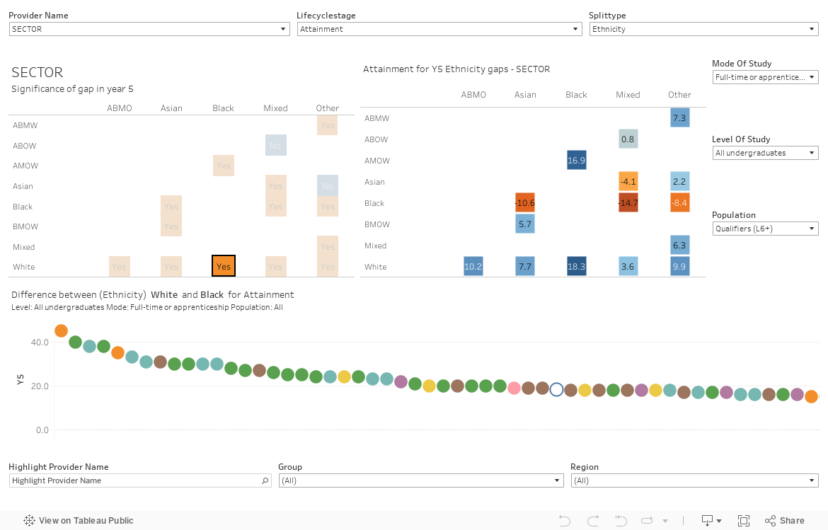
To start off with, select your institution of interest on the top left (we default to “sector”, which lets you see the sector averages), the lifecycle stage (access, continuation, attainment, progression) in the middle, and your area of interest on the top left (we default to ethnicity). The splits available vary depending on the lifecycle stage, but this is managed contextually.
The two matrices below the top row of filters show (on the left) whether the gap between each pair of aspects is statistically significant (marked in orange) or not, and (on the right) the size of each gap – expressed as the percentage point difference between the rate related to the attribute in rows from the attribute in columns. A positive (blue) value means the value in rows is higher, a negative (orange) value means the value in columns is higher.
At any time, you can tweak the mode or level of study you are interested in on the right – on the latter note the data is undergraduate only. If things look odd check the population drop-down: this mostly defaults to the correct value but there is sometimes a choice.
Clicking on any value on either of the matrices brings up a traditional sector rank diagram for that particular combination of characteristics in the space below – the colours of the dots represent mission groups, and you can mouse over the dots to see how the gap has changed for that provider over the five available years or whether the one and five year changes in gap size are significant.
Right at the bottom I’ve provided a provider name highlighter, a group filter, and a region filter to help you find providers of interest. The latter two are persistent, so if you set them once you can spend all day looking at, say post-92 providers in the North West of England.
This should get you started, but please see the notes below on the access lifecycle stage and on populations.
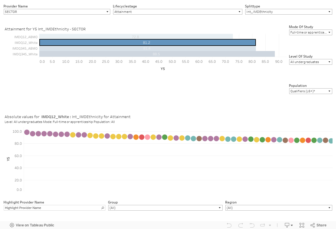
Absolute explorer
Though the gaps are probably of most interest, it is worth keeping an eye on the absolute values too. The second dashboard works in a broadly similar way to the first, but there is a simple provider bar chart rather than the two matrices. Just click on one of the bars to get into exploring absolute values in the sector for each combination of characteristic and lifecycle stage.
Additional points on the data
You’ll note the access matrices for the gap explorer look slightly different – here we see a gap between IMDQ1 and Q5 along with the access rates (comparing the age 18 access rates for each characteristic with the overall population from that characteristics). Here, a positive (blue) value on the right means that access is worse for that aspect than otherwise would be expected, a negative (orange) value means it is better. It’s all fairly straightforward, but it is unfortunately not consistent with other parts of the lifecycle.
If you do get into the population filter having options, these work as follows:
- Entrants and Entrants* – the former is the population (overall) of students, the latter is the population of students relevant to the chosen characteristics (you want to choose this one, most of the time).
- Qualifiers, Qualifiers*, Qualifiers(L6+), Qualifiers* (L6+) – the asterix works in the same way as above, the L6+ thing tells you whether or not these students got an honours level qualification, with the other option including all higher education qualifications.
For most options there is only one population available, which is why I have de-emphasised the importance of these options above. But do make sure you check if you see something confusing!
For those who dig into the spreadsheets and dashboards, you have the ability to go beyond binary significance measures as you get information about the numerator and denominator for each characteristic.
Thank you.
Have you had to do a lot of transformation of the published data sets to be able to get it in this form?
It’s all untransformed, incredibly. I thought I was going to need a lot of reworking, but it was all in there.
It’s interesting. ‘No Detriment’ is linked (for most people) to policies that discounted certain marks in degree classification algorithms. Internal analysis at my provider suggests that this didn’t close the attainment gap. The closure was driven by the shift to online examinations, in which disadvantaged students performed (comparatively) better than they do in physical exams. It will be interesting to see whether that is replicated this year, since we’re continuing with online exams (but not with No Detriment in the same format).
Andy – how do you know? Part of the point about ND is that it theoretically gives students confidence. If few students actually had grades that relied upon ND adjustments, that could just as easily be evidence of the policy giving them the confidence to succeed in these new forms of assessment. It will be surely be crucial now to actually engage with students to work out what’s happened here.
I don’t definitively know, but it is what the institutional analysis suggests.
If you break assessments down – which we did as part of the analysis, which was looking back at whether we were maintaining academic standards, and forward to identify which measures had been most successful in 2019/20 and should therefore be continued as part of supportive measures for this year – it is exams which show the consistent improvement in attainment gaps for students from disadvantaged groups in 2019/20. Other assessment types (such as coursework and projects) with deadlines after the pandemic (and therefore covered by No Detriment) did not see the same shift in attainment gaps (they typically either didn’t narrow, or didn’t narrow by as much where they did narrow).
We saw closure in attainment gaps overall for all student groups from online exams and this was generally true for the vast majority of gaps regardless of whether a subject’s marks overall improved or not (i.e. if students’ marks in general improved, the attainment gap closed; if marks were broadly comparable, the attainment gap closed). I say vast majority as when you start looking at the subject level by year, then some groups in some years did not see a closing gap (but gaps that didn’t close tend to be where the numbers are small and more volatile).
If you just focus on marks from the first year of undergraduate degrees – which don’t contribute to classification and which weren’t covered by No Detriment – you still typically see a larger narrowing of the attainment gap in exams.
What it might be about online exams – the reduction in pressure, the greater ease with which classic reasonable adjustments (extra time, regular breaks etc) can be taken into account (and the disability gap saw the biggest shift; with a similarly big shift in high end marks for BAME students), the ability to slot the work around other commitments, the fact there was so little else to do, chance – that seems to have made the difference, I can’t tell. But, for us at least, and on the basis of the fairly straightforward analysis which has been done, it looks like online exams is the factor most likely to have made that difference.
As I said, it will be interesting to see if this continues in 2020/21, given that we have a similar approach to online exams and pretty similar support mechanisms in place this year (with the exception of the classic ‘your marks can only go up not down’ No Detriment pledge), albeit in what has been a very different year (where online and blended teaching, learning and assessment has been more deliberate but also far more prevalent, and everyone has had a more challenging year).
But I think there’s reason to be cautiously optimistic, and to consider assessment changes carefully in 2021/22, even if No Detriment policies are different this year.
I’m not entirely clear why we’re certain that these improvements are owing to ‘no detriment’ policies rather than to new forms of assessment (often more radical than just switching to online exams), particularly as ‘no detriment’ policies often meant drawing on students’ pre-covid performances, which are presumably the same ones that previously yielded the bigger gaps. Yes, confidence could be a factor – but asking students won’t necessarily tell us whether that is significant. Just how do we pick out what has had the significant impact?
“All this prompts very important questions for the higher education sector – what is it about our usual methods of assessment that disadvantages non-traditional students?”
I fear the data may end up leading us down a path that isn’t going to be good for longer term ‘life’ outcomes and may do much reputational damage in the process.
Sitting in on Graduation’s it’s often informative to listen to other students when extra awards are given, one that’s stuck with me was a female Black African Grad who’d worked hard to achieve a 1st commenting on a female Black Afro/Caribbean British Grad being awarded a 1st and a ‘special award’, she couldn’t understand how as she, and other predominately non-white students I spoke with afterward, commented the B A/C B student rarely attended lectures, was intersectionally ‘politically active’ a regular user of hate speech and generally disruptive when she did attend, they almost all concluded the awards were to shut her up during Graduation and assist her in moving on to take a higher degree somewhere else.