


After a few years of rapid changes and exogenous shocks we are pretty much back to normal on the national student survey.
The 2025 results tell an overall tale of graduate improvement – of students being generally content that they are getting what they have been led to expect (or, for the cynics, having modulated their expectations appropriately), and of a sector where the majority of students are content with pretty much every area of their academic experience.
The positivity is always worthy of noting as it balances out a popular image of unhappy students, poor quality courses, and failing universities. The inconvenient truth is that UK higher education as a whole is pretty good, and remains so despite the efforts and fervent wishes of many.
Overall
The main utility of the National Student Survey is to draw gentle but persistent external attention to the kind of internal problems that decent providers will already be aware of. If you know, for example, there is a problem with students receiving timely feedback on your undergraduate architecture course, the temptation in these times of budgetary restraint may be to let it slide – a negative NSS finding focuses attention where it is needed.
Michelle Donelan (where is she now?) famously took against the framing of students being “satisfied” in her jeremiad against the old NSS – but the NSS has, since inception, acted as a tool to get students some satisfaction.
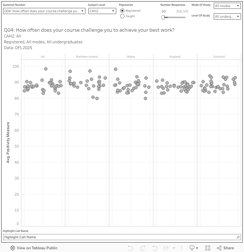
Our first chart looks at the four home nations and the UK as a whole – you can examine subject areas of interest at three levels, choose to see registered or taught students, of all undergraduate levels and mode, and filter out areas with low response numbers. From this we learn that food and beverage studies is probably the most challenging course in the UK, with 94.8 per cent of respondents responding positively to question 4 (“how often does your course challenge you to achieve your best work”).
In Wales, medical technology students were least likely to be positive about the fairness of marking and assessment. In England, maritime technology students are least likely to feel their student union represents them. To be clear, at CAH3 we are often looking at very small numbers of students (which may pertain to a single course in a single provider) – cranking things up to CAH1 means we can be much more confident that veterinary science students in Scotland find their course “intellectually stimulating”.
By provider
It gets interesting when you start comparing the national averages above to subject areas in your provider, so I’ve built a version of the dashboard where you can examine different aspects of your own provision. I’ve added a function where you click on a subject dot it updates the bar chart on the right, offering an overview of all responses to all questions.
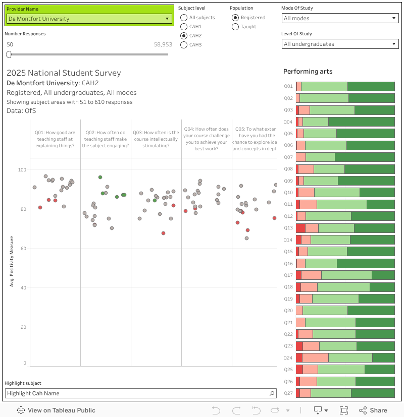
This helps put in perspective how cross your computer games and animation students are with your library resources – it turns out this is a national problem, and perhaps a chat to a professional body might be helpful in finding out what needs to be done
Of course, there’s a whole industry out there that uses NSS results to rank providers, often using bizarre compound metrics now we don’t have an “overall satisfaction” question (if you’ve ever read nonsense about nursing students in a provider being the most satisfied among modern campus universities in the East Midlands then this is how we get there).
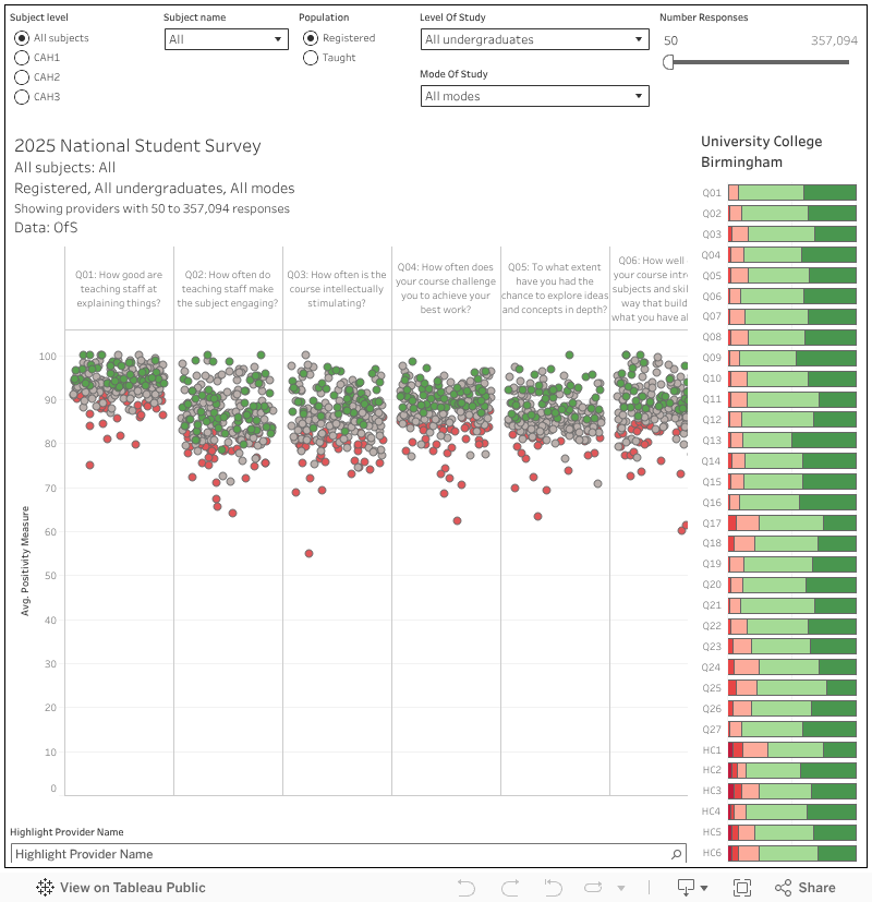
There is a value in benchmarking against comparators, so this is my gentle contribution to this area of discourse which works in the same way as the one above (note that you need to select a subject area as well as a subject level). For the people who ask every year – the population sizes and response numbers are in the tooltips (you can also filter out tiny response numbers, by default I do this at fifty).
I’ve not included the confidence intervals that OfS’s dashboard does because it simply doesn’t matter for most use cases and it makes the charts harder to read (and slower to load). You should be aware enough to know that a small number of responses probably doesn’t make for a very reliable number. Oh, and the colour of the dots is the old (very old) TEF flags – two standard deviations above (green) or below (red) the benchmark.
Characteristics
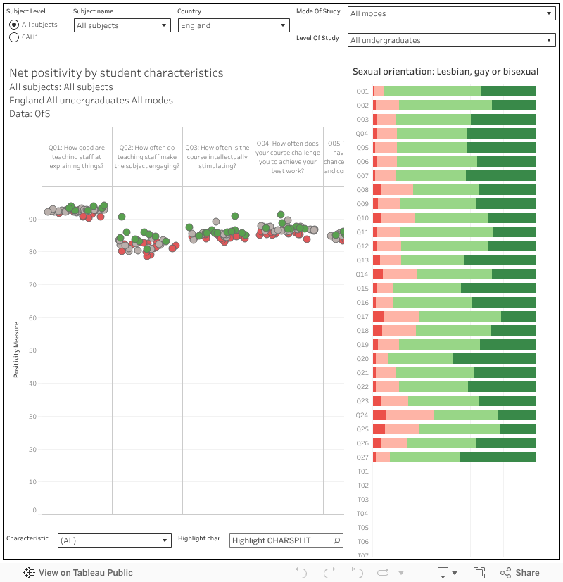
Beyond national trends, subject level oddities, and provider peculiarities the student experience is affected by personal characteristics.
While there may be a provider level problem, many of these could equally be a national or UK-wide issue: especially when linked to a particular subject area. We get characteristic statistics up to CAH level 1 (very broad groups of subjects) in public data, which may be enough to help you understand what is going on with a particular set of students.
For instance, it appears that – nationally – students with disabilities (including mental health struggles) are less likely to feel that information about wellbeing support is well communicated – something that is unlikely to be unique to a single provider, and (ideally) needs to be addressed in partnership to ensure these vulnerable students get the support they need.
Conclusion
If you take NSS at face value it is an incredibly useful tool. If we manage to leave it in a steady state for a few more years time series will add another level to this usefulness (sorry, a year-on-year comparison tells us little and even three years isn’t much better).
As ammunition to allow you to solve problems in your own provider, to identify places to learn from, and iterate your way to happier and better educated students it is unsurpassed. It’s never really convinced as a regulatory tool, and (on a limb here) the value for applicants only really comes as a warning away from places that are doing outstandingly badly.
At the risk of revealing my ignorance – what time series would be useful and if 1-3 years comparisons are not much use why are they afforded so much kudos?
Thanks for this question. What I was getting at is that we don’t yet have enough data to be clear what a “normal year” would be like for this version of the NSS. Over the many years with the previous design we started to build up an understanding of where scores “should be” that helped us interpret the results in the light of prior performance. (eg https://wonkhe.com/blogs/the-nss-a-survey/ )
We don’t yet have enough data points to do this with the new survey.
Would very much like to see a ‘survey’ on what incentives HEI’s use to get students to complete these surveys and also collusion of student unions to influence positive outcomes.