


The graduates who left university in 2021-22 mostly entered the workforce in the summer of 2022.
This was around the peak of inflation (CPIH was higher than 8 per cent) that is popularly known as the cost of living crisis. Political instability, the advent of the Truss administration, and the death of a monarch contributed to a very dark period in UK history.
Wages were generally failing to keep place with this peak, and employers were nervous about future plans for expansion and recruitment under such conditions. The data was largely collected 15 months after graduation – in the winter of 2023.
On this basis, the very slight rise in UK graduate unemployment (from four per cent in the previous cycle to five per cent in this), and a single percentage point drop in graduates undertaking work or further study (89 per cent, compared to 90 per cent) are encouragingly marginal. While clearly we would hope that all graduates would progress onto the fulfilling future of their design, a major economic slowdown does not appear to have greatly affected employer demand for graduate employees.
The release of HESA Graduate Outcomes data for the 2021-22 graduating year allows us to examine this in greater depth.
What graduates do next
Here, I’ve used a variation on the classically accepted “good” graduate outcome (full time employment, further study, or employment and further study) to allow us to examine trends at a provider and subject level.
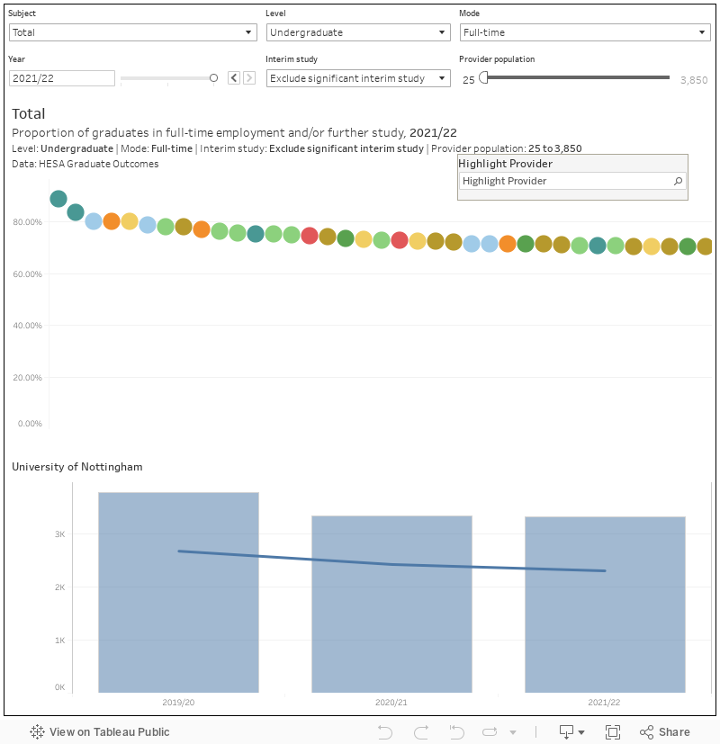
The top section of this chart allows you to see providers ranked by the proportion of graduates with known outcomes in full time employment, full time further study, or both. You can filter subject area (CAH top level), level of study, mode of study, interim study, and year using the controls at the top – and because this is a proportion I’ve included a filter to exclude providers with low numbers of graduates in each area (by default the minimum is 25 graduates) to avoid outliers. If you mouse over a coloured blob (you can use the highlighter to find a provider of interest) you can see the total number of graduates with “good” outcomes (line) against the total number of graduates where data is available (bar) for each year of data for the provider in question.
Exploring the data shows that we are looking at an overall depression across all subject areas (only medicine, where career paths are largely pre-set) bucks the trend. Likewise, the decline is notable across all types of provider (Russell Group as well as FE College), with only the larger number of alternative provider graduates yielding a larger number of graduates in these kinds of destinations. There’s a parallel across-the-board small rise in unemployment too, with only alternative and FE providers bucking the trend – although, as we will see later, there are other concerns there..
Quality of work
I remain a massive fan of the “quality of work” experimental measure under development by HESA. While a plot of salaries would show more doom and gloom, this measure (which looks, broadly, at how happy graduates are with what they are doing based on how meaningful they think it is, how it fits their career plans, and how it uses the skills they have developed at university.
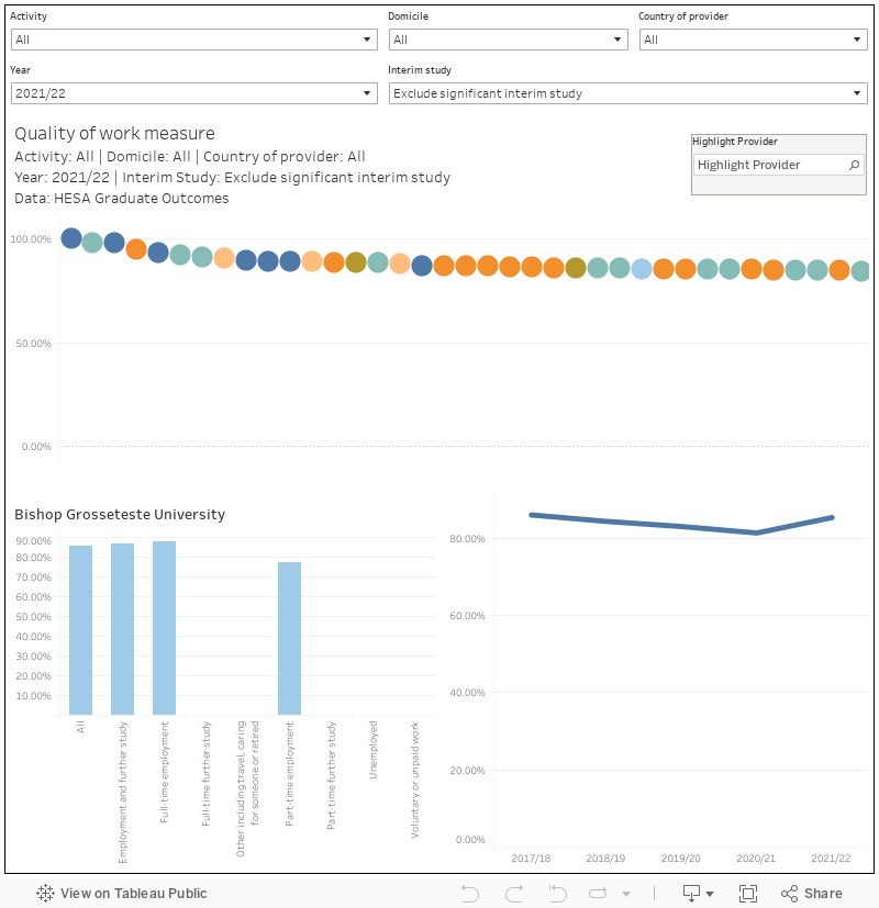
For this plot, you can filter the ranking at the top by graduate activity, domicile, the country of the provider, year of graduation, and interim study. Use the highlighter to find providers of interest, mousing over the coloured blob changes the focus of the two charts below: the one on the left shows quality of work scores by activity for that provider, and the one on the right shows a time series based on the provider and the activity selected above.
Here around 80 per cent of graduates in full time employment are satisfied with their quality of work (a figure that has remained largely stable over the previous five cohorts), while for those in further study satisfaction has increased (very slightly) for the third year in a row. Unemployed graduates, as you might expect, are less satisfied with what they are doing – the slightly larger proportion of graduates that are unemployed depresses the overall total.
Highly skilled
The Office for Students, on the other hand, is more interested in graduates in “graduate” (highly skilled) jobs. We’ve published a lot in the past about the limitations of the idea of a graduate job (based on what graduates tended to do 10 years ago) and of SOC coding (also 10 years old, doesn’t directly map to the graduateness of a job, describes several jobs with degrees directly leading to them as low or medium skilled), but this is probably the data within graduate outcomes that will receive most attention.
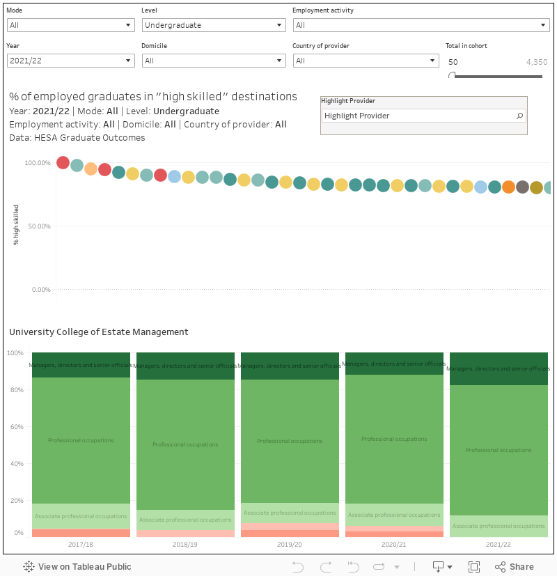
What you are looking at here a ranking by provider by percentage of working graduates in “highly skilled” (SOC group 1-3) employment – basically the metric used by OfS. You can filter the chart at the top by mode, level, employment activity (most of the data is in “paid employment”, but there are options for volunteering and self-employment), year, domicile, and country of provider. Again use the highlighter to find a provider of interest (you can also filter out smaller providers) – mousing over the coloured blob changes the focus of the chart at the bottom. This shows, per provider the proportion employed graduates in each of the 9 top level SOC groups – the three “highly skilled groups” are shown in various shades of green, the others in reds.
Again, the movement is downwards but largely within the margin of error. We’ve seen an ongoing rise in the number of graduates in managerial or directorial positions – and one that does not seem to be driven by a growth in graduate entrepreneurship. This is coupled by a slight drop in the proportion of undergraduates in professional or associate professional roles, with corresponding rises elsewhere.
If you think back to the state of the world in 2022 it may be fair to assume that graduates were just grabbing on to whatever work they could find (although the stable quality of work scores suggest they have not been looking too far out of their way in terms of career aims).
What industries do graduates work in?
SIC codes, which basically act as a proxy for the broad industrial sector (rather than role) each provider works in, are (at the top level presented here) large and unwieldy beasts. But it is a way of looking at graduates in terms of careers rather than first job – it is far from unusual, especially during an economic and cultural downturn, to see young people accept a job in the workplace that they want even if it isn’t the job they want.
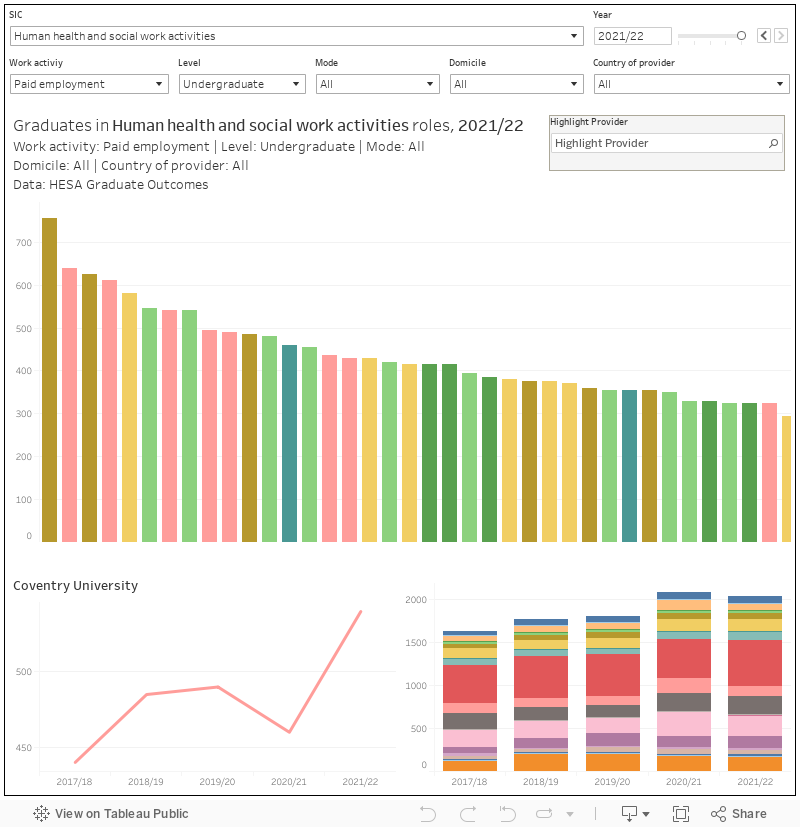
Like the charts above, this shows a ranked list of providers at the top with all the usual filters. Mousing over your chosen provider changes the lower two charts to focus on it – the chart on the left is a time series for the SIC code you have chosen, while the one on the left lets you see all SICs for that provider over time.
Of course, looking at all this in aggregate is hardly doing justice to the individual paths that graduates (balancing career plans, increasingly, with the rest of their life goals) will take in a ludicrously short amount of time after graduation. But even within the data there is the possibility of some nuance.
Thanks for this insightful article. Please note that the SOC coding is four years old – a new version, SOC2020, was published in 2020.