Easy finance
A new statement from HEFCE advises universities how to make financial information more visible to students. But is it advice, guidance, assistance or in fact a clear directive?
New guidance aims to help universities and colleges in England present information about income and expenditure on their web-sites in a way that is transparent and accessible to current students and the general public.
The guidance has been developed by the British Universities Finance Directors Group (BUFDG), GuildHE, HEFCE, NUS and Universities UK. It follows a request from the Department of Business, Innovation and Skills to HEFCE for universities and colleges to publish financial information more effectively.
It draws on findings from recent research, including a survey of 2,400 current students which found that there is interest in this type of information but that it was often difficult to find and understand.
The research identifies priorities for improving the presentation of financial information such as accessibility, clear signposting and ensuring technical language is clearly explained, as well as keeping information up to date.

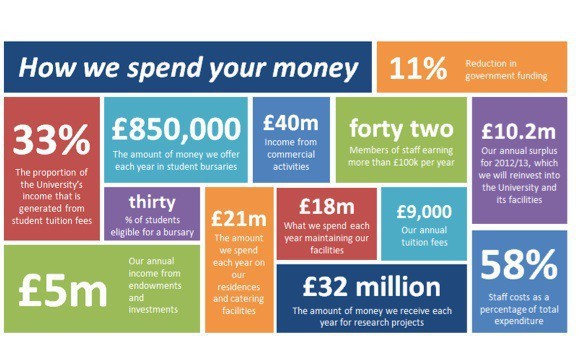
In summary, it seems that all this finance stuff is a bit difficult to find and understand and therefore needs to be provided in accessible and easily digestible form. In other words we need to ensure that this aspect of university management can be represented by infographic. Perhaps it would be better if every dimension of university life were to be represented in pictures?
This just adds, as previously posted, to the excess of information already made available to students. And, if it does turn out to be a requirement rather than just encouragement, then isn’t this yet another piece of unwelcome regulation to add to an already excessive burden?
Note that Hugh Jones has a slightly different take on this, favouring transparency and openness with students. He has a similar line on fancy pictures though…


Thanks for the link, Paul. I don’t think that in fact we’re that far apart. If you have so much data that the water is muddied, then almost by definition (or certainly by metaphor) you don’t have transparency. The trick is to identify the information which will help people to make informed choices, and present it clearly and well. This is why expertise matters. There’s two big problems, though. The first is that the ideology of big data is that people can sift it themselves to find meaning. And maybe sometimes they can. But applicants to university are likely not… Read more »