

The higher education sector has seen an increase in the volume and complexity of data at its fingertips. Between the tables, plans and reports, it can be difficult for someone not familiar with the data to know what to make of it all. Compelling charts are an invaluable – and underutilised – tool for navigating through this sea of data.
In access and participation plans (APPs), higher education providers set out how they will improve equality of opportunity for students. However – as Wonkhe has noted – the latest guidance from the Office for Students (OfS) hints at the lack of charts communicating equality gaps up to this point. Providers are now told that they “may use charts and graphs to aid communication.”
Using charts to widen your audience
This is a welcome addition. When conducting research and writing reports, we often underestimate just how much charts can aid communication. While we carefully conduct our analysis and diligently edit our writing, charts are quickly added in at the end of the process, without due consideration for the value they can add.
I have found John Burn-Murdoch’s work at the Financial Times to be one of the most inspiring examples of the power charts can have. Using charts, he visually unpacks tricky data in such a way that it’s immediately clear what the underlying story is. As he frames it: with the right additions, a visual can be elevated from a simple chart to an effective piece of communication. Like good writing, charts can help clearly communicate complex findings to a wide audience, drawing out the narrative behind the data for non-experts.
We should take advantage of all the tools we have at our disposal to communicate our findings to a broader audience, particularly one as underutilised as charts. As the quote often attributed to Chekhov goes: “knowledge is of no value unless you put it into practice.” If we can’t clearly communicate our research to its intended audience – whether this is students, time poor leaders, or the wider sector – the work is not going to have the impact that it otherwise could.
Designing an effective chart
So what makes a good chart? This is a question we have examined in depth at TASO through our data visualisation style guide. Charts should be designed with a target reader in mind, so there is no single right answer and it will vary significantly depending on the context. However, there are some key principles we can use when designing a chart to be as accessible as possible to a broad audience.
To illustrate how these principles can be applied in practice, let’s use some synthetic data and create a chart that you might see as part of an APP. Here, we show the percentage of students entering our imagined university who have a declared disability. The chart gets the fundamentals right: it displays all the correct data, uses an appropriate chart type (in this case a line chart to show trends over time), and includes descriptive alt text for those who may not be able to view the chart.
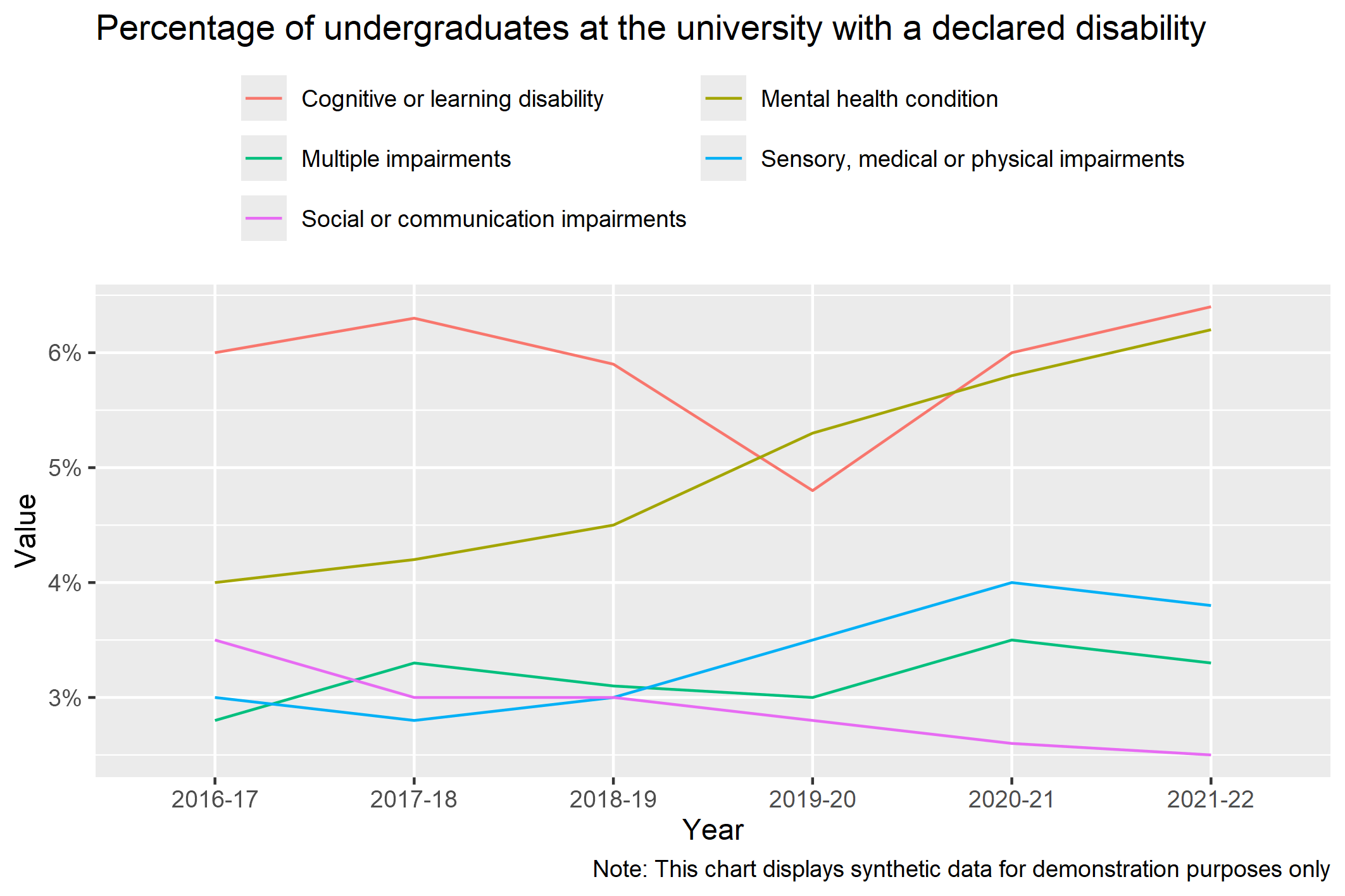
A chart like this wouldn’t look out of place in a report or an access and participation plan. To someone close to the data, this may give them all the information they need. But it’s not immediately obvious to someone who hasn’t read around the topic what their takeaway from this chart should be. As a busy reader scanning for new information, what conclusions should you draw from this?
To make the key takeaways as clear as possible to a wide audience, we can start by considering what story we’re trying to tell with the chart. If this data was part of a report, we might have noted the following as our key points of interest:
- The percentage of students with a mental health condition has been increasing.
- The percentage of students with social or communication impairments has been decreasing.
These results are in the chart if you’re looking for them, but they don’t stand out. Below, I’ve highlighted these insights through the use of a descriptive title and selective use of colour. I’ve also decluttered some of the design defaults from the original chart and made it more visually distinctive.
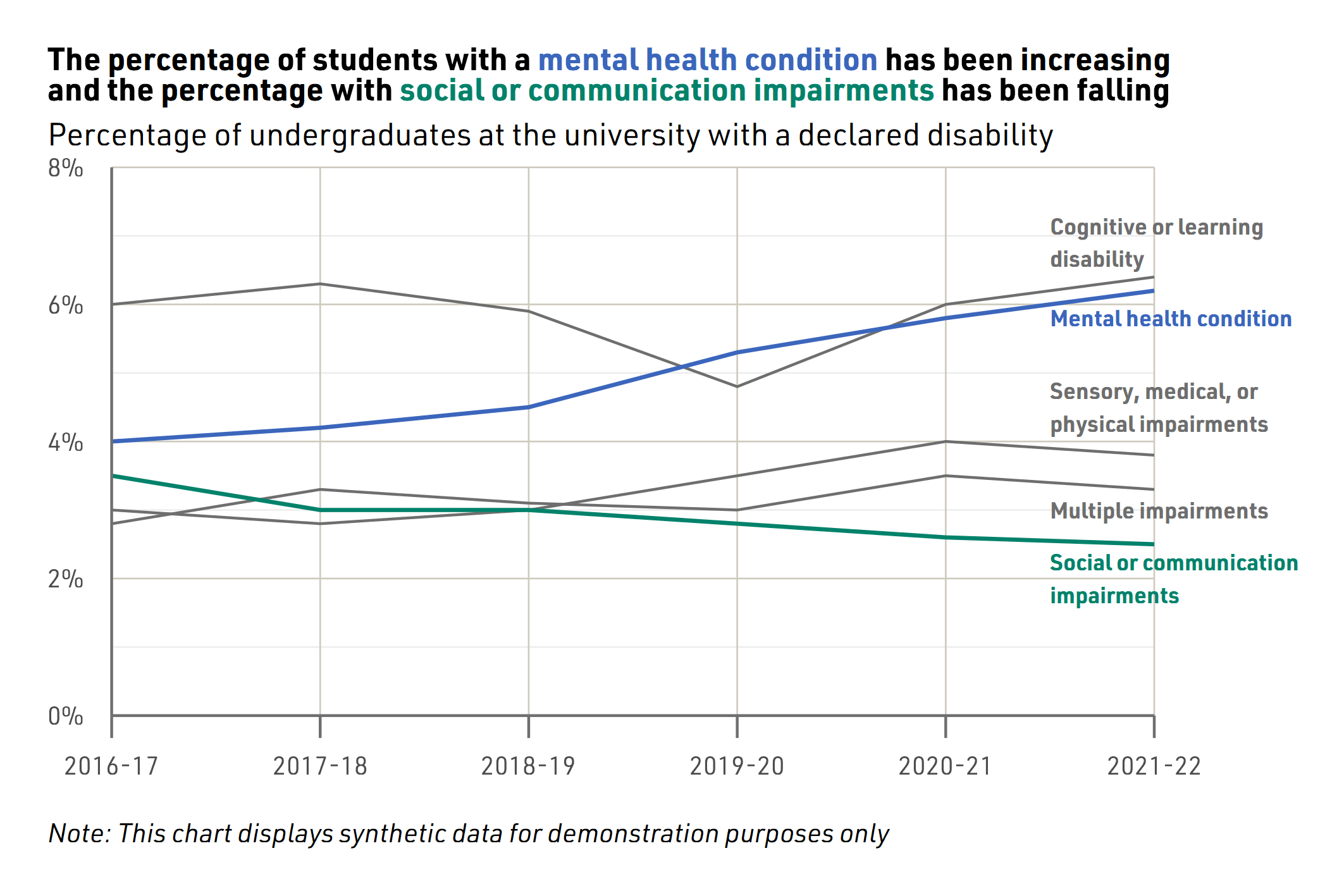
The impact of well-designed charts
An effectively designed chart like the one above makes these insights more memorable and aids understanding. Rather than getting lost in the data, a thoughtful chart can illuminate the key findings. Readers are much more likely to remember increases and decreases presented clearly in a chart like this than buried in a table or in paragraphs of text.
Not only are the insights more memorable, but engaging charts like this are also much more shareable and can create more compelling calls to action. Funders, policymakers and donors alike depend on accessible communication of data. If you took the above chart out from an APP and shared it in a webinar or on social media, it would still make sense and convey a clear need for action.
So, whether you’re writing your APP, sharing research at a conference, or promoting a report on social media, consider the value a well-designed chart might add.